In this video, Jaci from the Tested Technologies Interactive team has six tips on how to design a landing page that rakes in some major dough.
Transcript:
Great landing page design can take your business from a sales slump to an explosion of new customers. I’m here to give you six tips on how to design a landing page that converts, so you can see more leads, sales, and revenue.
I also have some real-world examples to share, so you have a more concrete idea of what each tip looks like in action.
Let’s get started with tip number one!
1. Match your landing page to your ad, email, or other content
How would you feel if you went to a scarf store only to discover that they actually sell hats? I would definitely be confused, and maybe a little frustrated. That’s the same feeling people would have if your landing page was completely unrelated to the ad someone clicked on.
If you have an ad or send an email about your scarf sale and the link sends people to a page with all of the clothing you sell, you’re probably not going to get the boost in scarf sales you hoped for.
The same goes for the calls-to-action. If your ad, email, or other content is focused on getting people to make a purchase, the landing page should be a place where people can buy something. If you want people to contact you from your ad, your landing page should include a form or information that tells people how to get in touch.
In this Facebook ad from Pantene, the company is trying to increase sales of its product at Costco and links from the ad to a Costco page where someone can make a purchase.
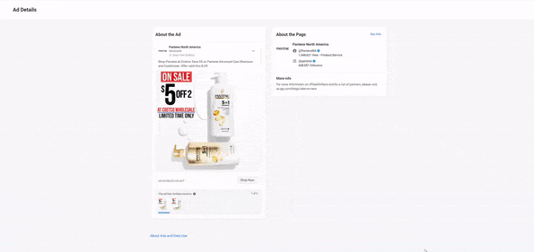
It’s clear, simple, and cohesive.
2. Include one call-to-action (CTA)
You don’t want to give your audience too many options on your website landing page. Choose one call to action and stick with it. That way, you can put more focus on getting people to do one thing, rather than splitting their attention and hurting the effectiveness of your messaging and design.
This Wistia landing page does a great job of keeping things short and sweet. It wants the user to take one action: Get in touch.
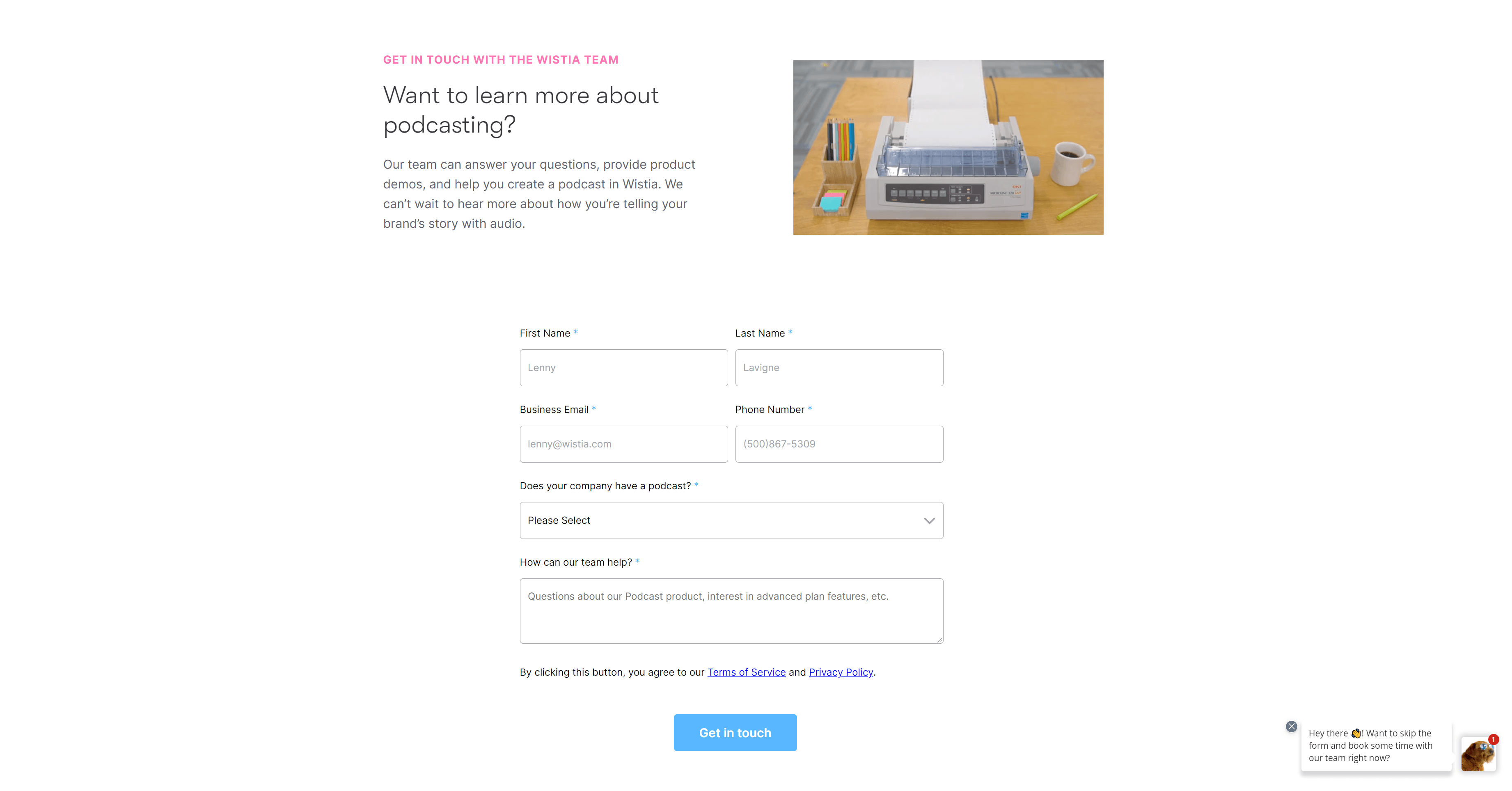
Everything on the page is geared toward that one action.
3. Write great copy
To design landing pages that convert, you need to give people a reason to convert — and make it easy, of course.
Your copy plays a big role in convincing people to give you their information (or their money).
First, make sure you tell people what they’re getting into. Whether it’s an online course or an email newsletter, people should have an understanding of what you’re offering from your landing page design.
Second, identify and use a value proposition. Basically, ask yourself what makes your business stand out among your competitors. How do your products or services make people’s lives better?
Do you offer something for free? Is your consultation process quick and easy?
Ahrefs provides a robust digital marketing tool for marketers of all skill levels. An ad promoting their free tools takes people to a landing page full of great copy.
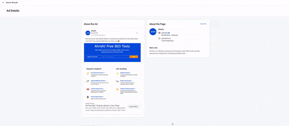
Their big headline tells you that the page has free SEO tools, and clearly labeled links take you to each tool they feature. For the value, Ahrefs tells you that you can improve your ranking and get more traffic for free.
There’s really no question of what your customers get from your business when you write great copy.
4. Avoid cluttering your design
Gone are the days of busy, clunky web design.
Let your content breathe. You don’t need to fill up your page with unnecessary icons or images.
Unless you’re the Yale School of Art.
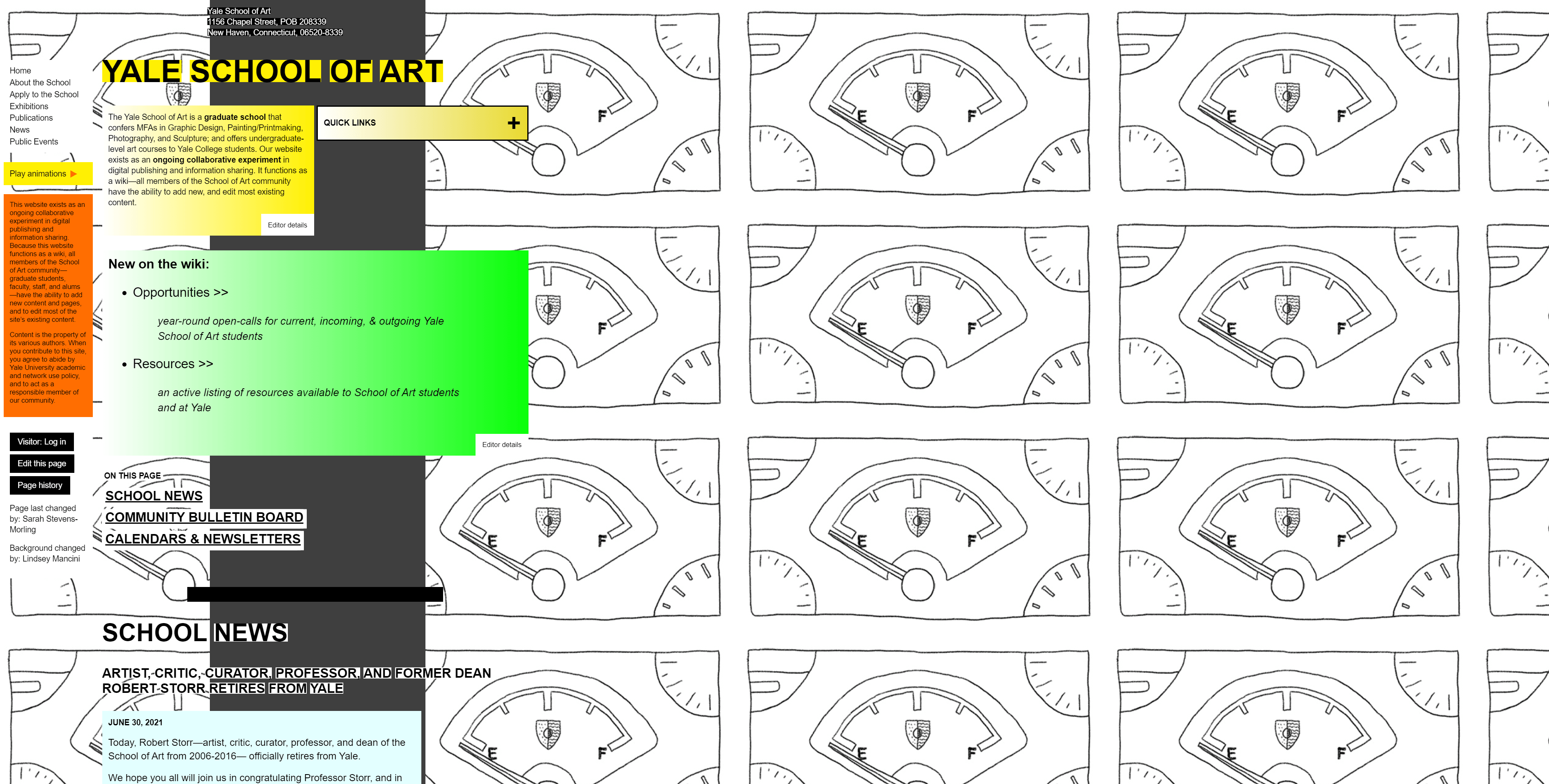
Giving different sections of your website space can help you call attention to specific elements. It makes things easier to read and can even increase reading comprehension.
Notice how the landing page layout for this Fiji water ad doesn’t use a lot of images. The design is simple with plenty of unused space that allows the products and the product details to stand out.
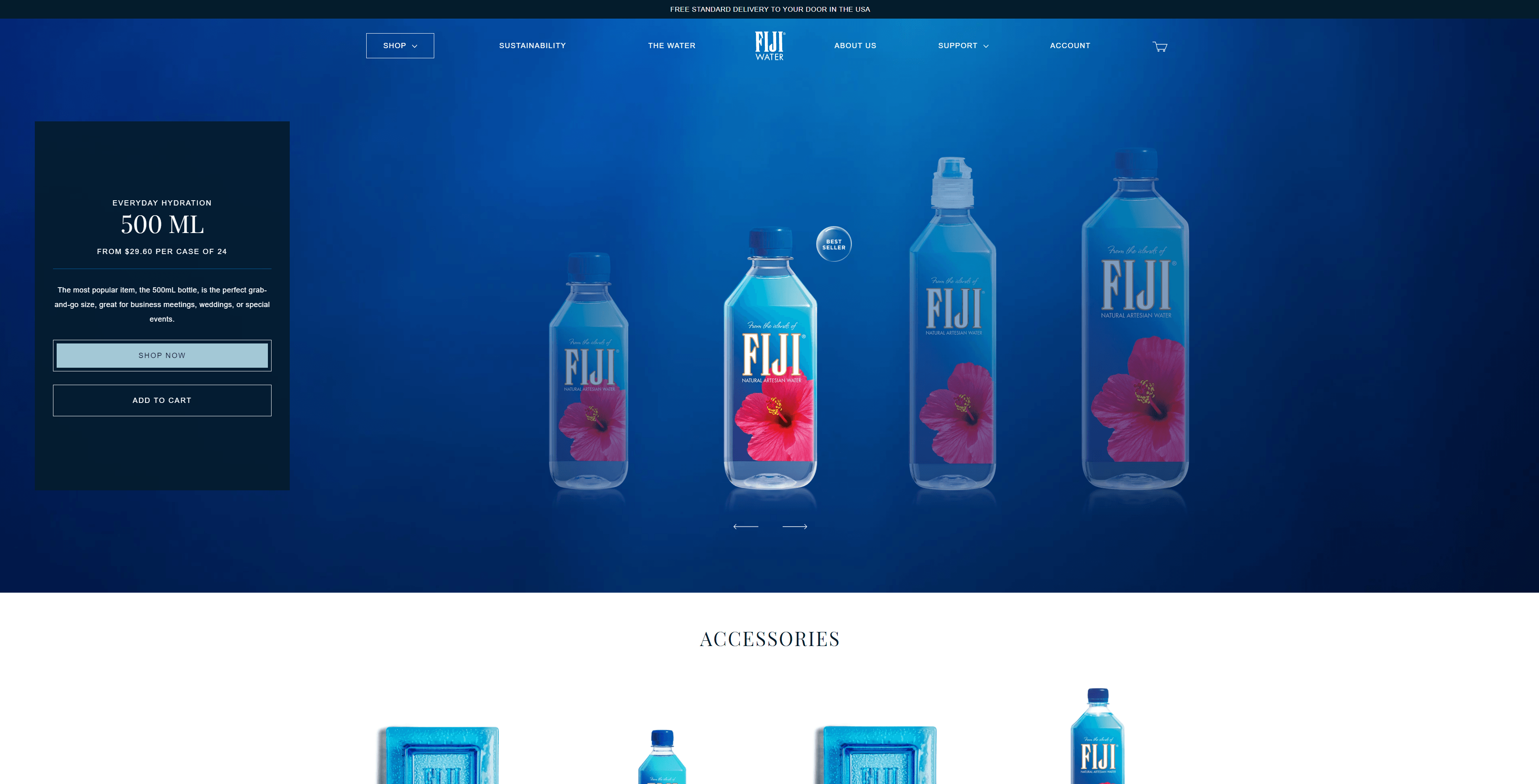
Also, white space doesn’t have to be white. It’s just a term we use to describe the parts of a page that don’t have any pictures or other elements.
5. Use color wisely
Color can make people feel and act in different ways. If used wisely, they can improve reading comprehension, learning, and impact people’s emotions.
Using contrasting colors can also bring attention to specific areas of your website.
Let’s look at this page LEGO created to go along with its ads promoting a building contest. I will obviously not be entering.
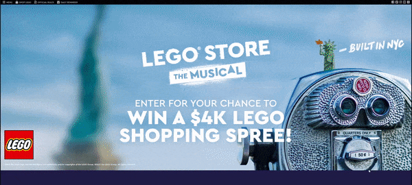
When you scroll down, you see three orange buttons that give you the option to upload or share your content and enter the competition.

The orange buttons stand out against the blue backdrop because they’re high-contrast complementary colors, meaning they sit on opposite sides of the color wheel. The contrasting colors make it clear that those buttons are important.
Diving into color psychology a bit, orange tends to represent excitement and enthusiasm. Marketers use it to create the feeling of a friendly, cheerful brand. What better way to generate excitement for a contest than with a color that reflects excitement?
You can learn more about the psychology of color on our website.
6. Offer visual cues
This is a visual cue.
I’m assuming you looked in the direction I was pointing.
When you design a landing page, you should consider strategically placing graphics and images on the page, so they direct people’s eyes to important or clickable elements.
The first thing you might think of is arrows. This is an obvious way to tell people where you want their eyes and mouse to go. But you don’t have to be as conspicuous.
If you want to use a photo on your website, make it so that the elements are angled towards your buttons or important text. Have a person in the photo look directly at the most important part of your page. They can even point like I did not long ago.
On Gucci’s website, you can see the company used an image of shoes to advertise its women’s shoe collection.
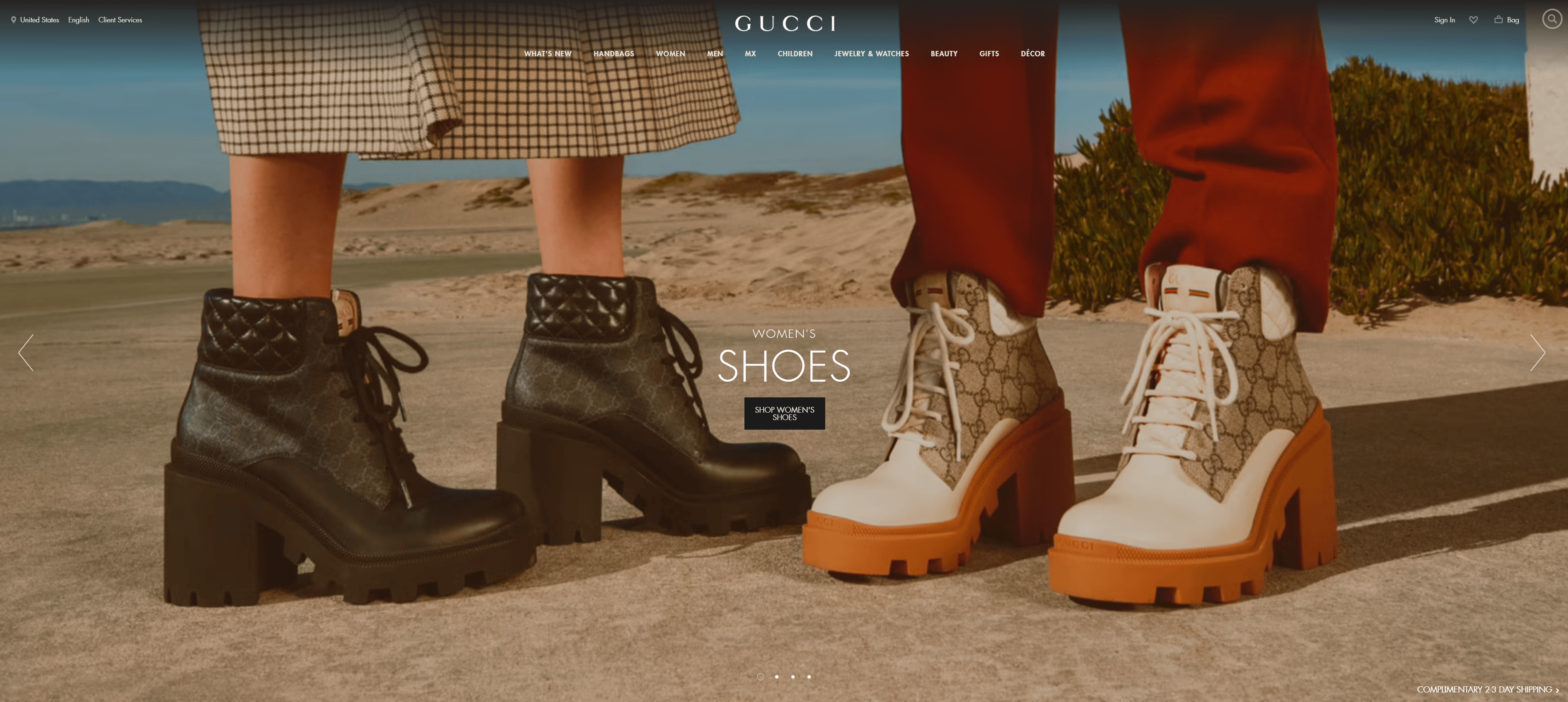
But if you take a closer look, you notice that the shoes are angled towards the “Shop” button. They subtly draw your eye to the clickable element, whether or not that was the original intention.
I hope all of these examples have given you a better understanding of how to design a landing page. My last piece of advice for you is to test everything. You don’t have to choose one design and stick with it if it’s not working.
Testing tools like Google Optimize or VWO can help you figure out which designs work best for your site visitors. Running tests like this is a part of conversion rate optimization, which you can learn about in some of our other videos.
If you’re looking for a team of designers to help you create landing pages that convert, don’t hesitate to reach out to us through the link in the video description.
And lastly, don’t forget to subscribe to our YouTube channel and our email newsletter, Revenue Weekly. Get the link to Revenue Weekly in the description, too.
See you next time!
The post How to Design a Landing Page That Sends Conversions Skyrocketing appeared first on Tested Technologies Blog.