
This is a guest article by the InVision team.
Gone are days of design projects that have a concrete list of deliverables. As web design and development continues to evolve, static web pages don’t cut it anymore.
Now, we’re expected to do a lot more. We’re tasked to design and develop prototypes, design systems, and provisions for future growth and development.
Stephen Hay said it best:
We’re not designing pages, we’re designing systems of components.
Our designs need to stay ahead of the rapidly changing device landscape and content types, which show no signs of slowing down.
The old design process is getting an overhaul. Agility, collaboration and adaptability are now on the forefront of the design process. The lines between design and development are blurring.
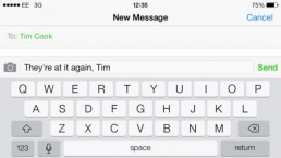
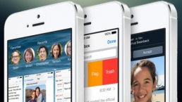
Mobile First
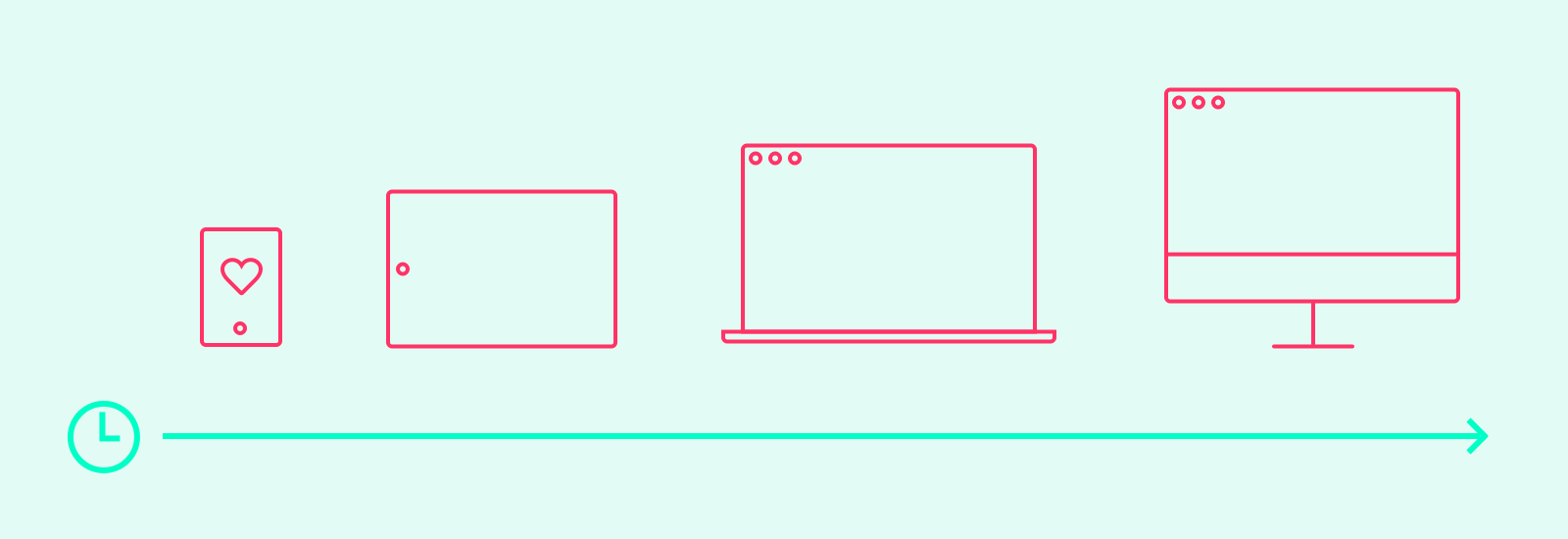
For years, Mobile First has been the battle cry of forward-thinking web designers. It’s a design process that says we should start with simple layouts for small screens, and then add complexity to that base foundation as more screen space becomes available.
As sales of mobile devices outpace PCs, and knowing mobile usage has officially passed the desktop, Mobile First is becoming the norm.
Unless you’ve got some really strong data and numbers against it, thinking Mobile First makes the most sense.
It’s easier to add complexity to a design as more screen space becomes available, rather than to reduce its complexity for smaller screens.
As someone who splits his time between design and dev, I find myself filling in a lot of gaps for clients. Half-completed page? I got this. Design for mobile not completed? I’ll fill in the gaps. I can’t recall the last time I needed to fill in the gaps for a desktop breakpoint.
Somehow, the desktop layouts always seem to get mocked up first; the mobile layouts usually look like a crudely stacked version of the former.
Let’s stop using “Mobile First” as a buzzword. Let’s actually start the design process for small screens.
One Brick at a Time
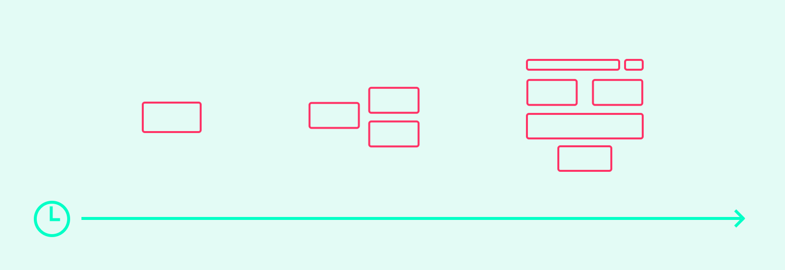
Design is a cumulative process, with each new round of progress building on the wins from the previous.
Planning for the small screen first just makes design sense. I like to add bricks as I’m building something, not knocking them down instead.
One of the best analogies I’ve found for this type of design process is atomic design, a methodology that views things through increasingly complex combinations. It goes something like this:
- Decide on some typography combinations, sizes, and colors
- Combine these choices into something small like form fields and labels
- Assemble the fields into something larger like a contact form
- Place the contact form into a “Contact Us” page, which is made up of lots of other small pieces
- Repeat
The humble brick. A small, simple, and blunt object. Assemble your bricks with care, and the possibilities are limitless.
Not only is building with bricks quicker and easier than building from scratch, the process lends itself from mobile to tablet to desktop perfectly.
Think about what you (and your user) really need at each step, and only add more bricks when it makes sense.
Think Beyond Breakpoints
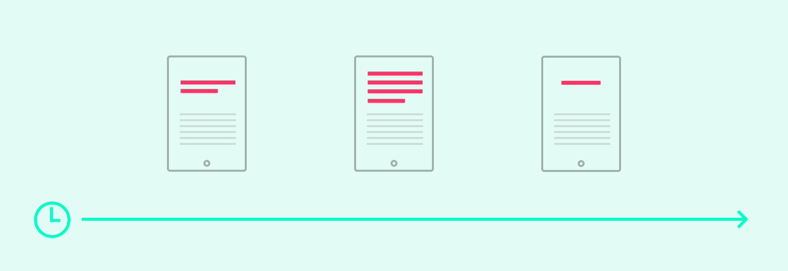
When discussing responsive web design processes, we spend a lot of energy sweating our media query breakpoints and designing for current devices, when one of the main causes of wonkiness is the site’s content.
When possible, design with real content. Working closely with your content/marketing team helps prevent surprises late in the game.
Even so, through the start of the design process right up until launch (and likely, after) content is going to change. Short headlines grow. Photos swap. Entire sections get the axe.
A thoughtfully constructed design system can roll with the punches. Translating the marketing team’s scattered Word doc into a shiny new page on the website shouldn’t hurt your head.
While some areas obviously require (and deserve) extra attention, my general rule of thumb is this: Don’t overthink it.
Lots of times, a smart and tight design style guide is all that’s needed to keep things on-brand.
Get Real
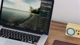
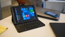
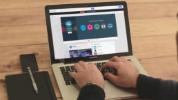
Design prototyping is great, but it typically takes place on desktop computers by the same people building the product.
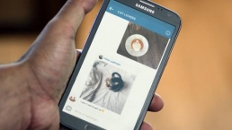
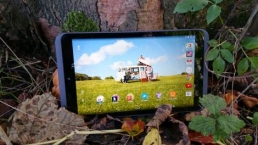
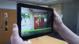
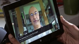
Get the best feedback by sharing a design on real devices with real people.
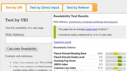
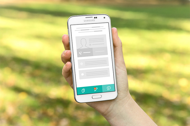 Even wireframes can be tested better on a real device
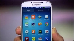
Testing a responsive design should be a wide and varied process. Load it on a real smartphone. Ask non-design coworkers and friends to have a run through things. Look at the designs on an iPad (because tablets are slated to surpass PC sales soon).
A Whole New World
Most of us are new to viewing large problems through a small lens. Increased collaboration and blurring team lines have the design process moving faster than ever.
To keep pace, our design needs to adapt and change as quickly as our content and business requirements. Starting small with razor focus keeps things sharp as complexity grows.
Related Content
- Understanding the Elements of Responsive Web Design
- Responsive Web Design is Not the Future
- How to Test Responsive Designs
 Clark Wimberly is a Content Designer at InVision, makers of a popular design prototyping tool. He spends his days writing and creating design content (screencasts, UI kits and ebooks). Previously, he was a UX Designer and founded the online community Android and Me. Check out ClarkLab, his personal website. Connect with him on Twitter and GitHub.
The post Reimagining the Web Design Process appeared first on Six Revisions.
Related Posts


The new brand identity
When you are alone for days or weeks at…