Introduction and Hamburger controversy
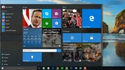
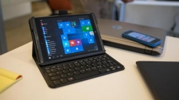
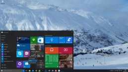
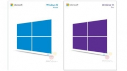
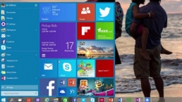
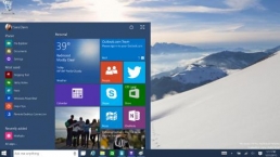
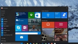
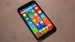
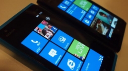
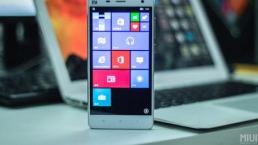
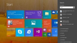
Recent Microsoft apps for both Windows Phone and recent previews of Windows 10 have increasingly featured the ‘hamburger’ menu on the top left for navigation, rather than the hubs, pivots, tabs and app bars of the Windows 8 and Windows Phone design style.
There was speculation that Microsoft was giving up on the look it originally called Metro and hoping to appeal to iOS and Android users with a more familiar interface. But at the recent Build conference the message was more that Windows 10 design is a work in progress, and that hamburger menus are only a small part of it, intended for some very specific scenarios.
Timeless design
Microsoft might have been forced to change the name of Metro (which was inspired in part by the strong graphics of transport systems like the London Underground), “but it’s still part of our design language and ethos,” design chief Albert Shum said at the Build conference.
“We want our design to be timeless; we want to create a system that will evolve over time,” he added, pointing out that we’re seeing changes because new devices mean the design language has to cover more screens and types of hardware.
“Having Windows as a universal platform means it needs a universal design that also spans the ten-foot TV and holographic experiences. We didn’t just do an updated design for the phone – this is about how we design for a universal Windows ecosystem.” Windows 10 has one SDK and one store, Shum noted. “We have to think about how does that experience flex, not just do a phone screen.”

Nothing’s final
Shum further noted that we haven’t seen the final design for Windows 10, and especially not for Windows 10 for Phones. “We’re still working on that. What you’ve seen so far is a glimpse of that.”
“People were thinking the phone designs were as finished as the desktop design,” Microsoft’s Kevin Gallo explained to TechRadar. “Our desktop design stabilised first and our phone design is stabilising later. People think they’re on the same cadence; they’re not. We’re building Windows OneCore all at once and we’re fixing the bugs for the platforms, we’re fixing the designs for the platforms in an order and I can tell you it’s mostly financial – what pays the most gets bugs fixed first.”
But Microsoft is also still working out what the new design is going to be for Windows 10 for Phones and Shum admits the design team has been “exploring concepts to push the boundaries”. In the past, Microsoft has done that internally – now it’s doing even more experimentation than in previous versions of Windows, and it’s doing this in the open as part of the preview programme. And yes, says Shum, that can be painful.
“We want you to get this early,” he explains. “It will be rough. That’s why we call it dogfood.” That’s true not just of the Windows 10 for Phones interface itself but especially for the apps Microsoft has been previewing. “What you’re seeing today are apps that are only partly adapted for the phone interface we intend to ship,” he says. “We’re still learning how to take advantage of controls that allow you to flex for the device.”

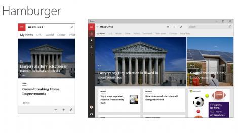
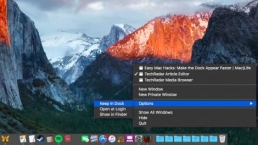
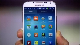
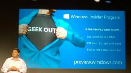
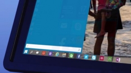
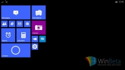
Hamburger controversy
The most controversial of those is the hamburger menu, which has been showing up in the phone-unfriendly top left corner of a lot of phone apps. The hamburger menu is ubiquitous on the web, Shum points out, and it isn’t even new – a similar icon was used in an interface at Xerox Parc in 1980.
“It answers the need for a control that helps you navigate across your app – sometimes it’s hard to find where to go to find another section of your app. I think it still does a good job of solving that problem. The issue is not the hamburger but how it’s applied.” In other words, it’s not supposed to be the only way to control and navigate in an app.
“The controls we’ve had before will always exist; the hamburger is just another tool you can use. Our intent was the hamburger is a great tool to navigate large sections of an app when that’s an infrequently performed task,” says Shum, suggesting “you should only use it when it’s appropriate.”
“Have a command bar, an app bar that you can quickly access for most functions. Use the hamburger and the app bar. Adapt it for your app. Make it appropriate for the context and the task you want the user to achieve.”
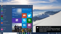
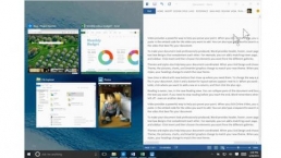
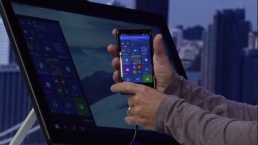
Different interfaces and devices
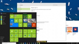
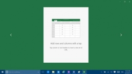
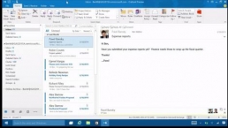
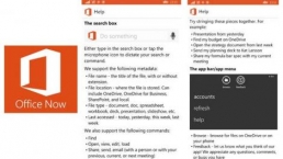
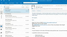
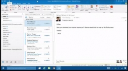
The problem has been that universal apps will have different interfaces on different devices, but the different interfaces aren’t all in the preview apps. In future builds, he said, the Photos app will have a hamburger when you use it on a PC but a pivot you can swipe through on a phone. Outlook app commands that have been on the hamburger menu will move down to the app bar, like switching between accounts or jumping from your inbox to the calendar. An early version will show up soon, with the final version of the app bar control appearing in later builds “once the Office team has finished building it”.

The address bar in the Edge browser might move back to the bottom of the screen – but it might not. Shum told TechRadar that the team had got feedback supporting both positions. They’re weighing up the importance of muscle memory against the problem of having auto-completions in the address bar spill upwards into the tab, covering the page.
Experiments in design
Another problem, admits Gallo, is that people didn’t realise that what they were seeing as a Windows Insider was not just early code but also design experiments – especially with the hamburger menus.

“In our early insider builds for the phone, we definitely went hamburger crazy. It was part of our experimentation and it was not clear to everybody that we were experimenting with the apps there. Even as we build our own apps we’re evolving the concepts. We’re inventing a new design language; we will be doing that all the time. But when we do this we need to be clear that we’re experimenting.”
“We’re going to change a bunch of the apps,” Gallo told us. “I know you’re frustrated you don’t have some of the one-handed functionality of the phone – you should see the feedback inside Microsoft. ‘Oh my god, you crazy people over in design land…’ We’ll make a bunch of tuning there. There definitely were some teams that had some bad designs and we’re glad we caught them before RTM.”

Go your own way
But Gallo doesn’t want app developers to feel they have to copy either Microsoft’s experiments or the final look of their apps. “I want developers to try different things. Sometimes we say ‘I have all the scenarios and let’s make these five really good and you can’t break out of that’. But openness is also the venue for creativity. We want to allow developers to do it their own way, they’re completely free to invent their own way – and fail. Many of them will fail but those who succeed will learn from the failures and go rebirth it again.”
![]()
Related Posts


The new brand identity
When you are alone for days or weeks at…