BigCommerce is one of the most popular platforms for creating ecommerce websites. It offers features that make building an ecommerce site more user-friendly while maintaining the flexibility that more advanced users want.
How does BigCommerce design work, and how can you create a successful ecommerce site using the platform? Keep reading to learn about the BigCommerce website builder and get our top ecommerce design tips.
Want more web design and digital marketing tips delivered to your inbox? Join 150,000 marketers in signing up for one of our email newsletters.
We don’t just want to tell you about the beautiful work we do.
WE WANT TO SHOW YOU
We’ve built over
Websites in industries like yours

View our past work
How BigCommerce design works
BigCommerce has several features that make building a website much easier, even if you don’t have any experience with web design or code. There are also options more advanced users can use to achieve more customization.
Here’s an overview of how you can create an ecommerce website with the BigCommerce website builder.
Themes
There are lots of themes available for BigCommerce that give you an excellent starting point for your site. You can choose a free or premium theme and then customize it according to your needs. BigCommerce offers numerous themes in its Theme Marketplace, and you can also find third-party BigCommerce themes.
Page Builder
Page Builder is BigCommerce’s visual editor, which allows you to adjust your site’s layout and make simple customizations without using code.
All the themes available through BigCommerce are compatible with Page Builder.
With Page Builder, you can add, remove, and rearrange elements on your pages and adjust style elements such as colors and text sizes.
Edit Theme Files
BigCommerce also offers a way to make more advanced edits within your browser. This option, called Edit Theme Files, is available for BigCommerce Stencil themes. It’s recommended that you use this option to:
- Make relatively minor theme changes that you can’t make with Page Builder
- Add scripts to integrate apps that you can’t add using BigCommerce’s Script Manager tool
Using Edit Theme Files requires knowledge of HTML, CSS, and Handlebars.js. If you’re not comfortable with these languages, you may need to work with an ecommerce website developer.
Stencil Command-Line Interface (CLI)
BigCommerce’s Stencil Command-Line Interface (CLI) is a tool that developers can use to make larger changes to a theme without impacting the live website.
It provides a controlled environment for customizing your BigCommerce themes and testing your changes. Stencil CLI is perfect for making more extensive and advanced changes to your theme but requires web development knowledge.
Partner with Ecommerce masters!
Campaigns managed by Tested Technologies have earned over
TRANSACTIONS IN THE LAST 5 YEARS
Read Case Studies
Tips for BigCommerce design
About 75% of visitors use a website’s design to judge its credibility. Appearing credible and professional is crucial for ecommerce businesses since users won’t give their payment information to a website they don’t trust.
So, your website’s design is essential to getting users to spend time on your site and convert.
Check out these BigCommerce design tips below to learn how to create a winning ecommerce website with BigCommerce.
1. Keep your design simple and uncluttered
The best ecommerce website designs tend to be simple and polished. Avoid over-stuffing your pages with content and use white space to separate elements.
Aim to make your pages scannable. Visitors should be able to determine what your page is about by quickly glancing at it.
Keeping your design simple and uncluttered will make your site easier to look at and navigate.
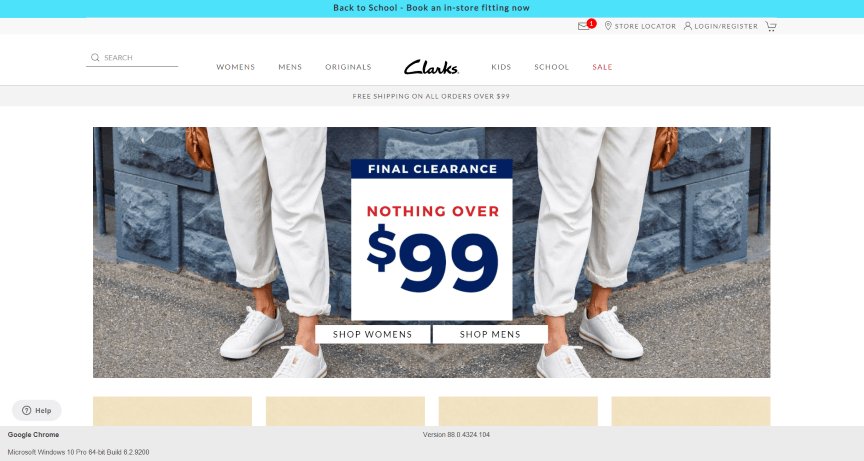
In this example from Clarks, you can see how the design includes a central image and an abundance of white space around it to keep the design looking clean and uncluttered.
2. Make your design responsive
As many as 90% of users have made a purchase on their smartphone, so ensuring your site looks good on mobile devices is essential. The best way to accomplish this task is with responsive design.
Responsive design enables your website to adjust to the device someone visits it on, so it looks professional and works correctly on all devices, including laptops, smartphones, and tablets.
Whichever theme you choose for your BigCommerce website, make sure it’s responsive. Today, there are plenty of responsive options available. If you customize your theme or build a custom theme, make sure you prioritize responsive design.
3. Keep your design consistent and incorporate branding
Use a consistent design across your website that matches your brand and includes important brand elements. A consistent, branded design will make your site look professional and help users feel confident they’re in the right place no matter where they are on your site.
Brand elements to use in your design include:
- Colors
- Logos
- Fonts
- Images
Your overall design should also match your brand’s personality. For example, if your brand is high-class and elegant, you’ll want a sophisticated, simple look. If your brand is fun and casual, you might use bright colors and eye-catching, lively images.
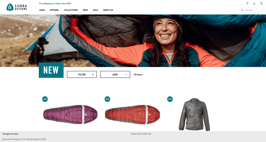
For an example of incorporating branding into your design, look at how Sierra Designs uses the color from its logo in its free shipping offer and its new product label.
4. Add high-quality images and videos
Adding images, graphics, and videos to your pages is an excellent way to make your pages more eye-catching and engaging. In fact, users spend 88% more time on pages that have videos.
Visuals are especially important when it comes to product pages. Include multiple photos of your product so shoppers can see it from various angles. Videos are great for showing your product in action.
Make sure the videos you add to your pages are high-quality, so they make your site look more professional and visually appealing. Opt for original images and videos whenever you can. Also, ensure the visuals you choose fit with your brand aesthetic.
5. Prioritize easy-to-use navigation
Almost 90% of consumers will shop with a competitor if they have a negative user experience. Your website’s design, especially your navigation, plays a central role in your visitors’ user experience.
Your navigation is how users get around your site, and if they can’t do so easily, they’ll likely end up frustrated and leave without making a purchase.
Create broad menu categories that are easy to see from anywhere on the site and organize various subcategories under these items. This setup helps users to quickly navigate to the types of products they need.
On Awesome GTI’s website, for example, visitors can shop for auto parts by car from the top navigation menu.
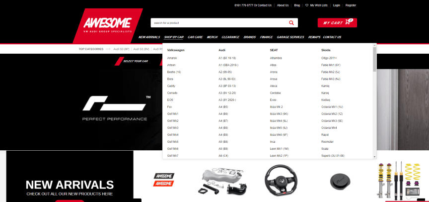
Search bars are also hugely important on ecommerce sites. For shoppers who know exactly what they want, the search function saves a lot of time. Make your search bar easily visible in your top menu.
Easy and quick navigation is critical during the checkout process. Include as few steps as possible in your checkout process and make sure it’s clear to users what they need to do to complete their purchase.
6. Test and refine your design
Don’t stop improving your website’s look and functionality once you’ve created your initial design! Instead, use A/B testing to determine what works best for your site and continuously refine your site.
A/B testing involves testing two different versions of a page to see which performs best. For example, you might create two headlines and see which one keeps users on the page longer. You could also design two calls to action (CTAs) to see which version gets more clicks.
By continuously testing and refining your designs, you can substantially improve your site’s performance over time.
Ecommerce design services
Whether you’re using BigCommerce, opting for another ecommerce platform, or building a custom website, partnering with a professional ecommerce website design and development firm can help you make the most of your project.
The award-winning web design team at Tested Technologies has created more than 1100 websites for our clients, and we’ve generated over $2.4 billion in revenue for our clients over the last five years.
To learn more about BigCommerce design and our other ecommerce services, contact us online or call us at 0802-583-7481.
The post 6 BigCommerce Design Tips For Big Ecommerce Results appeared first on Tested Technologies Blog.
Related Posts
March 6, 2021
Top 5 Web Design Tools & Software Applications
November 6, 2015
50 Web Designs with Awesome Typography
September 6, 2015


