Web design is responsible for nearly 95% of a visitor’s first impression of your business, and great design can help you improve sales numbers.
That’s why it’s more important than ever to incorporate modern web design into your marketing strategy.
But what modern web design trends are on the horizon for 2022, and how can you use them to freshen up your site?
Just keep reading for 10 modern web design trends you can steal for inspiration this year!
Need more modern web design and digital marketing inspiration? Sign up for one of our email newsletters!

We’ve created over 1000 beautiful, functional websites that help clients improve their site traffic by an average of 23%. We can do the same for you.
Get FREE quote ![]()
1. White space
Modern website design is heading back to minimalism with a tide of purposeful white space, much like in print magazines.
Like natural currents, white space helps move visitors through your site pages, flowing from one element to the next — and it creates a visual hierarchy where no element distracts from the whole.
The breathing room white space provides allows viewers’ eyes to rest. It also aids comprehension by defining relationships between page elements.
When two elements are close together with little white space in between, human eyes will view them as one unit. On the other hand, if two elements are further apart, your eyes will view them separately.
White space allows visitors to identify your site’s hierarchy. And they use white space to find the most important information on pages, so knowing how to use white space on your website will help improve your site’s user experience (UX).
Example: Take a look at the white space in Myles Nguyen’s digital portfolio as a web and interaction designer.

See how it leads you right to all the important bits? The amount of white space he leaves his modern site design lets your eyes travel comfortably, giving you lots of places to rest.
This modern web design example redefines minimalism with thoughtful use of white space.
2. Full-page headers
Full-page headers are the way to go for modern web design in 2022.
Web designers can implement header variations, but a popular setup involves adding key text or call-to-action (CTA) buttons to the left of the header with eye-catching images on the right.
This is because readers tend to focus most of their attention on the top-left of your page.
Example: Discord’s website providing a voice and text chat app for gamers is a good example.
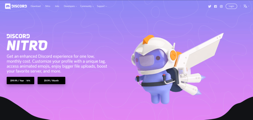
Discord exhibits a fun and quirky image to the right of their header and highlights the benefits of their paid service to the left. Their CTA buttons are clearly marked and tell viewers exactly what they need to do to get the added experiences.
Scrolling down, you’ll find that Discord groups site elements into cards, making their information sleek, easy-to-find, and easy-to-read, while keeping the fun element. You can see how websites like this one generate a feeling of playful sophistication.
3. Playful cursors
Modern websites often feature cursors that make viewing pages a new experience.
Implementing playful cursors on your site in 2022 can be as simple as changing the cursor shape or as complex as coding cursor-triggered animations. Either way, your visitors will have a great time engaging with unique cursors.
Example: Paolo Fornasier has an awesome cursor set up on his online portfolio. The cursor displays different photos with a rippling animation and a piano tone when scrolling over the vertically aligned text of the navigation menu.
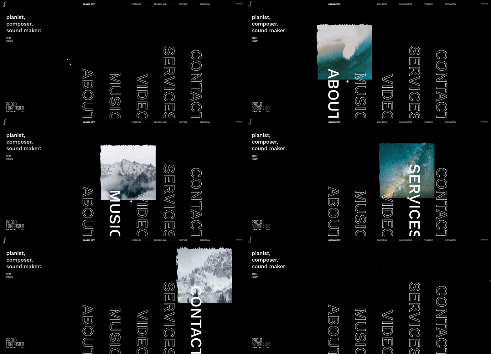
Because of the playfulness of the animation, users easily spend a couple of minutes floating their cursor over the navigation menu.
Your cursor doesn’t have to be as complex as this one, but adding a unique element to your cursor is sure to add some spice to your website.
4. Dynamic scrolling
Dynamic scrolling is another modern web design trend for 2022.
One version of dynamic scrolling sets different scrolling speeds for your site’s foreground and background to give visitors a 3D effect.
Example: Take a quick peek at Crypton’s site to see how amusing dynamic scrolling makes a site.
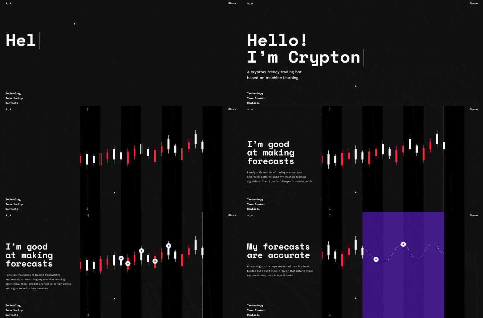
Background video can also incorporate into dynamic scrolling, where the video only plays when users scroll — and with dynamic scrolling, you can trigger animations and make your images appear like magic.
5. Custom illustrations
Illustrations breathe life into your brand and website.
When it comes to illustrations, modern web design for 2022 pulls inspiration from print publishing and other traditional art formats.
Gone are the days of cookie-cutter stock images, with websites incorporating custom illustrations into their modern web design in 2022.
Example: Take a look at the art of renowned illustrator Alice Lee, for example. She’s designed custom illustrations for popular brands like Macy’s and The Washington Post.
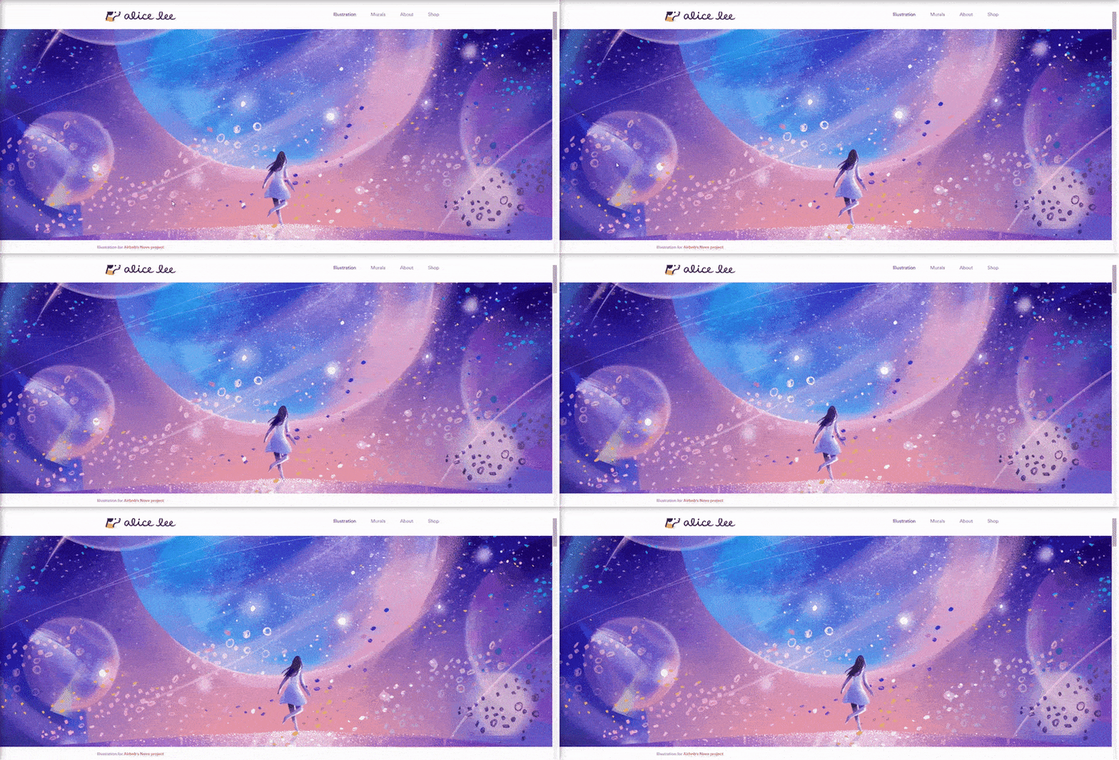
Her art has helped spark a growing trend of custom illustrations for brands that look like they came straight out of a storybook.
And with increased coding capabilities, illustrations continue to evolve beyond 2D design.
Even now, digital designs pull in 3D illusions that add another layer of depth to the Internet.
For example:
- The slow change from one color to another with gradient shading
- Digital cut-out styles that mimic designs cut out of layers of paper
- 3D cursor interaction that users can’t help engaging with on your site
You might also enjoy: 10 website statistics to know
6. Grid design
Modern web designers will continue to play with grids in 2022 — and an asymmetric layout likely will become even more popular.
Example: Jingqi Fan’s online portfolio displays how functional an asymmetric layout can be. His site exhibits plenty of white space and a minimalist style that highlights his project images, while the asymmetric design keeps his site fresh, exciting, and engaging.
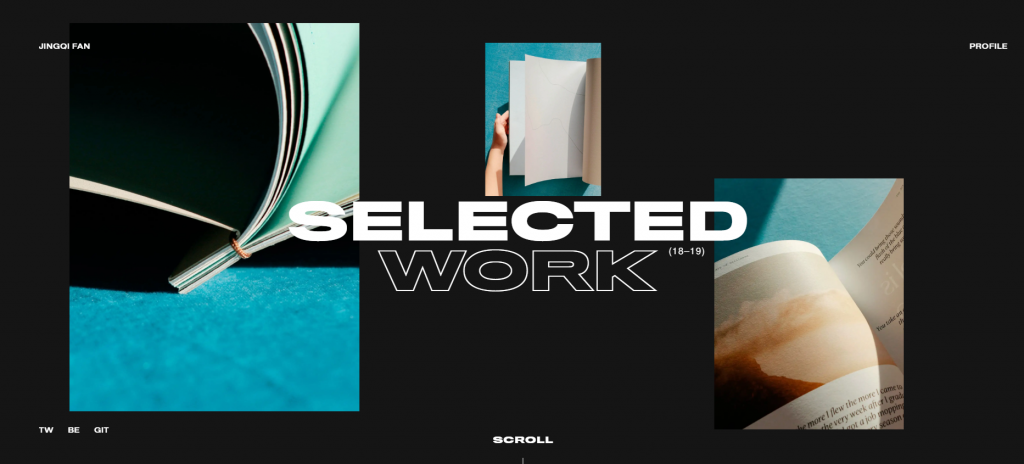
Many top designers use CSS Grid Layout to bring all the capabilities of print layout to the web.
Also known as Grid, CSS Grid Layout is a 2D grid layout system for Cascading Styles Sheet, a coding language that describes the layout of an HTML site page. Grid allows web designers to create layouts for complex responsive web design more easily and consistently across browsers.
CSS grid layout still has a way to go before it becomes compatible with all interfaces, but it continues to gain momentum as a top web design trend for 2022.
7. Color trends in 2022
Modern website design explores color pallets, and every year there’s a new popular color for the web. In 2019, it was blue, and in 2020, mint. For 2022, trend forecasting company WGSN and Coloro named A.I. Aqua, a tech-inspired shade of blue, their color of the year for 2022.
Overall, Venngage predicts that online color pallets will become more muted.
Gradients are a trend continuing from 2020, and designers will likely continue exploring the depths to which they can take design with gradients. And because gradients cover a range of colors, they’re perfect for targeting a broad audience.
Psychology of color will also play a significant role in web design trends for 2022. Make sure that you research the psychology behind colors before generating a new color palette for your company. It’s important that your colors match your brand.
Some smaller web design trends within colors will likely continue. It seems that:
- Soft, cool colors (blues, teals, and greys) = Information and backgrounds
- Bold, warm colors (reds, oranges, even greens) = Calls to action (CTAs)
Example: Check out Trello’s website for project collaboration and organization software.
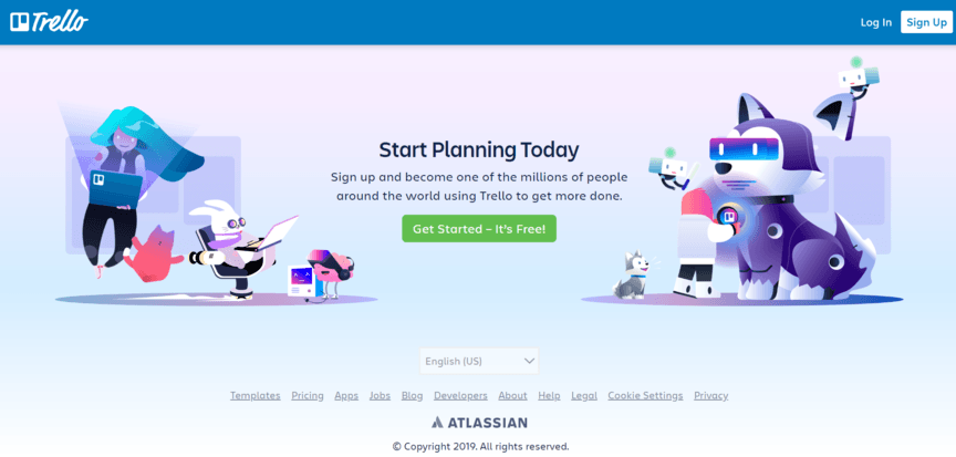
This website is a great example of incorporating muted color pallets and gradients into a smooth, illustrative design. They even highlight their CTA in a bright color!
8. Bold fonts
Modern web design will play even more with fonts in 2022. San-serif and serif fonts are as popular as ever, and vintage type is surprisingly making a comeback in branding.
Outlined type and bold type are also showing their faces in many places — from brand names to landing page headings, where the most prominent type trend of all is screen dominating text.
Example: Take a look at how Startup Lab plays with bold type cut out of images. Those give the site a bold, chunky feel, while still coming off as professional.
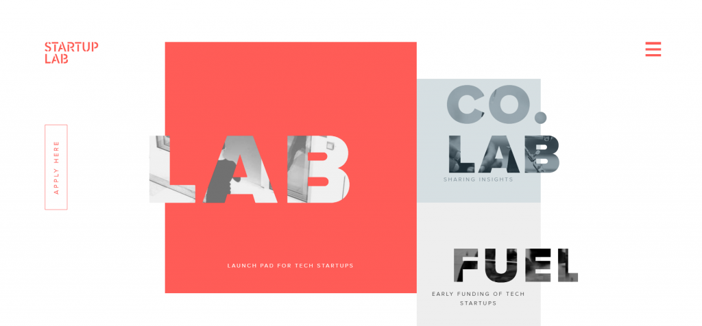
Fun, right?
See also how they incorporated stenciled letters into their brand name? It ads a bit of a grungy effect, which is nicely contrasted by the bubblegum pink of the page. A bold choice, but they pulled it off well.
Make sure to choose a typeface that matches your brand, your audience, and the goal that you have for your company.
Make sure to also choose an easy-to-read typeface for the body text of any content you have on your site. The readability of your text is one of the essential factors in improving your site’s UX. A simple, unassuming sans-serif like Arial is a great choice.
9. Increased focus on UX/UI
Modern web design trends focused on humans in 2020, and this will become even more important in 2022.
Your site’s UX must be smooth, uninterrupted, and engaging in 2022. This means:
- Fast page load
- Little clutter (use that white space!)
- Scannable, relevant SEO content
- Multimedia
Web designers wrap functionality with creativity to create a great UX, leaning into clean design while still being creative and unique in all the right ways. The top web designers throw a bit of untidiness into the white, sterile world of technology.
Hand in hand with UX, your site’s user interface (UI) must be intuitive in 2022. This means:
- Voice-enabled interfaces
- Image captions
- Video transcriptions
- No distracting elements
- Balanced motion design
Level up your site’s UX/UI by:
- Providing visitors with easy-to-read content and easy-to-use interfaces
- Hitting their aesthetic sweet tooth
It’s also important to note that mobile surfing will get bigger. More than 50% of Internet traffic comes from mobile devices, and that number is expected to rise.
For a website to have a successful modern web design in 2022, all of its elements need to translate flawlessly to both desktop and mobile. Mobile responsive animation and videography will become increasingly important for modern web design.
Example: Take a peek at Chobani’s sleek mobile design.
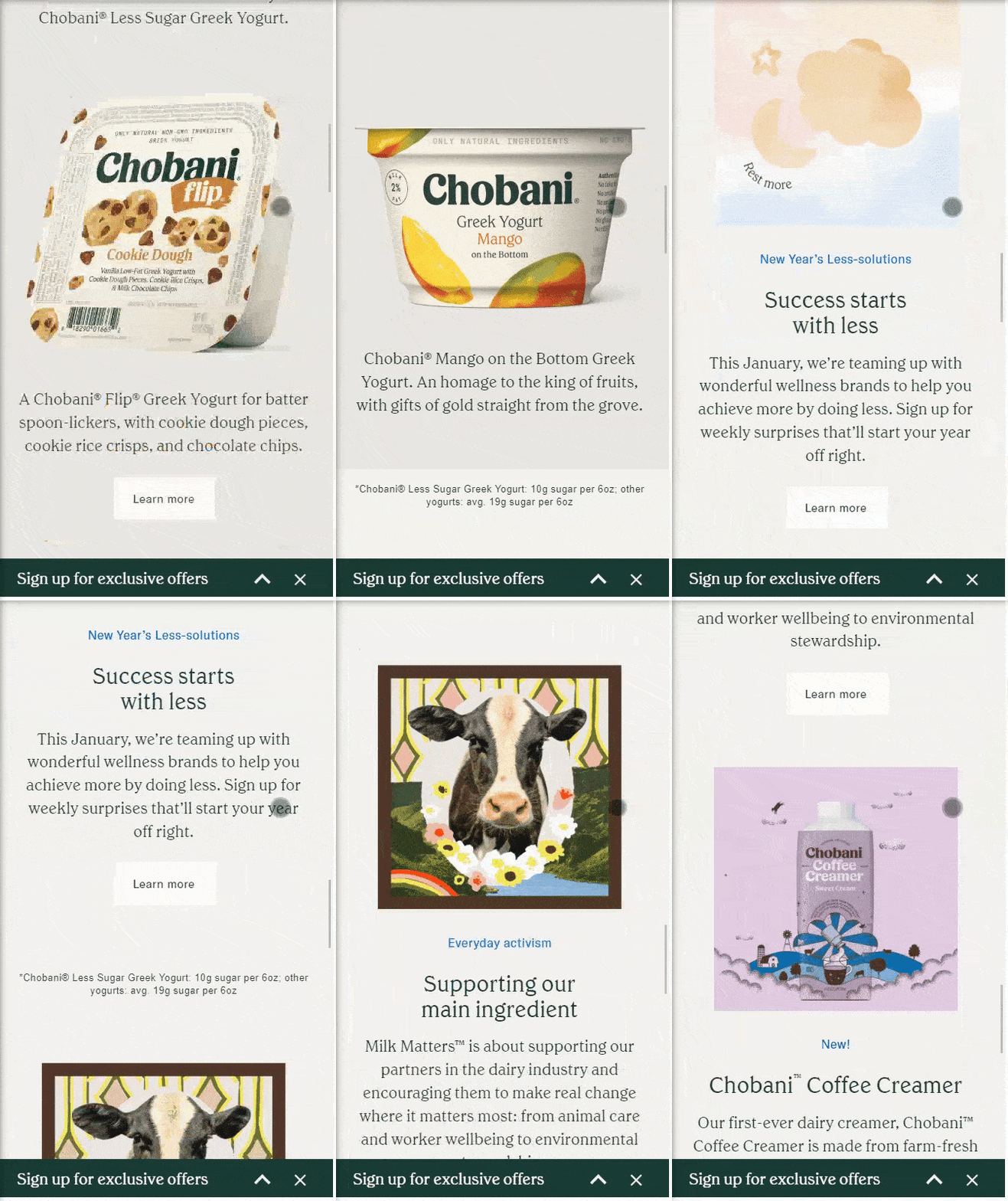
Chobani provides mobile users with a sleek, fully responsive design that makes full use of white space. Their content is easily scannable with eye-catching, mouth-watering pictures of their products.
With an easy-to-click CTA banner across the bottom of the screen, Chobani sure knows how to pull in their mobile audiences.
10. Impactful, engaging stories
Finally, modern websites in 2022 will shine at telling stories.
For your site to evolve into a genuine modern website, learn how to tell compelling stories in your content and advertising campaigns.
With classy website design and a compelling story, your site is sure to engage and convert your target audience.
Example: Sustainable food brand Zume’s website is a good example of using your website to tell a story.
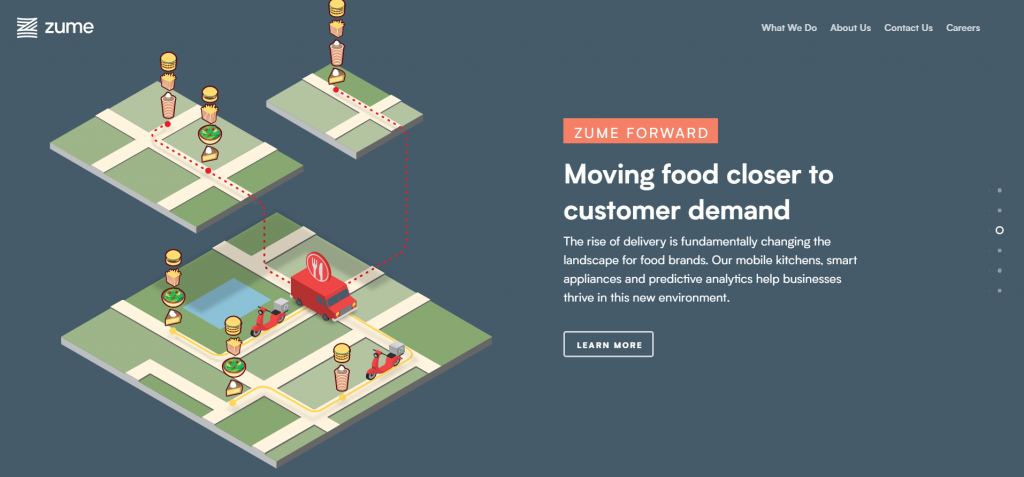
Zume spotted a problem, set out to fix it, and they’re telling the world how they’re doing it by making meal preparation more efficient one meal at a time.
The site is clean and scannable, and it has plenty of images and infographics as well as a very engaging video explaining who they are and their goal.

For even more digital marketing advice, sign up for the email that more than 190,000 other marketers trust: Revenue Weekly.
Sign up Today! ![]()
Hungry for more modern web design inspiration?
Here are some of our favorite modern website design examples to inspire you.
Want help transforming your site into modern web design in 2022? We’ve got an award-winning portfolio of web designs, and we’ve designed websites for over 1000 businesses!
Give us a ring at 0802-583-7481 or contact us online to see how our web design services can turn you into a modern web design guru!
The post 10 Modern Web Design Trends for 2022 appeared first on Tested Technologies Blog.
Related Posts
October 6, 2015
50 Design Agency Websites for Inspiration
September 6, 2015
50 Restaurant Websites for Inspiration
September 6, 2015


