Graphic design is everywhere — it’s used in traditional marketing efforts like billboards and flyers, and more importantly, it’s used in nearly every single digital marketing initiative from web design to social media marketing.
If you’re a business that’s working with a digital marketing agency for any number of marketing campaigns (especially web design), it’s important to understand basic graphic design terms.
Why?
In order for an agency to execute your design dreams properly, it’s a huge help when you can speak their language. Not only will they appreciate it, but it’ll make things easier for everyone involved — and the final product will better match your vision.
Let’s talk about some of the most important graphic design terminology and what they mean.
1. Lorem ipsum copy
Lorem ipsum is essentially placeholder text that allows designers to get a feel for where text will be, how much space it will take up, and how it’ll work with the rest of the design. Lorem ipsum has been used since the 1960s, and maybe even earlier. It’s also known as “dummy text.”

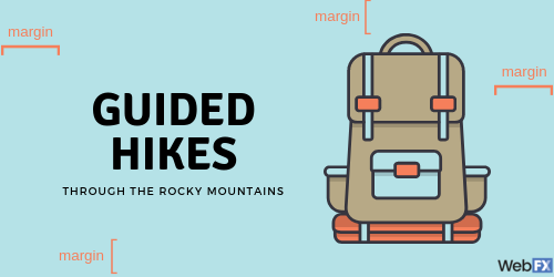
2. Margins
Margins refer to the amount of space around the edge of a page — whether on paper or in a digital design. Larger margins allow for more white space which can evoke a calming effect, while small margins can create a sense of panic.
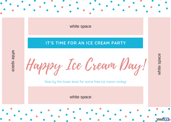
3. White space
Every designer’s dream, white space is crucial to any design. It allows for the many elements of a design to breathe and keeps users from feeling trapped. It’s also known as “negative space.”
4. Grid
The grid is something that designers work with in order to keep their designs evenly spaced. It’s just what it sounds like — a grid of intersecting lines that acts as a framework for designs. When designers use a grid, it allows them to create consistent, organized designs.

5. Wire frame
A wire frame is something that a designer creates to help them plan a proposed design. It’s also used to send to clients to gain approval for a specific design before it’s built.
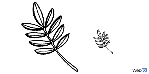
6. Scale
When you change the size of an object while keeping it scaled, that means you can grow or shrink the element without altering its proportions. For example, if you want to shrink this leaf while keeping it scaled, it would look just as it does in the example. If you shrunk the graphic without keeping it to scale, it would look much skinnier and skewed.
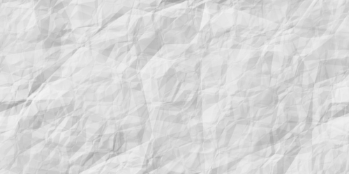
7. Texture
Texture on paper refers to the actual look and feel of a design. For example, if a wedding invite is printed on paper with texture, it might have a rippled or crumbled feel. On a digital design, texture simply means that the design evokes a texture that might occur in actual materials.
8. Stock photo
Instead of hiring a professional photographer, oftentimes designers will opt for stock photos. Stock photos are professional images that are sold online. Typically, you can purchase a license to download professional stock images, but some websites offer them for free.

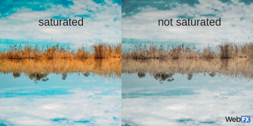
9. Saturation
Saturation refers to the intensity of a color. When you increase the saturation of a design element, it appears more vivid, but when you lower the saturation, it can appear faded.
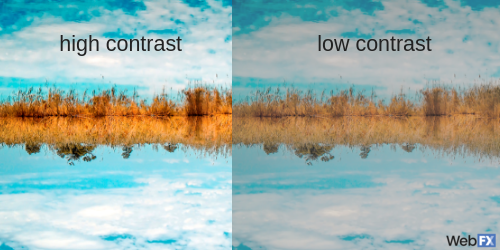
10. Contrast
Contrast refers to numerous design elements. Contrast typically means the amount of difference between two different things. For example, the contrasting color of black is white. Features like rough and smooth are contrasting elements, as well as light and dark. In the design world, contrast can refer to any of these elements.
11. Cool colors
When you study a color wheel, half of the colors are cool colors. These colors include blue, green, indigo, and violet (and all shades associated). These colors relate to feelings of calmness and relaxation.
12. Warm colors
Warm colors make up the other half of a color wheel. Red, orange, yellow, and all the shades in between are warm colors. They provide a sense of excitement and cheer.
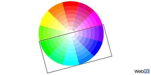
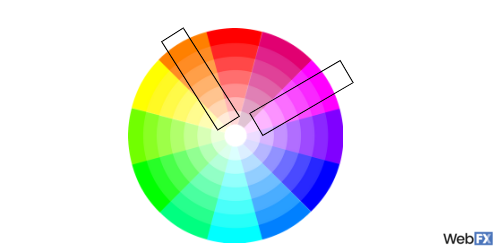
13. Complementary colors
When you look at a color wheel, contrasting colors are those that sit directly across from each other. Examples include blue and orange, green and red, and yellow and purple. When used together on a page, they can create interest and variety.

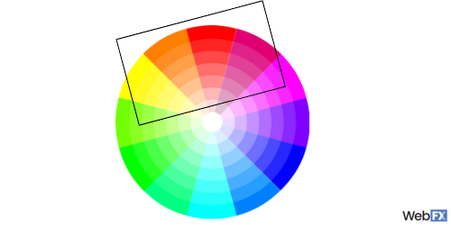
14. Analogous color scheme
An analogous color scheme consists of three colors located next to each other on the color wheel. These color schemes work well together in designs because of their clean appearance. Some examples of this color scheme include yellow, orange, and red, or purple, blue, and aqua.
15. Monochrome color scheme
Another popular color scheme in design, a monochrome color scheme consists of different tones of the same color. For example, sites that only use shades of blue have monochrome color schemes.
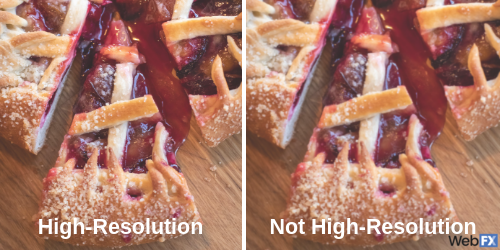
16. Resolution
Resolution refers to the clarity and crispness of images. Typically, designers use the highest resolution images on websites. These images look far more professional than blurry, low-resolution images or graphics.
17. Opacity
Opacity refers to the transparency of design elements. If a design element is opaque, you cannot see other elements through it, and it has low transparency. On the other hand, if an element has low opacity, you can see through it, and it has high transparency.

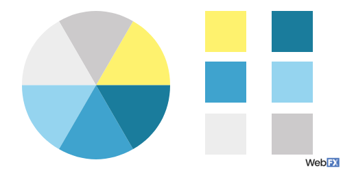
18. Color palette
A color palette is a group of colors that you choose for any given design. These colors work together to evoke your brand image and message.
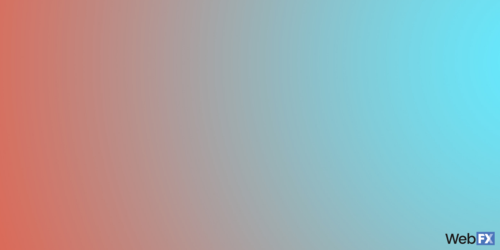
19. Gradient
A gradient refers to design elements that fade from one color to the next. The change is gradual, and you’ll typically notice some other colors in the design as it transforms. Think sunset!
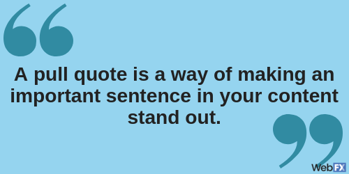
20. Pull quote
Pull quotes help important sentences in your content stand out on a page. Essentially, they are excerpts pulled from the body copy of a page, and it helps add some interest to a design. They are typically larger than the rest of the body text and include some sort of design element to help them stand out on the page.
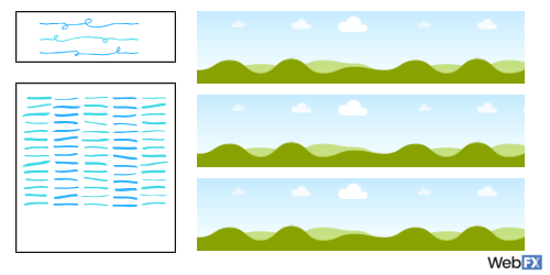
21. Tracking
Tracking refers to the space between letters in type. When the tracking is loose, letters are farther apart, while tight tracking makes for more tightly packed letters.
![]()
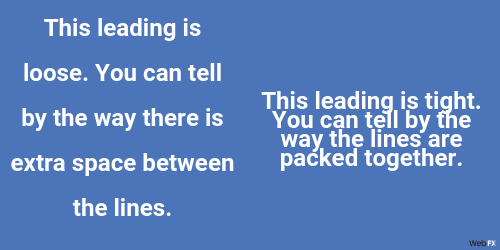
22. Leading
Leading is a term that refers to the amount of space between lines of type. With loose leading, lines will have more space between them, while tight leading squeezes lines closer together.
23. Alignment
Alignment is how elements are lined up on your page. There are four main kinds of alignment, and they are all used for different applications. Center, left, right, and justified alignments provide endless design opportunities.

24. Typography
Typography refers to the use of different typefaces in order to create an aesthetically pleasing design.
Need some help with your design?
Put your knowledge of graphic design terms to use, and work with a Tested Technologies designer to create the website of your dreams!
Feel free to contact us at 0802-583-7481, or fill out a contact form on our site!
The post 24 Must-Know Graphic Design Terms appeared first on Tested Technologies Blog.