Need some inspiration to build a high converting website?
Websites that convert persuade visitors to become customers. These websites drive more revenue, so if you want to increase your site’s revenue, use these examples of websites that convert as inspiration!
We’ll go over what makes for the best converting websites and five examples of websites that convert. For more tips on website conversion, sign up for our newsletter, Revenue Weekly!
What kind of web design converts?
A good converting website has a clean design, makes it easy for people to access information, and creates a clear conversion path that people can follow to ultimately convert.
The best converting websites have these things in common:
Attractive web design
Your website is the first impression your audience gets from your business. The websites that convert take advantage of their web design to pull people in and get them to explore their site.
Attractive web design for high converting websites means:
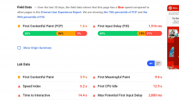
- Fast page load: People want information fast, especially since over half of internet traffic is on the go with mobile, so fast page speed is essential to convert.
- Responsive design: With so many people accessing the Internet via mobile, your site needs a responsive design that encourages Internet users to take the step to convert.
- Intuitive navigation: Websites that convert make it easy for people to find the information they want.
- Engaging layout: High converting websites use layouts that make it easy for people to find information on the page. These websites use white space as rest-stops for the eyes. They also use web-safe fonts and eye-catching images, graphics, and videos.
Clear concept and value propositions
High converting websites tell visitors right off the bat what their company is about and what makes their products and services unique.
The more your visitors know what your company does upfront, the more consumers who visit will feel like they can make informed purchasing decisions.
Websites that convert also identify what sets their business, products, or services apart from competitors.
Noticeable calls-to-action (CTAs)
Visitors convert best when they know what it is that you want them to do. That’s why high converting websites make use of calls-to-action (CTAs).
People will land on a site and say to themselves, “I’ve checked out some pages and read some information. I’m interested, but what do I do now?”
In other words, because there’s no CTA button, interested users won’t know how to take the next step towards conversion.
The best converting websites display their CTA buttons early on and give visitors plenty of opportunities to convert. CTA buttons help guide users to the next step, whether that step is to check out a pricing page or convert. You could set up a page containing several CTA buttons such as:
- Sign up
- Shop
- Subscribe
- Learn more
- Get started
By using CTA buttons, you’ll help guide more leads towards conversion.
5 high converting website examples
Let’s jump right into our top five examples of websites that convert!
1. Mint
Mint is an all-in-one financial management app that lets you set budgets, manage bills, and check credit scores.
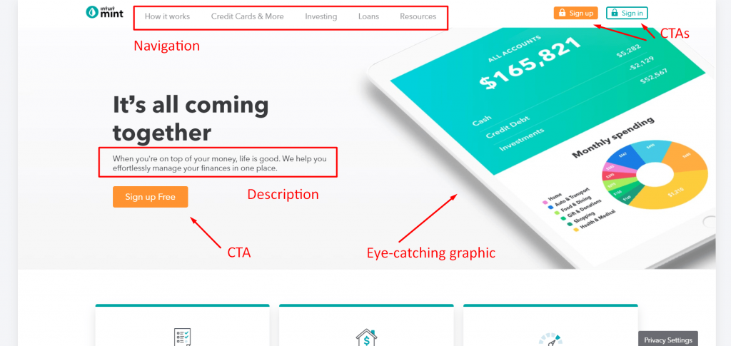
So, why is Mint an example of a high-converting website?
- Attractive web design: Their elegant web design brings simplicity to a topic that brings many people anxiety. With fast loading and mobile responsive pages, it’s easy to get information fast. Additionally, plenty of white space and sleek infographics make this site a pleasure to visit.
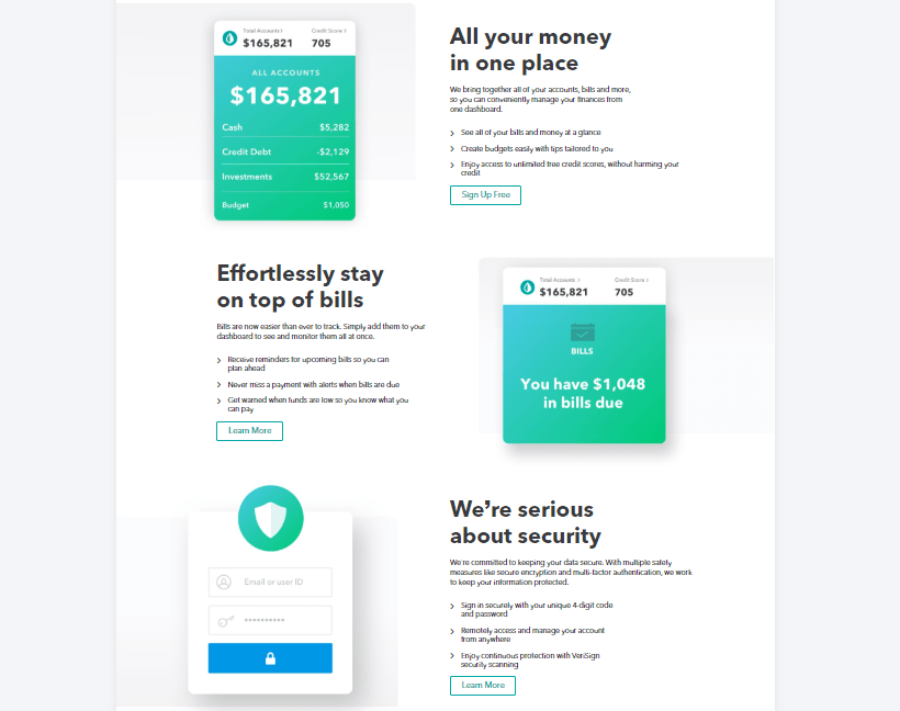
- Clear concept and value propositions: Mint lets you know exactly what you’re getting with their app when you first scroll down. They highlight what their app is and what makes it valuable by targeting the top concerns that people have when managing money. The information cards they display showcase how their app solves these concerns and includes call-to-action (CTA) buttons to help visitors learn more and sign up for free.
- Noticeable CTAs: Mint places valuable and relevant CTA buttons in visible places throughout their site. They have a few different styles of CTA buttons ranging from a blue outline for their “Sign in” button to a solid eye-catching orange for their “Sign up Free” CTA. These buttons contrast nicely with their overall blue-green color scheme.

2. Discord
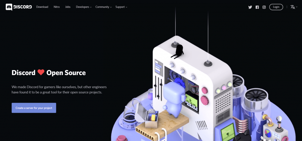
Discord is an app that targets the gaming and streaming industry. The app provides a free all-in-one voice and texting platform where people can interact.
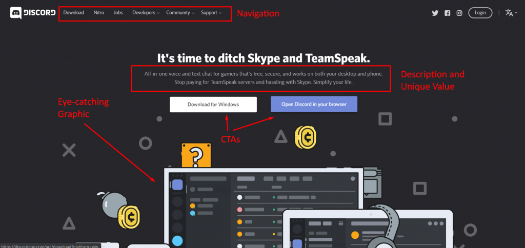
So, why is Discover one of the examples of websites that convert?
- Attractive web design: Discord knows their market, and they show it with their fun and quirky web design. Discord’s site has plenty of crisp graphics and engaging animations that charm its audience. With fast page load time, responsiveness, and intuitive navigation, this site checks all the appealing web design boxes.
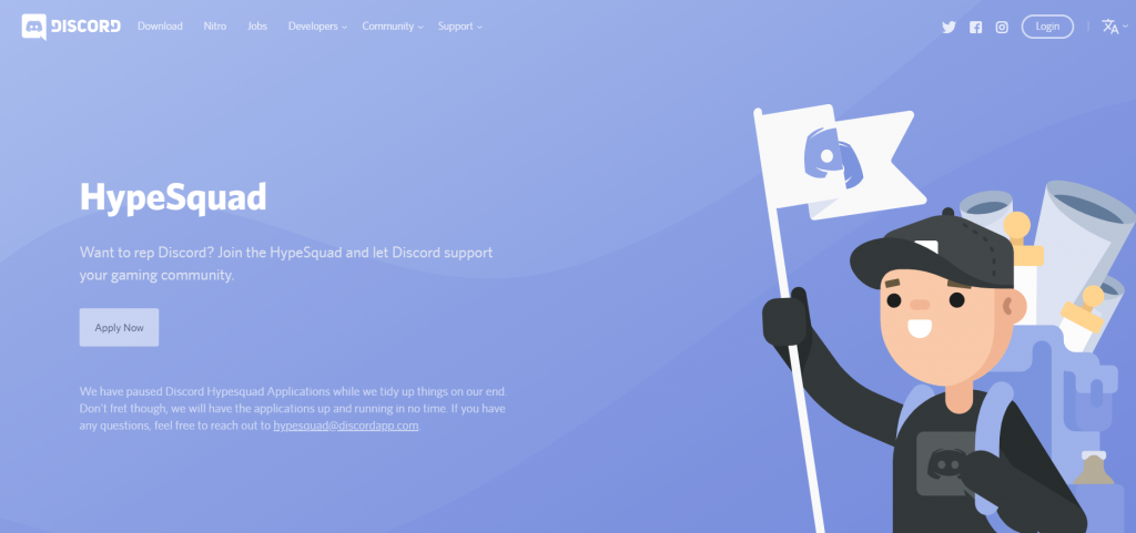
- Clear concept and value propositions: Discord knows what excites their community. On their site, they highlight both their free and premium (called Nitro) products, as well as providing unique opportunities for streaming influencers and game developers.
![]()
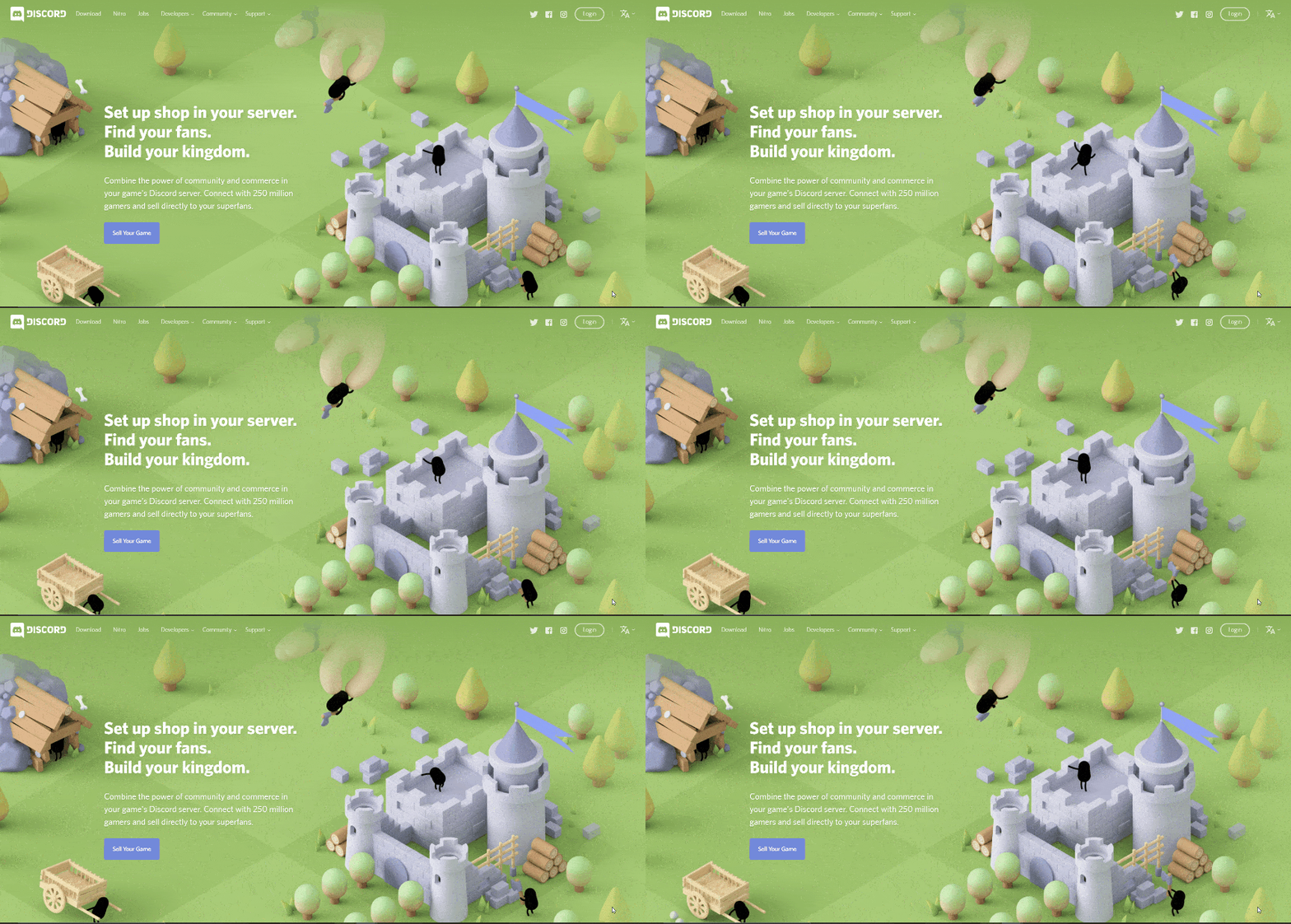
- Noticeable CTAs: Discord’s landing pages have a sleek design and plenty of white space. Their value propositions and CTA buttons stand out. And check out the entertaining animations on these two landing pages!
![]()
![]()
3. RealSpace
RealSpace makes amazing 3D renders and animations for architectural companies.
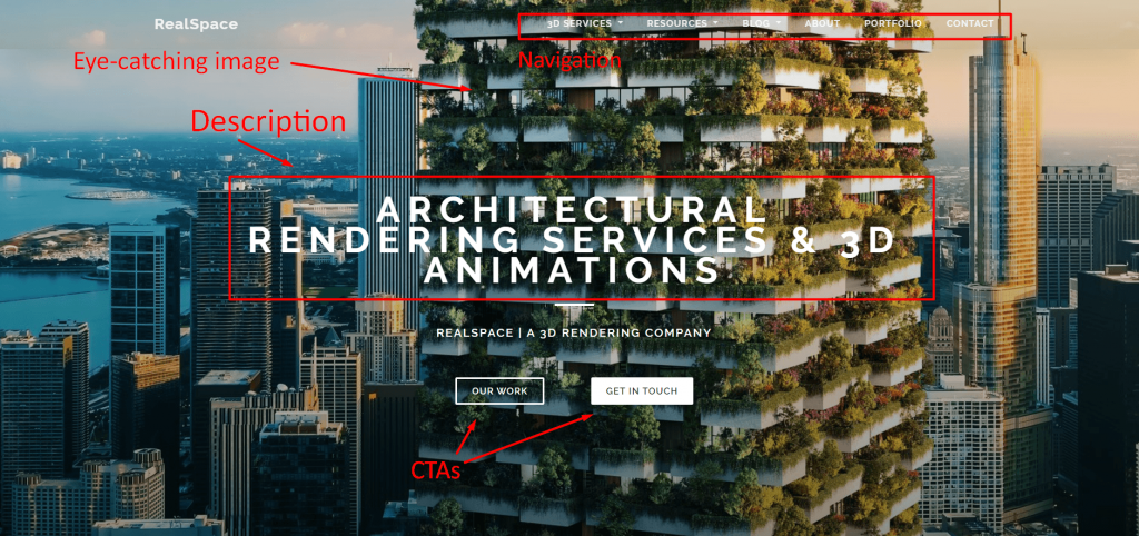
RealSpace fits the bill as an example of websites that convert.
- Attractive web design: With a beautiful portfolio of 3D rendered images (including the one used as the backdrop of their home page), RealSpace makes use of their clean design to attract customers. In addition, they have an awesome blog and plenty of 3D rendering resources for their customers. Their minimalist layout, in addition to these other elements, helps them create an attractive site.
- Clear concept and value propositions: Scroll down a bit on RealSpace’s home page, and you’ll find unique points about their services. With “Learn more” CTAs under each service point, it’s easy to find more information about services if users have an interest in them.
![]()
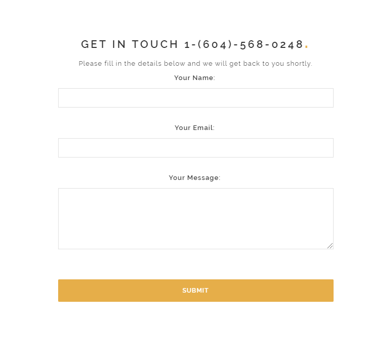
- Noticeable CTAs: With CTA links to their portfolio, services pages, and simple and easy-to-use contact form, RealSpace makes the conversion process quick and easy.
![]()
4. Rookwood
Rookwood is a company that makes beautiful pottery and tiles for home use.
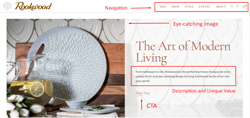
This pottery company is one of the best examples of websites that convert because it hits all the important elements for conversion.
- Attractive web design: Filled with beautiful and eye-catching images of their wares, Rookwood provides a clean and engaging design with their site that includes easy-to-use navigation and white space. Additionally, the muted color scheme brings out the color and appeal of their pottery.
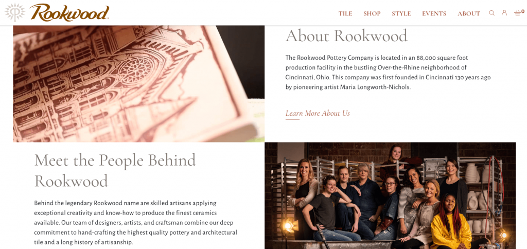
- Clear concept and value propositions: Rookwood shows off their company’s history and what makes them unique in their About page, outlining their intricate pottery crafting process and even providing information on reserving tours.
![]()
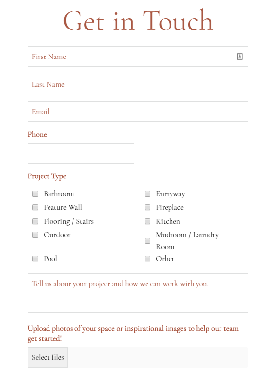
- Noticeable CTAs: Visitors can follow Rookwood’s “Learn More About Us” CTA to their About page, learn more about their artisans with the “Meet the Team” CTA, and explore their products with “Shop Now.” They even provide an easy form for users to fill out for information on services for big projects.
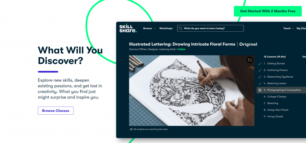
5. Skillshare
Skillshare is an online learning platform with a wide range of classes subscribers can take covering topics such as business, lifestyle, writing, photo/film, and more.

Skillshare is one of the best examples of websites that convert because it hits all the marks.
- Attractive web design: With a fun video header and a playful, decorative line that draws the eye down the page, Skillshare’s web design highlights how enjoyable learning can be.
- Clear concept and value propositions: Wander around their site, and you’ll learn that Skillshare promotes learning and creativity sharing among its subscribers. Visitors can explore classes taught by industry icons and experts, and participate in a thriving online inspiration-based community.
- Noticeable CTAs: With dark blue and white color scheme, Skillshare’s mint green accent color makes their CTAs pop. And with actionable CTA’s like “Browse Classes” and “Get Started With 2 Months Free,” Skillshare knows how to make customers act.
Create high converting websites with Tested Technologies!
Ready to apply inspiration from these five examples of websites that convert? Tested Technologies is here to help with our amazing website conversion design services!
As a full-service web design agency, Tested Technologies has an award-winning team of web designers to help you design a website perfect for converting customers. Check out our awesome web design portfolio to see what we can do for your business.
Need a website quickly? Our RainmakerFX software can help you get a high converting website up and running in 30 days!
Contact us online or call us at 0802-583-7481 to speak to one of our web design gurus!
The post 5 Magnificent Examples of Websites That Convert Visitors into Customers appeared first on Tested Technologies Blog.
Related Posts
January 3, 2020


