Web design is one of the most important parts of any Internet marketing strategy.
It has a huge impact on the digital customer experience in several different ways. Your site’s aesthetics, usability, any other crucial factors are essential to your company’s long-term online success.
But how dramatically does it actually impact your bottom line?
In this post, we’ll take a look at five major aspect of web design and how you can improve all of them.
1. Appearance

Web design most obviously impacts your site’s appearance. You choose how your site looks, which plays a huge role in your company’s first impression on new online visitors.
Often, you’ll hear marketing experts (including us) talk about web design in two extremes:
- Older websites that look like they were made in 1996
- Newer, sleeker websites that adhere to modern web design standards
Many websites fall between those two options, but they represent opposite ends of a spectrum.
It’s possible to have a site somewhere in the middle — one that looks attractive, but maybe it was last updated in 2007.
Regardless of how your site looks, the goal is to have it as current and up-to-date with modern design trends as you can.
Modern web design trends include:
- Responsive design
- Parallax scrolling
- Big, bold fonts
- Eye-catching “hero” images
- Multimedia
Responsive design means using code on your website that makes it look and function the same, regardless of the device someone uses to access it.
So whether someone comes to your site from a smartphone or a desktop computer, they’ll get a great experience and find the information they want.
Parallax scrolling means overlaying two visual elements on a page and moving them at different speeds as someone scrolls.
Then, when someone looks through a page on your site, they’ll get a cutting-edge visual experience that keeps them engaged and reading.
Big, bold fonts have been in vogue for a few years now. Essentially, the concept refers to using sans-serif typefaces that are easy to read on screens.
That makes your customer experience smoother, and it lets your readers get the most value out of every sentence on your site.
Eye-catching “hero” images are giant, full-width graphics at the top of articles that give you a summarizing visual representation of the text below.
They got the name “hero” because these images champion the article with which they’re associated. They’re great for generating clicks for social media, and they’re ideal introductions to concepts on your site.
Last, multimedia refers to images, videos, interactives, and other visual elements that help break up text and educate your visitors.
Multimedia is fair game for just about any page on your site from a blog post to a 100-page downloadable guide.
When you include it, you make your content much more scannable, engaging, and enjoyable for readers.
But this all has to do with your site’s appearance. Web design impacts a lot more than just how a website looks.
2. Professionalism
Professionalism refers to the impression you make on your site’s visitors before they ever start reading your site.
When someone arrives on your site, you want them to understand that you’re a modern, respectable business. This impression is largely based on how your web design represents you.
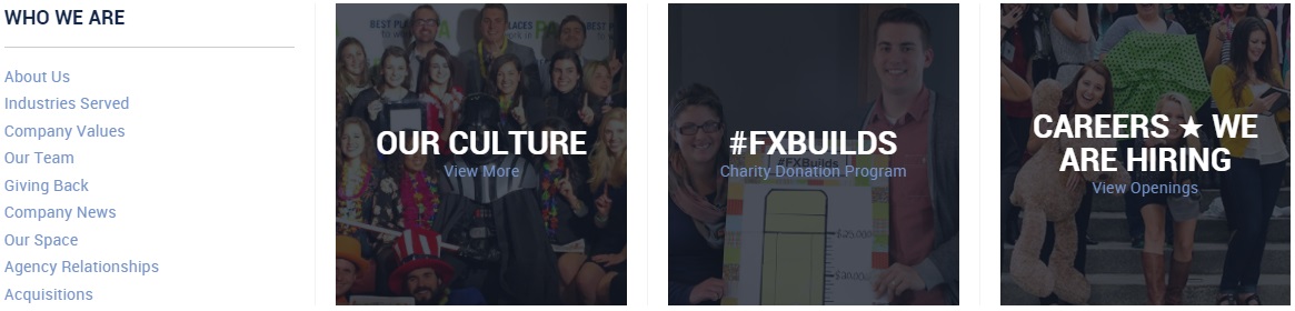
Several web design elements contribute to professionalism, including:
- A culture page
- Photos of staff
- Customer results
A culture page is part of your site that’s exclusively dedicated to talking about your company’s approach to daily operations.
Do you have certain values at your company? Do you maintain certain traditions? Do you celebrate anything unique?
These are all great additions to a culture page since they show what your company does besides work. Even your customers will be interested to see that your employees are happy.
Speaking of employee happiness, photos of staff can also go a long way in reinforcing professionalism.
Whether you choose to show them together at a happy hour or hard at work is up to you. Either way, you’re adding faces to your business that shows visitors you’re more than a brand name — you’re a thriving company.
Last, you can showcase customer results. If you can quantify your work in any way — even if it’s how many air conditioners you repaired last year — you can highlight that information on your site.
This demonstrates professionalism because it shows that you have your customers in mind, even those who haven’t converted yet.
Visitors who see that will understand that you’re a customer-focused business that values itself in terms of what you can deliver.
Still, professionalism needs another element that web design can offer — and it’s essential no matter what kind of business you own.
3. Clarity
Clarity means designing your website so visitors can find what they want as quickly as possible.
Most often, this means improving your navigation. Intuitive and familiar navigation styles allow your visitors to quickly find the information they want.
Today, navigation comes in a few well-known styles:
- Breadcrumb
- Drop-down menu
Breadcrumb navigation is inspired by the story of Hansel & Gretel.
Whenever someone clicks to a new page, your site automatically adds their previous page to a navigation bar. Then, a user can click back to that page in an instant if they want.
A drop-down menu lets someone hover their cursor over a menu title and see the pages that category contains.
Then, they can click on the page that interests them to get the information they want.
These navigation strategies can work together, too. Your homepage can use drop-down menus, and once someone clicks to a new page, you can use breadcrumb navigation on that page to let users go back to where they were.
Naturally, you have lots of other options for navigation. But these are the two most popular and useful in the web design world.
4. Load time

Load time refers to how long someone has to wait for a page on your site to display on their device(s).
Load time is a major Google ranking factor, and it’s become crucial to online success as more consumers move toward using the Internet on mobile devices.
The modern Internet user is concerned with websites that load in the blink of an eye and — more importantly — use minimal data.
So how can you reduce your site’s loading time?
- Optimize image sizes
- Remove auto-play multimedia
- Use white space
First, you can optimize image sizes on your website to make sure your site loads as quickly as possible.
To do that, use .jpg files for your images. This is the best way to show high-resolution photos or graphics while minimizing the size of the file.
Next, you should remove auto-play multimedia like video and audio.
That means your users won’t use big chunks of their mobile data when they go to your site on their smartphones.
Plus, auto-play multimedia is an irritating way to promote content anyway. Most users will leave your page if they get there and there’s automatically a video in their face.
Instead, make your multimedia require manual activation on every page.
Last, you can use white space more frequently to reduce data demand.
White space is any unused space on your pages. No text, no images, no videos — nothing.
White space spreads out your text and elements to make them easier to see, especially for mobile users.
This makes it easier for visitors to understand everything on a page so they don’t have to re-read content.
In a nutshell, that makes white space work on two levels. It helps your pages load in a flash and it makes them more readable.
Overall, that makes web design crucial to the speed of your site. You can also use these strategies together to help your individual pages load as quickly as possible.
5. Conversions
Conversions are arguably the most important part of web design.
After all, your business won’t thrive online without them.
Web design can impact conversions in a thousand different ways, and they’re all important, but these three are some of the most impactful:
- Color
- KISS principle
- Faces
Color sounds general, but in web design, it refers to a color scheme that intelligently uses contrast to highlight selling propositions.
So if your site uses a cool color scheme, use warm colors like red or yellow for your calls to action. That helps them stand out so people can find them more easily and convert.
The KISS principle is an acronym for “Keep It Simple, Stupid.”
The idea is that simpler designs are better designs. When you have an easy-to-follow, organized website, you make it that much easier for visitors to convert.
You don’t need loud backgrounds or showy graphics to sell your company online — it’s actually better to stay simple.
Last, faces may sound a little odd as a web design principle. But the idea is that human faces help visitors relate to your business.
You could use stock images, but this works best when you use your own staff.
Essentially, you show someone the human side of your company to make them feel more comfortable contacting you.
It may not sound like much, but that goes a long way in establishing trust, fostering a positive relationship, and eventually earning a new customer.
By using all three of these concepts at once, you make your site much more efficient at earning new customers.
How does your site’s design impact customer experience?
Do you know of any other ways to improve visitors’ experience on your site with web design?
Let me know in the comments!
The post 5 Ways Web Design Impacts Customer Experience appeared first on WebpageFX Blog.