Imagine if you walked into a store to grab a few things and found none of the aisles were labeled. It would feel like a chaotic mess — you would have no clue where to go to find what you need and may end up leaving the store to go somewhere else.
This same experience can happen with poorly designed navigation.
Your navigational structure plays a critical role in determining whether people can find what they need on your site. That’s why we’ve compiled this list of seven website navigation examples to help inspire your website’s navigation!
Keep reading to get your dose of design inspiration!

For even more digital marketing advice, sign up for the email that more than 150,000 other marketers trust: Revenue Weekly.
Sign up today!
What is website navigation?
Website navigation is the structure of your website that enables users to find pages and information. It serves as a guidance system to help users move around your site. Your website navigation also helps organize different sections of your website so users can find critical pages fast.
7 website navigation examples to inspire you
Need some ideas for designing your navigation? Check out these seven examples and get inspired!
Website navigation example #1: Best Buy
Defining feature: Organization
First on our list of examples of website navigation is Best Buy.
Best Buy offers multiple electronic products for their customers, which leads them to have an extensive navigation. Despite all these product offerings, Best Buy has an incredibly organized navigation that makes it easy for customers to find what they need.
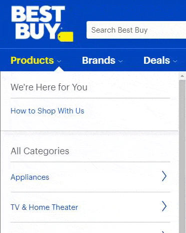
Once you click on a category, Best Buy breaks the navigation down even further to help you refine your search. For example, if you click on “Computers & Tablets,” you’re taken to a navigation with a list of computers and tablets. Then, if you click Tablets, you can see your product options for tablets.
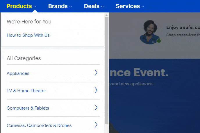
This navigation is extremely organized, which makes it easy for people to find what they need.
Takeaway: When you create your website navigation menu, ensure it’s organized. Categorize your products logically to make it easy for your audience to find what they need. The critical thing to remember is that you’ll want to organize your navigation in a way that makes sense to your audience.
Website navigation example #2: Skinny Ties
Defining feature: Simplicity
Next on our list of navigation examples is Skinny Ties. Skinny Ties offers a simple navigation that makes it easy for visitors to find the products they need.
When you look at their navigation, it’s broken down into categories:
- Color
- Width
- Fabric
- Pattern
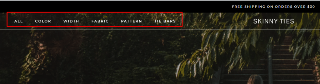
When someone visits their site, this simplistic navigation makes it easy for shoppers to find the tie they need.
Takeaway: Keeping your navigation simple is critical if you want to see success with your site. If your navigation is too busy, your audience will feel overwhelmed when trying to find what they need. A clean and straightforward navigation is best if you want to see success.
Website navigation example #3: New York Times
Defining feature: Ease of use
Next on our list of navigation examples is the New York Times. Their navigation is simple and easy to use, as it lays out all the headings across the top.
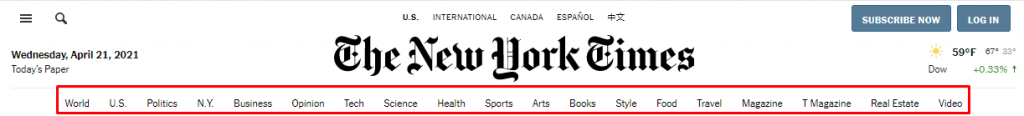
And the ease of use doesn’t stop there.
Once you click on a heading, you’re taken to a page with a more refined mini navigation. For example, if you click on the “Science” tab, it takes you to a Science category page, where there are more navigational links to narrow your focus.
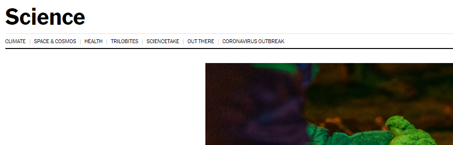
This navigation setup makes it easy for users to find what they need fast.
Takeaway: Creating an easy-to-use navigation is critical for delivering a positive user experience. The easier it is for people to find the products or services they need, the more likely they are to stay engaged with your business.
Website navigation example #4: Partake
Defining feature: Visuals
One of the best website navigation examples is Partake. Partake, a baking company, has a simple but visually appealing navigation. When you navigate to their products, you can see a visual for each type of product.
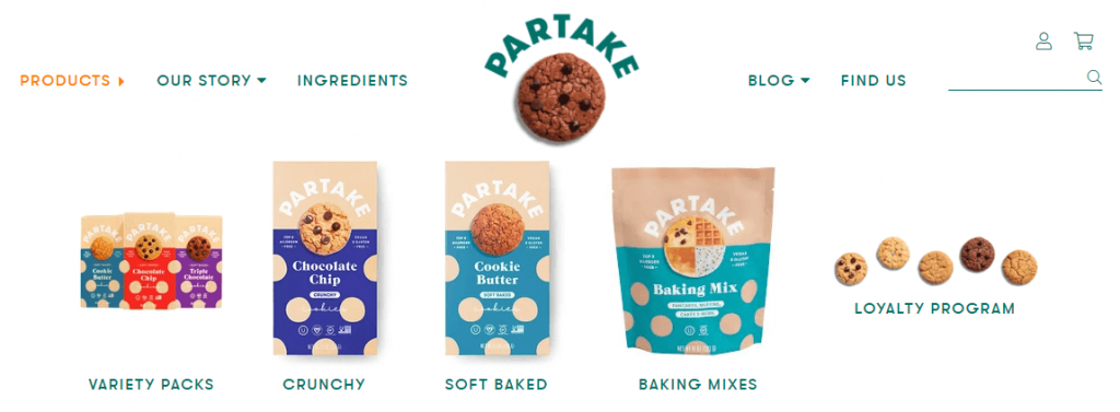
These visuals help customers get a sense of what their products look like, which can also help them navigate to the correct pages. It also adds an element of engagement by making the navigation more visually attractive.
Takeaway: When you create your navigation, consider adding some visual interest to it. While you may not be able to add a photo or graphic for every product you offer, you can add a single visual that represents the entire category to make it more interesting.
Website navigation example #5: Rothy’s
Defining feature: Mobile-friendliness
Next on our list of examples of website navigation is Rothy’s, a women and children’s shoe company. Their navigation is an excellent example of mobile friendliness.
They use a hamburger menu to make it easy to open their navigation on mobile devices. Once you open the menu, you can see it organized by shoes, bags, and extras.
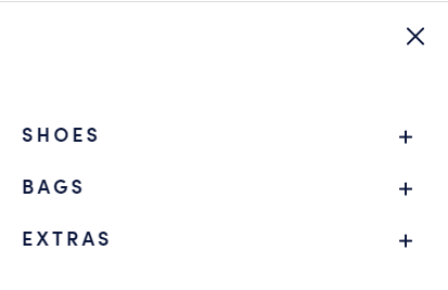
Rothy’s offers multiple product categories that make it easy for mobile users to sift through their products.

This navigation makes it simple and easy for mobile users to browse products on their site.
Takeaway: When you build your navigation, make sure you offer a mobile-friendly version of your navigation. A mobile-friendly navigation ensures people can find the products or services they need while browsing on mobile.
Website navigation example #6: Beauty Bakerie
Defining feature: Consistency
One of the visual website navigation examples is Beauty Bakerie. They highlight their products in their navigation to help people find what they need.

With this navigation, users can rely on visuals to help them find the beauty products they need on Beauty Bakerie’s website. Most importantly, though, all the icons are the same size, which allows for a consistent look and feel.
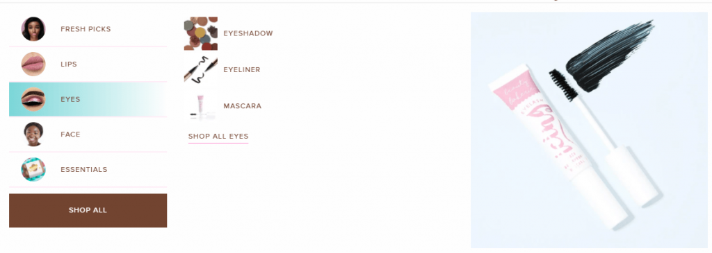
The consistency makes it easy to look through the navigation and find products users need.
Takeaway: If you decide to use visuals in your navigation, make sure they’re consistent to create a clean navigation. It will help you deliver the best user experience for your audience.
Website navigation example #7: Verve
Defining feature: Consistent branding
The last item on our list of website navigation examples is Verve. Verve is a coffee company that offers multiple coffee products for its customers.
Their navigation is a prime example of carrying your brand’s style into the navigation. With Verve, they use a similar font style and color scheme with their navigation to create a modern look and feel.
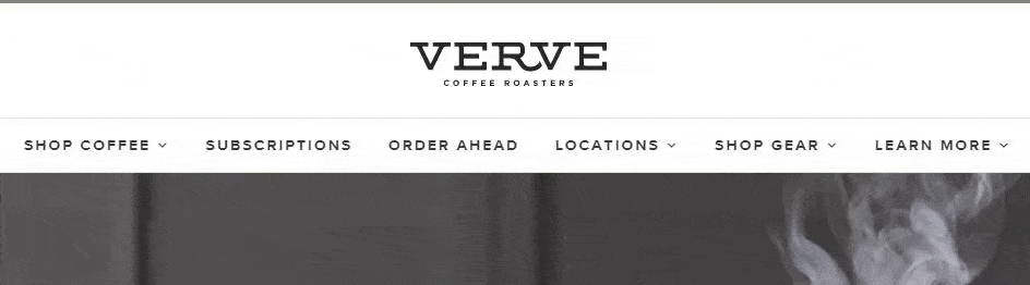
Takeaway: If you want to deliver a positive user experience, you need to align your navigation’s design to fit with your business’s style. It will ensure your site looks clean and cohesive.
Need help building your website navigation structure?
Your website navigation structure is critical to ensuring your audience can find the products they need on your site. But if you aren’t sure how to build the best navigation for your site, Tested Technologies can help. As an award-winning web design company, we know how to craft navigation bars that keep people engaged.
Our team of experts can help you craft a website design that drives results.
In the past five years, we’ve driven over $2.4 billion in sales and over 6.3 million leads for our clients. You can feel confident our team will build a website navigation menu that keeps leads engaged and checking out your products or services.
Ready to boost engagement on your site? Contact us online or call us today at 0802-583-7481 to speak with a strategist about our web design services!
The post 7 Website Navigation Examples That Will Inspire You to Create a Killer Website Navigation Structure appeared first on Tested Technologies Blog.