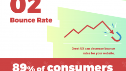
Did you know that 89% of people shop with a competitor after a poor user experience? If your website isn’t up to par, you risk losing leads to your competition.
Luckily, we’ve created a handy checklist that you can use to make sure your website has everything you need to attract new leads and keep them engaged on your site pages.
Keep reading to get our website best practices checklist and be sure to subscribe to Revenue Weekly to get actionable insights on how to market your website better!
Establish your target audience
Before you dive into the nitty-gritty of your website, you need to ensure that you know exactly who you’re targeting. To create a website that best serves your audience, you should analyze your typical site visitor to collect information like:
- Demographics
- Buying habits
- Income and occupation
- Pain points
- Hobbies/interests
- And more
When you have in-depth information about your audience, you can develop your site to better meet their needs.
Once you know the specific characteristics of your target audience, you can start answering important questions like:
- What does my audience want from my site?
- What site components are fundamental for providing my audience with a better experience?
- What information is more important to my audience, and how can I get it to them?
This tactic is one of the most important web design best practices for building an effective website. When you can answer these questions, you can start building a site that has your audience in mind.
Establish your style guide
As you develop a plan for your site’s design, you must create a style guide. A style guide ensures that your website keeps a consistent brand image and is cohesive across the board.
When you create a style guide, you establish information like:
- Website color scheme (3 or 4 colors)
- Font style
- Image style
- And more
Essentially, your style guide should give details on how pages on your site should look. Not only does it help you establish your brand identity, but it also ensures that no matter who works on your site, they have a guide for how to design different elements on the page.
Create an insightful navigation
Next on our list of best practices for web design is to create organized and functional navigation. Your navigation bar is a critical component of your site.
If users can’t find information fast, they’re likely to leave your site. And after that bad experience, 88% of people are less likely to come back to your site.
When you create your navigation, it’s pivotal that you use the right headings to separate your information effectively.
So, let’s say that you own a clothing store. Instead of having a generic “Clothing” tab to include all your products, you may break it down into tabs like “Men,” “Women,” and “Kids.” Tilly’s navigation bar is a prime example of how you can break down your navigation.

This navigation is simple and easy to follow. Users can find the product category that’s relevant to them and see subcategories of different types of products that fall under the main category.
Create an effective layout for each page type
Page layout is a critical component of your website. You want to ensure that you’re setting up pages in a way that provides a fantastic user experience for your audience.
Your page layouts may differ depending upon the page, but you’ll want to have a general layout for similar page types. It will help you ensure consistency and keep your site cohesive.
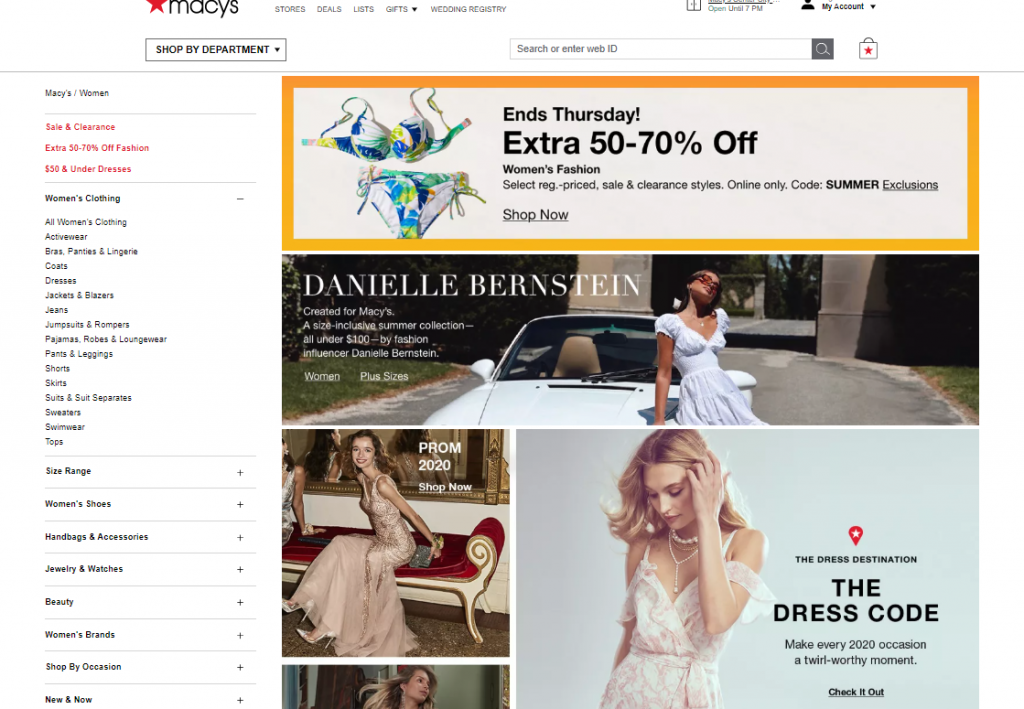
So, for example, if you visit Macy’s women’s clothing page, there is a grid of photos that showcases some of their product categories.

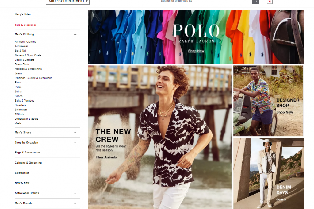
If you navigate to the same page for men’s clothing, you get a similar setup — a photo grid showcasing their product categories.

A similar format helps create a consistent image for these product pages across the board. It also helps users know what to expect as they browse around your site, which makes them feel more comfortable.
Establishing your page layouts is one of the most important web design best practices because it helps you build a consistent and familiar site for your audience that encourages them to continue browsing.
Compress images on your site
Next on our website best practice checklist involves images on your site.
Images are a valuable part of your site. They help create points of interest on your page and break up the text, and you want them to be high-quality images too. Grainy or low-res images make people think your site is less trustworthy.
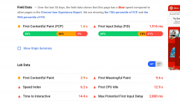
Integrating all these high-quality images can cause your site’s load time to suffer. If your site doesn’t load quickly, you’ll lose leads. Users expect your website to load within two seconds, so if it doesn’t, you risk losing leads.
The best thing you can do is compress your image file sizes. You can use a tool like Kraken to compress image file sizes without compromising the quality.
Bonus item to check off: In addition to your photos, make sure your videos aren’t bogging your site down, too. Host your videos on third-party platforms, like YouTube or Wistia, and embed the code on your site. It will keep heavy video files from slowing down your site.
Utilize white space
One of the most important web design best practices is that you need to use whitespace. When you’re building your website, you don’t want to overload it with text and visuals. Crowded pages will leave your audience feeling confused and overwhelmed and may even cause them to leave your website altogether.
To keep your site clean and easy to browse, don’t be afraid to use white space. In this example, from Target, you can see how they use white space on their pages to keep users engaged with the important information in the middle.

White space will help you keep your audience focused when visiting your pages and allow them to browse through your site with ease.
Design call to action (CTA) buttons that pop off the page
People will browse through your site to learn more about your products or services and if they like what they see, they’ll want to learn how to take the next steps. Without a call to action (CTA) button, your audience won’t know how to proceed in the buyer journey.
You must create CTA buttons that pop off the page, so your audience doesn’t miss them.

In this example from Igloo, you can see that the blue CTA button stands out on the page, as well as the yellow button to pay with PayPal. Both buttons catch the shopper’s attention and make it easy for them to see how to add the product to their cart or to pay with PayPal.
CTA buttons are extremely valuable for helping you guide your audience to the next step. Whether you want them to sign up for an email list, buy a product, or contact your business, CTAs can help you get people to take that step.
Make sure your website is mobile-responsive
Having a mobile-responsive website is one of the most critical best practices for web design. With over 50% of Internet traffic coming from mobile, you must offer a site that works on handheld devices.
Creating a mobile-friendly website will help you boost user engagement and earn more conversions for your business. In fact, 67% of users are more likely to buy from a mobile-friendly company. So, if you haven’t optimized your site for mobile, you’re missing a prime opportunity to earn conversions.
The best way to make your site look great on mobile is to integrate responsive design. Responsive design enables your site to adapt to whatever device a user uses. Whether it’s a smartphone or tablet, your website will adjust to fit the device’s screen.
As a result, you’ll provide a better experience for your audience and keep them engaged on your site.
Optimize your website for search engine optimization (SEO)
The last item on our website best practices checklist is to optimize your website for search engines. You’ll want to invest in search engine optimization (SEO) to help your site rank in search results.
SEO is the process of optimizing your website to rank in relevant search results. It involves strategies like:
- Researching and optimizing for relevant keywords
- Ensuring your site load quickly
- Making sure your site is mobile-responsive
- Creating content to drive traffic to your site
- And more
If you’re going to put the time and effort into building your beautifully designed site, you want to ensure that it’s optimized to rank in search engines so you can drive valuable traffic to your site.
Put these best practices for web design into action
Now that you’ve seen our website best practices checklist, you’re ready to start optimizing your website for conversions. But if you find you need to make a lot of changes and it feels overwhelming, you don’t need to do it alone.
Our team at Tested Technologies is here and ready to help. We have over a decade of experience in creating websites that engage and delight users. We have a team of award-winning designers and we’ve designed more than 1,100 client websites. Not to mention, web design can help you improve sales — and we can get you started.
Want to get started? Contact us online or call us today at 0802-583-7481 to speak with a strategist about our web design services!
The post Website Best Practices Checklist: 9 Web Design Best Practices appeared first on Tested Technologies Blog.
Related Posts
January 3, 2020
5 Lead Generation Website Design Best Practices
August 6, 2017
Why User Experience Matters to Marketing
July 6, 2017


