To make the crucial duty of testing your site’s responsiveness easier, here are a few excellent free online tools to check out.
ResponsiveTest

This open-source tool (repo is on GitHub in case you want to set it up locally) lets you see how a web page will render in various screen sizes. There are lots of devices supported by ResponsiveTest, such as iPhone, Blackberry, Samsung mobile phones, Dell laptops, and much more.
Responsinator
Responsinator takes in a URL and then outputs a sequence of device mockups with the web page rendered in them so you can get an idea of how the page layout will be experienced by your users in various devices.
Responsive
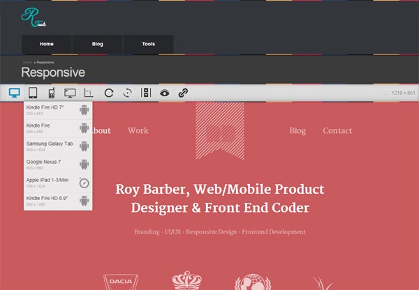
A useful feature this tool has is it gives you keyboard shortcuts (for example, pressing T will show you the tablet preview). This is handy if you like quickly switching back and forth between various device previews.
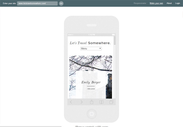
Am I Responsive?
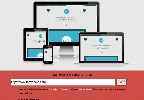
This is a simple Web tool for testing the responsiveness of any site. Plus, the preview image it renders can be a great visual for your presentations, design meetings, etc.
Viewport Resizer
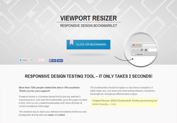
This useful bookmarklet simply lets you resize your browser to a specific dimension, e.g. the dimension of an iPhone 5, or Amazon Kindle Fire, or any one of Viewport Resizer’s 47 screen size presets.
resizeMyBrowser
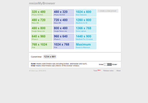
This tool lets you resize your browser based on any of the 15 default sizes that match up with some popular devices (MacBook, iPad, etc.). You can also set your own custom dimensions, and it also tells you what your current browser window size is.
Screenfly
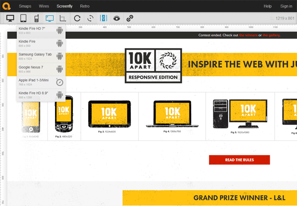
Just like some of the other tools in this list, Screenfly takes in any URL and then gives you a preview of the web page under various preset screen dimensions.
Responsive Web Design Test Tool by Designmodo
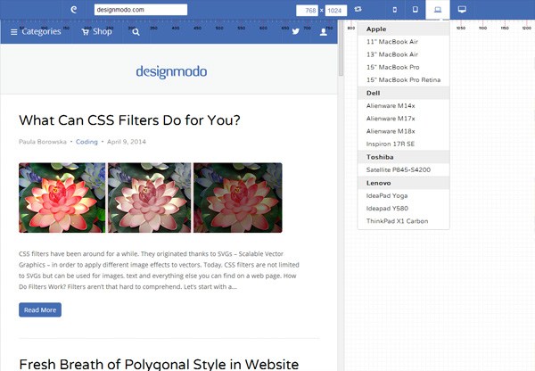
Designmodo has its own responsive design testing tool that can come in handy when you’re designing or debugging your responsive breakpoints.
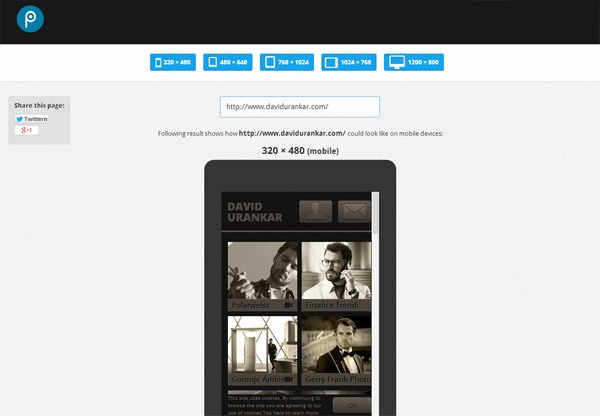
Responsive Web Design Testing Tool by pixeltuner.de
Like Responsinator, this responsive web design testing tool by pixeltuner.de allows you to enter a URL which is then rendered inside several device mockups.
responsivepx
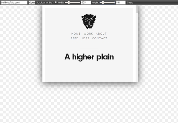
responsivepx can work with your local files. What I would do is just open your HTML document in your web browser and then copy-and-paste the URI into responsivepx. This is useful when you’re working on a responsive design project on your computer.
Which Tool Should You Use?
Many of these responsive design testing tools work pretty much the same way, so picking one over another is really just about personal preference.
I recommend playing around with all of them and then choosing the one you like most.
What’s your favorite responsive design testing tool? Share and talk about it in the comments.
Read Also
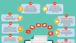
- 10 Infographics for Learning About Responsive Web Design
- 5 Best Books for Learning Responsive Web Design
- 6 Websites for Responsive Web Design Inspiration
The post 10 Useful Responsive Design Testing Tools appeared first on Tested Technologies Blog.