Did you know that over half of all Internet traffic comes from mobile devices? That means that if your website isn’t optimized for mobile, you’re missing out on a lot of potential traffic.
On top of that, Google ranks websites based on their mobile format using their mobile-first index — so without a mobile-friendly website, you won’t rank well. These are both reasons you need to optimize your company’s website for responsive design — that is, a design that works on multiple devices.
But how can you improve your mobile-friendliness to stay on top of rankings? Below, we’ll look at eight top-notch tips for how to use responsive design.
Read on to learn more, and then consider partnering with Tested Technologies’s team of over 200 experts for our responsive design services. Just call us at 0802-583-7481 or contact us online to get started!
Time To Level Up Your Sales
Our long list of services help you make waves in your industry and increase metrics that matter most – like sales.

In the past 5 years, we’ve managed over 9 million transactions across our client base.
Get A Proposal
8 tips for how to use responsive design effectively
Creating a mobile-friendly website doesn’t have to be a difficult process. With a few simple steps, you can ensure that your mobile site is driving traffic for your business.
Here are eight tips for how to use responsive design on your website.
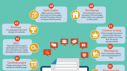
1. Use accelerated mobile pages (AMPs)
In addition to a normal responsive design format, you can set up certain pages on your website as accelerated mobile pages (AMPs). AMPs are stripped-down versions of pages that keep only the essential elements.
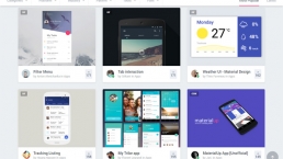
Here’s an example of a web page that practices normal responsive design:

And here’s the same page in an AMP format:

AMPs come with a couple of different advantages. The first advantage is visual — with less information and fewer graphics packed into the small screen, AMPs are easier on people’s eyes. The other advantage is that the minimalism of AMPs helps them run faster and use up less data.
2. Optimize page load speed
Page load speed is always important to get right. Most users expect pages to load within two seconds, and even on a desktop, you need to make sure your site meets that expectation. But on mobile, it’s even more important than usual.
Mobile searches often take place while people are out and about, and they want answers faster than they would at a desktop computer.
Here are some ways you can improve your page load speed:
- Compress images
- Limit redirects
- Minify code
- Cache web pages
3. Scale everything appropriately
When you design your website, you’ll probably do it on a computer, and that includes the mobile format. But when you’re working on a computer monitor, it can be easy to forget how much smaller that content will be when it appears on people’s phones.
To compensate for this, you need to scale everything differently. This starts with text. Anything that you want users to read should be large enough for them to see without using a magnifying glass (though still small enough to fit within the screen!). You don’t want anyone to have to squint at the screen, or pinch-and-drag to zoom in.
The same goes for buttons. Everything you want people to click should be big enough for their thumbs to easily tap. We’ve all had the experience of trying and failing to hit the ‘X’ on a popup because it was too small, and you don’t want that to happen on your site.
Not everything should be bigger, though — images, for example, should be scaled down to keep them from taking up the entire screen.
4. Avoid popups
When it comes to popups, you should avoid using them altogether if you can. On a computer, it’s easy enough to display a popup that doesn’t take up the entire screen, and it’s also easy for users to click the ‘X’ and move on if they’re not interested.
But that’s not the case on a phone.
It can be very hard to close mobile popups. Even when you make the ‘X’ large enough to click, it’s not always easy to find it on that small of a screen, and users often inadvertently click the popup itself instead.
In general, mobile popups tend to cause far more frustration for users than anything else. With the exception of popups that users specifically ask for by clicking on something, try to eliminate them from your site.
5. Simplify forms
Popups aren’t the only thing users can have a hard time with on mobile devices. Online forms can also cause problems if not used properly. Unlike popups, though, you can’t just eliminate forms altogether — you often need them to generate leads or help users make purchases.
The solution, then, is to make your forms as simple as possible. Don’t create forms that require tons of information or include many different boxes to fill out. Make them as minimalistic as possible, with large buttons and text boxes, so users will have an easy time using them.
6. Eliminate large blocks of text
Yet another thing that mobile devices make it harder to get away with are large blocks of text. Huge text blocks aren’t great for web design, even on a computer, but they’re particularly bad on mobile.
Don’t try to cram hundreds of words into a small phone screen at once. Instead, aim to use as little text as possible to get your point across. If you absolutely must convey a lot of information, break it up as much as you can to make for easier reading.
Here are some ways you can break up your text:
- Keep your paragraphs short
- Intersperse images and videos
- Incorporate bulleted and numbered lists
7. Simplify menus and navigation bars
Another way you can simplify things on your website is by optimizing your menus and navigation bars. On computers, you can stretch a long line of tabs across the top of the screen — but not on mobile, where the top of the screen is often under three inches wide.
The first way you can reformat your navigation bars is to use the common technique of relying on hamburger menus, which users can click on to expand. But even once a menu is expanded, make sure you don’t list too many tabs. Give users a small handful of options to keep things simple.
8. Perform frequent mobile testing
The final way to ensure mobile-friendliness on your website is to frequently test it. You can do this with Google’s mobile-friendly test tool, which will rate the mobile-friendliness of your website and make suggestions for how to improve it.

You can also test individual elements of your web design if you want to get a more detailed look at things. For example, you can test your page load speed in Google’s PageSpeed Insights, which will rate your site’s load speed for both desktop and mobile.

Get help improving your site’s mobile-friendliness with Tested Technologies
Ready to get started creating a mobile-friendly website? We can help! At Tested Technologies, we’ve been driving results in digital marketing for over 20 years, and we’d love to help you optimize your business’s website.
When you partner with us, you’ll have full access to all our responsive design services. You’ll also receive a dedicated account representative to work closely with you throughout the entire optimization process.
To get started with us, just call 0802-583-7481 or contact us online today!
The post 8 Tips for Developing a Fantastic Mobile-Friendly Website appeared first on Tested Technologies Blog.