Is your website mobile-friendly? If this isn’t a question you’ve asked yourself yet, you should start doing it now. Mobile-friendliness is one of the most important ranking factors in Google, and can play an essential role in your company’s digital marketing.
But while asking the question is easy enough, answering it can be harder. Plenty of factors contribute to mobile-friendliness, and it can be difficult to tell whether your website is optimized for all of them.
That’s why Tested Technologies has created this free mobile-friendly checker. Just plug in your website’s URL to get a report on your site’s mobile-friendliness within seconds!
Once you’ve gotten your results from the mobile checker, you can get a more in-depth analysis of your site’s performance in search by using our SEO checker!
Tested Technologies SEO Checker
- it’s Comprehensive.
- it’s Immediate.
- it’s FREE.
Try Now, It’s FREE!
Check your mobile-responsiveness now with our mobile-friendly checker tool
Here’s what you’ll get from our mobile-friendly checker tool:
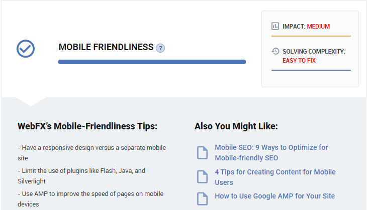
Mobile-friendliness analysis
Our mobile-friendliness analysis provides a generalized look at how functional your website is on a mobile device, and how easy it is for users to navigate it there. Recommendations you receive might include:
- Limiting plugins
- Using a responsive site instead of a separate mobile site
- Using accelerated mobile pages (AMPs)
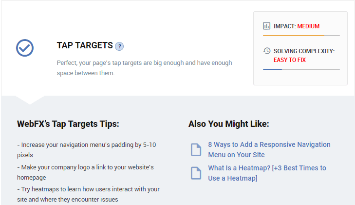
Tap targets analysis
The second section of our mobile-friendly report will assess your tap targets, or the buttons people can tap when they visit your site on their phones. Ideally, these buttons should be large enough — and spaced out enough — to tap without difficulty.
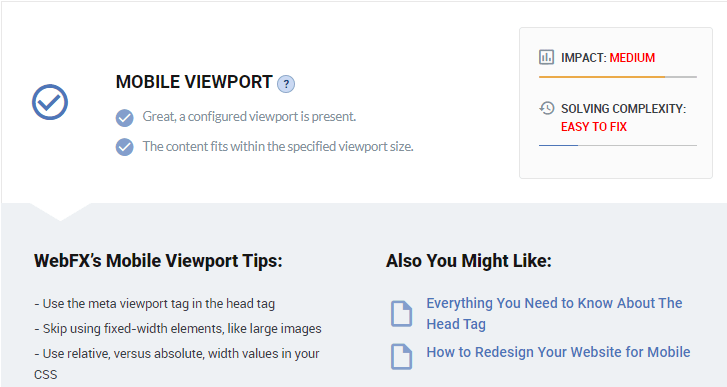
Mobile viewport analysis
Finally, you’ll receive a mobile viewport analysis. This analysis looks at how well your content can adjust across different types of devices, such as phones and tablets. Recommendations on this front may include:
- Avoiding large, fixed-width images
- Using a meta viewpoint tag in the head tag
- Using relative width values in your CSS
Why checking your site’s mobile-friendliness matters
Why is it important for your website to be mobile-friendly? There are several reasons, but the first one is that without a mobile-friendly site, you won’t rank well in Google.
Google ranks websites based on their mobile format with it’s mobile-first index. So, if your site isn’t mobile-friendly, you will struggle to perform in search results.
Even beyond rankings, mobile-friendliness is key to providing a positive user experience and driving conversions. Over half of all Internet traffic happens on mobile, so without a mobile-friendly site, you’re missing out on many potential customers.
It can be easy to assume that your site is mobile-friendly simply because you can visit on a phone, but that’s not what “mobile-friendly” means. It needs to be optimized to look good and function efficiently on a mobile devices and keep users engaged.
5 tips for making your website more mobile-friendly
If the results of your mobile-responsive test aren’t everything you’d hoped they’d be, don’t worry — there are ways to fix that! On top of the specific recommendations that come with your report, a few simple tactics can send your mobile-friendliness rocketing up.
Here are five ways you can make your site more mobile-friendly and improve your rankings as a result:
1. Scale things differently
When people visit your website on a mobile device, the screen is smaller, which makes things harder to see. To accommodate this, you’ll have to scale things differently in the mobile version.
To start with, the font size you use for the desktop format of your site may be appropriate for a computer monitor, but unreadable on a phone. Make sure you adjust text so users don’t have to squint — though don’t make it too large, either!
The same goes for buttons. It’s simple enough to click something with a mouse, but trying to tap something only a fraction of a centimeter wide can be difficult and frustrating. Enlarge buttons as needed so users have no trouble tapping them.
While text and buttons often require enlarging, other things — like images — often need to be made smaller so they don’t take up the entire screen.
2. Simplify forms
Next on our list of mobile-friendly tips involves simplifying your forms. Filling out forms on mobile is a different experience than on desktop, so it’s critical that you adjust your forms for mobile users.
When on a computer, your audience may be comfortablewith using forms that require submitting multiple pieces of information. But on a phone, people’s patience tends to be lower, and it’s harder to type information and fill out multiple lines.
Don’t make users work through twenty different boxes in a form before they can hit “submit.” Simplify things as much as possible to make them easier to use. You can always ask for more information later.
3. Optimize page speed
Page speed is critical for your website. Most people expect websites to load within one or two seconds, and you don’t want to fall short of that expectation.
But on mobile devices, page speed is even more vital than normal. People want answers fast when using their phones, so you need a site that loads quicky.
Here are some ways you can optimize your page speed:
- Minify code
- Limit redirects
- Compress images
- Cache web pages
4. Break up written content
Having large blocks of text on your website is overwhelming. When people see enormous paragraphs, they tend to become discouraged from reading your content, especially if they’re on a mobile device
Since phone screens aren’t nearly as big as computer screens, even shorter paragraphs can often look long to users on mobile. Try to break up the text in your written content as much as you can to avoid driving people to hit the “back” button.
Here are some ways to break up text:
- Use shorter paragraphs
- Intersperse images and videos
- Harness bulleted and numbered lists
5. Use accelerated mobile pages (AMPs)
On top of using standard responsive design practices on your web site, you can set up some of your pages to be accelerated mobile pages (AMPs). AMPs strip away many of the less crucial elements of the regular page, leaving only what’s essential for users.
Here’s an article in a normal mobile format:

And here it is as an AMP:
One advantage of this is that with less information to process, AMPs can load much quicker than normal pages. They’re also easier on people’s eyes, using far more white space and removing non-essential elements from the screen.
Mid-Size Businesses Trust Tested Technologies
Leah Pickard. ABWE
See the Case Study
Get more help optimizing your mobile-friendliness with Tested Technologies
Ready to take your results and put them into action? Tested Technologies can help you! Our mobile checker is just the start. With our responsive design services, you can optimize your website to dominate search results and produce happy customers.
At Tested Technologies, we’ve been driving results for clients for over 20 years. When you partner with us, you’ll receive a dedicated account representative to keep you informed and involved throughout the entire process.
To get started, just call 0802-583-7481 or contact us online today!
The post Mobile-Friendly Checker | Check Your Site’s Mobile Score Now appeared first on Tested Technologies Blog.
