People say to “never judge a book by its cover,” but people will most certainly judge your website by its design. If you don’t have a clean, modern, and practical design, your audience will bounce from your site and visit a competitor’s instead.
Your website’s design sets the first impression, so you want to make it a good one. As a business-to-business (B2B) company, it’s even more critical — you’re appealing to multiple decision-makers, and making one bad impression can potentially derail a sale.
To set you on the right track, check out these seven B2B website design tips with examples to guide you in the right direction!
P.S. Want to get the latest tips for marketing your B2B business online? Join 150,000+ marketers by subscribing to our email newsletter!
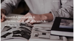
We don’t just want to tell you about the beautiful work we do.
WE WANT TO SHOW YOU
We’ve built over
Websites in industries like yours
View our past work
1. Create a consistent design that fits your brand
First on our list of B2B web design tips is creating a consistent design that fits your brand. When you craft your website’s design, you want it to reflect your brand. Your website is often the first glimpse people get of your brand, so you want them to get to know you as soon as they enter your site.
To help you create a homogenous B2B website design, you need to create a style guide. A style guide helps you set a consistent look and feel for your website. It also ensures that no matter who works on your website, your design looks the same.
When you craft your style guide, you’ll want to establish:
- Your brand’s color scheme (one primary color, one to two accent colors)
- Your font color
- Your font style (up to 2 recommended)
- Your image style
By establishing your style guide, you can build a consistent image of your brand throughout your site.
B2B web design spotlight: Adamo
To help you get inspiration, check out Adamo. Adamo is a prime B2B website example of establishing a style guide and consistently using it throughout your site. They have a blue, gray, and white style that greets you as soon as you enter their website.

When you visit different pages on their site, you can see the design carries throughout the site.
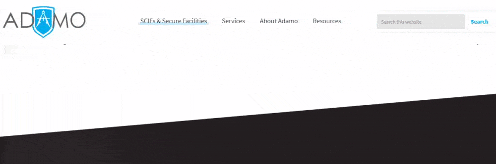
So, no matter what page you visit, you get a consistent brand look and feel. It’s a great example of how you can build brand consistency across the board to help you build brand recognition for your business.
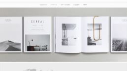
2. Use whitespace
The best B2B websites utilize whitespace. Whitespace is negative or blank space on your site that helps keep your site looking clean and organized.
You don’t want to overload your site with pictures, videos, and text. It makes your site look cluttered and difficult to read. Whitespace reduces clutter and makes it easier for your audience to focus on the most critical information.
Even though the name includes the color white, your whitespace does not have to be that color! It can be whatever color you use in your scheme — the important part is that it’s just blank space and nothing else!
B2B website design spotlight: Ultimaker
For this B2B website example, let’s look at Ultimaker. Ultimaker utilizes whitespace throughout their site to allow people to focus on their text and images.
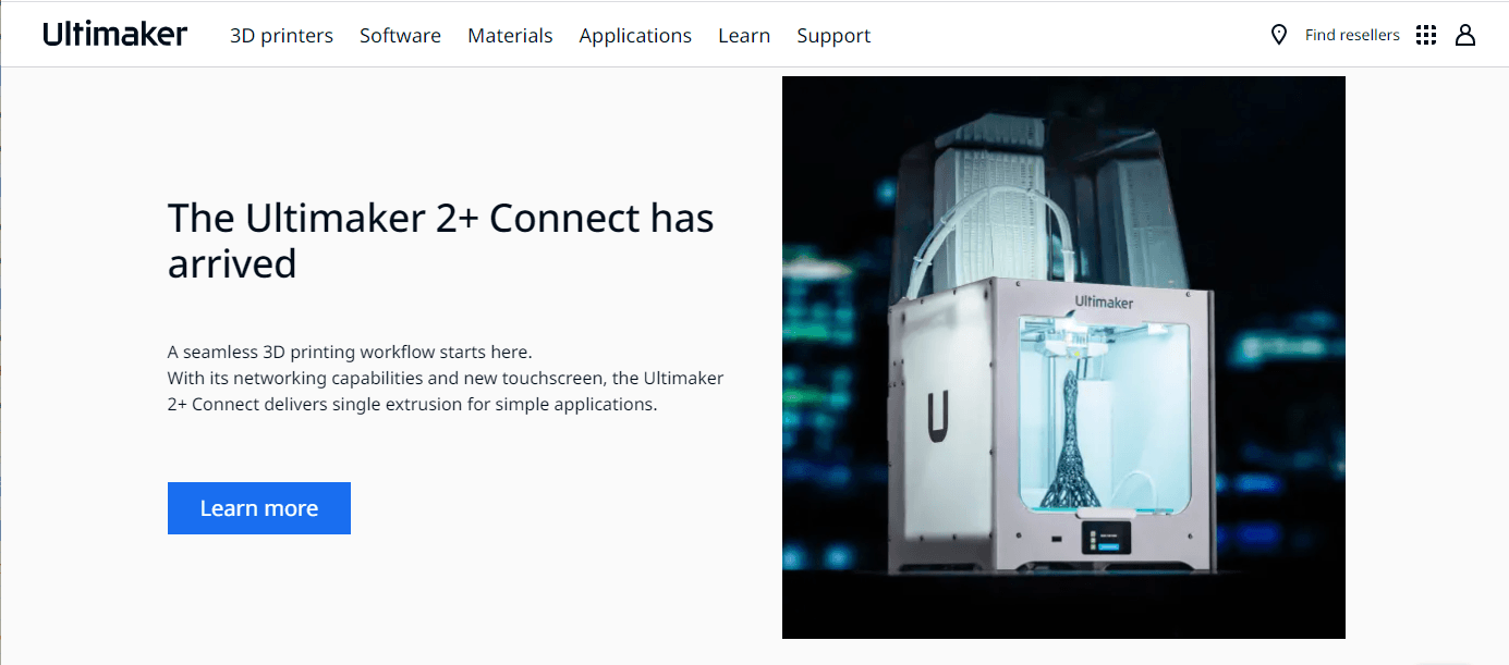
As you continue to scroll through their site, you can see they have a lot of negative space on their website. It makes it easy for you to focus on the information they have in each section.
So, if you want to utilize whitespace effectively, take a note from Ultimaker’s playbook!
3. Easy to use navigation
Another critical component of B2B website design is easy to use navigation. When people visit your site, they want to find information fast. If they struggle to find information, they’ll bounce from your site and visit a competitor’s site instead.
As a B2B business, you have a long sales cycle. Decision-makers will keep coming back to your site to find more information and learn about your company. If your navigation isn’t organized, these decision-makers won’t want to come back and learn more.
So, when you craft your website’s design, focus on creating easy-to-use navigation. First, start by using broad headings like “Products,” “Services,” and “About Us.” Then create subcategories beneath these broad headings to help keep your navigation organized.
By organizing your navigation, you’ll make it easy for people to browse your site and find the information they need.
B2B website design spotlight: Zendesk
Zendesk is an excellent B2B website example for navigation. When you visit their site, you can see broad headings at the top of the page that guide you to the information you need.

When you hover over each of their navigation headings, you can find more subheadings beneath each one.
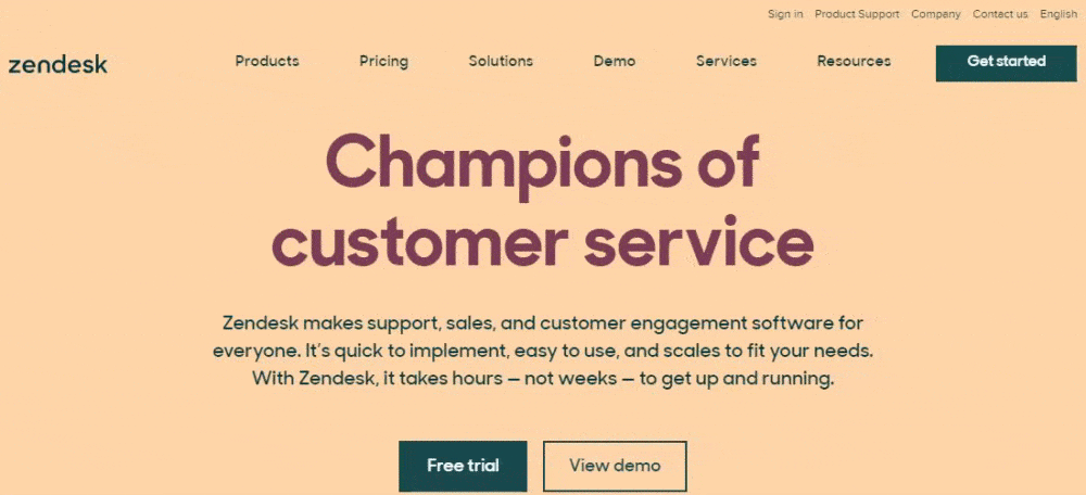
Zendesk’s navigation is simple, clean, and effective for helping people find information fast.
4. Create click-worthy CTA buttons
When you do B2B web design, you want people who visit your site to act. Whether it’s to sign up for your emails, get a demo, or download gated content, you’re ultimately looking for decision-makers to take the next step towards converting consistently.
Without calls to action (CTAs), though, these leads may not know how to take the next step.
CTA buttons are critical to guiding your audience. These buttons tell visitors how to proceed if they’re ready to move forward.
When you craft CTA buttons for your site, the first thing you want to do is make sure your buttons stand out. If people can’t see them, they won’t click on them. Your buttons should match your color scheme while still standing out on the page.
Second, make sure your CTA buttons are descriptive. If a button says, “Click here,” it doesn’t really tell your audience what happens when they click. A button that says, “Download your free guide,” on the other hand, is descriptive and tells users what to expect.
B2B website design spotlight: Packlane
If you need inspiration for CTA buttons, look at Packlane. Packlane uses great CTAs throughout their site. As soon as you enter their site, you’re greeted by a descriptive CTA that states, “Choose Your Style.”
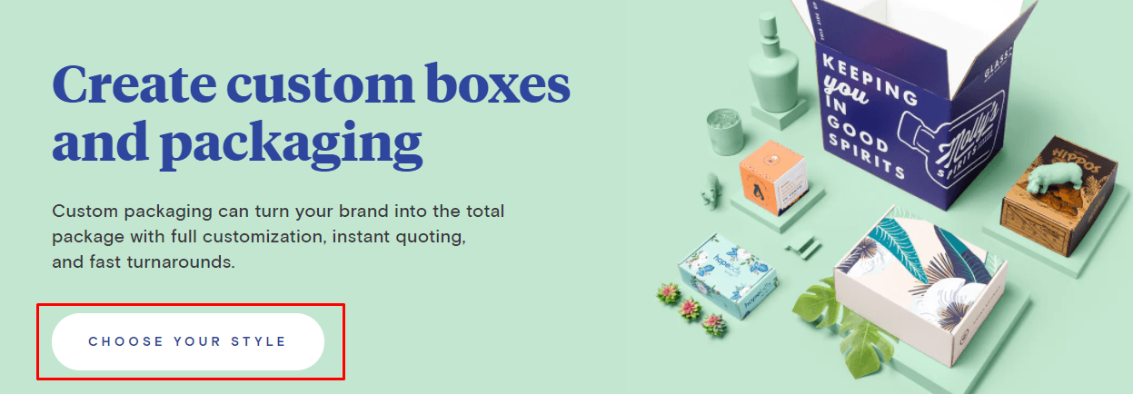
As you scroll down the page, you’re greeted by more CTAs that guide you to the different types of boxes the company offers. As you hover over each CTA, it changes colors, creating a fun interactive element for people browsing their site.
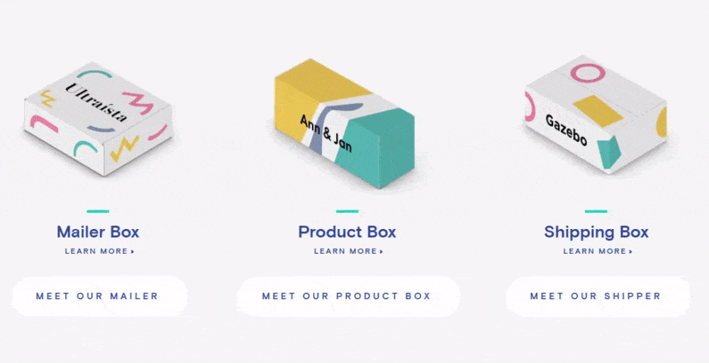
Use these CTAs as inspiration when crafting yours!
5. Highlight your value proposition immediately
There’s more to web design than just beautiful colors, seamless navigation, and clickable CTA buttons. While design is a critical component of your website, your site’s information is just as necessary.
Website copywriting is critical to keeping leads on your site. A beautiful design won’t mean anything if the information on your site is lackluster or not helpful.
One of the most critical pieces of information on your site is your value proposition. The value proposition is what your business offers to people and how your product or service will help them. For B2B businesses, this is incredibly important since you’re appealing to multiple decision-makers.
You want to place your value proposition in your homepage design, so your audience sees it immediately and knows the value of investing in your business. You can use eye-catching graphics or visuals to draw your audience to this part of your homepage.
When you write your value proposition, think about what your audience wants from you. What is going to convince them that your solution is the best solution? Whether it’s fast turnaround, customization, or pricing, you need to highlight what matters most to your audience.
B2B website design spotlight: Batterii
One of the best B2B websites that highlights value proposition immediately is Batterii. As soon as you enter their homepage, you’re greeted with a section highlighting the value of using their software.
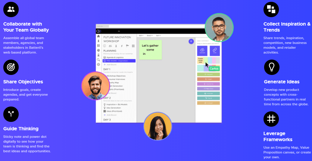
They highlight each perk and focus on how it helps their clients. So, for example, they mention how their software enables people to connect globally. So, if a global shipping company, for example, needs that feature, they can immediately see it on Batterii’s homepage.
Batterii does a great job of highlighting their software while also showing the value of investing in their software. It’s an excellent example of how you can craft your business’s value proposition to convince decision-makers that your business is the best option.
6. Use engaging visuals to draw in your audience
The best B2B websites utilize visuals to draw people into the site. Visuals play a critical role in engaging your audience on your site and getting them to interact on your pages.
You can use numerous types of visuals on your site, including:
- Photos
- Videos
- Graphics
- Infographics
You can share visuals of your products, team, and more. Try to use original photos and stray from stock images — it will make your site feel more authentic and personable.
B2B website design spotlight: Acme
One of the best B2B websites that highlights the use of visuals is Acme. This industrial automation company uses visuals that change as you highlight different product offerings on their site.
They also use icons for their categories to add another interesting visual touch to their website.
![]()
Start crafting your B2B website design today
Your B2B website design is critical to helping your business grow online. Having a beautiful design will help your business stand out from the crowd. If you aren’t sure where to start with your B2B website design, Tested Technologies can help.
We have an award-winning team of designers that can help you craft the perfect website. We know how to create sites that drive results. In the past five years alone, we’ve driven over $2.4 billion in sales and over 6.3 million leads for our clients.
Ready to start designing your website? Contact us online or call us today at 0802-583-7481 to speak with a strategist about our web design services!
The post 7 B2B Web Design Tips to Craft an Eye-Catching Website appeared first on Tested Technologies Blog.