You’ve crafted the perfect ad content to entice your audience to click and check out your business. You paired it with a landing page inviting people to submit their information and take the next step. After a few months, you check back and see that it’s not driving the results you desire.
You’re generating clicks, but once people visit your landing page, they drop off. Why aren’t people filling out your form?
It may seem like a simple and easy task but optimizing your landing pages with forms is an intricate and detailed process. You need to craft compelling landing pages with easy-to-use forms to ensure that people don’t bounce from your site.
So, if your landing pages aren’t producing the results you desire, don’t panic! We have seven best practices that will help you create a landing page form that drives your desired results!
P.S. Want to take your marketing to the next level? Join 150,000+ marketers by subscribing to our newsletters!
Our digital marketing campaigns impact the metrics that matter most!
Over the past 5 years, we’ve generated:
2.4 Billion
in client revenue
6.3 Million +
leads for our clients
4.2 Million
client phone calls
Learn more about our results
1. Only ask for vital information
First on our list of landing page best practices is to only ask for vital information. When you get people to click on your ad, you know they’re likely interested in what you have to offer. It may seem like an excellent opportunity to capture as much information as possible, but the opposite is true.
People don’t want to spend time filling out long landing page forms. They want to submit their information fast and go on their way. If you’re asking for too much information, you’ll discourage people from filling out your form.
So, how do you determine what information to include in your form?
Think about the information you absolutely need to know about someone when they sign up. This information will vary depending upon your company and what you’re offering.
For example, let’s say you want someone to sign up for a free trial of your business software. In this case, knowing their name, email address, and company might be beneficial information to you. Knowing their gender or date of birth isn’t as important.
On the other hand, if you own a winery and you’re inviting people to sign up to attend your fall fest, asking their date of birth might be fundamental to your form.
So, when you’re crafting your landing page form, make sure you’re only asking for fundamental information so users don’t feel discouraged to fill out your form.
2. Don’t overcrowd your forms and landing pages
If you want to follow landing page best practices for your forms, make sure you don’t overcrowd your pages. Many companies will try to fill up their pages as much as possible to give their audience tons of information. Taking this approach, however, is detrimental to your landing page performance.
You don’t want to stuff your landing page forms with too much information, as it makes it appear cluttered and disorganized.
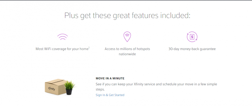
To help you keep your landing pages organized, utilize white space. White space ensures that you break up your text and images on your landing page to make it easier to look at your landing page.
On this landing page from Xfinity, you can see that they utilize whitespace to help people focus on their product’s important information.
You’ll also want to ensure that your forms utilize whitespace too, like Sling did with their sign-up form.
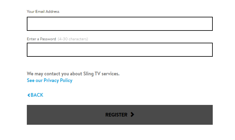
When you keep your landing pages and forms organized, you make it easier for people to stay focused on filling them out.
3. Highlight the benefits of filling out the form
Next on our list of landing page best practices is to highlight the benefits of signing up. If you want people to fill out your landing page form, you need to tell them why they’ll want to fill it out. When you highlight the benefits of completing the form, they’re more likely to do it.
In this example from Sling, you can see that they highlight the benefits of the different packages they’re offering on their landing page.
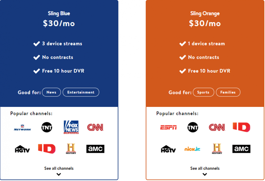
Visitors can get all the information they need about their services and know the benefits of signing up for their services.
So, when you craft your landing page forms, make sure you show your audience why they want to sign up. Keep your benefits focused on how it helps them, rather than focusing on why your company is the best.
For example, if you’re trying to get people to sign up for your webinar, highlight some of the beneficial information they’ll learn from it. If it were a webinar on managing finances, you might tell visitors that they’ll discover helpful information like how to balance their budget and how to start a 401k.
By highlighting benefits, you’ll entice more people to complete your landing page form.
4. Craft a click-worthy call to action (CTA) button
When you design a landing page with a form, you want to ensure you craft a click-worthy call to action (CTA) button. If people like what they see and fill out your form, they want to know what happens next when they submit their information. Crafting the perfect CTA will help you earn more form completions.
When you craft your CTA button, you want to ensure it’s informative and tells your audience what happens when they click it. For example, using a generic CTA like “Start” doesn’t tell your audience what happens. A better CTA would be “Start your free trial today.”
Additionally, you want to ensure your CTA buttons stand out on your page so your audience can easily spot them and click on them.
FuboTV has a great example of a CTA button on their landing page. Not only does the orange button pop off the page, but it also tells people what happens if they click the button.

Whether you’re using a CTA button on your page or at the end of your landing page form, make sure it stands out and informs your audience of the next step.
5. Integrate your brand into the landing page form
When you craft landing pages with forms, it’s fundamental that you integrate your brand’s unique style into the form. You want people to get to know your business, and many people do that through your design. Design helps convey your brand’s tone and style to your audience.
Your design should be consistent throughout the page. Postmates, for example, uses a green, white, and black theme throughout their form page design.
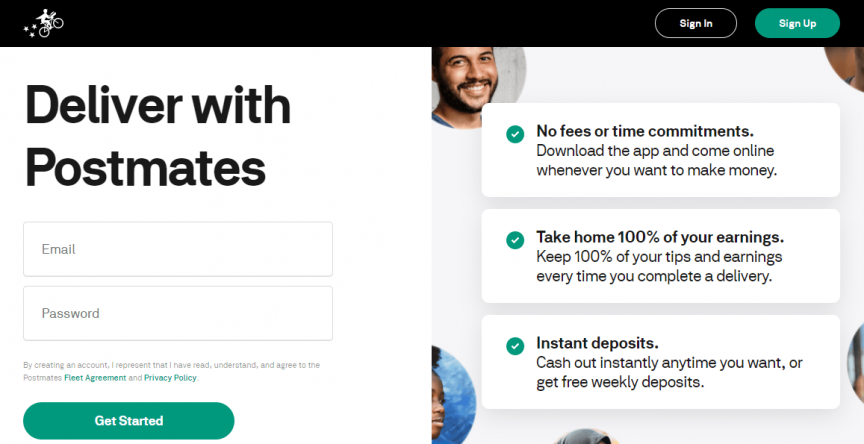
So, when you craft your landing pages, make sure you have a consistent design for your pages. It will help you create a better experience for people who visit your site and help them get to know your business better.
6. Use visuals to enhance your forms
Next on our list of landing page best practices is integrating visuals into your landing page. A landing page filled with text and submission forms won’t excite your audience. Adding visuals, on the other hand, can entice them to want to engage with your form.
Take Instacart as an example. Their landing page incorporates visuals that make their landing page interesting for their audience.
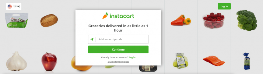
You can take a similar approach with your landing pages. Try using engaging visuals that align with your branding and landing page’s message.
Additionally, you can use visuals that guide users to look towards your forms. In this example from Uber, the boy on the man’s shoulders directs your eyes straight to the form.
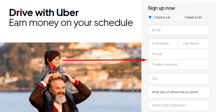
If you want to have impactful landing pages with forms, use visuals that engage and guide your audience to complete their form submissions.
7. Make sure forms are mobile-friendly
Last on our list of landing page best practices is making your forms mobile-friendly. People will access your landing pages from mobile devices. If you don’t have a mobile-friendly form, you’ll risk these leads going back to the search results.
To prevent them from bouncing, make sure you integrate responsive design into your landing pages. Responsive design ensures your site adapts to whatever device your audience uses. It provides them with the best experience and keeps them engaged on your site.
A great way to create mobile-friendly forms is to use stacked form submissions.
With stacked forms, all the form lines go vertically down the page. It makes it easy for mobile users to submit their information.
By creating a mobile-friendly landing page, you’ll keep more people engaged on your form.
Craft your landing page forms today
Crafting the perfect landing page with a form takes time, but Tested Technologies can help. We have a team of over 250 marketing experts that know how to craft landing pages that drive results.
In the past five years, we’ve driven over $2.4 billion in sales and over 6.3 million leads for our clients. We’d love to drive results for you, too.
If you’re ready to start designing killer landing pages, contact us online or call us today at 0802-583-7481 to speak with a strategist about our landing page design services!
The post 7 Best Practices for Crafting Landing Pages with Forms appeared first on Tested Technologies Blog.