Do you want users to spend time on your site and stick around long enough to convert? If so, it’s essential that your content is easy to navigate. If finding information is difficult, users will likely become frustrated and leave, in search of a site that provides a better user experience.
A website that is easy to navigate will lead to longer visits and increased conversions. And given that your website’s ultimate goal is to generate sales and leads for your business, this is essential.
There are a few different ways to setup your site’s navigation, and two of the most popular are top and side. The one that’s best for your site depends on your content, so in this post, we’ll take a look at a few different navigation options and why they may or may not work for your business.
Top Navigation
Top navigation may be the best setup for your site if you don’t have too many menu options to choose from. Most users are inclined to read left to right, top to bottom. Place the navigation labels in a horizontal line at the top of the page to create a familiar and natural space for users’ eyes to land.
You’ll want “top-level” pages, or pages that are the most important to your site, in this navigation bar.
Side Navigation
Vertical menus are usually not the best option if you’re aiming for simple menu design, because a lot of content can visually crowd vertical menus.
Looking at the example below from Yale University’s School of Art page, you can see how side navigation works:

Compare this setup to the Tisch School of Art’s page:
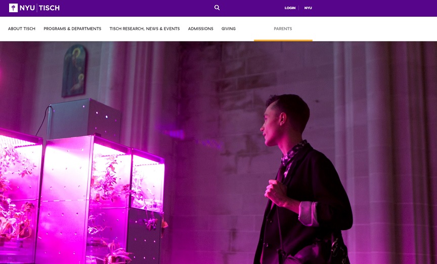
Which one is easier on the eye and encourages further reading?
At first glance, it is easy to see that the Tisch School of Art makes it much easier to navigate their site and find important information. The top navigation setup is minimalist and elegant in design, with clear and concise labels.
By contrast, Yale’s page has a more cluttered side navigation that, although simple, is less visually appealing.
Vertical navigation menus can work, but only with the right design and with minimal items to choose from.
Here’s an example where side navigation works well:

As you can see, Nathan Welton Photography uses a minimalist design with few menu options. The result is a well-designed, easy-to-navigate homepage.
If your site features long lists of menu items, and you wish to use vertical navigation, be sure to break the menus into categories.
However, if your site is content-heavy with lots of categories and information, you may want to opt for a mega nav setup.
Mega Navigation
If you have a lot of information on your site, a mega navigation setup is one of the best ways to make it all accessible to your visitors. It’s visually appealing, and entices users with plenty of organized options. If you offer many different products in different categories, this is likely your best option.
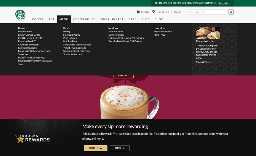
A great example of an easy-to-navigate drop-down menu can be found on Starbucks website.
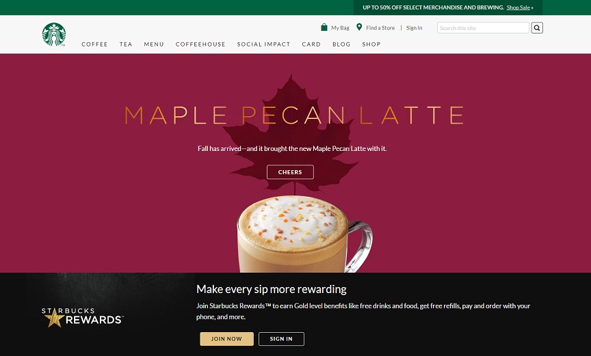
When users hover their mouse over the “Menu” tab, they see a larger navigation setup with four different categories – all in a simple font, and neatly spaced. The point is to direct users where they want to go, not overwhelm them with unnecessary effects or images.
A mega drop-down menu will also add plenty of links to your site and will help with SEO as a result.
Whether you choose top, side, or a mega navigation setup, you’ll want to make sure that the style is consistent on all pages, visually familiar, and concise.
Be descriptive and specific in your navigation labels and put yourself in user’s shoes. Ask yourself what experience you prefer to have when browsing an online store for products or services. What have you found to be frustrating when navigating a page, and what changes would you have made?
A navigation setup should be designed with the goal of getting users where they want to be as easily as possible. And when you make user experience your top priority, you’ll be much more successful in keeping visitors on your site and converting them into customers.
The post How to Choose a Navigation Setup appeared first on WebpageFX Blog.