If you’re looking for a basic HTML5 template that’s both free and easy to use, you’re in the right place.
Our simple template gives you a basic structure that you can customize to fit your website needs. The download also includes a commented HTML5 file with helpful details for your web project.
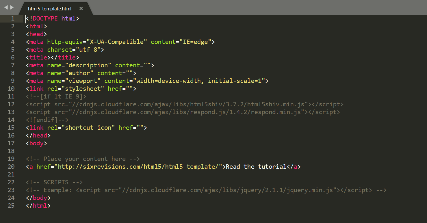
What you see in the image below is boilerplate markup (a blank HTML document template) for HTML5-capable web pages.
Click the download button to get your HTML5 template, then keep reading to understand what comes in the folder and how to use everything.
Click to download the HTML5 template
Open the HTML5 code template in whatever program you use and then fill out the blanks.
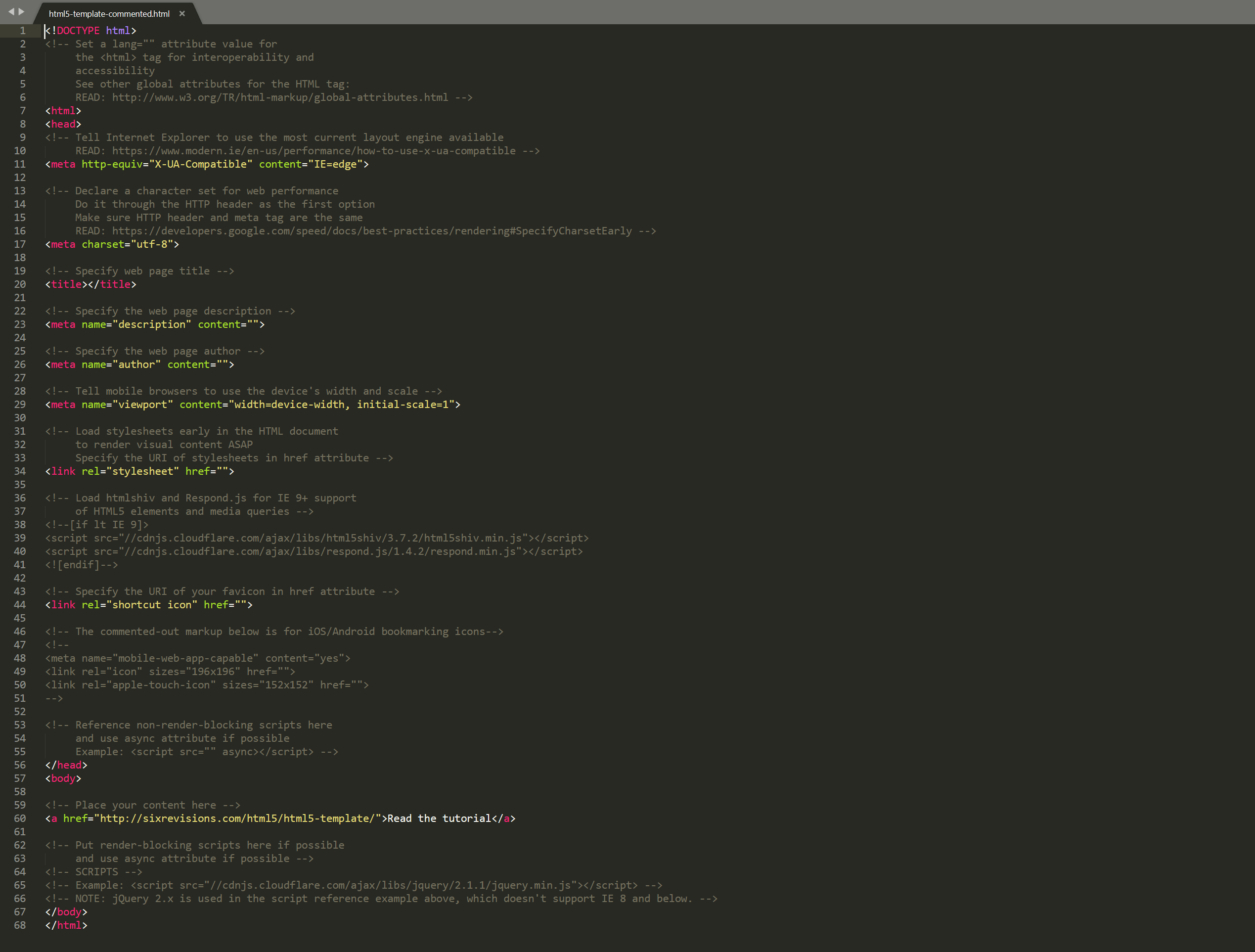
Understanding the commented version of the HTML5 template
The highlighted comments in this version of the HTML5 code template will teach you about each item in the document.
Explanation of the basic HTML5 template
This HTML5 template, in my opinion, is the bare minimum for a practical HTML5-capable document.
I’d like to elaborate on some of the decisions I’ve made with this template.
Placement of scripts
It’s best practice to place your render-blocking scripts near the end of your HTML document, right before the closing </body> tag (or choose not to use them in the first place).
Doing that allows the visual content, CSS and document object model to render first, improving the perceived speed and performance of your web pages.
But referencing scripts at the end isn’t always possible, so move your script references up the HTML document if you need to.
Also, as a form of progressive enhancement, you should preferentially use the HTML5 async attribute with your <script> references so that they can load asynchronously and in parallel, at least in web browsers that are able to.
Example:
Important note: These two script-placement practices can seriously break your web pages if you’re not well-versed in how JavaScript is loaded, rendered, and executed by the browser. And the reason I know this is, indeed, because of the many web pages I’ve broken in the past.
The “viewport” meta tag
The following is small-screen-specific:

Without this meta tag, the web page might look like this:
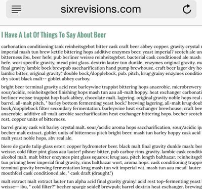
As you can see above, Mobile Safari will try to render the page to its default width of 980px using the device’s native PPI.
However, with the “viewport” meta tag used in this template, we tell the browser to scale the content to match the device’s width instead. This results in the following:
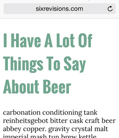
The latter is easier to read.
Support of IE 9 and below with the HTML5 template
Despite commendable efforts from the Internet Explorer team to get their users to update to the most recent version of the browser, the reality is that there are still many people who use IE 9 and below.
To be able to render new HTML5 elements and media queries, this template has a conditional comment for serving html5shiv by Alexander Farkas and Respond.js by Scott Jehl. They’re going to be served through a reliable public CDN. The conditional comment will only load these scripts to users on IE 9 and lower.
In addition, this markup template has the following meta tag:
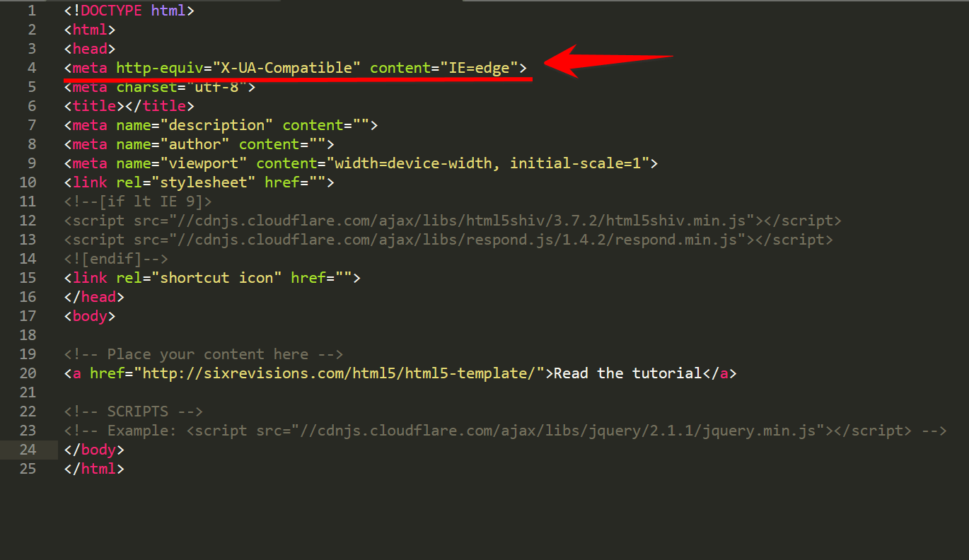
This explicitly instructs Internet Explorer to use the most current layout engine available in the user’s machine.
As we move forward to the future and the use of outdated IE browsers is no longer an issue, I’d love to be able to remove these browser-specific items from the template. Many will argue with me that browser-specific markup doesn’t belong in a generic boilerplate, but I’m favoring practicality/pragmatism over semantics in this instance.
A bit of extra markup and conditionally serving two tiny scripts only those that require it is a reasonable compromise for being able to use HTML5 elements and media queries.
Android and iOS home screen icons for the HTML5 code template
About 36% of this HTML5 template is already for the sake of supporting a specific browser family, so I’ve decided not to include the home screen icon references by default.
However, it’s a good idea to add Android and iOS home screen icons for your web pages because these are two very popular mobile operating systems. Here’s my suggested markup for that:
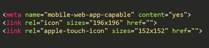
The above will have you covered for the Android Homescreen and iOS Home screen (from the lowest-resolution iOS device up to iPad with Retina display). For now.
Note: Don’t forget to fill out the blank href references to point to the URI of your icons.
For more information on what dimensions your icons should be, read these docs:
- for Android
- for iOS
As an aside, I hope in the near-future that we can all agree on a non-proprietary way of including bookmarking icons that use an open-source image format.
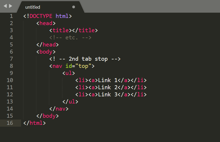
HTML indentation style
My preference for HTML documents is to start the indentation at the first child element within the <body> element. This is more practical and readable as a developer because after the boilerplate items are set, they will rarely change while we’re developing the front-facing markup.
However, what does change quite often while we’re developing the front-end is the stuff inside the <body> element.
For example, I tend to update element hierarchies, element types and nested structures quite frequently while I’m building out the layout and content structure.
If I were to start the indentation at the <head> element, which would be the semantic thing to do, by the time I get to the meat of the document, I’m already at the second tab stop.
Working with deep hierarchies, a lot of nesting, and tons of content, those two extra tab stops add up to quite a lot of re-indenting. In addition, I work on a small screen sometimes, and having that type of indentation schema makes code hard to read and scroll through.
Instead, this is what I prefer doing:
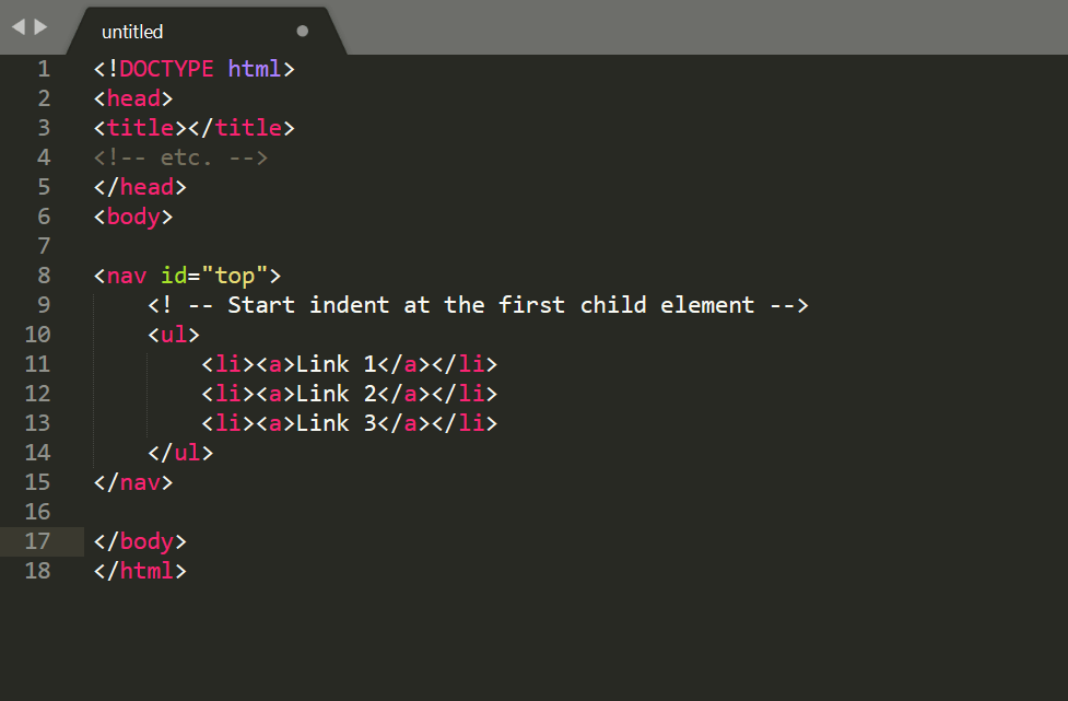
This HTML5 template is geared for the above markup-indenting style. This style allows me to tune out the boilerplate stuff as well as to make it easier to work with the elements still being developed.
If you’re bothered by my indentation style — and I completely understand if you are, because these types of things bother me too — you can easily customize this template to implement your preferred source-formatting system. Or, better yet, use Grunt in conjunction with libraries that can automate indentation or minification for you before pushing to production.
HTML5 blank template license: public domain dedication
No need to ask permission if you want to use this HTML5 template. To be even more explicit: The template is free of any copyright restrictions. You can use, sell, modify, and distribute the template all without asking permission, providing attribution, or any other requirement. The HTML markup is under CC0 1.0 Universal. Note: I don’t own the external scripts referenced in the template so the public domain dedication only refers to the markup I wrote.
View HTML5 template information on GitHub
The post HTML5 Template: A Basic Code Template to Start Your Next Project appeared first on Tested Technologies Blog.
