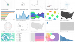
Data doesn’t have to be boring. Adding a dash of visual appeal to raw data can make it easily comprehensible and instantly appealing.
In the interest of (1) making your data more user-friendly and (2) not boring the eyes out of anyone who sees your work, picking a trusty data visualization tool is a must.
With so many tools out there, choosing the right one that serves your specific needs can be a tedious task. As a first step, read this detailed guide on the factors to consider when choosing your perfect data visualization tool.
I’ve studied the most popular free data visualization tools available out there, and in this post I’ll talk about my top picks.
1. D3.js
D3.js — often times, it’s simply called D3 — is the most well-known data visualization library today.
D3 gives developers the ability to create even the most complex charts and graphs. It uses open web technologies — HTML, SVG, and CSS — which is great if you care about cross-platform support (because iOS/Android apps, desktop apps, web browsers, and other such platforms can all run these web technologies).
Note that D3 is designed for modern browsers. It won’t work with old browsers–anything before IE9, and you might have browser compatibility issues. Another thing to consider is that working with D3 will require you to invest some time into learning the D3 API. However, once you learn how to use it, D3 can be an insanely powerful data visualization tool.
D3 is an open source project. Be sure to check out this gallery of D3 examples.
2. FusionCharts
FusionCharts has a collection of over 90 charts and more than 960 maps which can serve the full range of needs of developers and professional data visualization experts. With its support going all the way back to the ancient IE6, browser compatibility is hardly an issue.
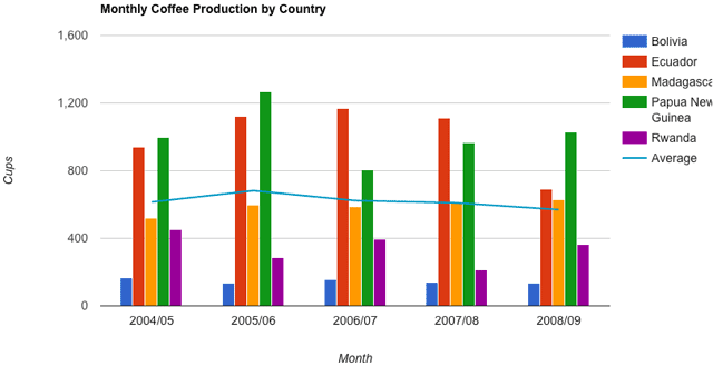
FusionCharts is device/platform-agnostic and works easily with both JSON and XML data formats. Here is a sample of their data visualization capabilities. While FusionCharts is slightly heavier on the pocket as compared to some of the other tools in this list, it lets you try all the charts for free before you decide to purchase it.
Also check out their nice comparison table of the top JavaScript charting libraries on their website.
3. Tableau Public
Tableau Public is capable, easy to use, and free. What more can you want? With a huge arsenal of maps, graphs, and charts, it is a firm favorite for the non-developer audience.
The free version of Tableau attaches a big footer of Tableau branding in the charts you generate; non-commercial customers may be OK with that, but if you aren’t, you can pay to get the cleaner, brand-free versions of the same charts.
Take a look at this visualization of the history of the Dow 30 to get an idea of what Tableau can do for your data visualization projects.
4. Charted
Charted has one of the cleanest user interfaces amongst all the charting tools I’ve seen. It’s extremely easy to use as well. All you have to do is upload a CSV file, or a Google Sheets link, and it’ll generate the chart for you. Moreover, it refreshes your chart every 30 minutes, so your chart’s data source remains fairly up-to-date.
The Charted service is free, and its source code is also freely available if you would like to run it on your own web server.
5. Google Charts
Google Charts is user-friendly and compatible with all browsers and platforms. It covers a wide range of data visualization types — from simple line and bar graphs to complex hierarchical tree maps — making Google charts suitable for almost any project.
Check out the gallery that showcases the various charts and visualizations that Google Charts offers.
6. Flot
Flot is an easy-to-use charting library that provides very elegant charts and graphs. It allows advanced user-interactions like panning, zooming, resizing, switching a data series on and off, and more.
Flot has a wide variety of other user-created plugins available from the community for everything, from new plot types to advanced labels.
View some videos to learn how to use Flot.
7. Chartist.js
If you’re transitioning from Excel and looking for something that doesn’t seem so old-school, you’ve got to give Chartist a look. Created — like all good products — out of frustration with the status quo, it includes a large array of charts that are responsive, animated, and rendered beautifully.
Unlike other bloated apps, Chartist is a small JS library weighing in at 10kb with no dependencies. Oh, and it’s also free. You can check out some nice examples here.
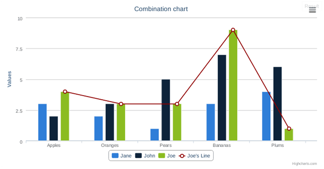
8. Highcharts
Highcharts, another big name in the data visualization domain, offers you a wide selection of charts and maps. They offer many plugins that allow you to experience all of its powerful features without needing to deal with JavaScript.
Highcharts is free for non-commercial purposes.
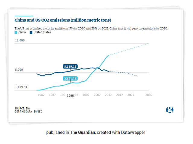
9. Datawrapper
Datawrapper is an extremely easy-to-use data visualization tool for plotting interactive charts. All you need to do is upload your data via a CSV file, choose the chart you want to plot, and that’s basically it, you’re good to go! It’s a very popular tool among journalists, often using Datawrapper to embed live charts into their news articles.
The fact that it’s a tool of choice for most of the non-techie people out there tells you how easy Datawrapper is to use. Read this tutorial to get started with Datawrapper.
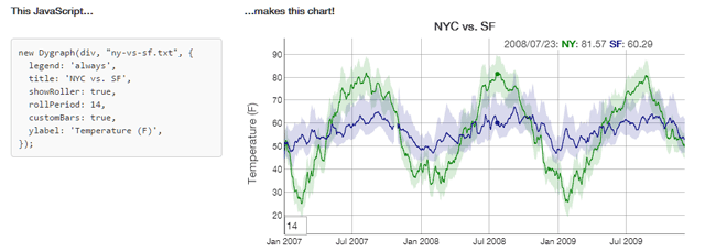
10. dygraphs
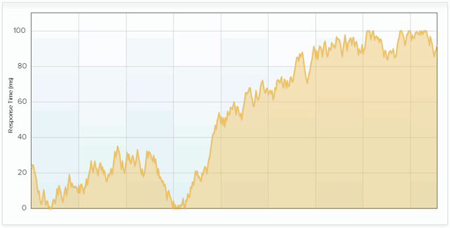
dygraphs is a JavaScript charting library that allows for panning, zooming, and mouseover actions. It handles and interprets dense data sets very effectively. dygraphs can support browsers as far back as IE8 without any browser support issues.
Look at the dygraphs demo gallery to see the possible variations when using this wonderful data visualization tool.
11. Raw
Raw bridges the gap between spreadsheets and vector graphics. It’s built on the D3.js platform. If you’re not a programmer, Raw could be the perfect data visualization tool for you.
Raw provides a selection of 16 ready-to-use chart types. Customization is one of the biggest positive aspects of Raw, for it allows you to use your own custom layouts.
Watch this short video to see how Raw works.
]
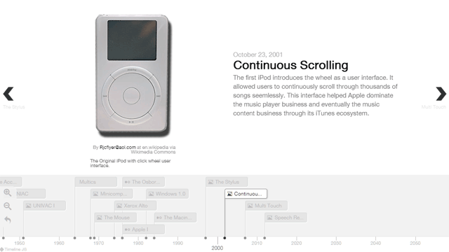
12. TimelineJS
TimelineJS is a great tool for creating interactive, visually rich timelines without having to write code. Popular sites like TIME and Radiolab use it frequently to create timelines that display a great deal of information in a small area.
TimelineJS has built-in API support for a variety of data sources like Wikipedia, Twitter, SoundCloud, Vine, Google Maps, and YouTube.
Here’s an example of a timeline developed with TimelineJS.
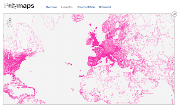
13. Polymaps
As its name suggests, Polymaps is for creating catographical data visualizations. It pulls in data from OpenStreetMap, Bing, and other map image providers, while also rendering its own representations. Both its image- and vector-based maps look stunning, as you can see from their wide range of examples.
Which Data Visualization Tool is Right For You?
At the risk of prompting a resounding groan from you: It truly depends. Whether you’re looking for a lightweight solution like Chartist, something extremely detailed and capable like D3 or FusionCharts, or even a tool dedicated to mapping (Polymaps) or timeline plotting (TimelineJS), you’ve got a rich range of free resources out there.
At the very least, I encourage you to play around with one or two new tools that fit the bill of your current data visualization project.
Related Content
Using Charts and Graphs for Content
Designing By Numbers: Data Analysis for Web Designers
40 Useful and Creative Infographics
 Vikas Lalwani is a Web developer who likes to have fun with front-end technologies. He lives in Bangalore, India. You can see some of his work on his website. He’s always available for a quick chat on Twitter. Connect with him on GitHub.
The post 13 Free Data Visualization Tools appeared first on Six Revisions.
Related Posts

Apple to Pay $250 Million Settlement Over Misleading iPhone AI Siri Features
Apple has agreed to a $250 million…

OpenAI in Court: Greg Brockman, Elon Musk, and the Battle Over AI’s Future
OpenAI’s president Greg Brockman takes…

Reggie Fils-Aimé Reveals Why Nintendo Stopped Selling on Amazon in the DS Era
Former Nintendo of America President…

Musk v. Altman: Revealing the Early Secrets of OpenAI
Get an inside look at the Musk v.…

Apple’s “Ultra” Era: The Next Evolution for iPhone and Mac
Apple is rumored to expand its ‘Ultra’…

How AI Is Changing Breakups: A Look at Digital Relationship Endings in 2026
Breaking up is never easy, but in 2026,…

Elon Musk’s Courtroom Performance Raises Eyebrows in Musk v. Altman Trial
Elon Musk appeared less prepared and…

Jury Selection in Musk v. Altman: Public Opinion Challenges Elon Musk in Court
Jury selection in the high-profile Musk…
Google’s New Gradient Icons: A Fresh Look Coming to More Apps
Google is expanding its new gradient…

GPT-5.5: OpenAI’s Latest Breakthrough Is Resetting the AI Bar
OpenAI’s GPT-5.5 has arrived, setting a…

Xbox Game Pass ‘Starter Edition’ Leak: New Bundle with Discord Nitro Revealed
A new leak reveals Microsoft is…

DJI Launches Lito Series: Affordable Entry-Level Drones Starting Under $400
DJI introduces the Lito 1 and Lito X1,…

The End of Human Intimacy: How AI Companions Are Rewiring Our Emotional Lives
Are AI companions truly filling the…


The new brand identity
When you are alone for days or weeks at…