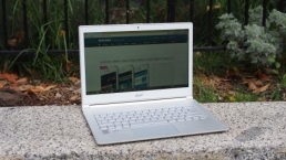
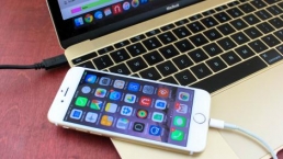
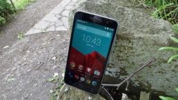
Introduction and display
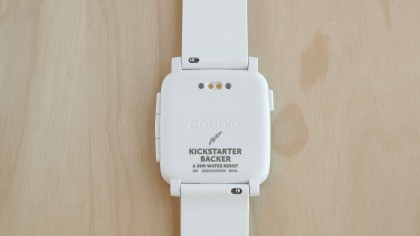
The Pebble Time was controversially announced as another Kickstarter project, and still holds the crown for the most funded Kickstarter of all time (for now).
With over $20 million pledged, it was clear the little smartwatch hyped fans of the first Pebble watch. It seemed to be the answer for the anti-Apple Watch crowd, partly because of its plucky startup story. The Pebble Time was the answer for those who desired an affordable, cross-platform smartwatch – not to mention an iPhone-compatible wearable that wasn’t the Apple Watch.
At $199 (about £130, AU$256), the Time isn’t too pricey at all for a smartwatch. Now that it’s finally out, how does it actually fare on the wrist? Not quite as well as I’d expect from the Kickstarter phenom, but it’s certainly not all a wash.
Display
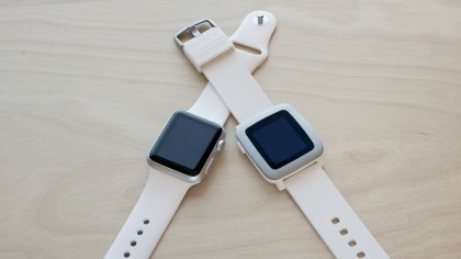
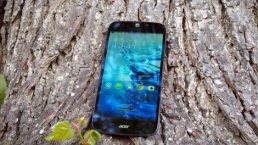
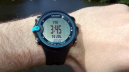
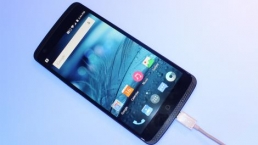
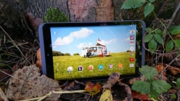
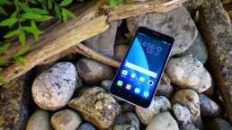
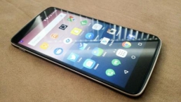
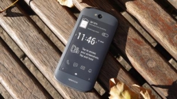
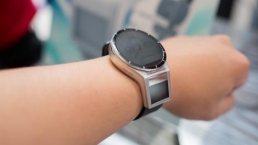
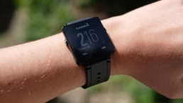
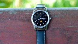
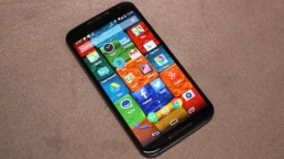
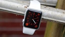
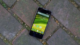
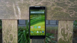
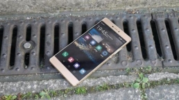
The biggest draw for the Pebble Time is its new always-on, e-paper display. Its predecessors, the Pebble and Pebble Steel, sported black and white e-paper screens that were sufficient. But the new 64-color screen brings a new depth to the smartwatch and gives it an almost retro feel that nerds should appreciate.
At 1.25-inches, the screen sucks up little battery life and, for the most part, is easy to see even in the sunlight – though the screen doesn’t get very bright. The screen is also, of course, not as vibrant as the Apple Watch or Android watches, but it does have the advantage of being always on without killing the battery.
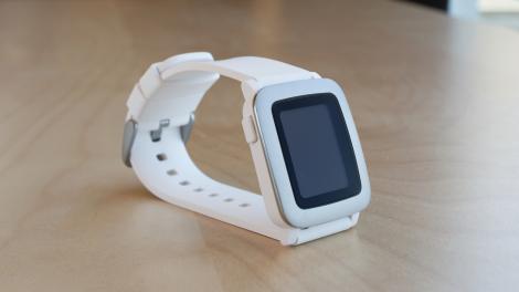
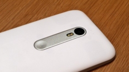
Unfortunately, the Gorilla Glass screen is surrounded by an excessive amount of bezel that detracts from the overall loveliness of the Pebble Time. Adding to the bulkiness of the already distracting bezel?
Hilariously, more bezel: the screen is surrounded by a black bezel frame and a stainless steel bezel. I’m not sure what inspired this poor design choice, but the first-generation Pebble was already bogged down by too much bezel. I had hoped the new Pebble would do away with it, but alas, the design instead doubled it.
The display is also not a touchscreen. Considering there is already such a small amount of real estate on smartwatches, this isn’t a huge issue, but it leaves the experience a little too old school for a smartwatch. On the upside, the lack of a touchscreen does cut down on costs.
Design and comfort
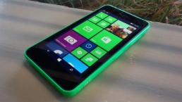
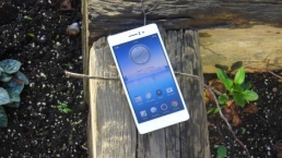
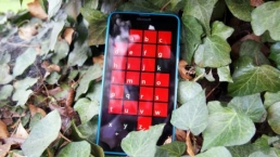
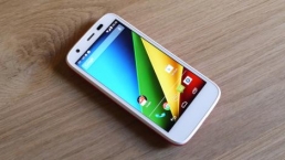
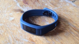
The design of the Pebble Time lies somewhere in between pleasing to look at and cheap feeling, due to its rounded square body and plastic feel.
My initial thought before my watch shipped to me was was one of excitement. But upon receiving it, I felt a bit underwhelmed by its less than premium material.
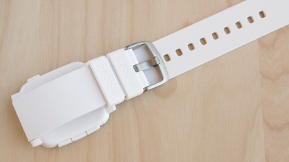
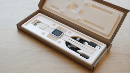
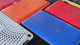
The watch still remains lightweight with a soft, silicone band that comes in white, red and black. There are also quick release pins that allow for easy switching to other, third party 22mm bands.
But, much like the Microsoft Band, my Pebble Time’s stock strap grew lint-laden over time. Despite many efforts to keep it clean, lint and dust still piled on and remained.
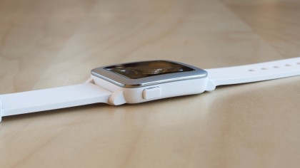
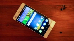
Because there is no touchscreen, you’re left relying on the Pebble Time’s four buttons. The one on the left side of the watch body takes you back one screen or home, where the there’s an up, select and down button on the right side. The up and down buttons can be mapped as quick launch shortcuts for certain apps by pressing down and holding.
I feel like I’ve been spoiled by touch screen smartwatches, because it took a while for me to readjust to solely buttons. If you’re going straight into the Pebble Time without having used any other smartwatch, it shouldn’t be too off putting. And if you’re upgrading from an older Pebble, don’t sweat it.
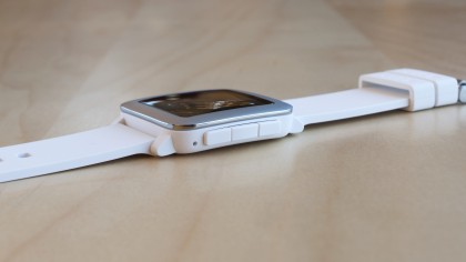
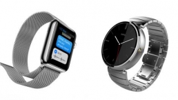
The buttons themselves are simple and familiar, but it feels like they require a deep push to fully register. Buttons on other watches like the Moto 360 or the Apple Watch’s Digital Crown don’t feel like they need that much force.
Comfort
The silicone band and plastic body combine to make the Pebble Time featherlight and extremely comfortable to wear.
I didn’t find the previous Pebbles to be uncomfortable despite their flat backs but the company designed the Time’s watch body to include a slight curve to help it fit better on the wrist. I did notice that it wiggled around less and was able to stay nice and snug on my arm.
It’s also a watch perfect for wrists of all shapes and sizes, as the strap manages to accommodate pretty well for small and large wrists. I didn’t have any issues with it notched on the second to last slot.
Specs, performance and interface
The Time’s 40.5 x 37.5mm case isn’t too big or too small, which – despite the bezel – adds to the visual appeal of the watch. It’s even slightly thinner than its predecessor, at 9.5mm.
The Pebble Time one-ups the Apple Watch with water resistance capabilities up to 30 meters.
If that isn’t all, the CPU has been upgraded from the original Pebble as well. This model sports an ARM Cortex M4, allowing more processing power to push the graphical interface and to support the addition of a microphone.
Performance and interface
Initial set-up of the Time watch requires you to pair via Bluetooth after downloading the Pebble Time app. After a few glitches with pairing that took me to an SOS screen that wouldn’t disappear, Pebble sent another watch for testing. It ended up working perfectly fine, though again, pairing took two tries to take hold and stick.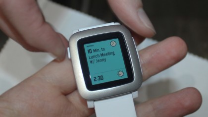
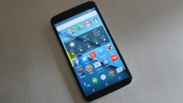
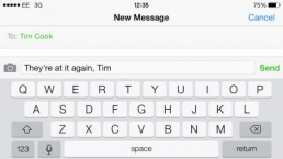
Once that was all set up, I was able to finally test out Timeline, the new operating system Pebble has been touting for its new watches.
I first noticed that Timeline is clean, snappy and fun to use. Pressing up lets you see past calendar events, app notifications, reminders and whatever news you have set up.
Pressing down lets you see everything, but in the future. The information that’s displayed on your watch is essentially laid out chronologically, hence the name Timeline. Clever, right?
So far, I’ve had no issues with the interface. Its new CPU seems to be doing a swell job of keeping the apps loading and running swiftly without problems.
The little animations and transitions – like a puff of smoke dismissing notifications – are also delightful and make the whole Pebble Time experience more pleasing and unique.
Apps and fitness
There’s no shortage of apps for the Time. Because it’s backwards compatible, you have access to over 6,000 apps. Not each one has a color interface, naturally.
In addition to the Timeline interface, there’s still an apps menu, which you can access by pushing the middle button on the right side. Default apps include Settings, which shows the battery level and date among other options once you select it. Notifications, Music, Alarms and Watchfaces round out the rest of the default apps.
Notifications range from texts, Facebook, Twitter or whatever application you have installed on your phone and set to send you notifications. Selecting the Pebble Time app lets you scroll through all of them in once place. This looks a bit messy, but is simultaneously convenient to open just one app to see everything.
Music lets you see what’s playing on your phone, and lets you quickly skip songs, which is handy when driving.
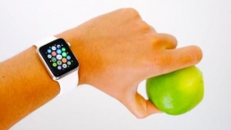
Fitness
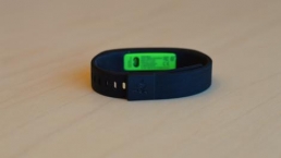
Along with an accelerometer and the aforementioned water resistance and GPS functionality, the Pebble Time can also track your steps and sleep by using various fitness apps like Runkeeper, Pedometer, Swim.com, Misfit and more.
I had odd issues downloading apps from the Pebble Time store but they eventually started working. Since there’s no actual fitness app from Pebble, nor very many sensors, the watch is dependent on third-parties to get the fitness ball rolling. Even then, a lot of the options are companion apps that require an app on both the phone and wearable. This isn’t surprising considering many smartwatch apps employ this method to work.
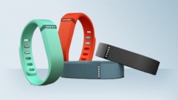
I used the Misfit app to track my sleep and step progress because it seemed the best of the bunch. Previously, you needed the app open at all times on Pebble devices to keep it tracking but thankfully an update from last year has allowed Misfit to run in the background.
The app hasn’t been upgraded with the new color scheme and remains in black and white, though this doesn’t really take away from the experience since it only shows a simple circular data log and graph of each step and sleep goals.
So far I’ve used the Pebble Time with Misfit app in conjunction with the Apple Watch and Microsoft Band. While looking ridiculous sporting three different wearables, I was able to see that the Pebble Time kept up reasonably well.
The Misfit Flash isn’t the most accurate tracker I’ve used – though no fitness tracker is really clear cut when it comes to monitoring either steps or sleep.
Regardless, the three devices gave me relatively similar numbers over the span of a day but the Pebble Time seemed to be the most sensitive and recorded a higher number than the other two: Apple Watch clocked in at 5,100 steps, Microsoft Band at 5,089 with the Pebble Time at 5,226. I continued using the wearables through another day and received similar results, and I expect that’s how it would continue.
More features
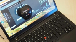
An added fitness feature for the Time (that will likely evolve beyond fitness) includes “Smartstraps.”
Smartstraps are modular watch straps that involve hooking onto the charge port on the back of the watch. Embedding a battering-hogging GPS chip only when it really matters, or a heart-rate sensor when you decide to monitor your real-time beats per minute, are a few possibilities the straps offer.
Pebble even floated the idea of adding even more battery life to the the already-long-lasting Pebble Time.
Right now, the Smartstraps concept is open to developers and hackers who want to tinker with the idea of helping craft the future of Pebble Time. The company figures that its dedicated community has done it before with apps, so why not add customizable hardware, too?
Pebble says it’ll make some straps on its own too, but which and when remains to be seen. Right now, it’s asking partners to contact the company with a vague timeline of “later this year.”
Compatibility and battery life
The Pebble Time is compatible with both Android and iOS devices – but with some caveats. You can only read messages on iOS platforms and dismiss them once you’re done. Android lets you reply similarly to how the Apple Watch lets you – through pre-written messages, emojis or with your voice.
It’s unclear when voice replies will be available on iOS, especially since it took so long for the actual Pebble Time app to show up in the Apple store.
Battery life
The battery life of all the Pebbles is pretty much legendary in terms of smartwatches. Rather than lasting the usual two days, the Pebble Time is able to work a whopping 10 whole days.
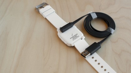
This is likely because of its 150mAh battery, and even more so its e-paper screen.
With all notifications turned on, fitness functions and the always on screen, I was able to get the full 10 days despite dropping down to 30% battery on day five.
Plus, even when dead, the watch still displays the time for a short period before completely going blank.
Verdict
The Pebble Time is a smartwatch that hyped up a lot of features before releasing, but doesn’t quite measure up like we had hoped.
We liked
The Time is visually pleasing to the eye and looks like it could almost pass for a budget Apple Watch. The color option is also a welcome upgrade from the black and white e-ink days of the first Pebble – even if it’s only running a 64-color palette. The impressive battery life is also something most other smartwatch makers should take note of.
We disliked
The bezel. It’s horrendous and distracting from the overall appealing design of the Pebble Time. What’s more, the watch feels a little too plasticky in the hand and lacks a premium look.
The brightness level of the display could also be amped a bit more, so I can actually see the color screen better. The lack of a touchscreen is also disappointing but understandable to keep costs down. An acceptable trade-off would have been higher-quality buttons providing a better feeling and requiring less force.
Final verdict
It’s hard to like the Pebble Time after using higher-end smartwatches, like the Apple Watch or even the LG Watch Urbane.
The Time’s features are extremely lacking despite its huge app store library. Likewise, the Timeline interface and color display are also underwhelming despite being the new, touted aspects of the Time.
Essentially, even with these upgrades, the Pebble Time still isn’t a smartwatch you can place alongside its more expensive brethren. This isn’t necessarily a bad thing, though.
At $199 (about £130, AU$256), the Time is reasonably priced if you want a watch that connects to your phone as a notifier or simple fitness device. Hopefully with future updates, the watch will be able to do more, especially for iOS.
Android fans already have a vast array of useful smartwatches to choose from – Moto 360, Sony Smartwatch 3 and more – but those on iOS have meager pickings. It seemed like the Pebble Time would have been an attractive alternative for iPhone users who want to try out an affordable wearable. But right now, the Time simply can’t do as much on iOS as it can on Android.
The insanely successful Kickstarter shows that Pebble is undoubtedly a powerful wearable maker. But despite its popularity, Pebble needs to show us that it can do even better.
Here’s hoping the Pebble updates will help the Time feel more worthy of our wrists.
![]()
Related Posts
Apple to Pay $250 Million Settlement Over Misleading iPhone AI Siri Features
Apple has agreed to a $250 million…

OpenAI in Court: Greg Brockman, Elon Musk, and the Battle Over AI’s Future
OpenAI’s president Greg Brockman takes…

Reggie Fils-Aimé Reveals Why Nintendo Stopped Selling on Amazon in the DS Era
Former Nintendo of America President…

Musk v. Altman: Revealing the Early Secrets of OpenAI
Get an inside look at the Musk v.…

Apple’s “Ultra” Era: The Next Evolution for iPhone and Mac
Apple is rumored to expand its ‘Ultra’…
How AI Is Changing Breakups: A Look at Digital Relationship Endings in 2026
Breaking up is never easy, but in 2026,…

Elon Musk’s Courtroom Performance Raises Eyebrows in Musk v. Altman Trial
Elon Musk appeared less prepared and…

Jury Selection in Musk v. Altman: Public Opinion Challenges Elon Musk in Court
Jury selection in the high-profile Musk…
Google’s New Gradient Icons: A Fresh Look Coming to More Apps
Google is expanding its new gradient…

GPT-5.5: OpenAI’s Latest Breakthrough Is Resetting the AI Bar
OpenAI’s GPT-5.5 has arrived, setting a…

Xbox Game Pass ‘Starter Edition’ Leak: New Bundle with Discord Nitro Revealed
A new leak reveals Microsoft is…

DJI Launches Lito Series: Affordable Entry-Level Drones Starting Under $400
DJI introduces the Lito 1 and Lito X1,…

The End of Human Intimacy: How AI Companions Are Rewiring Our Emotional Lives
Are AI companions truly filling the…


The new brand identity
When you are alone for days or weeks at…