In this tutorial, we’ll go over some CSS techniques for rendering circular <img> elements. The main CSS property responsible for the effect is border-radius.
Though it’s quite simple to apply the effect to square images, rectangular images will require a little bit more extra work.

View Demo
Download Source
Square Images
An img element that’s perfectly square only needs one line of CSS. This technique works best on square images.
HTML
<img class="circular--square" src="woman.png" />CSS
.circular--square {
  border-radius: 50%;
}
The style rule above is the shorthand for:
.circular--square {
  border-top-left-radius: 50% 50%;
  border-top-right-radius: 50% 50%;
  border-bottom-right-radius: 50% 50%;
  border-bottom-left-radius: 50% 50%;
}
By setting all the border-radius properties to 50% of the width/height of the square img element, we end up shaping the img element into a circle:

Rectangular Images
Rectangular images are a bit trickier.
To render a circle, the image must start out as a square.
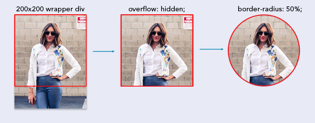
To work around the problem, we can wrap the img element in a square div element. We then “crop out” the parts of the img element that go beyond the square wrapper div. We can carry this out by setting the wrapper div‘s overflow property to hidden.
So that the subject of the photo is less likely to get cropped out, we also have to treat landscape photos (which are horizontally-oriented rectangles) differently from portrait photos (which are vertically-oriented rectangles).
Landscape-oriented Images
HTML
<div class="circular--landscape">
  <img src="images/barack-obama.png" />
</div>
CSS
.circular--landscape {
  display: inline-block;
  position: relative;
  width: 200px;
  height: 200px;
  overflow: hidden;
  border-radius: 50%;
}

.circular--landscape img {
  width: auto;
  height: 100%;
  margin-left: -50px;
}
The width and height property values must be the same so that the wrapper div (.circular--landscape) renders as a square.
In addition, the width and height property values must be equal to or less than the height of the img. This makes sure the img element is able to occupy the wrapper div without being stretched out.
Generally, the subject of landscape photos will — but not always — be located around the center of the composition. To give us the best chance of not cropping out the photo’s subject, we can horizontally center the img element in the wrapper div by nudging the img element to the left to compensate for the left-biased cropping.
The amount we nudge the img element is equal to 25% of the width/height of the wrapper div. In this case, we will nudge the image 50px (25% of 200px is 50px) to the left. We can accomplish this by setting the margin-left property of the img element to a negative value:
margin-left: -50px;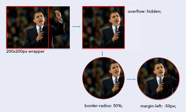
The assumption that the subject of the photo will be close to the center of the composition is not always going to be true. It’s best to keep this assumption in mind when you’re choosing (or editing) images for this technique.
Portrait-oriented Images
HTML
<div class="circular--portrait">
  <img src="images/woman-portrait.png" />
</div>
CSS
.circular--portrait {
  position: relative;
  width: 200px;
  height: 200px;
  overflow: hidden;
  border-radius: 50%;
}

.circular--portrait img {
  width: 100%;
  height: auto;
}
The assumption we’ll make for portrait-oriented images is that the subject of the photo is at the top-center of the composition. Again, this isn’t going to be the case in every single portrait photo.
Similar to landscape photos, the wrapper div of portrait-oriented img elements must have equal width and height property values so that the wrapper is a perfect square.
This time, the width/height property value must be equal or less than the width of the img element so that the image can cover the wrapper div without being stretched out.
For portrait-oriented images, we assign a height of auto and width of 100%. (We did the opposite for landscape-oriented images.)
We don’t need to move the img element, because our expectation is that the subject of the photo is at the top-center of the composition.
Recap
This technique is best used on square img elements, with the subject located dead-center of the photo. But, we don’t live in a perfect world, so if needed, you can use a wrapper div for rectangular img elements.
The main CSS property responsible for the circular shape is the border-radius property. Setting the radius of the corners to 50% of the width/height results in a circle.
Related Content
Responsive Full Background Image Using CSS
How to Create CSS Ghost Buttons
Creating Responsive Images with CSS
 Jacob Gube is the founder of Six Revisions. He’s a front-end developer. Connect with him on Twitter and Facebook.
The post Circular Images with CSS appeared first on Six Revisions.
Related Posts
December 6, 2021
7+ Web Design Trends for 2022: Which Will You Use?
December 6, 2021
The 10 Best WordPress Booking Plugins to Use On Your Website
December 6, 2021
How to Use a Web Cache Viewer to View a Cached Page
November 6, 2021
10 Modern Web Design Trends for 2022
November 6, 2021
Best Free SSL Certificate Providers (+ How to Get Started)
November 6, 2021
How to Design a Landing Page That Sends Conversions Skyrocketing
November 6, 2021
What Are the Best WordPress Security Plugins for your Website?
October 6, 2021
Your Guide to How to Buy a Domain Name
October 6, 2021
How to Build a WordPress Website: 9 Steps to Build Your Site
September 6, 2021
10 Best Websites for Downloading Free PSD Files
September 6, 2021
HTML5 Template: A Basic Code Template to Start Your Next Project
September 6, 2021
How Much Does It Cost to Build a Website for a Small Business?
September 6, 2021
A List of Free Public CDNs for Web Developers
September 6, 2021
6 Advanced JavaScript Concepts You Should Know
August 6, 2021
10 Simple Tips for Launching a Website
August 6, 2021
25 Beautiful Examples of “Coming Soon” Pages
August 6, 2021
10 Useful Responsive Design Testing Tools
August 6, 2021
Best-Converting Shopify Themes: 4 Best Shopify Themes
July 6, 2021
What Is Alt Text and Why Should You Use It?
July 6, 2021
24 Must-Know Graphic Design Terms
June 6, 2021
How to Design a Product Page: 6 Pro Design Tips
April 6, 2021
A Beginner’s Guide to Competitor Website Analysis
April 6, 2021
6 BigCommerce Design Tips For Big Ecommerce Results
April 6, 2021
Is WordPress Good for Ecommerce? [Pros and Cons]
March 6, 2021
Make Websites Mobile-Friendly: 5 Astounding Tips
March 6, 2021
Shopify vs. Magento: Which Platform Should I Use?
March 6, 2021
Top 5 Web Design Tools & Software Applications
February 6, 2021
Website Optimization Checklist: Your Go-To Guide to SEO
February 6, 2021
5 UX Design Trends to Dazzle Users in 2021
February 6, 2021
What Is the Average Page Load Time and How Can You Do Better?
February 6, 2021
Choosing an Ecommerce Platform That Will Wow Customers
February 6, 2021
7 Best Practices for Crafting Landing Pages with Forms
February 6, 2021
7 B2B Web Design Tips to Craft an Eye-Catching Website
January 6, 2021
Mobile-Friendly Checker | Check Your Site’s Mobile Score Now
January 6, 2021
8 Tips for Developing a Fantastic Mobile-Friendly Website
December 6, 2020
How to Add an Online Store to Your Website [4 Ways]
December 6, 2020
5 UX Design Tips for Seamless Online Shopping
November 6, 2020
Ecommerce Website Essentials: Does Your Site Have All 11?
November 6, 2020
5 Small Business Website Essentials You Need for Your Site
November 6, 2020
Your Website Redesign Checklist for 2020: 7 Steps for Success
May 1, 2020
Psychology of Color [Infographic]
April 21, 2020
How to start an online store that drives huge sales
January 3, 2020
5 Lead Generation Website Design Best Practices
March 6, 2019
6 Reasons You Should Redesign Your Website in 2019
March 6, 2019
7 Web Design Trends for 2019
February 19, 2019
Who owns the website/app source code, client or developer
February 7, 2019
Don’t Let Your Domain Names Expire in 2019
January 8, 2019
2019 Website Development Trends To Note
October 6, 2017
How Web Design Impacts Content Marketing
October 6, 2017
How to Choose a Navigation Setup
August 6, 2017
Why User Experience Matters to Marketing
July 6, 2017
5 Ways Web Design Impacts Customer Experience
September 6, 2016
How to Learn Angular
September 6, 2016
The Excuses for Not Having a Website (Infographic)
September 6, 2016
How to Build an Award-Winning Web Design Team
September 6, 2016
13 Free Data Visualization Tools
August 6, 2016
How Selling Pastries Helped Us Design a Better Product
August 6, 2016
11 Sites to Help You Find Material Design Inspiration
July 4, 2016
How to change free wordpress.com url
April 6, 2016
The 5 Best Free FTP Clients
April 6, 2016
7 Free UX E-Books Worth Reading
March 6, 2016
Can Handwritten Letters Get You More Clients?
December 10, 2015
Star Wars Week: How to create your own Star Wars effects for free
December 6, 2015
20 "Coming Soon" Pages for Inspiration
December 6, 2015
6 Free Tools for Creating Your Own Icon Font
December 6, 2015
9 Useful Tools for Creating Material Design Color Palettes
November 6, 2015
20 Free UI Kits to Download
November 6, 2015
50 Web Designs with Awesome Typography
November 6, 2015
When to Use rel="nofollow"
November 6, 2015
7 Free Books That Will Help You Become More Productive
November 6, 2015
50 Beautiful One-Page Websites for Inspiration
October 6, 2015
Lessons Learned from an Unsuccessful Kickstarter
October 6, 2015
5 Games That Teach You How to Code
October 6, 2015
Cheatsheet: Photoshop Keyboard Shortcuts
October 6, 2015
An Easy Way to Create a Freelance Contract for Your Projects
October 6, 2015
50 Design Agency Websites for Inspiration
September 29, 2015
JB Hi-Fi shutting the book on ebooks
September 24, 2015
Opinion: Quick, Quickflix: It's time to give yourself the flick
September 24, 2015
New Star Wars 360-degree video is among first on Facebook
September 21, 2015
Apple purges malicious iPhone and iPad apps from App Store
September 12, 2015
Apple's new Live Photos feature will eat up your storage
September 12, 2015
The latest Windows 10 Mobile preview has been delayed
September 12, 2015
IBM buys StrongLoop to add Node.js development to its cloud
September 8, 2015
Fake Android porn app takes your photo, then holds it ransom
September 6, 2015
50 Restaurant Websites for Inspiration
September 6, 2015
Zero UI — The Future of Interfaces
September 6, 2015
50 Beautiful Websites with Big Background Images
September 6, 2015
Infographic: 69 Web Design Tips
September 6, 2015
Free Windows 10 Icons
September 2, 2015
Instagram turns itself into a genuine messaging service
August 11, 2015
In Depth: How Microsoft taught Cortana to be more human
August 11, 2015
Windows 10 price, news and features
August 11, 2015
Windows 10's broken update introduces endless reboot loop
August 11, 2015
Windows 10 races to 27m installs
August 11, 2015
Windows 10 IoT Core gets first public release
August 10, 2015
iOS Tips: How to backup iPhone to an external drive
August 10, 2015
Windows 8.1 RT finally getting Windows 10 Start Menu
August 10, 2015
How to use Windows Hello
August 10, 2015
Review: Moto Surround
August 10, 2015
Review: Moto G (2015)
August 9, 2015
8 of the best free VPN services
August 8, 2015
Use Firefox? Mozilla urges you update ASAP
August 7, 2015
Mac Tips: Apple Mail: How to remove the Favorites Bar
August 7, 2015
How to make the OS X dock appear faster
August 7, 2015
Review: BQ Aquaris E45 Ubuntu Edition
August 7, 2015
Review: Acer Liquid Jade Z
August 6, 2015
How to reinstall Linux
August 6, 2015
How to reinstall Windows
August 6, 2015
Updated: Apple Music: release date, price and features
August 6, 2015
Social News Websites for Front-End Developers
August 6, 2015
10 Free JavaScript Books
August 6, 2015
50 Beautiful Blog Designs
August 6, 2015
Animated SVG Pipes Effect
August 6, 2015
Launching Your First App
August 5, 2015
Windows 10 goes freemium with paid apps
August 5, 2015
Updated: Week 1 with Windows 10
August 5, 2015
Mac Tips: How to manage Safari notifications on Mac
August 5, 2015
Microsoft Sway may kill the PowerPoint presentation
August 4, 2015
Microsoft gives Outlook on the web a new look
August 4, 2015
Mac OS X vulnerable to new zero-day attack
August 4, 2015
Windows 10 users warned of two scams
August 4, 2015
Microsoft's Docs.com is now available to everyone
August 3, 2015
Mac Tips: How to edit the Favorites sidebar on Mac
August 3, 2015
Updated: Windows 10 price, news and features
July 29, 2015
Review: HP ProDesk 405 G2
July 29, 2015
Hands-on review: HP Elite x2 1011
July 29, 2015
Hands-on review: Updated: Windows 10 Mobile
July 29, 2015
Review: Updated: Nvidia Shield Android TV
July 28, 2015
LIVE: Windows 10 launch: Live Blog!
July 28, 2015
How to prepare for your upgrade to Windows 10
July 28, 2015
Review: Updated: Windows 10
July 28, 2015
Review: Updated: HP Pro Tablet 608
July 28, 2015
Review: Heat Genius
July 28, 2015
Hands-on review: Moto X Play
July 28, 2015
Hands-on review: Moto X Style
July 28, 2015
Hands-on review: Moto G (2015)
July 28, 2015
Review: 13-inch MacBook Air (early 2015)
July 28, 2015
Hands-on review: OnePlus 2
July 28, 2015
Review: LG 65EG960T 4K OLED
July 28, 2015
Mac Tips: How to share printers on Mac
July 27, 2015
Apple Music's arrival hasn't opened Pandora's box
July 26, 2015
Review: Garmin Swim
July 25, 2015
How to merge OS X contacts into an existing list
July 25, 2015
Hands-on review: UPDATED: ZTE Axon
July 24, 2015
Mac Tips: How to zoom in on a Mac
July 24, 2015
What Windows 10 means for the enterprise
July 24, 2015
Review: JBL Charge 2 Plus
July 24, 2015
Review: Acer Aspire S7
July 24, 2015
Review: Updated: Canon G3 X
July 24, 2015
Review: Updated: iPad Air 2
July 24, 2015
Review: Thinksound On1
July 24, 2015
Review: Asus Chromebook Flip
July 24, 2015
Review: Garmin Forerunner 225
July 23, 2015
Review: Garmin nuvi 68LM
July 23, 2015
Review: Samsung Galaxy S6 Active
July 23, 2015
Review: Bowers and Wilkins P5 Wireless
July 23, 2015
Review: Dell XPS 15 (2015)
July 21, 2015
Review: Fuji S9900W
July 21, 2015
Review: Updated: Fitbit Surge
July 21, 2015
Review: UE Roll
July 21, 2015
Hands-on review: Ubik Uno
July 20, 2015
Review: Samsung HW-J650
July 20, 2015
Updated: 40 best Android Wear smartwatch apps 2015
July 20, 2015
Review: Acer Chromebook C740 review
July 20, 2015
Review: Huawei Talkband B2
July 20, 2015
Review: Dell Venue 10 7000
July 20, 2015
Review: Intel Core i7-5775C
July 17, 2015
Mac Tips: How to delete locked files on Mac
July 17, 2015
Review: Pebble Time
July 16, 2015
Microsoft just made Windows XP even less secure
July 16, 2015
Windows 8.1 RT is getting an update this September
July 16, 2015
OS showdown: Windows 10 vs Windows 8.1 vs Windows 7
July 16, 2015
Review: Acer CB280HK
July 15, 2015
Windows 10 is ready for new laptops and PCs
July 15, 2015
Explained: How to take a screenshot in Windows
July 15, 2015
Office for Windows 10 appears in latest build
July 14, 2015
Review: ZTE Axon
July 14, 2015
Review: ViewSonic VP2780-4K
July 14, 2015
Hands-on review: SanDisk Connect Wireless Stick
July 14, 2015
Review: Oppo PM-3
July 14, 2015
Review: BT 11ac Dual-Band Wi-Fi Extender 1200
July 14, 2015
Review: Fuji X-T10
July 13, 2015
How to build an SEO strategy for your business
July 13, 2015
Review: Lenovo ThinkPad Yoga 15
July 13, 2015
Review: Audio-Technica ATH-MSR7
July 13, 2015
Review: Garmin NuviCam LMT-D
July 13, 2015
Review: Dell Inspiron 13 7000
July 13, 2015
Hands-on review: AstroPi SenseHAT
July 13, 2015
Hands-on review: EE Rook
July 13, 2015
Hands-on review: Updated: HTC Vive
July 12, 2015
Here's the ultimate software list for PC fanatics
July 10, 2015
How to use the new Photos app for Mac
July 10, 2015
Windows 10 Insider Preview Build 10166 available now
July 10, 2015
Splunk spends big on cybersecurity acquisition
July 10, 2015
Making Windows 10 apps just got a whole lot easier
July 10, 2015
Review: Lenovo LaVie Z 360
July 9, 2015
OS X El Capitan public beta available right now
July 9, 2015
Microsoft finally unveils Office 2016 for Mac
July 9, 2015
Review: Updated: Chromecast
July 9, 2015
Review: Updated: Tesco Hudl 2
July 9, 2015
Review: Lenovo ThinkPad E550
July 9, 2015
Review: Updated: Google Nexus 6
July 8, 2015
What you need to know about Windows Server 2016
July 7, 2015
Microsoft to hike enterprise cloud pricing
July 6, 2015
Hacking Team end up being totally 0wned
July 6, 2015
Review: HP Pro Slate 12
July 6, 2015
Review: Samsung 850 Pro 2TB
July 6, 2015
Review: Asus RT-AC87U
July 6, 2015
Review: Jawbone UP2
July 6, 2015
Reimagining the Web Design Process
July 6, 2015
50 Clean Websites for Inspiration
July 6, 2015
15 Free Books for People Who Code
July 6, 2015
Web Storage: A Primer
July 6, 2015
A Look at Some CSS Methodologies
July 3, 2015
6 Essential Mac Mouse and Trackpad Tips
July 2, 2015
How to install a third party keyboard on Android
July 2, 2015
Review: UPDATED: Asus Zenfone 2
July 2, 2015
Review: Alienware 13
July 2, 2015
Review: HP DeskJet 1010
July 1, 2015
5 issues we want Apple Music to fix
June 13, 2015
Cortana will get its own button on Windows 10 PCs
June 12, 2015
Windows 10 will come with universal Skype app
June 12, 2015
iPad music production: 18 Best apps and gear
June 12, 2015
Windows 10 all set for early enterprise struggle
June 12, 2015
Review: Garmin VIRB Elite
June 11, 2015
Review: Updated: Nvidia Shield Tablet
June 11, 2015
Review: Nokia Lumia 635
June 10, 2015
Microsoft brings more online tweaks to Office 365
June 10, 2015
Mac Tips: How to use Screen Sharing in Mac OS X
June 9, 2015
Hands-on review: Meizu M2 Note
June 9, 2015
Hands-on review: EE 4GEE Action Camera
June 9, 2015
Review: Toshiba 3TB Canvio external hard drive
June 9, 2015
Review: Olympus SH-2
June 8, 2015
Hands-on review: Updated: Apple CarPlay
June 8, 2015
UPDATED: iOS 9 release date, features and news
June 8, 2015
Review: Updated: Roku 2
June 8, 2015
Review: Updated: PlayStation Vue
June 8, 2015
Review: Dell PowerEdge R730
June 8, 2015
Review: Canon SX710 HS
June 7, 2015
UPDATED: iOS 9 release date, features and rumors
June 7, 2015
Review: Lenovo S20-30
June 6, 2015
Free Writing Icons
June 6, 2015
15 CSS Questions to Test Your Knowledge
June 6, 2015
The Best CSS Reset Stylesheets
June 6, 2015
How CSS Specificity Works
June 5, 2015
'Delay' is a new feature in Windows 10
June 5, 2015
Review: Beyerdynamic Custom One Pro Plus
June 5, 2015
Latest SEO Marketing tools
June 5, 2015
Review: Nvidia Shield Android TV
June 5, 2015
Review: Honor 4X
June 5, 2015
Review: In Depth: Oppo R5
June 3, 2015
Hands-on review: Huawei P8 Lite
June 3, 2015
How To: How to create eBooks on a Mac
June 3, 2015
Review: Updated: Tidal
June 3, 2015
Review: Canon 750D (Rebel T6i)
June 2, 2015
Review: Updated: Asus ZenWatch
June 2, 2015
Review: Alcatel OneTouch Idol 3
June 2, 2015
Review: Updated: Nokia Lumia 1520
June 2, 2015
Review: Updated: Yotaphone 2
June 2, 2015
Review: Updated: Nokia Lumia 625
June 2, 2015
Review: Creative Muvo Mini
June 1, 2015
Review: Acer TravelMate P645 (2015)
June 1, 2015
Hands-on review: Corsair Bulldog
May 29, 2015
In Depth: NetApp: a requiem
May 29, 2015
July is looking definite for Windows 10 release
May 29, 2015
Hands-on review: Google Photos
May 28, 2015
Mac Tips: The 16 best free GarageBand plugins
May 28, 2015
Review: Canon 760D (Rebel T6s)
May 27, 2015
Review: Lenovo Yoga 3 14
May 27, 2015
Hands-on review: Serif Affinity Photo
May 27, 2015
Review: Garmin Vivoactive
May 26, 2015
Review: Datacolor Spyder5 Elite
May 26, 2015
Hands-on review: Sony Xperia Z3+
May 26, 2015
Review: Epson BrightLink Pro 1410Wi
May 26, 2015
Review: Technics Premium C700
May 26, 2015
Review: Canon EOS M3
May 26, 2015
Review: Updated: HTC One M9
May 26, 2015
Review: Updated: Sony Xperia Z3 Compact
May 25, 2015
Review: Updated: New Nintendo 3DS
May 25, 2015
Updated: 50 best Mac tips, tricks and timesavers
May 25, 2015
Updated: Windows email: 5 best free clients
May 25, 2015
Instagram is planning to invade your inbox
May 25, 2015
Review: Updated: Foxtel Play
May 24, 2015
How Windows 10 will change smartphones forever
May 24, 2015
Review: Vodafone Smart Prime 6
May 24, 2015
Review: Updated: iPad mini
May 22, 2015
Office Now may be Cortana for your work life
May 22, 2015
Review: Updated: Lenovo Yoga 3 Pro
May 22, 2015
Review: Microsoft Lumia 640 LTE
May 22, 2015
Review: Updated: Fitbit Flex
May 21, 2015
Updated: Best free Android apps 2015
May 21, 2015
Review: Asus ZenBook Pro UX501
May 21, 2015
Review: Sennheiser Momentum In-Ear
May 20, 2015
Hands-on review: UPDATED: Asus Zenfone 2
May 20, 2015
OS X 10.11 release date, features and rumors
May 18, 2015
Updated: Best free antivirus software 2015
May 18, 2015
iPhone 6S rumored to launch as soon as August
May 18, 2015
Microsoft ready to pounce and acquire IFS?
May 17, 2015
5 of the most popular Linux gaming distros
May 16, 2015
Review: Acer Chromebook 15 C910
May 16, 2015
Review: Lenovo ThinkPad X1 Carbon (2015)
May 16, 2015
Review: Polk Nue Voe
May 16, 2015
The top 10 data breaches of the past 12 months
May 16, 2015
Hands-on review: Updated: LG G4
May 16, 2015
Review: Updated: Quickflix
May 16, 2015
Review: LG Watch Urbane
May 16, 2015
Review: Razer Nabu X
May 16, 2015
Hands-on review: Updated: Windows 10
May 16, 2015
Review: UPDATED: Moto X
May 16, 2015
Review: Updated: Moto G (2013)
May 12, 2015
Review: TomTom Go 50
May 12, 2015
Review: Updated: Moto G (2014)
May 12, 2015
Review: Garmin Vivofit 2
May 12, 2015
Review: Asus Transformer Book Flip TP300LA
May 11, 2015
Review: MSI GT80 Titan
May 11, 2015
Review: Monster SuperStar BackFloat
May 9, 2015
Review: Updated: Apple Watch
May 7, 2015
5 million internet users infected by adware
May 7, 2015
Review: Updated: New MacBook 2015
May 6, 2015
Android M will be shown at Google IO 2015
May 6, 2015
Review: Epson WorkForce Pro WF-4630
May 6, 2015
Review: Master & Dynamic MH40
May 6, 2015
How to Use Gulp
May 6, 2015
Getting Started with Command-Line Interfaces
May 6, 2015
What It’s Like to Contribute to WordPress
May 6, 2015
Ultimate Guide to Link Types for Hyperlinks
May 6, 2015
11 Things You Might Not Know About jQuery
May 5, 2015
Hands-on review: Updated: PlayStation Now
May 5, 2015
Review: Lenovo ThinkPad Yoga 12
May 5, 2015
Review: Updated: iPad Air
May 5, 2015
Review: Panasonic SZ10
May 5, 2015
Review: Updated: Fetch TV
May 4, 2015
Review: Cambridge Audio Go V2
May 3, 2015
Review: Lightroom CC/Lightroom 6
May 2, 2015
5 of the most popular Raspberry Pi distros
May 1, 2015
Review: PlayStation Vue
May 1, 2015
Hands-on review: Updated: Microsoft HoloLens
April 30, 2015
Build 2015: Why Windows 10 may not arrive until fall
April 29, 2015
The biggest announcements from Microsoft Build 2015
April 29, 2015
Hands-on review: TomTom Bandit
April 29, 2015
Hands-on review: EE Harrier Mini
April 28, 2015
Review: Samsung NX500
April 28, 2015
Hands-on review: LG G4
April 28, 2015
Review: Patriot Ignite 480GB SSD
April 28, 2015
Hands-on review: EE Harrier
April 28, 2015
Review: Linx 10
April 28, 2015
Review: 1&1 Cloud Server
April 26, 2015
Hands-on review: Acer Iconia One 8
April 25, 2015
How to run Windows on a Mac with Boot Camp
April 24, 2015
Dropbox Notes poised to challenge Google Docs at launch
April 24, 2015
Hands-on review: Acer Aspire E14
April 24, 2015
Hands-on review: UPDATED: Valve Steam Controller
April 24, 2015
Review: Acer Iconia One 7
April 23, 2015
Windows 10 just revived everyone's favorite PC game
April 23, 2015
Google opens up Chromebooks to competitors
April 23, 2015
Here's how Outlook 2016 looks on Windows 10
April 23, 2015
Hands-on review: Updated: Acer Liquid M220
April 23, 2015
Hands-on review: Acer Aspire Switch 10 (2015)
April 23, 2015
Hands-on review: Acer Aspire R 11
April 22, 2015
Review: Alienware 17 (2015)
April 22, 2015
Hands-on review: Updated: HP Pavilion 15 (2015)
April 21, 2015
This is how Windows 10 will arrive on your PC
April 21, 2015
Review: iMac with Retina 5K display
April 21, 2015
Review: Epson XP-420 All-in-One
April 18, 2015
Google Now brings better search to Chrome OS
April 17, 2015
Review: Epson Moverio BT-200
April 17, 2015
Review: Pentax K-S2
April 16, 2015
Updated: Android Lollipop 5.0 update: when can I get it?
April 15, 2015
Hands-on review: Updated: Huawei P8
April 15, 2015
Review: SanDisk Ultra Dual USB Drive 3.0
April 15, 2015
Review: Updated: LG G3
April 15, 2015
Review: Updated: LG G3
April 15, 2015
Review: Crucial BX100 1TB
April 13, 2015
iOS 8.4 beta reveals complete Music app overhaul
April 13, 2015
Linux 4.0: little fanfare for a tiny new release
April 13, 2015
Achievement unlocked: Microsoft gamifies Windows 10
April 13, 2015
Best Android Wear smartwatch apps 2015
April 13, 2015
Review: Acer Aspire R13
April 12, 2015
Review: TP-Link Archer D9
April 10, 2015
Microsoft's new browser arrives for Windows 10 phones
April 10, 2015
Review: LG UltraWide 34UC97
April 9, 2015
Office now integrates with Dropbox on the web
April 9, 2015
Now you can buy video games with Apple Pay
April 9, 2015
Updated: iOS 8 features and updates
April 9, 2015
Microsoft's stripped down Nano Server is on the way
April 8, 2015
Skype Translator gets even more features
April 8, 2015
Windows mail services hit by widespread outages
April 8, 2015
Review: UPDATED: Amazon Echo
April 8, 2015
Hands-on review: Dell Venue 10 7000
April 8, 2015
Review: Updated: OS X 10.10 Yosemite
April 7, 2015
Google's GMeet could kill teleconferencing
April 7, 2015
Is Redstone the first Windows 10 update?
April 7, 2015
Next peek at Windows Server 2016 due next month
April 7, 2015
Review: Acer Aspire Switch 11
April 7, 2015
Review: Adobe Document Cloud
April 6, 2015
Hands-on review: Updated: New MacBook 2015
April 6, 2015
Freebie: 100 Awesome App Icons
April 6, 2015
Six Revisions Quarterly Report #1
April 6, 2015
A Modern Approach to Improving Website Speed
April 6, 2015
Disable Text Selection with CSS
April 4, 2015
Review: Nikon D7200
April 3, 2015
Amazon Prime video now streams to any Android tablet
April 3, 2015
Review: Google Cardboard
April 3, 2015
Review: MSI WS60
April 2, 2015
Chrome users can now run 1.3 million Android apps
April 2, 2015
See Windows 10 Mobile running on an Android handset
April 2, 2015
Review: Mini review: Macphun Noiseless Pro 1.0
April 2, 2015
Review: Intel SSD 750 Series 1.2TB
April 2, 2015
Review: BenQ TreVolo
April 2, 2015
Hands-on review: Nikon 1 J5
April 1, 2015
Microsoft launches Windows 10 music and video apps
April 1, 2015
Review: mini review: Sony XBA-H1
December 19, 2014
Review: CoPilot Premium sat nav app
December 19, 2014


