Introduction
The Apple Watch is a bold device, the product of a brand trying to shake up a stuttering smartwatch market and prove that, once again, it can make a niche device cool and mainstream.
The iPhone 5-and-up-compatible smartwatch comes in 38 flavors, with different case materials, colors, sizes and interchangeable Apple Watch bands. None are inexpensive.
Starting at $349 (£299, AU$499) and peaking at an exorbitant $17,000 (£13,500, AU$24,000), this lightweight wristwatch is meant for patient early adopters and boutique store regulars.
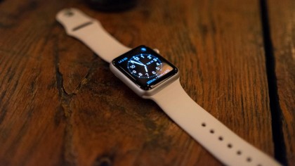
Is it worth that tough-to-swallow Apple Watch price? Well, beaming apps like Messages, Mail and every iPhone notification to an always-on-hand gadget is certainly a convenience.
I no longer retrieve my seemingly always-hiding iPhone 6 every time someone texts me, yet I can ping it whenever I really can’t find it, usually buried beneath the couch cushions. It’s the easiest way to find my iPhone yet.
What feels strange about writing this review is that there’s no point in really comparing it to Android Wear at all. Nobody chooses a smartwatch first and then decides on which phone to go with it – no, if you’re reading this review you’re probably either doing it on the iPhone or with one close to hand, wondering if it adds enough convenience to be worth the extra cost.
That convenience is seen in the large number of apps. Checking into a flight thanks to a wrist-mounted QR code sure beats scrambling for my phone or paper boarding pass.
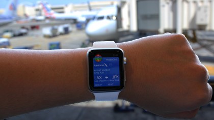
At least you’re still being active at the same time, with those steps being counted in the Apple Watch’s fitness app. It’s not the most comprehensive fitness tracker, but it lets me keep tabs on metrics like my steps walked, calories burned and heart rate. Surprise: I need to move more when I’m writing reviews.
But not having to fetch my phone for each and every vibration in my pocket is very much a luxury rather than a necessity, and not one every iPhone user needs – at least for the current asking price.
Why buy an Apple Watch?
Apple Watch is often oversimplified as an iPhone on your wrist, and almost everyone I have demoed it to has accidentally referred to it as “your phone.” Even I slipped up once.
It’s not an unreasonable comparison. The square-shaped smartwatch is like a mini iPhone; it lets me read emails, summon Siri and make and receive phone calls from my wrist.
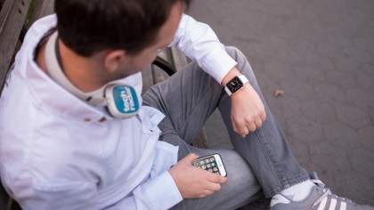
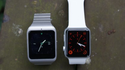
The size is just right too. While many Android Wear watches look and feel chunky to most, the 42mm Apple Watch fits my wrist much more unobtrusively.
An even smaller 38mm size is also available, though most people should for opt for the bigger of the two. It offers better battery life and more useable touchscreen space (but does come at a higher cost).
But do I need this Watch? On the one hand it’s been great to change my behavior, as too many times I have instinctively run to my phone, charging in another room, because it’s ringing or because the default SMS chime has turned me into one of Pavlov’s dogs.
How many times have I missed an important call or text? Just as important, how many times have I rushed to the phone and it was an unimportant telemarketing call or a friend replying with text that simply says “OK” to something I said three hours ago?
These missed connections and potential disappointments are less insufferable thanks to the Apple Watch and its ability to either pick up or dismiss these alerts in a tenth of a second.
Custom watch faces, like we’ve seen from Android Wear watches, are here (although only those that Apple makes, as it’s not permitting third parties to do the same thing, which sucks), as well as new exclusive technology like the pressure-sensitive Force Touch touchscreen.
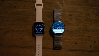
There are also a large number of Apple Watch apps already, including the easy-to-use Apple Pay in the US and frequently used Uber car hailing service, which aren’t available on Android Wear.
What’s missing?
There are plenty iPhone features that aren’t carried over to the wrist. Apple Watch is not a fully-fledged iPhone replacement.
It makes calls, but it can’t add new contacts. It listens to dictated texts and sends them as an audio message or transcription, but it doesn’t have any sort of edit function.
It tracks basic fitness goals, but not it’s GPS-enabled, doesn’t track sleep and third-party workout apps require an iPhone close by. Likewise, it can name songs through the Shazam app, but it listens with the iPhone microphone, not its own.
Having to carry a phone still is a weird disappointment to a lot of people who are missing the point of a current smartwatches. “Wait, I still need my phone?” is the response I’ve heard from baffled people. Of course you do. The Watch isn’t big enough for watching YouTube videos on its tiny display size and trying to comment on Facebook posts while pecking away on a teeny keyboard would be terrible.
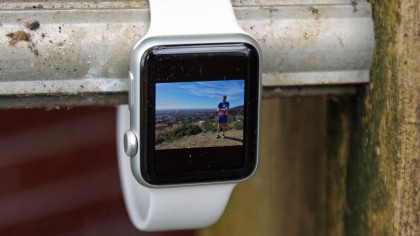
Who would want to don a giant watch capable of such specs or a large enough battery to run that? You still need an iPhone with you at all times, but you’ll use it less than before.
The bigger questions: can is do enough to be worth its price, and is it fashionable enough to wear everyday, by geek chic and non geeks alike? Let’s examine the design first.
Design and display
Apple’s build-up to the Watch’s launch was all about the style, how it was forged in Ive’s clean furnaces and made of angel tears (or something), and how it’s capable of replacing the emotional connection thousands of us have with our current timepiece.
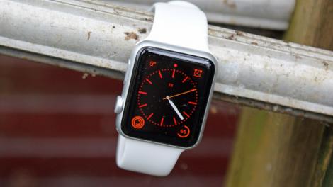
That really depends on who you ask and which Apple Watch you’re talking about. There are three models, the aluminum Sport, stainless steel Watch and gold Watch Edition.
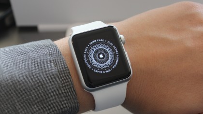
I’ve tried on every Apple Watch model, outside of the 18-karat gold Apple Watch Edition, before ordering, but I stuck with the entry-level 42mm aluminum Apple Watch Sport in white.
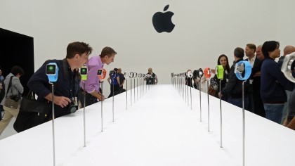
It’s the cheapest configuration slightly more comfortable than its two posh counterparts that are made of heavier steel and gold.
They vary in price and unnecessary weight more than they do in attractiveness, although when switching to the steel Watch with Milanese loop I found more people preferred the shiny exterior of the more expensive model.
But if lightness is what you’re after, the Sport’s anodized aluminum case and Ion-X glass make it 30% lighter. It’s 30g instead of the steel’s 50g, and gold’s 69g. That adds up on my wrist when I’m wearing this thing for 18 hours a day before the battery life is zapped.
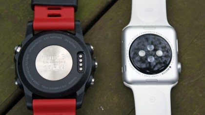
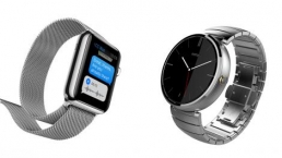
After a day of wearing the lightweight Apple Watch on my right wrist and a heavier Moto 360 on my left wrist – for testing purposes, I assure you – I almost couldn’t feel the Apple Watch. For the same test with the Garmin Fenix 3 when running – a much, much larger watch – I noted the same effect, showing Apple’s got the balance pretty right here.
Its aluminum frame matches the iPhone build and is therefore duller than the shiny stainless steel Apple Watch, but it still goes with a steel band like the Milanese Loop just fine.
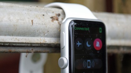
A bigger problem in the future may be that the Apple Watch Sport is missing the premium sapphire crystal glass, which is supposed to be almost scratch-proof. The good news is that the Ion-X glass substitute on the Sport model has proven resilient so far.
I’ve seen several “drop tests” videos of shattered Apple Watch Sport glass, but more relevant real-world tests would consist of minor wall and corner scraps for wearables. Geeky iPhone diehards whose equilibrium is off may want to spring for AppleCare just to be safe, but I’ve not seen a problem.
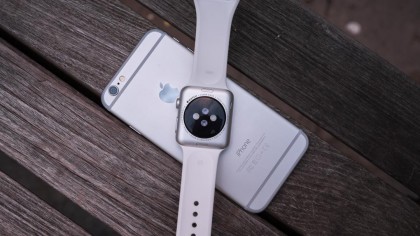
Everything else is the same among all the models. The case sits 10.5mm off of my wrist, slightly thicker than an Android Wear watch, but it has a stylishly curved glass and rounded off corners on the top, and a small bump to its black composite back’s heart rate sensor.
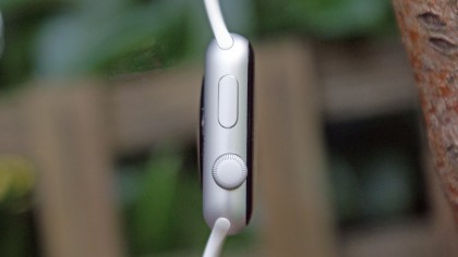
It’s reasonably thin for now, but I can already imagine Apple making a “world’s thinnest smartwatch” several times over for the Apple Watch 2 and beyond.
Its thickness does leave room for two large buttons, a classy sounding digital crown and an uninspiringly named “side button.” Both are located on the right side for twisting and pressing through menus. A microphone and speaker are on the left side.
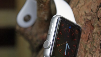
The Apple Watch Sport band is made of fluoroelastomer, which is Apple’s fancy way of saying synthetic rubber, which is supposed to be extremely durable. Time will tell.
The smooth strap, available in white, black, blue, green and pink colors, feels comfortable and is easier to buckle than any prong-clasped Fitbit I’ve tested. It tucks the excess band in a hole so that it hides behind the beginning the strap.
The difference between using the Sport model with the rubber strap and the Watch with Milanese loop felt like I was stepping up to a “proper” Watch. That’s more the band than the model itself, so a swift switch between the two (providing you outlay the high cost to buy another band) is fine to improve the look.
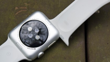
My watch came with two bands in the box, a larger and shorter size in the same white color. Changing the strap was incredibly simple and required no tooling, unlike the Moto 360. A secure fingernail tip-sized button underneath the watch releases each strap.
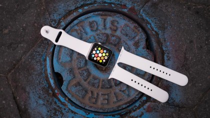
Although many Android Wear smartwatches work with third-party 22mm bands, the transition to a new Apple Watch band is more seamless. Cheaper third-party straps are also said to be on the way.
Overall, the design of the Apple Watch is probably the biggest thing it’s got going for it. As one of the first to walk around wearing this new timepiece, I felt both awesome early adopter as people asked in hushed tones to see the new Watch, and embarrassed as other would see me as having paid a large amount of money for something that doesn’t really do a huge amount yet, another follower of whatever Apple does just for the sake of owning it.
The truth was somewhere in the middle – and after a few months, both will die down and the idea of having a smartwatch on the wrist won’t seem so crazy, which will perversely help the Android Wear story too.
Display
Behind the Ion-X or sapphire glass of the Apple Watch sits a bright and colorful OLED. It’s sharper than other smart watches, most notably the pixelated LCD of the Moto 360.
It’s the right screen technology for smartwatches, as OLED displays draw much less battery when showing a darker screen. With OLED only the pixels used are turned on, and fewer pixels equals less battery drain.
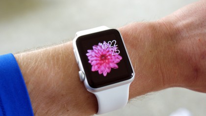
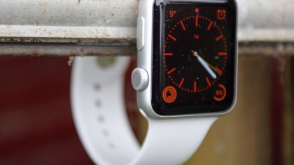
That’s why most of the Apple Watch faces are surrounded by deep black background. It also helps the colorful app icons and watch face element pop.
The 38mm Apple Watch resolution is 272 x 340, while a 42mm version is 312 x 390. The bigger display’s necessary extra power is offset by a larger Apple Watch battery.
Apple was able to design a sharp-looking flexible OLED display for the Watch, but it didn’t go as far as creating a circular screen for a truly classic watch look.
Last year’s Moto 360 did exactly that to the envy of iPhone owners who weren’t able to get in on the modern smartwatch craze outside of the first two Pebble watches.
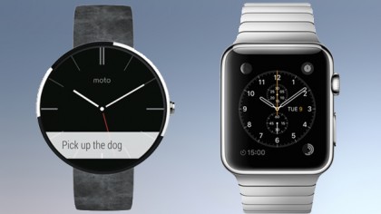
All of Apple’s flowery marketing rhetoric about reinventing the classic watch look – from digital crown to complications – didn’t also translate into that that traditional round watch look, which is one of my largest criticisms with the design. I appreciate that the square is better for interacting with the Watch, but with the apps interface being spherical and ‘traditional’ watches just look better when round.
Apple Watch is more colorful than its iPhone-connected rivals though, especially the new Pebble Time, and readable in all but the brightest sunlight. But it comes at the expense of its battery life.
Battery life and clever charging
Apple Watch is supposed to have 18 hours of battery life, which would translate into a full day if I were to ever keep to a normal sleeping schedule.
I was able to lengthen the uptime of my watch to a full 24 hours on days in which I didn’t make battery-taxing phone calls with it, or use the half-as-power-hungry heart rate monitor.
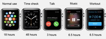
I’ll put it simply: I think Apple deliberately downplayed the battery life of its Watch to make sure it didn’t get hit with angry users should the numbers not stack up. I’ve had days where I’ve been for a couple of hours’ run and it’s still easily lasted the day, and not once in the week of testing did I get to the evening approaching critical levels of power.
Apple Watch depletes the battery in three hours if used for non-stop phone calls. Working out with the heart rate monitor or listening to music does the same in six hours. Conversely, just checking the time every so often boosts it to 48 hours.
But you’ll also need to think about the future here. Like Nokia’s old attempts at smartphones, the battery life on the Watch is good because you don’t find yourself wanting to play with it a lot because, well, it doesn’t do a whole lot right now.
That’s going to change though. As developers get their hands on the Watch and start making use of the inbuilt NFC or other sensors, you’ll find the battery life will drop faster as more apps start making a play for its reserves.
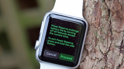
Talking of which, a 72-hour Power Reserve mode kicks in when the Apple Watch battery reaches 0% so that it doesn’t shut off completely. It only tells the time doesn’t keep the fancy watch face.
This sent me running to a charger since it does nothing else in this catatonic state. Making it even more perilous, it was actually a bit difficult to exit this catatonic state. The watch takes a solid minute and a half to reboot, which initially made me think I didn’t know how to reboot the device and was accidentally resetting it every time.
Power Reserve mode
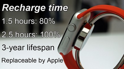
The official Apple Watch recharge time is 1.5 hours to 80% and and 2.5 hours to 100%. That’s a bit slower than the average smartwatch. Moto 360 charges up in 2 hours flat. But I’ve been able to completely recharge my Apple Watch in the same 2-hour window.
The 205mAh battery pack is predictably sealed into the device, and is smaller than the battery on other Android Wear devices.
My faster-than-expected charging time may be because, at 0%, the watch still has its limited time-checking Power Reserve state to go. I had charged the watch when it and entered this special mode, so it technically had some juice left to it.
Inductive charger
Apple Watch’s inductive magnetic charger takes cues from the company’s popular MagSafe chargers, which come with all MacBook Air and MacBook Pro computers (but not the New Macbook).
It combines a MagSafe magnet with an inductive charger for a wire-free solution. It helps when you’re in the dark or in tight situations, like a coach seat on an airplane, and need to simply clip on a charger and be done with it. Magnets, boss.
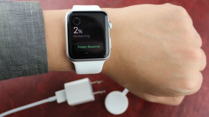
As much as I don’t like having yet another type of cable to carry around, it’s way better than the flimsy Pogo charger designs used by Pebble, LG, Samsung and others. It wire-free design also means that Apple Watch is sealed and is therefore water-resistant to a point.
Using the Watch day to day
There’s something a little more complicated about this shrunken Apple product compared to the now familiar iPhone and iPad. It took a few days to wrap my head around the interface, which is surprising for an Apple product. The Watch is nowhere near as intuitive as most will expect.
I immediately started receiving texts and emails on my wrist, as expected, and I could easily dismiss what wasn’t vital. This sudden flurry of notifications was actually welcomed. However, to do much with these alerts, I had to learn to bounce between three menus: watch face, app launcher and glances, and the methods of flicking between them doesn’t feel natural.
This learning for users curve exists because the software tries to do too much at once, and smartwatches offer extremely limited interface real estate. Plus, the Apple Watch is part of a brand new product category for everyone.
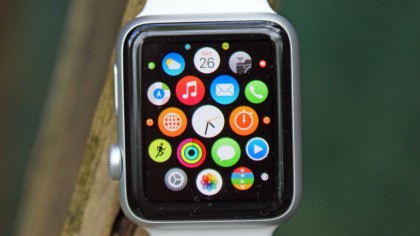
Remembering to swipe down to see my backlog of notifications or swipe up to see my pinned “Glances” widgets is complicated by the fact that this only works when in the watch face menu. It doesn’t work in any other app or the app launcher menu, where with the iPhone swiping up or down is pervasive.
Sometimes I hit the side button because it looks like the iPhone sleep/wake button only to realize that it brings up my contacts list. Pressing in the digital crown does the trick here. Double tapping the crown will switch between apps, but it’s a soft press and doesn’t always feel like it’s registered, and the easiest way to get back to time is to let the watch dangle by the wrist and then bring it back up again.
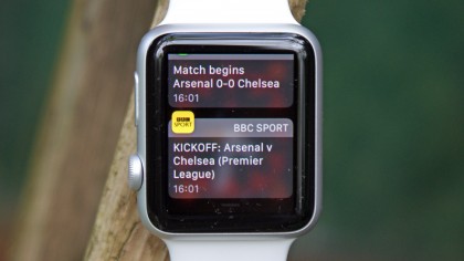
That’s not intuitive, and is the sort of thing that gives the Watch naysayers (of which there appear to be a few) ammunition when you’re having to jump through hoops just to tell them the time on your watch.
There’s also the issue of slowdown that flickers intermittently throughout Watch use, with opening the settings menu the biggest offender. Hit the teeny icon (you can scroll the digital crown to make things bigger, but that feels like an odd extra step) and you’re greeting with icons that have no words next to them, and a couple of seconds later everything blinks into view.
The same happens with most lists, where using the digital crown to scroll through is fluid, using the finger (the more intuitive way to do things) lags and jumps a bit.
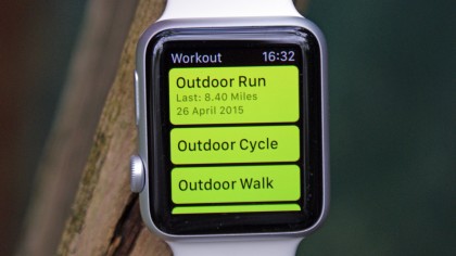
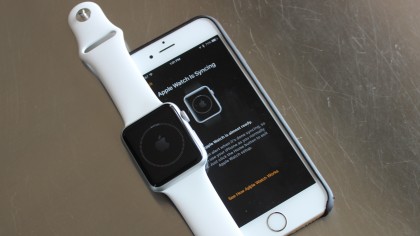
As first generation software, it’s just not always as intuitive as it could be. Luckily, the setup is fairly seamless. I booted up my iPhone’s Watch app, which came with iOS 8.2, and it asked me to take a photo of my new Apple Watch. Done. It was paired.
Syncing my existing apps happened automatically too, but took a couple of minutes. After that, I was able to customize my watch face and load up a springboard of circular apps. The device connects using a weird fusion of Wi-Fi and Bluetooth, but unlike the phone, you can’t use Bluetooth when the Watch is in flight mode, which makes Bluetooth music streaming a no-no when in mid-air.
The My Watch menu within the iPhone companion app is astonishingly complex, which may end up being a good thing once I get the hang of it but will displease Apple fans who crave simplicity, where the thing just works.
I can disable notifications for specific apps and just about every setting can be mirrored from the iPhone or be set up individually, from Do Not Disturb to Messages notifications. Texts can repeat twice all the way up to ten times if I hate myself.
Apple Watch doesn’t contain all of the intricate gears of a Swiss watch, but it has a lot of moving parts to its software. It has taken a few days to learn and configure to my liking, but I feel as though the less-interested iPhone audience, like my new smartphone-owning parents, needs to wait until it’s further refined and more apps come to the Apple Watch app store.
A brilliant new breed of apps
The Apple Watch needs a headline feature, and while it doesn’t really have it yet (beyond sending random pictures to other Watch-wearers) the apps that live on it are going to be the real reason to buy one.
Sure, they’re not there yet, but the in-built choices and first goes from third parties are pretty good already, meaning this is a device with a lot of potential.
Watch faces
Apple’s watch faces take advantage of the pressure sensitive Force Touch display. Holding down on the glass, with a bit of exertion, zooms out of the current watch face and loads up a gallery of faces, from the information-packed Modular to the toe-tapping Mickey Mouse. Utility ended up being my favorite because it was simple, yet fit all of my customizations.

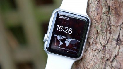
These let me insert information snippets onto the watch face, such as the full date, my next calendar appointment or the sunrise and sunset time if I really wanted to know daily. Most faces make room for smaller, pre-select spaces in the corners too. These let me display the critical Apple Watch battery life percentage, my daily fitness graph and the time in another city, which has been great for traveling.
There are “millions” of combinations, according to Apple, but these custom pre-determined spaces can’t be moved around and, in reality, there are just ten faces. Apple has yet to open up its watch face API to developers and it’s currently banning third-party faces.
Apple has to catch up to Android Wear here as it’s one of the things I love about Android Wear (the Goldeneye and PacMan faces are real crowd pleasers) and if Apple is serious about making the Watch personal, being able to choose more faces is a must.
Built-in apps
Apps, on the other hand, are open to developers, and it shows. There are loads are launch, and the best Apple Watch apps are those from Apple itself. Siri answered my basic questions, like “who is the governor of New York” and “when in the next Phillies game.” Anything more in-depth than that, and the silent virtual assistant proposes you “handoff” to your iPhone.
Apple’s built-in timer let me set the timer for cooking and the laundry, without requiring me to take out my iPhone (which were in my other jeans).
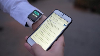
Passbook worked flawlessly at the airport (although be prepared for the ‘Early Adopter’ syndrome when you try and check in at a desk where the attendant has no idea why you want to use your watch) and Apple Pay enabled me to buy food at McDonald’s (for testing purposes) while I continued to play on my smartphone.
Apple Pay on a phone? That’s so 2014.
We’re still waiting for the payment to come to markets other than the US, with the UK set to receive the update sometime in 2015, so that function isn’t going to be of use to everyone.
But a real USP of the Watch would be that runners who have left the phone at home can still get vital hydration or a ride home in an emergency thanks to the contactless capabilities of the Watch.
Well, that’s if I’d ever use the Apple Watch as a standalone running device, which I’d struggle to at the moment (more on that later).
There’s no camera on the Apple Watch, but it doesn’t have a Camera Remote app that let me snap photos remotely in conjunction with my iPhone’s iSight camera. That was handy, unlike the actual Photos app, which was a tiny way to look at your photos from the phone.
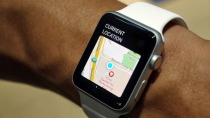
The watch isn’t a particular visual experience and it’s restricted by its 8GB of internal storage (with about 6GB available), with Music running into the same dilemma, so controlling your iPhone’s music collection is a better choice.
That said, you can pair a set of Bluetooth headphones and tell your iPhone to shove some of your playlists over to the Watch. However the most you can have on there is 2GB of music (which you have to change from the 1GB default) so this is no iPod replacement.
It’s good for music when you’re out running though, and is a nice touch from Apple letting you choose between the phone and Watch for audio pleasure.
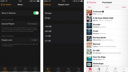
Apple Maps on Apple Watch let me navigate the streets of New York City without forcing me to foolishly take out my iPhone at every new turn, like a tourist. The iPhone app also opened up in my pocket, just in case I needed to change up the directions or see the route in full. No, there sadly isn’t a native Google Maps app here and no metro directions. Maybe with iOS 9.
Calls and messages
Calling someone through an Apple Watch isn’t the most ideal way to talk to chums, especially in a noisy environment. It sounds like a speaker phone with a little more static. But it works well in an otherwise quiet location or when your phone is two floors above you.
The Apple Watch side button leads to a dedicated “favorite contacts” menu, which let me text and call my friends and family.
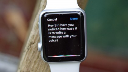
I found sending a speech-to-text transcription a bit easier on the Apple Watch than any Android Wear watch. Apple’s way of doing it doesn’t rudely cut me off and hurriedly send a broken text message when I stop mid-sentence. I actually get to think about what I want to say. I value that distinction.
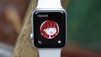
Apple Watch users have the added bonus of including very simple sketches and attention-grabbing taps to other Watch owners using the timepiece’s Taptic feedback vibration. Heartbeats can also be exchanged for what may be the weirdest / creepiest Apple Watch feature.
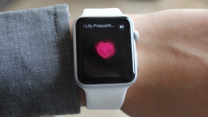
It’s novel at first, but after receiving my tenth heartbeat from the same few People Watch owners, it has become fairly annoying.
Third-party apps
Apple Watch apps from developers are hit or miss when it comes to design and performance. I can request a car with Uber, receive breaking news alerts from CNN and track my lost wallet with the Title app on Apple Watch. But many of them are read-only apps. Instagram is here, but you can only see a few recent posts and comments are limited to emojis at the moment.
Twitter, the New York Times and Nike+ Running made the jump to Apple Watch, but a number of other essential third-party apps are missing, at least in native form. This includes Facebook, Google Maps and the iOS Gmail app, which forced me to switch back to Apple’s default mail app.
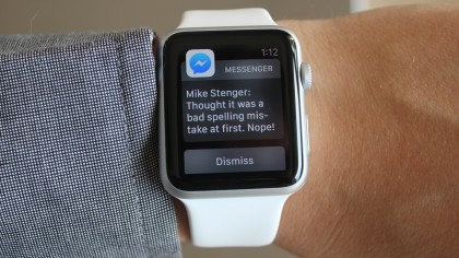
Sure, Facebook main app notifications pop up on the watch, as do emails snippets from the Gmail app, but seeing anything beyond “Lily posted a comment on your timeline” or reading the full email requires an iPhone for now. Worse, getting two Facebook comments or emails makes it even more vague.
“You have two messages.” That’s less than helpful, Apple Watch. Thanks. This is unlike Instagram’s native app or Apple’s built-in Mail app with interactive controls on the wrist.
Many third-party apps need to load faster and include finer controls that go far beyond “Show App on Apple Watch.” This is up to developers and over time I’m sure some really great apps will begin to appear that take advantage of this new tech location.
Running and fitness tracking
Apple Watch isn’t a fitness band, watch or fashion accessory, despite taking a bit from each of those camps. It’s hard to define what it really is, which means that users may struggle to justify the purchase.
What has saddened me in the time since launch is finding out that Apple won’t be selling it properly into the health market. Apparently early tests to add in a stress sensor and blood pressure monitor failed, (beautifully partly because of hairy arms) so the Apple Watch – at least version one – will be a cut down version of what it could have been.
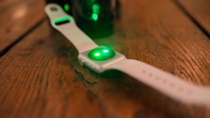
The fitness tracking is comprehensive (in as much a fitness tracker can be) in that it wants you to exercise for 30 minutes per day, stand for at least a minute for 12 hours and burn enough calories every 24 hours. It’ll also tell you steps and distance travelled, which is a staple of the tracker.
But like these trackers, it’s pointless. I’m not saying that it doesn’t help clue you in on sedentary habits, but nearly every person who isn’t already active, but would like to be, will go through these phases: jumping to attention whenever the Watch tells them to stand, poring over their data to see how well they’ve done and making sure all the rings get filled.
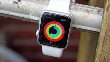
Until the day they don’t. Then a sense of guilt wanders in. So our hero promises to redouble their efforts, walking further the next day to make up for it. Except they inevitably slip again and then guilt roars higher. Then it’s a couple of days with unfilled rings, and the nudges from the Watch become unfriendly. Why have you bought something that’s telling you that you’re not fulfilling your goals all day long?
The Watch also constantly told me to stand up just minutes after sitting down, which gave me very little trust in the app.
I know this is an extreme case, and many people are capable of ignoring the messages, but that misses the point. While a device that can act like a coach is good, if it was a person the goals would change each day. They’d be linked to a challenge, would increase or vary over time – it would give victory to this gamification.
And that’s the very, very big problem I have with the Apple Watch when comparing it to a running watch: it’s far too basic to be considered a rival to a Garmin or Polar device, and for the new user it doesn’t have any way of helping you get fitter.
Starting up the Workout app and you’ve got a pleasing amount of options to choose from, with elliptical and rowing machines bound to attract those people that “always mean to use them things at the gym.”

But running is the main focus, with Apple joining up with Christy Turlington-Burns to show how she trained for the London Marathon using the Apple Watch.
Perhaps she honestly did the entire time, but she would probably have wished for a more in-depth device during the training. The Apple Watch will ask you how many calories you wish to burn, how far you’d like to go or how long you’d like to run for (or just an open-ended goal) and then off you pop, with rings appearing to let you know how close to your goal you are.

But that’s it. And it’s up to you to improve, with “beating your best time / burn / distance” the only thing the Apple Watch will let you do. If this is for the beginner then it should be giving you different workouts to keep things interesting, helping you progress to improved running power.
There are so many apps out there which can do the same thing, so why can’t Apple nail this area? There’s also the fact GPS isn’t on board, so unless the phone is tethered you won’t get accurate data.
Actually, even with the phone in a bag, pocket or pouch the GPS is still a little on the generous side, compared the Garmin Fenix 3 which I tested against. Over a 5KM run, the Garmin was a shade under the distance, but Apple added another 160m onto the distance.
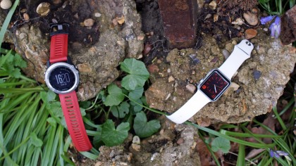
The heart rate monitor is also not up to the task. It needs a much tighter fit than the Watch seems to be able to offer and when running, and checking to see how hard I was working, the monitor constantly showed a much higher BPM than the chest strap was showing.
This means users will get erratic results, and it’s not possible to tell when you’re overtraining and the heart rate soars at low levels of exercise, which again makes the Apple Watch not great for training if you don’t invest a little.
One thing that did impress me is that it can connect to sensors, so adding in a heart rate monitor like the Wahoo Tickr X, which can connect to nearly every device going, which instantly improved the health chops of the Apple Watch.
But having to fork out to improve a certain area when you’ve already paid so much for the Watch isn’t going to impress everyone.
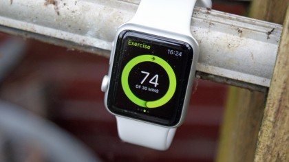
You can use other apps here but they won’t work without the phone connected, which again makes them slightly redundant. That said, for those running with a phone religiously bandaged to their arm (which is a lot of people) the second screen on the wrist is a really nice addition, opening up your pace and distance info in real time when before you wouldn’t know anything until you finished your jaunt.
All this leaves me feeling like the Apple Watch 3 will be a brilliant running watch, when there are enough sensors and apps from third parties can use them to bring all the power of their standalone devices to the wrists of people who don’t really care about running, Trojan Horsing a clever running plan into their lives.
But for now, it’s hard to recommend the Watch as a fitness device unless all you want to do is be poked to stand up once in a while.
Verdict
The constant question I had when writing this review is: what’s the Apple Watch actually for? It’s one thing to get one in for a review, another when you’ve got no reason to buy one other than it looks a bit fancy.
The Apple Watch both surprised and disappointed in that respect, with some things impressing me with their intuition (being able to add in heart rate monitors was a nice touch, and the overall polish of the interface on the OLED display wasn’t something I was expecting from a first gen product).
Some things didn’t work as well as I’d have liked (I was surprised that the interface was so fiddly for an Apple product) but they were relatively few.
We liked
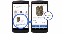
The overall look and feel of the Apple Watch, as with most products from Cupertino, was a major plus for me. The last thing you want is a watch that you have to apologize for visually just so you can find out when Ebay has found some things you might like to bid on without having to get your phone out of the pocket.
Having used a number of smartwatches over the last two years, there’s something about the slickness of the Apple Watch that appeals. Yes, it doesn’t do a huge amount right now, but no smartwatch does, and Apple is primed to get the best of the developers’ produce – in just the same way as the iPhone and iPad did – to get the apps that will really supercharge the Watch.
And once you’ve bought the Watch and got over the high price, it is a genuinely useful thing to have around at times. Being able to check when you’ve got a message or see who’s calling and be able to make snap decisions feels like the future, especially when exercising or in another situation where grabbing your phone isn’t easy.
We disliked
The Apple Watch feels exactly like you’d expect it to: a first attempt. Apple’s fused its own design ethos with the limited technology around at the moment to make a compelling smartwatch – but it’s still a smartwatch, a device that doesn’t really have an easy answer when your pals ask ‘So, what’s so good about that?’.
The fact the time isn’t always showing on the face isn’t brilliant either – while the wrist raise is among the most infallible I’ve encountered, there are still times when I’m lying down, want to know the time and have to tap the watchface to find out.
When the old technology beats the new, that’s where a problem needs to be solved.
And while I find it hard to even bang the ‘Apple has made a product that costs more than it should’ drum again, this is still a very expensive luxury. You don’t need it in the same way a smartphone is a necessity, and unlike the iPad, it’s more expensive than the competition by some distance.
The fitness angle feels underpowered at the moment too – there’s a lot of potential there, but the Apple Watch is not something I’d recommend to anyone that’s serious about getting into shape… unless they’re desperate for all the other elements this device offers too.
Final Verdict
For iPhone users desperate for a smartwatch, the Apple Watch is perfect for you. It relays some iOS apps and all notifications to my wrist without requiring me to constantly pull out and unlock my phone, and that’s a nicely convenient thing to have.
This concept is going to become more useful when the hype dies down and new apps emerge, as the best smartwatches work better as an unexciting fashion piece or fitness tracker that fades into the background.
That contrasts with an iPhone or an iPad that you constantly pull out to play with in an idle few minutes, and ironically by being better connected with the Watch you’ll hopefully start to rid yourself of the smartphone addiction. If you’re asking why it can’t play YouTube or take photos, you’re really missing the point.
It’s a time-telling and time-saving convenience, though one that still requires a nearby iPhone and a hefty sum to buy. The Apple Watch price is rightfully getting mixed reviews from fans. That’s why I ultimately recommend the cheapest aluminum Apple Watch Sport with another band for the moments when you want to look more ‘grown up’.
It has same dimensions, functionality and battery life as the pricey steel and gold models and when you look lustily at the inevitably improved Apple Watch 2, you won’t lose as much money when you stuff this one straight on Ebay.
![]()
Related Posts
December 6, 2021
7+ Web Design Trends for 2022: Which Will You Use?
December 6, 2021
The 10 Best WordPress Booking Plugins to Use On Your Website
December 6, 2021
How to Use a Web Cache Viewer to View a Cached Page
November 6, 2021
10 Modern Web Design Trends for 2022
November 6, 2021
Best Free SSL Certificate Providers (+ How to Get Started)
November 6, 2021
How to Design a Landing Page That Sends Conversions Skyrocketing
November 6, 2021
What Are the Best WordPress Security Plugins for your Website?
October 6, 2021
Your Guide to How to Buy a Domain Name
October 6, 2021
How to Build a WordPress Website: 9 Steps to Build Your Site
September 6, 2021
10 Best Websites for Downloading Free PSD Files
September 6, 2021
HTML5 Template: A Basic Code Template to Start Your Next Project
September 6, 2021
How Much Does It Cost to Build a Website for a Small Business?
September 6, 2021
A List of Free Public CDNs for Web Developers
September 6, 2021
6 Advanced JavaScript Concepts You Should Know
August 6, 2021
10 Simple Tips for Launching a Website
August 6, 2021
25 Beautiful Examples of “Coming Soon” Pages
August 6, 2021
10 Useful Responsive Design Testing Tools
August 6, 2021
Best-Converting Shopify Themes: 4 Best Shopify Themes
July 6, 2021
What Is Alt Text and Why Should You Use It?
July 6, 2021
24 Must-Know Graphic Design Terms
June 6, 2021
How to Design a Product Page: 6 Pro Design Tips
April 6, 2021
A Beginner’s Guide to Competitor Website Analysis
April 6, 2021
6 BigCommerce Design Tips For Big Ecommerce Results
April 6, 2021
Is WordPress Good for Ecommerce? [Pros and Cons]
March 6, 2021
Make Websites Mobile-Friendly: 5 Astounding Tips
March 6, 2021
Shopify vs. Magento: Which Platform Should I Use?
March 6, 2021
Top 5 Web Design Tools & Software Applications
February 6, 2021
Website Optimization Checklist: Your Go-To Guide to SEO
February 6, 2021
5 UX Design Trends to Dazzle Users in 2021
February 6, 2021
What Is the Average Page Load Time and How Can You Do Better?
February 6, 2021
Choosing an Ecommerce Platform That Will Wow Customers
February 6, 2021
7 Best Practices for Crafting Landing Pages with Forms
February 6, 2021
7 B2B Web Design Tips to Craft an Eye-Catching Website
January 6, 2021
Mobile-Friendly Checker | Check Your Site’s Mobile Score Now
January 6, 2021
8 Tips for Developing a Fantastic Mobile-Friendly Website
December 6, 2020
How to Add an Online Store to Your Website [4 Ways]
December 6, 2020
5 UX Design Tips for Seamless Online Shopping
November 6, 2020
Ecommerce Website Essentials: Does Your Site Have All 11?
November 6, 2020
5 Small Business Website Essentials You Need for Your Site
November 6, 2020
Your Website Redesign Checklist for 2020: 7 Steps for Success
May 1, 2020
Psychology of Color [Infographic]
April 21, 2020
How to start an online store that drives huge sales
January 3, 2020
5 Lead Generation Website Design Best Practices
March 6, 2019
6 Reasons You Should Redesign Your Website in 2019
March 6, 2019
7 Web Design Trends for 2019
February 19, 2019
Who owns the website/app source code, client or developer
February 7, 2019
Don’t Let Your Domain Names Expire in 2019
January 8, 2019
2019 Website Development Trends To Note
October 6, 2017
How Web Design Impacts Content Marketing
October 6, 2017
How to Choose a Navigation Setup
August 6, 2017
Why User Experience Matters to Marketing
July 6, 2017
5 Ways Web Design Impacts Customer Experience
September 6, 2016
How to Learn Angular
September 6, 2016
The Excuses for Not Having a Website (Infographic)
September 6, 2016
How to Build an Award-Winning Web Design Team
September 6, 2016
13 Free Data Visualization Tools
August 6, 2016
How Selling Pastries Helped Us Design a Better Product
August 6, 2016
11 Sites to Help You Find Material Design Inspiration
July 4, 2016
How to change free wordpress.com url
April 6, 2016
The 5 Best Free FTP Clients
April 6, 2016
7 Free UX E-Books Worth Reading
March 6, 2016
Can Handwritten Letters Get You More Clients?
December 10, 2015
Star Wars Week: How to create your own Star Wars effects for free
December 6, 2015
20 "Coming Soon" Pages for Inspiration
December 6, 2015
6 Free Tools for Creating Your Own Icon Font
December 6, 2015
9 Useful Tools for Creating Material Design Color Palettes
November 6, 2015
20 Free UI Kits to Download
November 6, 2015
50 Web Designs with Awesome Typography
November 6, 2015
When to Use rel="nofollow"
November 6, 2015
7 Free Books That Will Help You Become More Productive
November 6, 2015
50 Beautiful One-Page Websites for Inspiration
November 6, 2015
Circular Images with CSS
October 6, 2015
Lessons Learned from an Unsuccessful Kickstarter
October 6, 2015
5 Games That Teach You How to Code
October 6, 2015
Cheatsheet: Photoshop Keyboard Shortcuts
October 6, 2015
An Easy Way to Create a Freelance Contract for Your Projects
October 6, 2015
50 Design Agency Websites for Inspiration
September 29, 2015
JB Hi-Fi shutting the book on ebooks
September 24, 2015
Opinion: Quick, Quickflix: It's time to give yourself the flick
September 24, 2015
New Star Wars 360-degree video is among first on Facebook
September 21, 2015
Apple purges malicious iPhone and iPad apps from App Store
September 12, 2015
Apple's new Live Photos feature will eat up your storage
September 12, 2015
The latest Windows 10 Mobile preview has been delayed
September 12, 2015
IBM buys StrongLoop to add Node.js development to its cloud
September 8, 2015
Fake Android porn app takes your photo, then holds it ransom
September 6, 2015
50 Restaurant Websites for Inspiration
September 6, 2015
Zero UI — The Future of Interfaces
September 6, 2015
50 Beautiful Websites with Big Background Images
September 6, 2015
Infographic: 69 Web Design Tips
September 6, 2015
Free Windows 10 Icons
September 2, 2015
Instagram turns itself into a genuine messaging service
August 11, 2015
In Depth: How Microsoft taught Cortana to be more human
August 11, 2015
Windows 10 price, news and features
August 11, 2015
Windows 10's broken update introduces endless reboot loop
August 11, 2015
Windows 10 races to 27m installs
August 11, 2015
Windows 10 IoT Core gets first public release
August 10, 2015
iOS Tips: How to backup iPhone to an external drive
August 10, 2015
Windows 8.1 RT finally getting Windows 10 Start Menu
August 10, 2015
How to use Windows Hello
August 10, 2015
Review: Moto Surround
August 10, 2015
Review: Moto G (2015)
August 9, 2015
8 of the best free VPN services
August 8, 2015
Use Firefox? Mozilla urges you update ASAP
August 7, 2015
Mac Tips: Apple Mail: How to remove the Favorites Bar
August 7, 2015
How to make the OS X dock appear faster
August 7, 2015
Review: BQ Aquaris E45 Ubuntu Edition
August 7, 2015
Review: Acer Liquid Jade Z
August 6, 2015
How to reinstall Linux
August 6, 2015
How to reinstall Windows
August 6, 2015
Updated: Apple Music: release date, price and features
August 6, 2015
Social News Websites for Front-End Developers
August 6, 2015
10 Free JavaScript Books
August 6, 2015
50 Beautiful Blog Designs
August 6, 2015
Animated SVG Pipes Effect
August 6, 2015
Launching Your First App
August 5, 2015
Windows 10 goes freemium with paid apps
August 5, 2015
Updated: Week 1 with Windows 10
August 5, 2015
Mac Tips: How to manage Safari notifications on Mac
August 5, 2015
Microsoft Sway may kill the PowerPoint presentation
August 4, 2015
Microsoft gives Outlook on the web a new look
August 4, 2015
Mac OS X vulnerable to new zero-day attack
August 4, 2015
Windows 10 users warned of two scams
August 4, 2015
Microsoft's Docs.com is now available to everyone
August 3, 2015
Mac Tips: How to edit the Favorites sidebar on Mac
August 3, 2015
Updated: Windows 10 price, news and features
July 29, 2015
Review: HP ProDesk 405 G2
July 29, 2015
Hands-on review: HP Elite x2 1011
July 29, 2015
Hands-on review: Updated: Windows 10 Mobile
July 29, 2015
Review: Updated: Nvidia Shield Android TV
July 28, 2015
LIVE: Windows 10 launch: Live Blog!
July 28, 2015
How to prepare for your upgrade to Windows 10
July 28, 2015
Review: Updated: Windows 10
July 28, 2015
Review: Updated: HP Pro Tablet 608
July 28, 2015
Review: Heat Genius
July 28, 2015
Hands-on review: Moto X Play
July 28, 2015
Hands-on review: Moto X Style
July 28, 2015
Hands-on review: Moto G (2015)
July 28, 2015
Review: 13-inch MacBook Air (early 2015)
July 28, 2015
Hands-on review: OnePlus 2
July 28, 2015
Review: LG 65EG960T 4K OLED
July 28, 2015
Mac Tips: How to share printers on Mac
July 27, 2015
Apple Music's arrival hasn't opened Pandora's box
July 26, 2015
Review: Garmin Swim
July 25, 2015
How to merge OS X contacts into an existing list
July 25, 2015
Hands-on review: UPDATED: ZTE Axon
July 24, 2015
Mac Tips: How to zoom in on a Mac
July 24, 2015
What Windows 10 means for the enterprise
July 24, 2015
Review: JBL Charge 2 Plus
July 24, 2015
Review: Acer Aspire S7
July 24, 2015
Review: Updated: Canon G3 X
July 24, 2015
Review: Updated: iPad Air 2
July 24, 2015
Review: Thinksound On1
July 24, 2015
Review: Asus Chromebook Flip
July 24, 2015
Review: Garmin Forerunner 225
July 23, 2015
Review: Garmin nuvi 68LM
July 23, 2015
Review: Samsung Galaxy S6 Active
July 23, 2015
Review: Bowers and Wilkins P5 Wireless
July 23, 2015
Review: Dell XPS 15 (2015)
July 21, 2015
Review: Fuji S9900W
July 21, 2015
Review: Updated: Fitbit Surge
July 21, 2015
Review: UE Roll
July 21, 2015
Hands-on review: Ubik Uno
July 20, 2015
Review: Samsung HW-J650
July 20, 2015
Updated: 40 best Android Wear smartwatch apps 2015
July 20, 2015
Review: Acer Chromebook C740 review
July 20, 2015
Review: Huawei Talkband B2
July 20, 2015
Review: Dell Venue 10 7000
July 20, 2015
Review: Intel Core i7-5775C
July 17, 2015
Mac Tips: How to delete locked files on Mac
July 17, 2015
Review: Pebble Time
July 16, 2015
Microsoft just made Windows XP even less secure
July 16, 2015
Windows 8.1 RT is getting an update this September
July 16, 2015
OS showdown: Windows 10 vs Windows 8.1 vs Windows 7
July 16, 2015
Review: Acer CB280HK
July 15, 2015
Windows 10 is ready for new laptops and PCs
July 15, 2015
Explained: How to take a screenshot in Windows
July 15, 2015
Office for Windows 10 appears in latest build
July 14, 2015
Review: ZTE Axon
July 14, 2015
Review: ViewSonic VP2780-4K
July 14, 2015
Hands-on review: SanDisk Connect Wireless Stick
July 14, 2015
Review: Oppo PM-3
July 14, 2015
Review: BT 11ac Dual-Band Wi-Fi Extender 1200
July 14, 2015
Review: Fuji X-T10
July 13, 2015
How to build an SEO strategy for your business
July 13, 2015
Review: Lenovo ThinkPad Yoga 15
July 13, 2015
Review: Audio-Technica ATH-MSR7
July 13, 2015
Review: Garmin NuviCam LMT-D
July 13, 2015
Review: Dell Inspiron 13 7000
July 13, 2015
Hands-on review: AstroPi SenseHAT
July 13, 2015
Hands-on review: EE Rook
July 13, 2015
Hands-on review: Updated: HTC Vive
July 12, 2015
Here's the ultimate software list for PC fanatics
July 10, 2015
How to use the new Photos app for Mac
July 10, 2015
Windows 10 Insider Preview Build 10166 available now
July 10, 2015
Splunk spends big on cybersecurity acquisition
July 10, 2015
Making Windows 10 apps just got a whole lot easier
July 10, 2015
Review: Lenovo LaVie Z 360
July 9, 2015
OS X El Capitan public beta available right now
July 9, 2015
Microsoft finally unveils Office 2016 for Mac
July 9, 2015
Review: Updated: Chromecast
July 9, 2015
Review: Updated: Tesco Hudl 2
July 9, 2015
Review: Lenovo ThinkPad E550
July 9, 2015
Review: Updated: Google Nexus 6
July 8, 2015
What you need to know about Windows Server 2016
July 7, 2015
Microsoft to hike enterprise cloud pricing
July 6, 2015
Hacking Team end up being totally 0wned
July 6, 2015
Review: HP Pro Slate 12
July 6, 2015
Review: Samsung 850 Pro 2TB
July 6, 2015
Review: Asus RT-AC87U
July 6, 2015
Review: Jawbone UP2
July 6, 2015
Reimagining the Web Design Process
July 6, 2015
50 Clean Websites for Inspiration
July 6, 2015
15 Free Books for People Who Code
July 6, 2015
Web Storage: A Primer
July 6, 2015
A Look at Some CSS Methodologies
July 3, 2015
6 Essential Mac Mouse and Trackpad Tips
July 2, 2015
How to install a third party keyboard on Android
July 2, 2015
Review: UPDATED: Asus Zenfone 2
July 2, 2015
Review: Alienware 13
July 2, 2015
Review: HP DeskJet 1010
July 1, 2015
5 issues we want Apple Music to fix
June 13, 2015
Cortana will get its own button on Windows 10 PCs
June 12, 2015
Windows 10 will come with universal Skype app
June 12, 2015
iPad music production: 18 Best apps and gear
June 12, 2015
Windows 10 all set for early enterprise struggle
June 12, 2015
Review: Garmin VIRB Elite
June 11, 2015
Review: Updated: Nvidia Shield Tablet
June 11, 2015
Review: Nokia Lumia 635
June 10, 2015
Microsoft brings more online tweaks to Office 365
June 10, 2015
Mac Tips: How to use Screen Sharing in Mac OS X
June 9, 2015
Hands-on review: Meizu M2 Note
June 9, 2015
Hands-on review: EE 4GEE Action Camera
June 9, 2015
Review: Toshiba 3TB Canvio external hard drive
June 9, 2015
Review: Olympus SH-2
June 8, 2015
Hands-on review: Updated: Apple CarPlay
June 8, 2015
UPDATED: iOS 9 release date, features and news
June 8, 2015
Review: Updated: Roku 2
June 8, 2015
Review: Updated: PlayStation Vue
June 8, 2015
Review: Dell PowerEdge R730
June 8, 2015
Review: Canon SX710 HS
June 7, 2015
UPDATED: iOS 9 release date, features and rumors
June 7, 2015
Review: Lenovo S20-30
June 6, 2015
Free Writing Icons
June 6, 2015
15 CSS Questions to Test Your Knowledge
June 6, 2015
The Best CSS Reset Stylesheets
June 6, 2015
How CSS Specificity Works
June 5, 2015
'Delay' is a new feature in Windows 10
June 5, 2015
Review: Beyerdynamic Custom One Pro Plus
June 5, 2015
Latest SEO Marketing tools
June 5, 2015
Review: Nvidia Shield Android TV
June 5, 2015
Review: Honor 4X
June 5, 2015
Review: In Depth: Oppo R5
June 3, 2015
Hands-on review: Huawei P8 Lite
June 3, 2015
How To: How to create eBooks on a Mac
June 3, 2015
Review: Updated: Tidal
June 3, 2015
Review: Canon 750D (Rebel T6i)
June 2, 2015
Review: Updated: Asus ZenWatch
June 2, 2015
Review: Alcatel OneTouch Idol 3
June 2, 2015
Review: Updated: Nokia Lumia 1520
June 2, 2015
Review: Updated: Yotaphone 2
June 2, 2015
Review: Updated: Nokia Lumia 625
June 2, 2015
Review: Creative Muvo Mini
June 1, 2015
Review: Acer TravelMate P645 (2015)
June 1, 2015
Hands-on review: Corsair Bulldog
May 29, 2015
In Depth: NetApp: a requiem
May 29, 2015
July is looking definite for Windows 10 release
May 29, 2015
Hands-on review: Google Photos
May 28, 2015
Mac Tips: The 16 best free GarageBand plugins
May 28, 2015
Review: Canon 760D (Rebel T6s)
May 27, 2015
Review: Lenovo Yoga 3 14
May 27, 2015
Hands-on review: Serif Affinity Photo
May 27, 2015
Review: Garmin Vivoactive
May 26, 2015
Review: Datacolor Spyder5 Elite
May 26, 2015
Hands-on review: Sony Xperia Z3+
May 26, 2015
Review: Epson BrightLink Pro 1410Wi
May 26, 2015
Review: Technics Premium C700
May 26, 2015
Review: Canon EOS M3
May 26, 2015
Review: Updated: HTC One M9
May 26, 2015
Review: Updated: Sony Xperia Z3 Compact
May 25, 2015
Review: Updated: New Nintendo 3DS
May 25, 2015
Updated: 50 best Mac tips, tricks and timesavers
May 25, 2015
Updated: Windows email: 5 best free clients
May 25, 2015
Instagram is planning to invade your inbox
May 25, 2015
Review: Updated: Foxtel Play
May 24, 2015
How Windows 10 will change smartphones forever
May 24, 2015
Review: Vodafone Smart Prime 6
May 24, 2015
Review: Updated: iPad mini
May 22, 2015
Office Now may be Cortana for your work life
May 22, 2015
Review: Updated: Lenovo Yoga 3 Pro
May 22, 2015
Review: Microsoft Lumia 640 LTE
May 22, 2015
Review: Updated: Fitbit Flex
May 21, 2015
Updated: Best free Android apps 2015
May 21, 2015
Review: Asus ZenBook Pro UX501
May 21, 2015
Review: Sennheiser Momentum In-Ear
May 20, 2015
Hands-on review: UPDATED: Asus Zenfone 2
May 20, 2015
OS X 10.11 release date, features and rumors
May 18, 2015
Updated: Best free antivirus software 2015
May 18, 2015
iPhone 6S rumored to launch as soon as August
May 18, 2015
Microsoft ready to pounce and acquire IFS?
May 17, 2015
5 of the most popular Linux gaming distros
May 16, 2015
Review: Acer Chromebook 15 C910
May 16, 2015
Review: Lenovo ThinkPad X1 Carbon (2015)
May 16, 2015
Review: Polk Nue Voe
May 16, 2015
The top 10 data breaches of the past 12 months
May 16, 2015
Hands-on review: Updated: LG G4
May 16, 2015
Review: Updated: Quickflix
May 16, 2015
Review: LG Watch Urbane
May 16, 2015
Review: Razer Nabu X
May 16, 2015
Hands-on review: Updated: Windows 10
May 16, 2015
Review: UPDATED: Moto X
May 16, 2015
Review: Updated: Moto G (2013)
May 12, 2015
Review: TomTom Go 50
May 12, 2015
Review: Updated: Moto G (2014)
May 12, 2015
Review: Garmin Vivofit 2
May 12, 2015
Review: Asus Transformer Book Flip TP300LA
May 11, 2015
Review: MSI GT80 Titan
May 11, 2015
Review: Monster SuperStar BackFloat
May 7, 2015
5 million internet users infected by adware
May 7, 2015
Review: Updated: New MacBook 2015
May 6, 2015
Android M will be shown at Google IO 2015
May 6, 2015
Review: Epson WorkForce Pro WF-4630
May 6, 2015
Review: Master & Dynamic MH40
May 6, 2015
How to Use Gulp
May 6, 2015
Getting Started with Command-Line Interfaces
May 6, 2015
What It’s Like to Contribute to WordPress
May 6, 2015
Ultimate Guide to Link Types for Hyperlinks
May 6, 2015
11 Things You Might Not Know About jQuery
May 5, 2015
Hands-on review: Updated: PlayStation Now
May 5, 2015
Review: Lenovo ThinkPad Yoga 12
May 5, 2015
Review: Updated: iPad Air
May 5, 2015
Review: Panasonic SZ10
May 5, 2015
Review: Updated: Fetch TV
May 4, 2015
Review: Cambridge Audio Go V2
May 3, 2015
Review: Lightroom CC/Lightroom 6
May 2, 2015
5 of the most popular Raspberry Pi distros
May 1, 2015
Review: PlayStation Vue
May 1, 2015
Hands-on review: Updated: Microsoft HoloLens
April 30, 2015
Build 2015: Why Windows 10 may not arrive until fall
April 29, 2015
The biggest announcements from Microsoft Build 2015
April 29, 2015
Hands-on review: TomTom Bandit
April 29, 2015
Hands-on review: EE Harrier Mini
April 28, 2015
Review: Samsung NX500
April 28, 2015
Hands-on review: LG G4
April 28, 2015
Review: Patriot Ignite 480GB SSD
April 28, 2015
Hands-on review: EE Harrier
April 28, 2015
Review: Linx 10
April 28, 2015
Review: 1&1 Cloud Server
April 26, 2015
Hands-on review: Acer Iconia One 8
April 25, 2015
How to run Windows on a Mac with Boot Camp
April 24, 2015
Dropbox Notes poised to challenge Google Docs at launch
April 24, 2015
Hands-on review: Acer Aspire E14
April 24, 2015
Hands-on review: UPDATED: Valve Steam Controller
April 24, 2015
Review: Acer Iconia One 7
April 23, 2015
Windows 10 just revived everyone's favorite PC game
April 23, 2015
Google opens up Chromebooks to competitors
April 23, 2015
Here's how Outlook 2016 looks on Windows 10
April 23, 2015
Hands-on review: Updated: Acer Liquid M220
April 23, 2015
Hands-on review: Acer Aspire Switch 10 (2015)
April 23, 2015
Hands-on review: Acer Aspire R 11
April 22, 2015
Review: Alienware 17 (2015)
April 22, 2015
Hands-on review: Updated: HP Pavilion 15 (2015)
April 21, 2015
This is how Windows 10 will arrive on your PC
April 21, 2015
Review: iMac with Retina 5K display
April 21, 2015
Review: Epson XP-420 All-in-One
April 18, 2015
Google Now brings better search to Chrome OS
April 17, 2015
Review: Epson Moverio BT-200
April 17, 2015
Review: Pentax K-S2
April 16, 2015
Updated: Android Lollipop 5.0 update: when can I get it?
April 15, 2015
Hands-on review: Updated: Huawei P8
April 15, 2015
Review: SanDisk Ultra Dual USB Drive 3.0
April 15, 2015
Review: Updated: LG G3
April 15, 2015
Review: Updated: LG G3
April 15, 2015
Review: Crucial BX100 1TB
April 13, 2015
iOS 8.4 beta reveals complete Music app overhaul
April 13, 2015
Linux 4.0: little fanfare for a tiny new release
April 13, 2015
Achievement unlocked: Microsoft gamifies Windows 10
April 13, 2015
Best Android Wear smartwatch apps 2015
April 13, 2015
Review: Acer Aspire R13
April 12, 2015
Review: TP-Link Archer D9
April 10, 2015
Microsoft's new browser arrives for Windows 10 phones
April 10, 2015
Review: LG UltraWide 34UC97
April 9, 2015
Office now integrates with Dropbox on the web
April 9, 2015
Now you can buy video games with Apple Pay
April 9, 2015
Updated: iOS 8 features and updates
April 9, 2015
Microsoft's stripped down Nano Server is on the way
April 8, 2015
Skype Translator gets even more features
April 8, 2015
Windows mail services hit by widespread outages
April 8, 2015
Review: UPDATED: Amazon Echo
April 8, 2015
Hands-on review: Dell Venue 10 7000
April 8, 2015
Review: Updated: OS X 10.10 Yosemite
April 7, 2015
Google's GMeet could kill teleconferencing
April 7, 2015
Is Redstone the first Windows 10 update?
April 7, 2015
Next peek at Windows Server 2016 due next month
April 7, 2015
Review: Acer Aspire Switch 11
April 7, 2015
Review: Adobe Document Cloud
April 6, 2015
Hands-on review: Updated: New MacBook 2015
April 6, 2015
Freebie: 100 Awesome App Icons
April 6, 2015
Six Revisions Quarterly Report #1
April 6, 2015
A Modern Approach to Improving Website Speed
April 6, 2015
Disable Text Selection with CSS
April 4, 2015
Review: Nikon D7200
April 3, 2015
Amazon Prime video now streams to any Android tablet
April 3, 2015
Review: Google Cardboard
April 3, 2015
Review: MSI WS60
April 2, 2015
Chrome users can now run 1.3 million Android apps
April 2, 2015
See Windows 10 Mobile running on an Android handset
April 2, 2015
Review: Mini review: Macphun Noiseless Pro 1.0
April 2, 2015
Review: Intel SSD 750 Series 1.2TB
April 2, 2015
Review: BenQ TreVolo
April 2, 2015
Hands-on review: Nikon 1 J5
April 1, 2015
Microsoft launches Windows 10 music and video apps
April 1, 2015
Review: mini review: Sony XBA-H1
December 19, 2014
Review: CoPilot Premium sat nav app
December 19, 2014


