Introduction and key features
Update: We’re just waiting for Android Lollipop to drop on our review device, then we’ll do a big update to this review. It’s coming soon!
With the LG G3, we saw a brand release a phone ahead of time in order to grab a foothold in an industry that could be spiralling away from its grasp.
It’s an odd thing to say considering we’re talking about a manufacturer that launched one of the critically acclaimed phones of 2013, with the LG G2 impressing far more than most expected.
But that was last year, and LG realised that with Samsung, Sony and HTC all bringing out far superior models it couldn’t wait until later in the year to catch up, so it’s tried to race to the front of the pack with a previously-unseen step forward in screen technology.
It’s now finally rolled out Android 5.0 Lollipop to some users on certain networks in the UK, with the final set of users getting ready to receive it in the very near future.
If you need more evidence that this is a phone that LG has accelerated to launch, check out the changes it’s made: removable battery, microSD slot, metallic frame and new, mature interface; in short, everything that was wrong with last year’s model in the eyes of many.
And here’s the other good news: this thing is cheap compared to the rest of the market. Where others are costing a huge chunk of cash, the G3 can be picked up for 75% of the cost of a new iPhone, with far greater spec. That’s not bad at all.
So with that in mind, is the LG G3 the perfect smartphone?
FutTv : u8BX3Mc9yp7lD
Key features
There are a number of key features that LG is touting as new and improved this year with the G3, but none sticks out as prominently as the QHD screen. Some might think that this is four times the pixel count of an HD screen, and you’d be right to a degree.
But only if you’re talking about 720p screens – if you’re comparing the G3 to something like the Galaxy S5, that packs in two million pixels to the G3’s 3.6 million. It’s a lot sharper, sure, but anyone thinking it’s going to be mindblowing will be disappointed.

The big question here with the screen is: why do it? The official reason LG told me was it had done some research and had realised that Steve Jobs was wrong.
While it agreed he was right there was a limit to what the human eye can see in terms of sharpness, LG reckons that the way sight works means the Retina display isn’t the top end. That’s obvious anyway; the display on the Samsung Galaxy S5 or HTC One M8 is significantly sharper than that on the iPhone 5S or iPhone 6, so there is more headroom.
But apparently there’s another level still to attack, and that’s just what it’s done with the QHD screen. Where Samsung’s offering 440ppi sharpness, the G3 has 538ppi, which is equivalent to high end glossy art books, which LG used as the benchmark of sharpness to aim at.
Dr RamChan Woo, head of smartphone planning for LG, told me that the idea was you need pixels to fill in the space between lines, to make something that sorts out the ‘dead space’, which is why it went for the upper limit to make everything look premium.
Now, here’s the quandary: the screen is brilliant, no question. Internet browsing, looking at pictures, watching high-end video, is all awesome. But that’s the exact same feeling I had with the G2, which also had a simply stunning screen.
It feels like the QHD screen is great to look at because LG knows how to make an amazing display, rather than offering a next level of sharpness that blows me away. I didn’t feel that I was looking at something superior to the G2 in terms of screen quality, and with the larger heft and hit on battery life, I believe LG has gone too early with the technology just to make an impact.
Or possibly its not even early. Perhaps we just don’t need QHD screens in our phones. The display isn’t without problems either: tilt it left or right and the brightness drops off sharply, which makes sense when you consider how many pixels are packed in there.
It’s unfair to criticise the QHD screen on the G3 – there’s no doubt all high end smartphones will be using this technology in a year or so and in the months since the G3 launched Samsung’s joined the club with the Galaxy Note 4, and Google / Motorola have repeated the trick with the Nexus 6.
But as a headline spec, it doesn’t seem to add a huge amount to the G3, which is a shame as I was hoping to be looking at the next generation of picture quality on a phone.
New interface
When it came to listing the criticisms of the LG G2, the biggest problem was the interface. It was so cluttered that if you had the remote activated and received a message you had to scroll down to see it.
Compare that to the HTC One M8, and you’ve got nothing but the missive to check. On top of that, the G2 went for a really garish and cartoony look too, meaning it was hard to evangelise about a phone that was otherwise brilliant.
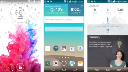
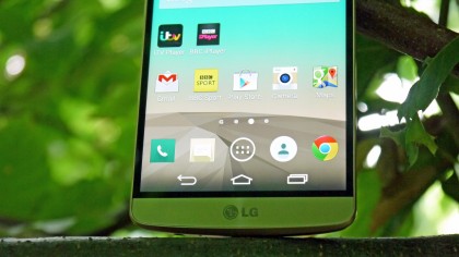
The new interface on the LG G3 is a big improvement. Gone is the skeumorphism in favour of a new flat tile look. The icons are redesigned. The different applications have their own colour scheme for easy recognition and the colour palette is more muted than before.
It’s a much more fluid system that shows LG has grown up, taking the problems of before and making it into a more intuitive way of navigating through the handset.
LG has definitely taken touches from HTC, Samsung and Apple with the new interface. The home screen features a separate section for the pedometer and tips videos (where Samsung’s pointless magazine option is on the Galaxy S5), the colours are very similar to HTC’s on the M8 and the flatter design owes more than a tip of the hat to Apple.
The interface is still a little cluttered, but overall it’s a tick for LG updating something that sorely needed a new look.
Metallic shell
As mentioned the other big problem with the G2 was the fact it had a really glossy plastic shell. The phone was well packaged, but still didn’t offer the same premium quality as the HTC One, iPhone or Sony Xperia Z1.
So with the LG G3, the South Korean brand has gone for the best of both worlds. It’s created a ‘metallic skin’ that supposedly looks and feels premium, but offers the lower weight and added connectivity benefits of polycarbonate.
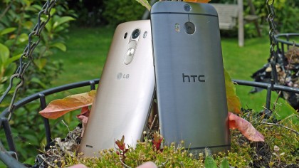
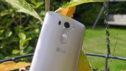
The problem is, LG hasn’t really managed this lofty goal. The G3 certainly looks the business, bringing a more iconic look of brushed metal and some cool colours (black, silver and gold) to make it stand out on the shelves, which makes sense given it’s mostly screen otherwise.
But the second you pick it up, the plastic nature jars with the look of the phone, which is a disappointment. It actually feels cheaper than the G2 thanks to using a removable back, which lowers the tightness of the packaging and makes it feel more hollow.
The upside of this is you’ve got a removable battery and microSD slot, both of which are a big win for a certain section of the customer base. That said, there are better ways of doing this, as you can easily have a slot for a microSD card without needing to remove the back.
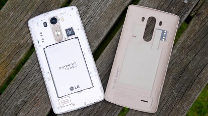
And I know a few people disagree, but a unibody phone feels better in the hand and a portable battery pack is much more useful than being able to swap in a new battery – it’s easier to charge, for one, and 98% of users will never swap the battery in and out anyway, so why bother when an integrated unit can offer more capacity and better design?
So again, LG has stepped forward with the G3 – but it’s still not quite got all the pieces together when it comes to design.
Health chops
The LG G3 doesn’t have the heart rate monitor that the Samsung Galaxy S5 packs, which means some will see it as less of a phone for being able to keep you on track.
That’s not true though, as it features a fairly in depth stride sensor and some other elements to help you maintain a healthy lifestyle.
And when the Android 5 Lollipop drops, the G Watch R will be able to automatically take your heart rate at intervals throughout the day (as well as being able to unlock your phone through proximity to the smartwatch) which should give you a fuller picture of what’s happening to you health-wise.
Simple camera with laser autofocus
The 13MP camera on the LG G3 is also another big talking point, both in terms of the new look to the interface and the additional technology on board.
I’ll start with the latter point: the laser auto focus, which is designed to make it the fastest-focusing smartphone on the market. It seems to be true at times, but I’m not sure shaving another 100 milliseconds off makes that much of a difference when boot-up speed is more important..
It’s possibly a bit unfair to say that the extra speed isn’t warranted – if the system worked perfectly, chances are you’d take 10-20 more high quality pictures that capture the moment compared to the competition, but without being able to fully test the system it’s hard to comment.
The laser works by sending out a conical infra-red signal (using technology nabbed from a robo-vacuum cleaner from LG’s home appliances division) and absorbs information from the surroundings to create an instant and clear picture for the camera to use.
This means it doesn’t have to look for contrast shifts like before, and offers a sharper image.
The interface is really scaled back too: it’s nothing more than a back button, a menu icon and the viewfinder. Tap the screen and it focuses and takes the picture, designed to be simple and effective.

It also doesn’t let you focus to check the shot composition before taking the photo, which would be nice – but then again, tap that menu icon and you get all you need in terms of shutter, options and video recording.
The G3 is all about simplification, and this kind of technology really works. It’s a little too scaled back for the camera, but it’s the right idea.
The front 2.1MP camera is now cringingly called the ‘selfie’ camera – it seems that dreaded word is here to stay, at least for a few years. The lens is a wider angle, so you can get more friends into the photo (or more actors at the Oscars) and features clever gesture recognition to take the photo.
Hold your hand out, make a fist and it’ll start the G3 self-portrait timer. It’s a clever system and it works, which is great for those moments when you can’t use both hands and don’t want to tap the screen.
Another cool feature is the ability to have a front-facing flash, although it’s not an LED light. Instead, part of the screen goes white, which illuminates faces and takes better pictures. LG has even white balanced this screen to correct skin tone imperfections – and it really gives some nice front facing snaps.
Design
LG, as I’ve mentioned, was keen to tout a number of features of the new design that make the LG G3 a real upgrade over the G2. One of the big elements, and something that was seen a number of times in the leaks leading up to the launch was the metallic skin that now adorns the new phone.
Considering the all-plastic unibody of the G2 was one of the main issues I had with a phone that was pretty close to 5 stars, the leaks showing a shiny metal body to the G3 got me pretty excited. We’re all friends here – I’m OK admitting that to you.
But then when the phone was displayed for the first time, it was a plastic shell painted to look like a brushed metal case. LG was almost apologetic about this, saying it wanted to deliver a metal phone that felt as premium as possible, but the mechanics simply didn’t allow for it.
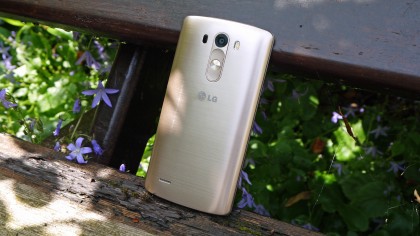
The result is somewhere between the two, as LG has created a special film that takes away the plastic feel somewhat while still looking the part in a world where consumers are crying out for a high-end design.
And to look at it on a table or on the shop shelf, it’s a great-looking phone. And LG has done something else that I was crying out for: made the backplate removable, allowing you to swap the battery and add in a microSD card.
I’m not convinced that the world needs to be able to remove a battery in a phone, but I always think a microSD card is a good option to have. Despite internal storage being a better thing in terms of phone function, the LG G3 comes in only 16GB and 32GB options and most will buy the former, which doesn’t give a huge amount of room for all the larger apps on offer these days.
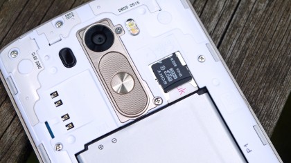
Anyway, the fact that the battery is removable might be a big win for some, but it comes at the cost of feel in the hand, as the LG G3 doesn’t feel as nicely packaged as the G2, which is the design sacrifice necessary when you add in a backplate like the one here.
The result is that despite being made of a more refined material, the LG G3 actually feels cheaper in the hand than the G2. Not by much, but enough for me to long for this metallic plastic to be used on the older version.
And then there’s the issue of the screen. Not the actual display itself, which I’ve already said is excellent – but the size of it.
The term ‘smartphone’ is constantly evolving; where once we thought anything over 4 inches in terms of display size was enormous, it’s now tiny. So we’re now seeing phones with a 5-inch screen as a normal option at the high end, and I get the feeling that’s the limit of what’s acceptable.
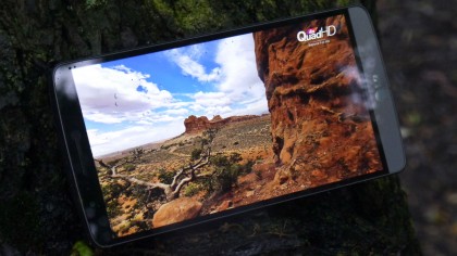
Actually, perhaps that’s a little harsh, as the LG G3’s screen size isn’t overly cumbersome, thanks in part to packing really thin bezels around the side, which means a large amount of the front of the phone is dominated by the display.
But 5.5-inches is just too large to be considered a smartphone – we’re definitely at the bottom end of phablet territory here. This means it’s not as fluid to navigate around the screen with one hand, and combined with the more angular corners it’s not a great experience when using the G3 day after day.
I do like the rear buttons though. The principle gets burned into your muscle memory much faster than you’d expect, to the point where I keep tapping the camera on other handsets I review to turn off the screen.
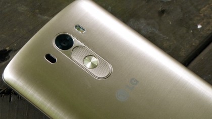
And LG’s upgrades here, making the power button more rounded and the volume keys ridged, means it’s even easier to operate without looking. If you’re thinking this is something that’s a reason not to buy the phone, then disregard it – it’s actually a really neat feature and one that I’m surprised hasn’t been copied yet.
In summary, LG has both improved the design of its flagship phone and taken a couple of steps backwards. The G3 certainly looks more premium, and offers the removable battery and microSD slot some people believe they simply cannot live without.
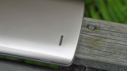
But in making the backplate a separate piece, the tight packaging has been negated, and as such I found holding it less pleasant than I did with the G2.
If you’re going to make a phone look metallic, then it has to have the same pleasant weight seen on the excellent HTC One M8 or iPhone 6 Plus, where this is more like the Samsung Galaxy S5 in feel, albeit with a coat of paint and no weirdly dimpled back.
True, the new design is much less drawn to fingerprints than the predecessor, but that doesn’t change the fact that those who don’t want a phablet will see the G3 as a touch too large.
Interface and performance
LG’s theme for the G3 is ‘Smart is the new Simple’ and one of the key factors in this is the all-new interface it’s put together for the new handset.
One of my big criticisms of the LG G2 was that the interface was simply awful: cartoon-like, hard to understand, cluttered and simply not up to the standard the HTC One M8 and friends offer.
So it’s great to see that the brand has gone back to the drawing board and made something that’s more fitting with a top-end handset. The garish colours are replaced with more muted ‘mature’ hues, meaning out goes the bright yellow and purple to be replaced with softer greens and autumnal burnt reds.
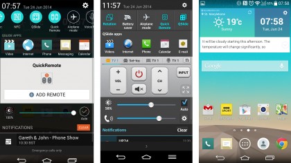
Each core app, such as contacts and messaging, has its own colour to help you discern where you are in the phone – if that was a confusing problem for you – and the notifications bar has been stripped right back to simply pack a row of quick settings and the stuff you want to know about.
By default you do have a brightness bar and the option to control volumes (which is useful when you’re using the phone in landscape) but these can be toggled on or off, depending on your preference, which allows for a very clean notifications zone.
If you think of it as somewhere between Samsung’s new TouchWiz and native Android 4.4, you’ll be pretty close. It’s not as close to standard Android as some would have you believe, as the notifications area and menu systems are different, but the ethos is there and it’s very similar.
That closeness has allowed LG to be the first non-Nexus brand to bring its software to a flagship phone, with the new interface taking a lot of the visual cues already added in from the first G3 interface iteration. The good news is this will speed up the flagship phone even more, which should make sweeping around the home screen a joy.
The interface is visually a triumph for LG, a new look that brings a freshness that sends a statement that the South Korean brand is finally looking to make the step up to top-tier manufacturer.
To that end, there have been a couple of extra features added in to help with day to day living – these include helpful video tips that alter throughout the lifetime of the phone (so start-up tips in the first few weeks, app tutorials for the programs you’re not using a bit later on and then telling you about new LG products as the G3 nears the end of life).
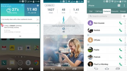
The idea is clever, but one you’ll not really use that often. The same can be said of Smart Notice, a constant label that hangs beneath the weather widget on the home screen.
This is meant to be the companion in your phone, allowing you to see the truth behind the weather by prompting you when you’ll need an umbrella or offering to save a contact that you call multiple times but isn’t in your phone book.
The thing is more often it tells you when there’s a new video to watch, or adding helpfully that when it’s foggy outside ‘it’s very foggy’. The idea is cool, but it’s more annoying than helpful, at least in the first month of ownership.
I also got a number of shipping forecast-style updates when in New York. Helpful.
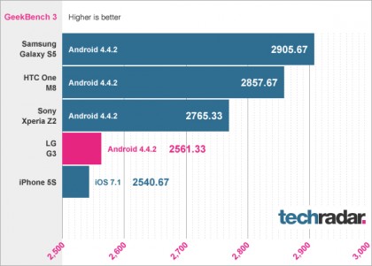
So, onto the performance of the LG G3; as you can guess with the Snapdragon 801 CPU on board and up to 3GB of RAM (if you buy the 32GB iteration of the phone) this handset performs well on standard benchmarks.
However, in day to day use it’s not great. There’s a definite lag under the finger that’s simply not present when using the HTC One M8 or iPhone 6, and it’s quickly noticeable.
In side by side tests opening and closing apps was markedly slower on the LG G3, and while we’re talking nanosecond differences it does all add up. I definitely felt the G3 wasn’t as slick as other handsets on trial, and the problem didn’t resolve itself between getting the European version of the software and the pre-production Korean handset.
It’s not deal-breaking, but I’m confused as to why a firm that prides itself so much on engineering would let something like this slip through. There were also a few freezes here and there, but nothing that you won’t see on most other smartphones.
The benchmark GeekBench 3 results could give a clue as to why – the LG G3 doesn’t perform as well as the rest of the competition, which could be partly down to the extra pixels needing to be driven. It’s surprising, given LG usually bosses these tests, but Geekbench is designed to replicate real life use as much as possible, and the results tally with the way I found using the phone.
App compatibility is still an issue as well: some of the top apps simply aren’t there, such as Real Racing 3, making it hard to properly test some elements of the phone. These will probably come in time, but be warned that if you’re using the LG G3 from launch you won’t be overly happy with some of the limitations.
Knock On / Knock Code
LG’s proprietary way of unlocking the phone is back for a second round – and it’s as good as it was before.
The notion is simple: you tap the screen twice when turned off to unlock the phone (if you’ve not got lockscreen security set up) and can then tap the notification bar twice in quick succession, or any empty area on the home screen, to shut it down again.
It worked really well on the LG G2 to the point where, like the rear buttons, I often tried the same trick on other handsets. Others are coming on board now, like the Sony Xperia Z2 or the HTC One M8, and of course it was Nokia’s idea in the first place to invent the technique.
But none do it as well as LG, and it’s a real boon.
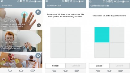
And that’s where the brand reached a little too far in my opinion by adding in Knock Code. It’s a clever system where you can simply tap the right quadrants of the screen with the screen turned off and it works the same as an unlock code or pattern.
The issue I had was that it didn’t register 80% of the time. This was often down to the fact you pick the phone up holding a portion of the screen, which seems to register as an early tap to add into the code.
This means the screen still lights up, but prompts you once again to enter the code. If you must have security then it’s OK, but tapping the display twice to wake it and entering the pattern is a little simpler.
That said, if you opt for the simplest pattern first and really try at it, you’ll get some joy more often than not, and when it works Knock Code is second only to the iPhone’s TouchID in terms of a simple way to open the phone.
Battery
Battery life on the LG G3 was an area I was really interested in checking out, as you’ll have noted in the hands on review of the handset.
With its 3000mAh battery, the power pack on the G3 is certainly big enough, but it has to fire all those extra pixels, which could limit things. But then again, it’s also got the ultra-efficient Snapdragon 801 CPU that even made an HTC phone last through the day without giving up the ghost.
Well, let me let you wait no longer: the battery life is great. It’s not quite as impressive as other LG phones, but given the extra power that’s needed as well as other brightness controls, it’s a stellar effort and one that will easily see you through a day or so of medium to hard use.
LG has worked all its magic to get the power efficiency of the G3 to the maximum possible, and you won’t see a lot of the stuff that’s going on under the hood in day to day use.
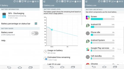
It all depends on what you’re doing. The frame rate of the display will slow down if not needed, as will the clock speed of the 2.5GHz quad-core CPU, and the LCD controls themselves also adapt to your usage, and it all works well together.
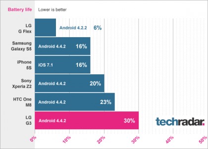
The result is that I never really noticed the phone getting overly warm either, which usually hints at strong power efficiency. However, what’s interesting here is that the LG G3 performed very badly in our video rundown test, coming in lower than even the HTC One (2013) which was one of the worst at running video at a higher brightness.
So while the day to day use isn’t terrible, clearly firing all those pixels is causing the G3 to melt a little even with full HD video. This only matters if you’re constantly using the screen to look at myriad things on the phone, and even then the G3 is intelligent enough to slow power use down when jumping between apps.
The graph below shows the G3 to have poor battery when it comes to using the screen in our looped 90 mins HD video, with a lot more battery life lost than the competition, proving that firing the pixels isn’t a treat for the phone – although when you’re not watching video or internet browsing it’s a lot more robust.
It’s interesting to note that LG doesn’t seem to have the same Ultra/Extreme power saving mode as seen on the HTC One M8 and Samsung Galaxy S5 – I’ve not been convinced of their need to be a headline feature, but if you’re in a pinch these modes can turn the phone down to the minimum power drain possible.
It’s not needed, but such is the synergy between what Samsung and LG do with their flagship phones I’d have expected to see it there.
It’s also great to see the LG G3 coming with wireless charging out of the box, although not all models will have this feature. It’s frustrating that it’s not a standard feature on more handsets, as it would help with the proliferation of the method of charging a phone.
LG says this wireless charging is based on the Qi standard, and while it seems to be a little confused over which charging pads it uses, it’s ace to see it there from the start.
Overall, battery life is good enough on the LG G3, and as something that most people look for in a new smartphone, this is a real recommendation.

There’s a small, wistful, part of me that almost wishes that the QHD screen wasn’t added into the G3 – which I appreciate borders on the hypocritical given it’s something we’ve been looking forward to for a long while in a phone.
But given LG’s ability to eke the most out of the battery, this could have been a record breaking phone, especially if the battery had been sealed in. The LG G2 had a battery that was morphed around the internal components, so if we could have feasibly had an even larger capacity on a phone that didn’t draw as much power, meaning you genuinely wouldn’t have to charge more than once every two days.
It’s not fair to criticise a brand for pushing the boundaries of technology in everyday devices, but it perhaps hints that longer battery life would have been a better selling point than the first QHD display, especially now that it’s not even the only phone with a QHD screen any more.
The essentials
One of the big selling points of the LG G3 is the fact the company thinks it’s sorted the onboard keyboard, making it into something more useable and better than the wealth of third party options out there.
It’s certainly taken some dramatic leaps forward, as the keyboard is both resizable and able to learn from your typing action, meaning it becomes more accurate the more you use it.
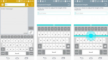
The resizing option is pretty good, although increasing the height of the keys does limit the space you can see what you’re actually typing, which isn’t great when you’re trying to enter text into fields on the web browser.
Similarly shrinking it doesn’t do a lot for trying to improve the accuracy, no matter how much I used it. One of the other elements that LG has brought in is the next word prediction, but it’s not really got the idea well.
For instance, if you’re trying to type ‘can’t’ but accidentally enter ‘vant’ then it will still go with that option, rather than working out succinctly what you’re after.
I always use the test of whether the keyboard makes me want to install Swiftkey Keyboard, and sadly with the LG that was the case after a couple of weeks’ use.
The ability to change the layout to your own choices slightly is a big boon though – having the comma key instead of settings is a real win.
But given so many good aftermarket options are so good, I can’t say the new keyboard is really a selling point; HTC’s One M8 is still the only phone I’ve not bothered to upgrade the typing experience on.
The call quality on the LG G3 is pretty good though, as it seemed to offer really good connection throughout. It also comes with all the bells and whistles you’d hope, such as being able to message straight from the call if you so need.
The one issue I did note is that the LG G3 sometimes struggled to get a signal where other phones managed it just fine – it wasn’t that the signal was weak, or the reception from the phone poor, it just was stuck searching to find any reception, meaning a restart or putting it in and out of airplane mode to sort.
However, it was decent at flipping in and out of Wi-Fi and 4G – while it doesn’t have the download booster of the Samsung Galaxy S5, when it gets a fast connection it didn’t let it go.
The internet browsing, as a result, was super slick and speedy whether using the onboard browser or Chrome – the latter isn’t obvious, but now that Google’s managed to get its mobile internet app up to speed I can’t see why you’d use LG’s option.
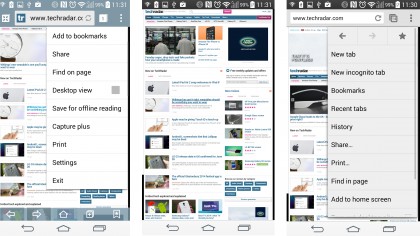
It’s not that it’s bad, but it harks back to an older era where the clever notions were from the manufacturers and Google’s Chrome offered nothing more than a desktop sync – but that advantage has been eroded now.
Camera
The camera on the LG G3 is a pretty good affair, despite being largely similar in spec to the LG G2. This means the same 13MP sensor, enhanced optical image stabilisation (OIS+) and the same efforts to overly-disguise noisy photos by smoothing them with software algorithms.
But on the software side, LG has stripped things right back to make one of the most streamlined UIs for a phone yet.
Turn on the camera and you’ll be greeted with just a back button and small set of dots to signify more features, should you want them. Simply tap the screen to focus where you want, and the phone takes the shot quickly.
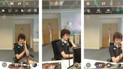
If you want to just take speedy snaps, this is a great method (and the camera is activated by holding the down volume button in standby mode, and can be used as a shutter button too.
If you want a few more options (and I do when taking a photo) then intriguingly the G3 doesn’t have much more to play with. You can toggle the HDR mode on or off (it’s on by default), enter dual capture, panorama or ‘Magic Focus’ which is the same re-focus feature that’s become popular with all high-end phones.
There’s no way to change the ISO settings, exposure or contrast… it’s a camera with minimal interaction. It’s not a bad thing, but I would like to see a touch more control, even if it’s buried down through the menus.
Nokia, Samsung and even HTC have done a great job in starting the education process of how to get great snaps by playing with settings, but it seems LG is more interested in doing the same as Apple and not getting in the way of your pictures.
The actual picture quality is pretty good, with well-lit scenes giving really clear, sharp and well-defined snaps. In lower light the G3 is good, if not as fast at taking snaps, although that image smoothing easily goes over the top – like the One M8, if you’re thinking of zooming in or cropping your photos, some will look a bit muddy on the G3.
But the general pictures gained from day to day photography are up there with the best on the LG G3, and it’s a real recommendation from me.
The autofocus needs a mention here again – the laser shooting out a conical beam to check out the room leads to blistering autofocus, and does notably out-do the Samsung Galaxy S5 in terms of going from a standing start and snapping the picture..

The S5 struggles to wake from sleep mode as fast as the G3, and the speed of the shutter is so impressive with the latter – check out the snaps below to see.
The other big change is the front facing camera (and I refuse to use the S-word that LG has named it with) by increasing the angle of the snap, so you can fit more in. You can also open and close your hand to start the countdown, which means if you’ve framed the photo well you won’t knock it out of shot by tapping the screen.
The beauty slider is present too, meaning the photo is smoothed out to make a weird soft-focus on your face (especially weird for men with beards, as they end up looking like a sooty smudge).
I do like the addition of the ‘flash’ on the front. As I mentioned, this sees the front camera image shrink down and the surrounding area go a skin-friendly white tone, meaning in darker scenes I got much better pics.
Camera samples

Click here for the full resolution image

Click here for the full resolution image

Click here for the full resolution image

Click here for the full resolution image

Click here for the full resolution image

Click here for the full resolution image

Click here for the full resolution image

Click here for the full resolution image

Click here for the full resolution image

Click here for the full resolution image

Click here for the full resolution image
Media
Media on the LG G3 is predictably excellent for a number of reasons: the screen and audio experience being two of them.
The QHD screen is something that has to be seen to be believed – the criticisms of it earlier aren’t that it’s a bad screen (quite the opposite, it’s stunning) but more that the effect isn’t that much better than a Full HD screen.
It is better though, and even average movies look a touch sharper than they would do otherwise – plus you’ve got a much bigger display to look at.
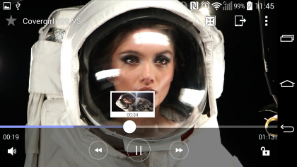
For instance, I was browsing through some video files I had on a spare SD card, and came across one that was shot in QHD resolution. Well, that was what I thought when watching it back… it was actually a 720p file when I checked it out, which was amazing given the flawless detail on offer.
The preloaded stuff from LG is obviously the most amazing thing, and nobody that I showed off the starry night scenes to wasn’t gobsmacked by the detail on show. However, it was the same reaction that I saw with the G2, and with the G3 you’ll need to be ready to put up with that larger screen.
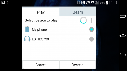
I do wish the Video player was still a separate app, as it’s still in there (as the option to use it comes up when you start a video for the first time) as rooting the Gallery isn’t that much fun.
Music

The music player on the LG G3 is both simple and sophisticated at the same time. It can handle really high quality audio (LG had to rewrite some of the core code of Android to facilitate this last year) and the new phone has a built in amplifier to make music sound louder and clearer with less distortion.
This means if you’re properly into your tunes, then 50MB FLAC files will be noted with a small ‘Hi-Fi’ icon next to them, and sound really rather nice. But even the tunes you’ve ripped in low quality from a CD sound OK – nothing amazing, but team the LG G3 with a decent pair of headphones and you’ve got a brilliant sound system.
There’s not a lot more to say about the music player though, as like with many high end smartphones it’s more out of the way than in your face.
You can control the tunes from the notifications bar, or the dedicated widget on the home screen. The Android 4.4 trick of having full screen album art on the lockscreen is there too – it looks awesome and it annoys me it’s on every top Android phone bar the HTC One M8.
The speaker on the rear of the phone isn’t as good as the competition though. I’ve come to adore front facing speakers on both the One M8 and Sony Xperia Z2, not to mention the Sony Xperia Z3 and to not have it here is a failure. It’s loud, that’s for sure, and the internal amplification means it doesn’t distort too much, but it’s only OK.
The competition
The LG G3 entered a really rather packed smartphone market, and these are the big phones you’ll probably be considering over the South Korean’s big hitter – take a look to see how it stacks up against the best the competition has to offer.
Samsung Galaxy S6
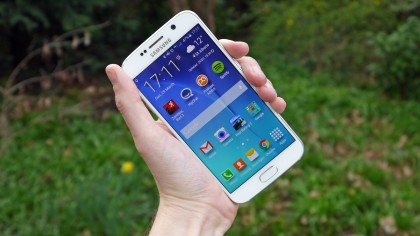
When the LG G3 first launched the Samsung Galaxy S5 was a key competitor, which worked in the G3’s favour due to the Galaxy S5’s disappointing design. However Samsung hasn’t given LG such an easy ride lately, with the much improved Galaxy S6 proving more of a challenge.
Not only does the Galaxy S6’s screen handily beat the LG G3’s in quality thanks to Samsung’s Super AMOLED tech, but the S6 now matches the LG G3’s 1440 x 2560 resolution – something that the Galaxy S5 failed to.
Because of the slightly smaller 5.1-inch screen, the Galaxy S6 has a higher pixel density, giving it the edge in clarity as well.
The Galaxy S6 also has an improved design, ditching the plastic chassis of the S5 for a more premium metal design. This reduces the LG G3s previous lead in this area, though its brushed metal effect still feels and looks good, so don’t worry about getting a worse looking smartphone if you go for the cheaper LG G3 – it still holds its own.
iPhone 6 Plus
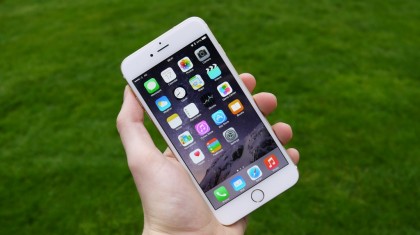
Apple’s out the gates with its first phablet and it’s got an LG G3-matching 5.5-inch display. It’s a strong first attempt too, with a 401 pixel per inch 1080p screen, sporting impressive viewing angles, great contrast and bright colours.
I’d argue that it’s not quite a match for the LG G3’s display though, thanks to that phone’s crystal clear QHD resolution.
The iPhone 6 Plus certainly trumps the LG G3 when it comes to looks though, with a truly premium body and it also gives the LG G3’s camera a run for its money.
But despite its high-end appearance, the design of the iPhone 6 Plus makes it more awkward to use one-handed than the LG G3, as it’s both taller and wider. Its biggest problem though is its price tag, because with a starting price of £619 it makes the LG G3, which can now be found for under £300 in some places, look positively cheap and it’s hard to justify the extra expenditure.
HTC One M9

The LG G3 was initially pitted against the HTC One M8 – a rather tough challenge considering it was one of the best smartphones we’d had the pleasure of using. Since then the HTC One M9 has been released, and although it is still a better overall smartphone than the G3, LG’s ageing handset still puts up a decent fight.
The HTC One M9 keeps a similar metal design of the M8 with some choice improvements, which gives it the edge against the LG G3.
However the LG G3 does come with a larger 3000mAh battery, compared to the 2840mAh capacity of the M9, and in our battery benchmarks we saw that the LG G3 does slightly better at holding on to battery life – though only just.
Another thing in the LG G3’s favour is that it doesn’t get that hot when in heavy use – unlike the HTC One M9.
Of course where the LG G3 really benefits is in price;s not too surprising when you consider that it’s getting on a bit, and the HTC One M9 is still relatively new. It does mean that if you don’t mind a slightly older handset, you can save quite a bit of cash by going for the LG G3 and still end up with an excellent phone.
iPhone 5S

The difference between the iPhone 5S and the G3 is stark – one is compact, the other massive. LG reckons that the Retina display has had its time in the sun, and it has found the ultimate screen resolution – yet Apple stuck with Retina HD for the iPhone 6 and 6 Plus.
The iPhone 5S probably has a more robust camera that’s a little simpler to use and handle, and the app selection is improved. But everything from a faster OS to a better screen and improved audio experience swings things in LG’s favour.
Sony Xperia Z3
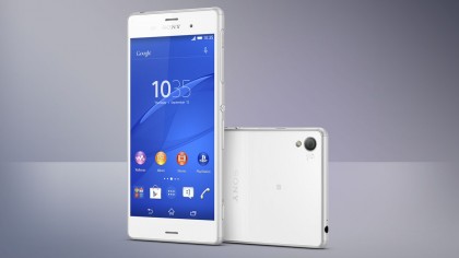
The Sony Xperia Z3 is also getting on a bit, like the LG G3, but has yet to be replaced – although we expect the Xperia Z4 to arrive in the not too distant future.
The Xperia Z3 has a lower resolution screen than the LG G3, yet it still comes out slightly on top in the image quality stakes thanks to some nifty display tech.
Camera-wise both handsets are very good, with the two smartphones coping particularly well with low light images. Although the Z3’s 20.7 megapixel camera looks more impressive on paper than the LG G3’s 13 megapixel snapper, in reality the gap is a lot closer.
The Xperia Z3 also wins when it comes to design with it’s slimline and waterproof, design that looks and feels more premium than LG’s offering.
Verdict
The LG G3 is a phone that shows the South Korean brand knew it needed something better than the G2 to compete with the best Samsung, Sony and HTC have to offer, which is why it arrived less than a year after the G2.
It’s supremely powerful and addresses nearly all the issues I had with its predecessor – so has LG suddenly created the ultimate smartphone?
We liked
The screen on the LG G3, when used properly to display high-resolution content, is immense… LG knew that, and has been rightly making a big deal about it.
The overall design of the phone is vastly improved too, with the faux-metal cover not necessarily feeling great but certainly looks the part when laid on a table.
The camera is powerful too, leading to some great snaps and not letting me down when I wanted to just capture the moment here and there. The size of the phone makes some shots slightly harder, but overall it’s a good sensor to pack on there.
I really like the new interface LG has created – it’s clean, flat and really shows a maturity from a brand that erred far too much on the side of ‘fun’ rather than making me feel like I had a phone that was worthy of a significant chunk of change each month.
The battery life is also really impressive – sure, it only matches the competition, but given it has so much more to do with the QHD screen it’s a revelation really.
We disliked
So how can a phone that’s improved in nearly every area have any flaws? Well, there are a few areas where LG has made compromises that haven’t quite worked – and dropped the ball in others.
For instance, the lag in the interface is really irritating – that beat between launching apps and jumping back to the home screen is annoying.
The fact that it’s not optimised for some apps isn’t cool either – I’m not sure whether it’s the screen (although they should scale) or some internal jiggery-pokery… but it’s a flaw, no doubt.
The QHD screen is also a drawback – I know what you’re going to say, so let me explain. Yes, it looks great in perfect conditions, but a good smartphone is about balance. There’s no point having technology for the sake of it, and that’s what the QHD screen feels like right now.
Internet browsing, watching videos and generally using apps looks a bit better, but nothing massive. If you weren’t looking for it, you’d just think it was a decent screen, and I’ve had the same feeling from the likes of the Samsung Galaxy S5, the LG G2 and the HTC One M8.
Without the screen, which does lose brightness when viewed from anything other than straight on, the battery would last longer, the lag might have been removed and the LG G3 could be made to sit in the palm better.
I’m all for advancement, but the screen on the G3 feels like a headline spec rather than something that enriches a great phone.
The camera needs to perform much better in low light too – it’s too heavy on the smudges as the software tries to cover up a slight inability to perform in the dark. We’ve all been there.
Verdict
The LG G3 is a great smartphone – like its predecessor, if you’re after power and precision, perhaps over design and form, then this is a winner.
The camera and battery combo is sure to win some hearts, and the improved user interface both will attract new users and give relief to those that were put off by the clutter on the G2.
However, I think something was lost in design in making the backplate removable – I feel that unibody designs just feel better in the hand thanks to being more solid, and I miss that from the G2.
The plastic / metal doesn’t feel great in the hand either, and the dimensions are very much small phablet rather than big smartphone, which you’ll need to take into consideration if you’re thinking of buying the LG G3.
If that doesn’t bother you then the G3 is a really impressive, very accomplished smartphone that drops the gimmicks to create one of the most powerful and impressive handsets you can buy right now.
First reviewed: July 2014
![]()
Related Posts
December 6, 2021
7+ Web Design Trends for 2022: Which Will You Use?
December 6, 2021
The 10 Best WordPress Booking Plugins to Use On Your Website
December 6, 2021
How to Use a Web Cache Viewer to View a Cached Page
November 6, 2021
10 Modern Web Design Trends for 2022
November 6, 2021
Best Free SSL Certificate Providers (+ How to Get Started)
November 6, 2021
How to Design a Landing Page That Sends Conversions Skyrocketing
November 6, 2021
What Are the Best WordPress Security Plugins for your Website?
October 6, 2021
Your Guide to How to Buy a Domain Name
October 6, 2021
How to Build a WordPress Website: 9 Steps to Build Your Site
September 6, 2021
10 Best Websites for Downloading Free PSD Files
September 6, 2021
HTML5 Template: A Basic Code Template to Start Your Next Project
September 6, 2021
How Much Does It Cost to Build a Website for a Small Business?
September 6, 2021
A List of Free Public CDNs for Web Developers
September 6, 2021
6 Advanced JavaScript Concepts You Should Know
August 6, 2021
10 Simple Tips for Launching a Website
August 6, 2021
25 Beautiful Examples of “Coming Soon” Pages
August 6, 2021
10 Useful Responsive Design Testing Tools
August 6, 2021
Best-Converting Shopify Themes: 4 Best Shopify Themes
July 6, 2021
What Is Alt Text and Why Should You Use It?
July 6, 2021
24 Must-Know Graphic Design Terms
June 6, 2021
How to Design a Product Page: 6 Pro Design Tips
April 6, 2021
A Beginner’s Guide to Competitor Website Analysis
April 6, 2021
6 BigCommerce Design Tips For Big Ecommerce Results
April 6, 2021
Is WordPress Good for Ecommerce? [Pros and Cons]
March 6, 2021
Make Websites Mobile-Friendly: 5 Astounding Tips
March 6, 2021
Shopify vs. Magento: Which Platform Should I Use?
March 6, 2021
Top 5 Web Design Tools & Software Applications
February 6, 2021
Website Optimization Checklist: Your Go-To Guide to SEO
February 6, 2021
5 UX Design Trends to Dazzle Users in 2021
February 6, 2021
What Is the Average Page Load Time and How Can You Do Better?
February 6, 2021
Choosing an Ecommerce Platform That Will Wow Customers
February 6, 2021
7 Best Practices for Crafting Landing Pages with Forms
February 6, 2021
7 B2B Web Design Tips to Craft an Eye-Catching Website
January 6, 2021
Mobile-Friendly Checker | Check Your Site’s Mobile Score Now
January 6, 2021
8 Tips for Developing a Fantastic Mobile-Friendly Website
December 6, 2020
How to Add an Online Store to Your Website [4 Ways]
December 6, 2020
5 UX Design Tips for Seamless Online Shopping
November 6, 2020
Ecommerce Website Essentials: Does Your Site Have All 11?
November 6, 2020
5 Small Business Website Essentials You Need for Your Site
November 6, 2020
Your Website Redesign Checklist for 2020: 7 Steps for Success
May 1, 2020
Psychology of Color [Infographic]
April 21, 2020
How to start an online store that drives huge sales
January 3, 2020
5 Lead Generation Website Design Best Practices
March 6, 2019
6 Reasons You Should Redesign Your Website in 2019
March 6, 2019
7 Web Design Trends for 2019
February 19, 2019
Who owns the website/app source code, client or developer
February 7, 2019
Don’t Let Your Domain Names Expire in 2019
January 8, 2019
2019 Website Development Trends To Note
October 6, 2017
How Web Design Impacts Content Marketing
October 6, 2017
How to Choose a Navigation Setup
August 6, 2017
Why User Experience Matters to Marketing
July 6, 2017
5 Ways Web Design Impacts Customer Experience
September 6, 2016
How to Learn Angular
September 6, 2016
The Excuses for Not Having a Website (Infographic)
September 6, 2016
How to Build an Award-Winning Web Design Team
September 6, 2016
13 Free Data Visualization Tools
August 6, 2016
How Selling Pastries Helped Us Design a Better Product
August 6, 2016
11 Sites to Help You Find Material Design Inspiration
July 4, 2016
How to change free wordpress.com url
April 6, 2016
The 5 Best Free FTP Clients
April 6, 2016
7 Free UX E-Books Worth Reading
March 6, 2016
Can Handwritten Letters Get You More Clients?
December 10, 2015
Star Wars Week: How to create your own Star Wars effects for free
December 6, 2015
20 "Coming Soon" Pages for Inspiration
December 6, 2015
6 Free Tools for Creating Your Own Icon Font
December 6, 2015
9 Useful Tools for Creating Material Design Color Palettes
November 6, 2015
20 Free UI Kits to Download
November 6, 2015
50 Web Designs with Awesome Typography
November 6, 2015
When to Use rel="nofollow"
November 6, 2015
7 Free Books That Will Help You Become More Productive
November 6, 2015
50 Beautiful One-Page Websites for Inspiration
November 6, 2015
Circular Images with CSS
October 6, 2015
Lessons Learned from an Unsuccessful Kickstarter
October 6, 2015
5 Games That Teach You How to Code
October 6, 2015
Cheatsheet: Photoshop Keyboard Shortcuts
October 6, 2015
An Easy Way to Create a Freelance Contract for Your Projects
October 6, 2015
50 Design Agency Websites for Inspiration
September 29, 2015
JB Hi-Fi shutting the book on ebooks
September 24, 2015
Opinion: Quick, Quickflix: It's time to give yourself the flick
September 24, 2015
New Star Wars 360-degree video is among first on Facebook
September 21, 2015
Apple purges malicious iPhone and iPad apps from App Store
September 12, 2015
Apple's new Live Photos feature will eat up your storage
September 12, 2015
The latest Windows 10 Mobile preview has been delayed
September 12, 2015
IBM buys StrongLoop to add Node.js development to its cloud
September 8, 2015
Fake Android porn app takes your photo, then holds it ransom
September 6, 2015
50 Restaurant Websites for Inspiration
September 6, 2015
Zero UI — The Future of Interfaces
September 6, 2015
50 Beautiful Websites with Big Background Images
September 6, 2015
Infographic: 69 Web Design Tips
September 6, 2015
Free Windows 10 Icons
September 2, 2015
Instagram turns itself into a genuine messaging service
August 11, 2015
In Depth: How Microsoft taught Cortana to be more human
August 11, 2015
Windows 10 price, news and features
August 11, 2015
Windows 10's broken update introduces endless reboot loop
August 11, 2015
Windows 10 races to 27m installs
August 11, 2015
Windows 10 IoT Core gets first public release
August 10, 2015
iOS Tips: How to backup iPhone to an external drive
August 10, 2015
Windows 8.1 RT finally getting Windows 10 Start Menu
August 10, 2015
How to use Windows Hello
August 10, 2015
Review: Moto Surround
August 10, 2015
Review: Moto G (2015)
August 9, 2015
8 of the best free VPN services
August 8, 2015
Use Firefox? Mozilla urges you update ASAP
August 7, 2015
Mac Tips: Apple Mail: How to remove the Favorites Bar
August 7, 2015
How to make the OS X dock appear faster
August 7, 2015
Review: BQ Aquaris E45 Ubuntu Edition
August 7, 2015
Review: Acer Liquid Jade Z
August 6, 2015
How to reinstall Linux
August 6, 2015
How to reinstall Windows
August 6, 2015
Updated: Apple Music: release date, price and features
August 6, 2015
Social News Websites for Front-End Developers
August 6, 2015
10 Free JavaScript Books
August 6, 2015
50 Beautiful Blog Designs
August 6, 2015
Animated SVG Pipes Effect
August 6, 2015
Launching Your First App
August 5, 2015
Windows 10 goes freemium with paid apps
August 5, 2015
Updated: Week 1 with Windows 10
August 5, 2015
Mac Tips: How to manage Safari notifications on Mac
August 5, 2015
Microsoft Sway may kill the PowerPoint presentation
August 4, 2015
Microsoft gives Outlook on the web a new look
August 4, 2015
Mac OS X vulnerable to new zero-day attack
August 4, 2015
Windows 10 users warned of two scams
August 4, 2015
Microsoft's Docs.com is now available to everyone
August 3, 2015
Mac Tips: How to edit the Favorites sidebar on Mac
August 3, 2015
Updated: Windows 10 price, news and features
July 29, 2015
Review: HP ProDesk 405 G2
July 29, 2015
Hands-on review: HP Elite x2 1011
July 29, 2015
Hands-on review: Updated: Windows 10 Mobile
July 29, 2015
Review: Updated: Nvidia Shield Android TV
July 28, 2015
LIVE: Windows 10 launch: Live Blog!
July 28, 2015
How to prepare for your upgrade to Windows 10
July 28, 2015
Review: Updated: Windows 10
July 28, 2015
Review: Updated: HP Pro Tablet 608
July 28, 2015
Review: Heat Genius
July 28, 2015
Hands-on review: Moto X Play
July 28, 2015
Hands-on review: Moto X Style
July 28, 2015
Hands-on review: Moto G (2015)
July 28, 2015
Review: 13-inch MacBook Air (early 2015)
July 28, 2015
Hands-on review: OnePlus 2
July 28, 2015
Review: LG 65EG960T 4K OLED
July 28, 2015
Mac Tips: How to share printers on Mac
July 27, 2015
Apple Music's arrival hasn't opened Pandora's box
July 26, 2015
Review: Garmin Swim
July 25, 2015
How to merge OS X contacts into an existing list
July 25, 2015
Hands-on review: UPDATED: ZTE Axon
July 24, 2015
Mac Tips: How to zoom in on a Mac
July 24, 2015
What Windows 10 means for the enterprise
July 24, 2015
Review: JBL Charge 2 Plus
July 24, 2015
Review: Acer Aspire S7
July 24, 2015
Review: Updated: Canon G3 X
July 24, 2015
Review: Updated: iPad Air 2
July 24, 2015
Review: Thinksound On1
July 24, 2015
Review: Asus Chromebook Flip
July 24, 2015
Review: Garmin Forerunner 225
July 23, 2015
Review: Garmin nuvi 68LM
July 23, 2015
Review: Samsung Galaxy S6 Active
July 23, 2015
Review: Bowers and Wilkins P5 Wireless
July 23, 2015
Review: Dell XPS 15 (2015)
July 21, 2015
Review: Fuji S9900W
July 21, 2015
Review: Updated: Fitbit Surge
July 21, 2015
Review: UE Roll
July 21, 2015
Hands-on review: Ubik Uno
July 20, 2015
Review: Samsung HW-J650
July 20, 2015
Updated: 40 best Android Wear smartwatch apps 2015
July 20, 2015
Review: Acer Chromebook C740 review
July 20, 2015
Review: Huawei Talkband B2
July 20, 2015
Review: Dell Venue 10 7000
July 20, 2015
Review: Intel Core i7-5775C
July 17, 2015
Mac Tips: How to delete locked files on Mac
July 17, 2015
Review: Pebble Time
July 16, 2015
Microsoft just made Windows XP even less secure
July 16, 2015
Windows 8.1 RT is getting an update this September
July 16, 2015
OS showdown: Windows 10 vs Windows 8.1 vs Windows 7
July 16, 2015
Review: Acer CB280HK
July 15, 2015
Windows 10 is ready for new laptops and PCs
July 15, 2015
Explained: How to take a screenshot in Windows
July 15, 2015
Office for Windows 10 appears in latest build
July 14, 2015
Review: ZTE Axon
July 14, 2015
Review: ViewSonic VP2780-4K
July 14, 2015
Hands-on review: SanDisk Connect Wireless Stick
July 14, 2015
Review: Oppo PM-3
July 14, 2015
Review: BT 11ac Dual-Band Wi-Fi Extender 1200
July 14, 2015
Review: Fuji X-T10
July 13, 2015
How to build an SEO strategy for your business
July 13, 2015
Review: Lenovo ThinkPad Yoga 15
July 13, 2015
Review: Audio-Technica ATH-MSR7
July 13, 2015
Review: Garmin NuviCam LMT-D
July 13, 2015
Review: Dell Inspiron 13 7000
July 13, 2015
Hands-on review: AstroPi SenseHAT
July 13, 2015
Hands-on review: EE Rook
July 13, 2015
Hands-on review: Updated: HTC Vive
July 12, 2015
Here's the ultimate software list for PC fanatics
July 10, 2015
How to use the new Photos app for Mac
July 10, 2015
Windows 10 Insider Preview Build 10166 available now
July 10, 2015
Splunk spends big on cybersecurity acquisition
July 10, 2015
Making Windows 10 apps just got a whole lot easier
July 10, 2015
Review: Lenovo LaVie Z 360
July 9, 2015
OS X El Capitan public beta available right now
July 9, 2015
Microsoft finally unveils Office 2016 for Mac
July 9, 2015
Review: Updated: Chromecast
July 9, 2015
Review: Updated: Tesco Hudl 2
July 9, 2015
Review: Lenovo ThinkPad E550
July 9, 2015
Review: Updated: Google Nexus 6
July 8, 2015
What you need to know about Windows Server 2016
July 7, 2015
Microsoft to hike enterprise cloud pricing
July 6, 2015
Hacking Team end up being totally 0wned
July 6, 2015
Review: HP Pro Slate 12
July 6, 2015
Review: Samsung 850 Pro 2TB
July 6, 2015
Review: Asus RT-AC87U
July 6, 2015
Review: Jawbone UP2
July 6, 2015
Reimagining the Web Design Process
July 6, 2015
50 Clean Websites for Inspiration
July 6, 2015
15 Free Books for People Who Code
July 6, 2015
Web Storage: A Primer
July 6, 2015
A Look at Some CSS Methodologies
July 3, 2015
6 Essential Mac Mouse and Trackpad Tips
July 2, 2015
How to install a third party keyboard on Android
July 2, 2015
Review: UPDATED: Asus Zenfone 2
July 2, 2015
Review: Alienware 13
July 2, 2015
Review: HP DeskJet 1010
July 1, 2015
5 issues we want Apple Music to fix
June 13, 2015
Cortana will get its own button on Windows 10 PCs
June 12, 2015
Windows 10 will come with universal Skype app
June 12, 2015
iPad music production: 18 Best apps and gear
June 12, 2015
Windows 10 all set for early enterprise struggle
June 12, 2015
Review: Garmin VIRB Elite
June 11, 2015
Review: Updated: Nvidia Shield Tablet
June 11, 2015
Review: Nokia Lumia 635
June 10, 2015
Microsoft brings more online tweaks to Office 365
June 10, 2015
Mac Tips: How to use Screen Sharing in Mac OS X
June 9, 2015
Hands-on review: Meizu M2 Note
June 9, 2015
Hands-on review: EE 4GEE Action Camera
June 9, 2015
Review: Toshiba 3TB Canvio external hard drive
June 9, 2015
Review: Olympus SH-2
June 8, 2015
Hands-on review: Updated: Apple CarPlay
June 8, 2015
UPDATED: iOS 9 release date, features and news
June 8, 2015
Review: Updated: Roku 2
June 8, 2015
Review: Updated: PlayStation Vue
June 8, 2015
Review: Dell PowerEdge R730
June 8, 2015
Review: Canon SX710 HS
June 7, 2015
UPDATED: iOS 9 release date, features and rumors
June 7, 2015
Review: Lenovo S20-30
June 6, 2015
Free Writing Icons
June 6, 2015
15 CSS Questions to Test Your Knowledge
June 6, 2015
The Best CSS Reset Stylesheets
June 6, 2015
How CSS Specificity Works
June 5, 2015
'Delay' is a new feature in Windows 10
June 5, 2015
Review: Beyerdynamic Custom One Pro Plus
June 5, 2015
Latest SEO Marketing tools
June 5, 2015
Review: Nvidia Shield Android TV
June 5, 2015
Review: Honor 4X
June 5, 2015
Review: In Depth: Oppo R5
June 3, 2015
Hands-on review: Huawei P8 Lite
June 3, 2015
How To: How to create eBooks on a Mac
June 3, 2015
Review: Updated: Tidal
June 3, 2015
Review: Canon 750D (Rebel T6i)
June 2, 2015
Review: Updated: Asus ZenWatch
June 2, 2015
Review: Alcatel OneTouch Idol 3
June 2, 2015
Review: Updated: Nokia Lumia 1520
June 2, 2015
Review: Updated: Yotaphone 2
June 2, 2015
Review: Updated: Nokia Lumia 625
June 2, 2015
Review: Creative Muvo Mini
June 1, 2015
Review: Acer TravelMate P645 (2015)
June 1, 2015
Hands-on review: Corsair Bulldog
May 29, 2015
In Depth: NetApp: a requiem
May 29, 2015
July is looking definite for Windows 10 release
May 29, 2015
Hands-on review: Google Photos
May 28, 2015
Mac Tips: The 16 best free GarageBand plugins
May 28, 2015
Review: Canon 760D (Rebel T6s)
May 27, 2015
Review: Lenovo Yoga 3 14
May 27, 2015
Hands-on review: Serif Affinity Photo
May 27, 2015
Review: Garmin Vivoactive
May 26, 2015
Review: Datacolor Spyder5 Elite
May 26, 2015
Hands-on review: Sony Xperia Z3+
May 26, 2015
Review: Epson BrightLink Pro 1410Wi
May 26, 2015
Review: Technics Premium C700
May 26, 2015
Review: Canon EOS M3
May 26, 2015
Review: Updated: HTC One M9
May 26, 2015
Review: Updated: Sony Xperia Z3 Compact
May 25, 2015
Review: Updated: New Nintendo 3DS
May 25, 2015
Updated: 50 best Mac tips, tricks and timesavers
May 25, 2015
Updated: Windows email: 5 best free clients
May 25, 2015
Instagram is planning to invade your inbox
May 25, 2015
Review: Updated: Foxtel Play
May 24, 2015
How Windows 10 will change smartphones forever
May 24, 2015
Review: Vodafone Smart Prime 6
May 24, 2015
Review: Updated: iPad mini
May 22, 2015
Office Now may be Cortana for your work life
May 22, 2015
Review: Updated: Lenovo Yoga 3 Pro
May 22, 2015
Review: Microsoft Lumia 640 LTE
May 22, 2015
Review: Updated: Fitbit Flex
May 21, 2015
Updated: Best free Android apps 2015
May 21, 2015
Review: Asus ZenBook Pro UX501
May 21, 2015
Review: Sennheiser Momentum In-Ear
May 20, 2015
Hands-on review: UPDATED: Asus Zenfone 2
May 20, 2015
OS X 10.11 release date, features and rumors
May 18, 2015
Updated: Best free antivirus software 2015
May 18, 2015
iPhone 6S rumored to launch as soon as August
May 18, 2015
Microsoft ready to pounce and acquire IFS?
May 17, 2015
5 of the most popular Linux gaming distros
May 16, 2015
Review: Acer Chromebook 15 C910
May 16, 2015
Review: Lenovo ThinkPad X1 Carbon (2015)
May 16, 2015
Review: Polk Nue Voe
May 16, 2015
The top 10 data breaches of the past 12 months
May 16, 2015
Hands-on review: Updated: LG G4
May 16, 2015
Review: Updated: Quickflix
May 16, 2015
Review: LG Watch Urbane
May 16, 2015
Review: Razer Nabu X
May 16, 2015
Hands-on review: Updated: Windows 10
May 16, 2015
Review: UPDATED: Moto X
May 16, 2015
Review: Updated: Moto G (2013)
May 12, 2015
Review: TomTom Go 50
May 12, 2015
Review: Updated: Moto G (2014)
May 12, 2015
Review: Garmin Vivofit 2
May 12, 2015
Review: Asus Transformer Book Flip TP300LA
May 11, 2015
Review: MSI GT80 Titan
May 11, 2015
Review: Monster SuperStar BackFloat
May 9, 2015
Review: Updated: Apple Watch
May 7, 2015
5 million internet users infected by adware
May 7, 2015
Review: Updated: New MacBook 2015
May 6, 2015
Android M will be shown at Google IO 2015
May 6, 2015
Review: Epson WorkForce Pro WF-4630
May 6, 2015
Review: Master & Dynamic MH40
May 6, 2015
How to Use Gulp
May 6, 2015
Getting Started with Command-Line Interfaces
May 6, 2015
What It’s Like to Contribute to WordPress
May 6, 2015
Ultimate Guide to Link Types for Hyperlinks
May 6, 2015
11 Things You Might Not Know About jQuery
May 5, 2015
Hands-on review: Updated: PlayStation Now
May 5, 2015
Review: Lenovo ThinkPad Yoga 12
May 5, 2015
Review: Updated: iPad Air
May 5, 2015
Review: Panasonic SZ10
May 5, 2015
Review: Updated: Fetch TV
May 4, 2015
Review: Cambridge Audio Go V2
May 3, 2015
Review: Lightroom CC/Lightroom 6
May 2, 2015
5 of the most popular Raspberry Pi distros
May 1, 2015
Review: PlayStation Vue
May 1, 2015
Hands-on review: Updated: Microsoft HoloLens
April 30, 2015
Build 2015: Why Windows 10 may not arrive until fall
April 29, 2015
The biggest announcements from Microsoft Build 2015
April 29, 2015
Hands-on review: TomTom Bandit
April 29, 2015
Hands-on review: EE Harrier Mini
April 28, 2015
Review: Samsung NX500
April 28, 2015
Hands-on review: LG G4
April 28, 2015
Review: Patriot Ignite 480GB SSD
April 28, 2015
Hands-on review: EE Harrier
April 28, 2015
Review: Linx 10
April 28, 2015
Review: 1&1 Cloud Server
April 26, 2015
Hands-on review: Acer Iconia One 8
April 25, 2015
How to run Windows on a Mac with Boot Camp
April 24, 2015
Dropbox Notes poised to challenge Google Docs at launch
April 24, 2015
Hands-on review: Acer Aspire E14
April 24, 2015
Hands-on review: UPDATED: Valve Steam Controller
April 24, 2015
Review: Acer Iconia One 7
April 23, 2015
Windows 10 just revived everyone's favorite PC game
April 23, 2015
Google opens up Chromebooks to competitors
April 23, 2015
Here's how Outlook 2016 looks on Windows 10
April 23, 2015
Hands-on review: Updated: Acer Liquid M220
April 23, 2015
Hands-on review: Acer Aspire Switch 10 (2015)
April 23, 2015
Hands-on review: Acer Aspire R 11
April 22, 2015
Review: Alienware 17 (2015)
April 22, 2015
Hands-on review: Updated: HP Pavilion 15 (2015)
April 21, 2015
This is how Windows 10 will arrive on your PC
April 21, 2015
Review: iMac with Retina 5K display
April 21, 2015
Review: Epson XP-420 All-in-One
April 18, 2015
Google Now brings better search to Chrome OS
April 17, 2015
Review: Epson Moverio BT-200
April 17, 2015
Review: Pentax K-S2
April 16, 2015
Updated: Android Lollipop 5.0 update: when can I get it?
April 15, 2015
Hands-on review: Updated: Huawei P8
April 15, 2015
Review: SanDisk Ultra Dual USB Drive 3.0
April 15, 2015
Review: Updated: LG G3
April 15, 2015
Review: Crucial BX100 1TB
April 13, 2015
iOS 8.4 beta reveals complete Music app overhaul
April 13, 2015
Linux 4.0: little fanfare for a tiny new release
April 13, 2015
Achievement unlocked: Microsoft gamifies Windows 10
April 13, 2015
Best Android Wear smartwatch apps 2015
April 13, 2015
Review: Acer Aspire R13
April 12, 2015
Review: TP-Link Archer D9
April 10, 2015
Microsoft's new browser arrives for Windows 10 phones
April 10, 2015
Review: LG UltraWide 34UC97
April 9, 2015
Office now integrates with Dropbox on the web
April 9, 2015
Now you can buy video games with Apple Pay
April 9, 2015
Updated: iOS 8 features and updates
April 9, 2015
Microsoft's stripped down Nano Server is on the way
April 8, 2015
Skype Translator gets even more features
April 8, 2015
Windows mail services hit by widespread outages
April 8, 2015
Review: UPDATED: Amazon Echo
April 8, 2015
Hands-on review: Dell Venue 10 7000
April 8, 2015
Review: Updated: OS X 10.10 Yosemite
April 7, 2015
Google's GMeet could kill teleconferencing
April 7, 2015
Is Redstone the first Windows 10 update?
April 7, 2015
Next peek at Windows Server 2016 due next month
April 7, 2015
Review: Acer Aspire Switch 11
April 7, 2015
Review: Adobe Document Cloud
April 6, 2015
Hands-on review: Updated: New MacBook 2015
April 6, 2015
Freebie: 100 Awesome App Icons
April 6, 2015
Six Revisions Quarterly Report #1
April 6, 2015
A Modern Approach to Improving Website Speed
April 6, 2015
Disable Text Selection with CSS
April 4, 2015
Review: Nikon D7200
April 3, 2015
Amazon Prime video now streams to any Android tablet
April 3, 2015
Review: Google Cardboard
April 3, 2015
Review: MSI WS60
April 2, 2015
Chrome users can now run 1.3 million Android apps
April 2, 2015
See Windows 10 Mobile running on an Android handset
April 2, 2015
Review: Mini review: Macphun Noiseless Pro 1.0
April 2, 2015
Review: Intel SSD 750 Series 1.2TB
April 2, 2015
Review: BenQ TreVolo
April 2, 2015
Hands-on review: Nikon 1 J5
April 1, 2015
Microsoft launches Windows 10 music and video apps
April 1, 2015
Review: mini review: Sony XBA-H1
December 19, 2014
Review: CoPilot Premium sat nav app
December 19, 2014


