Introduction (Overview, design and feel)
With the launch of the Samsung Galaxy Note 4 and the LG G4, the smartphone war appears to have moved on from processor cores and camera megapixels and into the realm of screen inches and pixel density.
It’s not what your phone does, it’s at how large a scale it does it, and how sharply.
This trend towards the pocket-filling may run counter to the whole concept of a “mobile” phone, but that’s to misunderstand what customers these days want from their phones (or at least think they want).
People have the taste for HD films, uncompromised web browsing and expansive gaming on the go. They don’t want mobile phones, they want mobile tablets.
Android has several “phablet” champions, including the ones mentioned above. Now here’s the Nokia Lumia 1520 to provide the first large-screen Windows Phone 8 flagship.
In fact, scratch that: with the possible exception of the Nokia Lumia 930 the Nokia Lumia 1520 is the Windows Phone 8 flagship, full stop.
It’s evident in the spec sheet alone. This was the first Windows Phone 8 device with a Full HD 1080p display. It’s also the first to run on a quad-core processor.
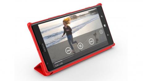
We’re not just talking about any HD display either. We’re talking about a 6-inch 1920 x 1080 IPS LCD screen (producing 367ppi) with Nokia’s ClearBlack and super-sensitive technologies. The former means that you can see it better when outside, and the latter means you can use it with your gloves on – two immensely practical features that tend to get brushed over too quickly.
While we’re at it, this isn’t just any quad-core processor, either. This Qualcomm Snapdragon 800 chip, clocked at 2.2GHz and backed by a healthy 2GB of RAM, is a pretty powerful quad-core chip. It’s the same processor as can be found in the Google Nexus 5 and in Windows Phone land only the Nokia Lumia 930 can rival it.
FutTv : V2rUn8Lq8T4Fw
With these two components alone, Nokia lifted the Windows Phone platform to specification parity with its Android rivals after three solid years of trailing firmly in its wake. It’s since been topped by the likes of the Samsung Galaxy S6 and HTC One M9, but it’s still quite a big achievement.

There’s that word again. Big. The Nokia Lumia 1520 is big in every way. Opening the box drew a genuine gasp from this typically stony-faced writer, who moments before had been typing out an email on his teeny-tiny iPhone 5S.
Initially, the Nokia Lumia 1520 looks ridiculous next to Apple’s stubbornly compact phone and even towers over the newer and larger iPhone 6. After a few hours’ company with the 1520, you might well find that the iPhone 5S looks and feels like a toy.

That’s not to say that we prefer the Lumia 1520 as a day-to-day tool. Let’s be straight – it’s too big for most general users.
At 6.41 x 3.36in, it will slip into the back pocket of your jeans, but only if it’s that pair you bought in preparation for the forthcoming festive pig-out. And there won’t be space in there for anything else.
In fact, now might be the time to acquaint yourself with a good tailor, because you’ll either need to reinforce those pockets or repair them. At 206g, this is one hefty piece of kit.
To place the Lumia 1520’s size and weight in context, it’s a good 30g heavier than the Galaxy Note 4 with its similarly sized 5.7-inch display, and is a whole centimeter taller. It’s also 7mm wider.
Having said all that, the Nokia Lumia 1520 feels surprisingly sleek in the hand, and that’s partly down to its 8.7mm thickness. Compared to other Lumia phones like the Nokia Lumia 1020 or the Nokia Lumia 930, it’s proportionally flatter.

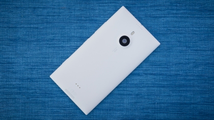
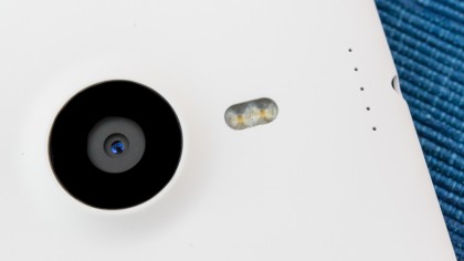
Even the 20MP PureView camera barely breaks the rear contour with its subtle blister shape, unlike the angry carbuncle on Nokia’s previous phone, the Lumia 1020.
Then there’s Nokia’s customary high-class build quality. We’ve said it before, but Nokia is the only other smartphone manufacturer out there capable of rivaling Apple and HTC for strong, distinctive design.
The Lumia 1520 continues Nokia’s predilection for unibody polycarbonate designs. This means that it’s essentially carved out of a single solid chunk of posh plastic. If you’ve never held a Nokia Lumia device before, then think of the HTC One X and you’ll have an idea of how it feels.
We didn’t dare put it to the test, but the Lumia 1520 feels like it would survive its share of drops, and certainly a little rough and tumble – although its sharply pointed corners are asking to be dinged, and it doesn’t use the very latest version of toughened Gorilla Glass.
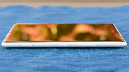
There’s a slight ridge where the display meets the chassis. When Nokia introduced this design with the Nokia Lumia 800, its display melted into its body, which added an extra feel of class. It’s a shame that’s not been included here.
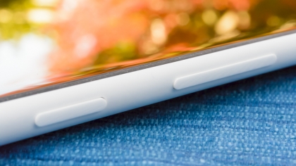
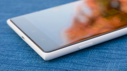
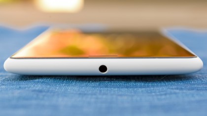
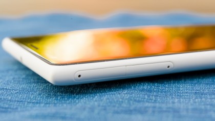
Curiously, after the flamboyant flourishes witnessed elsewhere (especially in the shocking yellow of our test model), the Nokia Lumia 1520’s physical buttons seem almost coy. They’re practically flush with the chassis along the right hand side – even the two-stage physical camera shutter button barely raises its head.
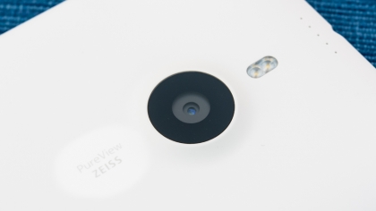
This helps with the ergonomics of this unwieldy device, but doesn’t help when you’re fumbling for the volume controls in the dark.
On the opposite side of the device you have the microSD card slot and the SIM slot. The former is in addition to the 32GB of internal memory, raising the possibility of a whopping 96GB of storage.
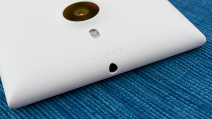
The latter accepts a nanoSIM, which is even smaller than the micro SIMs found in previous Nokia phones. It’s the same standard used by Apple, and it serves to free up a few valuable millimeters of space for other internal components. Although we doubt that the Lumia 1520’s innards are exactly struggling for air.
In summary, the Nokia Lumia 1520 is certainly striking, but we wouldn’t want to be struck with one. You’re getting a lot of phone here for around $550 / £360 / AU$500. An awful lot. That is, if you can actually find it, which is becoming increasingly hard, especially in the UK.
Interface
The Nokia Lumia 1520 launched with Windows Phone 8 and is now upgradeable to Windows Phone 8.1, complete with Nokia’s own “Denim” software modifications. We’re not talking Samsung-tweaking-the-life-out-of-Android levels here. Just a few thoughtful modifications to the still-sharp WP8 experience.
But first things first – what does Windows Phone 8 look like on that super-sharp 6-inch 1080p display? Much the same as it does on any other Windows Phone 8 device, is the simple and somewhat disappointing answer.
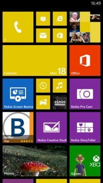
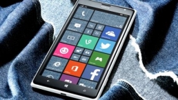
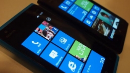
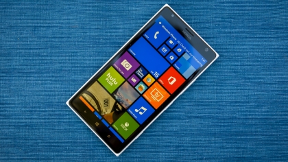
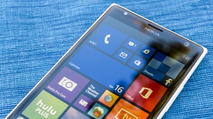
The main difference is that there’s an extra column of Live Tiles on the start screen. It’s never looked more like a colorful mosaic, with familiar faces and images popping out at you amongst live message alerts and other app icons.
In truth, it’s actually a little overwhelming now, with the ordered uniformity of the previous two-row set-up giving way to a Windows 8-like sprawl. We’re sure we’ll get used to it with time, but for now it’s just that little bit harder to identify and access the information you want in a pinch.
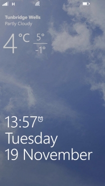
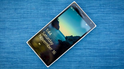
The lock screen is the same mix of sharp wallpaper pic and minimal information – just the time, date, and your latest calendar date, reminder, or missed call.
Nokia hasn’t so much enhanced this lock screen as partially undermined it with its Glance feature. This adds a permanent, faint clock to your phone’s display when in sleep mode, along with a count of any pending notifications.
You can also add the likes of Bing Weather information to your lock screen, offering a one-glance appraisal of the day’s conditions and a representative image without forcing you to step into the OS proper.
We also appreciated Nokia’s new double-tap-to-unlock system, which seemed particularly reliable, and saved us from scrambling for that hard-to-feel-out power key.
Windows Phone 8’s Live Tile system itself remains the most elegant and well-integrated implementation of widgets in any mobile OS. They’re essentially expanded app icons, which come in three different sizes. However, each can display a certain amount of live information from within the relevant app.
Weather apps may show you the current temperature and conditions, before flipping over to give you a three day forecast. The default Photos app cycles through your camera roll, lending your home screen that extra dose of personalization without the need to set up your own wallpaper.
Speaking of home screens, Windows Phone 8 just has the one. It scrolls up and down as you add more Live Tiles, and that extra column means that you’ll probably be doing a lot less of this on the Lumia 1520.
There is an extra screen accessed by swiping to the right, but this is effectively the app tray, where all of your applications are listed in alphabetical order.
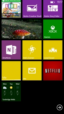
Pressing and holding on any of these will enable you to add it to the Start screen, probably complete with an expanded Live Tile.
Notifications remain a little undercooked in Windows Phone 8. You get a little banner appearing at the top of the screen when fresh messages come in, but you can’t expand this as you can with iOS and Android.
You also miss out on the settings toggles that these provide, meaning that you have to dive into the general Settings menu to do things like turn off Wi-Fi.
Thankfully these things are fixed by the update to Windows Phone 8.1, which adds Action Center, allowing you to swipe down on the screen for full notifications and quick toggles. The update also adds Cortana, finally giving Windows Phone a Google Now and Siri competitor.
Plus there are a bunch of other new features added, like a new and improved Word Flow keyboard and folders. In short it doesn’t drastically change the appearance of Windows Phone but it adds a whole lot of new functionality and it’s all for the better. That’s not the last update it will see either, with Windows 10 Mobile likely to hit it when available too.
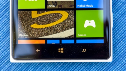
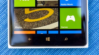
Nokia has stuck with the standard three capacitive soft keys for general navigation, as stipulated by Microsoft. There’s a back-up key, which is also used to access multitasking through a long press.
Then there’s the distinctive Windows home button, which also has a secondary function. Press and hold, and it will bring up WP8’s voice-activated assistant.
Through it you can open apps, make calls, launch Bing searches, and the like. It’s nowhere near as powerful or useful as Siri, but it’s handy for making calls when you attention is otherwise occupied.
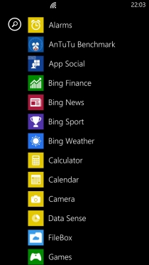
The final soft key is for search, which initiates a manual web search (you’re restricted to Bing again).
There’s no secondary function here, which is a shame – Microsoft could have implemented universal search for quickly finding files, contacts or apps. Such a feature is present in iOS and Android, and it’s badly missed in Windows Phone 8.
Going back to multitasking, it brings up a list of thumbnails showing recently opened apps, which have been held in stasis at the point you left them. These can be returned to with a tap or, new to the lasted version, dismissed with tap of the delete prompt. It looks and handles a lot like iOS 7’s approach, though it’s worth noting that Microsoft’s solution came first by several years.
Overall, Windows Phone 8 runs like a dream on the Nokia Lumia 1520. With its Snapdragon 800 CPU and that huge 1080p display, it’s never had as much headroom to spare, both in terms of screen space and in terms of power on tap.
On the latter point, it’s worth noting that Windows Phone has always felt slick (if not always fast) regardless of the hardware running it, thanks to Microsoft’s extremely tight spec guidelines and efficient software design, not to mention slick animations that serve to disguise variances in performance.
The OS runs very well here, too, but the difference between this and even a mid-range handset like the Lumia 720 isn’t what you’d call night and day.
Contacts and calling
Contacts
As with every other Windows Phone device from version 7 onwards, the Nokia Lumia 1520 uses the People app for handling contacts.
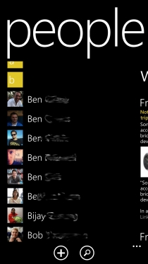
It remains a thoroughly pleasant method for keeping track of friends, family and acquaintances, with that extra personal touch that Microsoft’s mobile OS provides.
First up when you enter the People app is the standard A-to-Z list of contacts, each accompanied by a little thumbnail picture (if you’ve set one up, or connected to a social network).
Each contact page contains all of their information, and tapping on any addresses listed here will open up Here Maps and show you where they’re based.
Adding a fresh contact is a simple matter of hitting the “+” symbol at the bottom of the screen, whilst you can also search for a specific contact from the same area.
Tapping on one of the letter headings, meanwhile, brings up a large list of all the letters, allowing you to jump to the one you want with another tap. Smartly, any letters that aren’t used (such as Q or X, in my case) are blacked out.
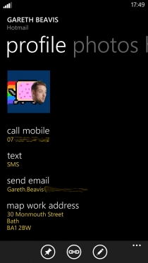
Another neat touch that continues to please is the ability to pin individual contacts to your start screen through a long press. It’s a great way to keep your nearest and dearest on speed dial.
Windows Phone 8 is arguably the most social mobile OS of them all, and that’s most evident here in the People app.
Sign in to your Facebook, Twitter or LinkedIn account (among others) through the Lumia 1520 and information from these will automatically be filtered through to the People app. Not only will your contacts be added and integrated where necessary, but their latest updates will be visible in their individual contact page.
Scrolling right from the main alphabetical contact page brings up the What’s New section, which is a list of the very latest updates from across your social network accounts. Keep in mind that all of this is delivered within the Windows Phone 8 UI – no third party apps are required.
It’s even possible to reply or like social posts from here.
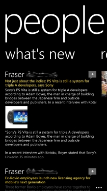
Scrolling across again from the What’s new section brings up Recent, which is a list of your most recently used contacts.
As you tend to call a small handful of your contacts far more than the rest, this is a handy way to cut through all of those old school friends you never talk to without the brutal use of the delete function.
As is the next section along, called Together. Here you can set up groups of contacts, such as Family or Close Friends.
What’s more, if you add them to a Room, you can share calendar entries, photos and videos with them, even if they own an iPhone or Android device. Fellow Windows Phone users get to indulge in group chats, too.
Overall, contacts on Windows Phone 8 – and by extension the Nokia Lumia 1520 – remains arguably the best of the big three platforms.
Calling
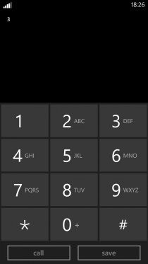
The dialler on the Nokia Lumia 1520 is the same chunky, minimalistic Windows Phone 8 example as always. It’s easy enough to use, but the continued lack of smart dialling – where the OS narrows down suggestions for the number you’re trying dial as you add more digits – is a frustration.
Single-handed dialling on the Nokia Lumia 1520 is a no-no for those with smaller hands. This is because the dialler has just been scaled up, as with much of the rest of the OS, so the chunky numbers still take up two thirds of the gigantic 6-inch display.
There are, at least, shortcut keys for Voicemail and the People app alongside the dialler on the phone screen, which lists your call history complete with instant call-back shortcuts.
Call quality on the Nokia Lumia 1520 was uniformly excellent during our test period, and the loudspeaker was both loud and clear.
Messaging
Sending messages on the Nokia Lumia 1520 is an intuitive and fluid experience, but it does serve as an example of where Windows Phone 8 needs to be more flexible when it comes to larger devices.
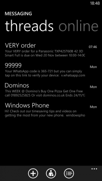
The messaging app itself is a typically crisp and succinct way to send SMS and MMS messages, with the main messaging screen showing you your most recent threads.
These threads take the chat-style indented speech bubble approach that’s now pretty much standard across all three major smartphone platforms. Of course, in Windows Phone 8 it comes with a sultry black background, which looks inkily seductive on the Nokia Lumia 1520’s display.
There’s also the permanent option to attach a picture, video, location, contact or voice note to a message through the little paperclip icon at the bottom.
Back to the main messaging app, and a lateral swipe will take you to the Online section, Here you can also access Facebook chat, change your status, and check out which of your Facebook contacts are online.
It’s at this point that we should probably address the Nokia Lumia 1520’s keyboard. It’s no different to the keyboard on any other Windows Phone 8.1 device, but that’s the problem.
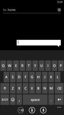
Thanks to Microsoft’s restrictive requirements (you can’t download keyboard alternatives like on Android, for example), Nokia has had to stick with a keyboard that was designed for a much smaller form factor.
It means that it still takes up a good half of the Lumia 1520’s screen, which is complete overkill on a 6-inch device. More than that, it feels completely unoptimized.
It could have benefited from a dedicated row of numerical keys, or at the very least the ability to shrink it and reposition it to one lower corner of the screen to enable single-handed text entry.
Still, you get the same clearly laid out keyboard and the same unobtrusively smart word suggestion system, and with the Windows Phone 8.1 update it also gets the ability to swipe words rather than tapping them out, so it’s by no means a write-off. It’s just that the Lumia 1520 isn’t the messaging or emailing power-house that it could have been.
Speaking of email, the Lumia 1520 comes with the usual email tools available to other Windows Phone 8 users. Set-up is easy, as it’s set-up to deal with Hotmail and Nokia Mail (of course) as well as Gmail and Yahoo. We were even able to set up our Apple Mail account by selecting the “Other account” option, and it worked without a hitch.
There’s still no unified email app for all of these disparate accounts, though, which is a bit of a pain. You have to have a different Live Tile for each account, which feels a little messy.
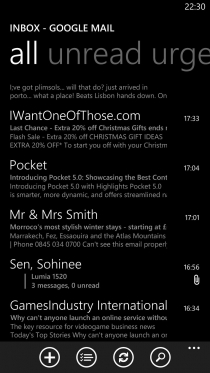
Especially as each app handles the same. You start with the All screen, which is a list of your emails, from newest down to older. Scrolling right enables you to order them by Unread or Urgent instead.
It’s also possible to access all of your email account’s separate folders by expanding the settings bar along the bottom and selecting Folders, so can view your drafts, deleted items and the like.
We like the way that individual emails are handled in Windows Phone 8. They’re automatically resized to fit the width of the screen, so on your Lumia 1520’s 6-inch HD display you get a supremely readable view. It’s especially noticeable when you receive image-heavy emails (and tap the prompt to download images), such as those from any subscriptions you might have.
Here, at least, Windows Phone 8’s default tool scales up well.
Attachments are also smartly handled, sitting just under the sender information near the top of the email.
You get the same drawbacks with the oversized keyboard in the email apps, but you also get helpful @ and .co.uk prompts added to the default QWERTY view, which is handy. The email-entry screen is also white by default, which helps set it apart from the black messaging equivalent.
There remains a lack of haptic feedback for typing, which may prove an annoyance for some.
Internet
This being a Windows Phone 8 device, you’re stuck with Microsoft’s Internet Explorer as your default web browser of choice. It’s no Chrome or even the latest Safari, but it does offer a reasonably clean and zippy browsing experience.
It’s also worth noting that you can change the default search engine from Bing to Google, which transforms your browsing session into something a lot more familiar.
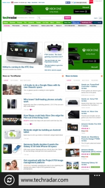
The first thing to get used to is having the address/search bar (which is unified like those aforementioned rivals) at the bottom of the screen. This actually makes reaching for it a little easier than on other mobile browsers. In fact, with that 6-inch display, it’s a lot easier.
By expanding this bar in typical Windows Phone 8 fashion (hit the three dots), you gain access to tabs, recently visited sites, favorites, page search, and the ability to pin individual websites to your Start page.
The tabs implementation, which is a rigid list of separated thumbnails, feels extremely basic and somewhat removed from the general browsing experience compared to the likes of Chrome.
Meanwhile the favorites system is even more basic, offering a sparse white-on-black written list of your stored websites. It feels as if the Lumia 1520’s display is wasted again here, as a representative thumbnail logo would aid browsing and look a darned sight more attractive to boot.
It is possible to exchange the refresh command, which by default sits to the left of the address bar, with tabs or favorites shortcuts.
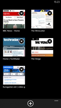
This is another area we think the Lumia 1520’s unique screen dimensions could have been capitalized on. Offering us all three commands simultaneously would not have felt overly congested here.
The web page viewing experience itself, however, is very pleasant. As you’d expect from a 1080p 6-inch display – which is only a little way short of compact tablet dimensions, after all – viewing content-rich websites is not a problem here.
We could read the entire desktop TechRadar home page pretty comfortably without any panning or zooming.
Try that on an iPhone. And the full TechRadar website completely loaded in around 11 seconds, and it was usable in less than half that. That’s pretty nippy.
It’s also worth noting that we got similar results on a both a decent Wi-Fi connection and with a full HSPA+ network connection. It bodes well for those of you on a 4G contract, which the Lumia 1520 supports.
Overall, browsing the web on the Nokia Lumia 1520 is a fine experience thanks to its speedy performance and near-tablet-like screen specs, but it feels somewhat hampered from reaching its full potential by the restrictive Windows Phone 8 OS with IE.
Camera
The Nokia Lumia 1520 continues Nokia’s recent strong work on the mobile photography front. It’s no Lumia 1020, but its 20MP snapper learns a few lessons from that beast while reverting to the rather more wieldy form of the Nokia Lumia 925.
In particular, Nokia has applied the same oversampling techniques found in the Lumia 1020 here. This means that it uses that 20MP image sensor to produce sharper, cleaner 5MP images.
In fact, the Lumia 1520 will automatically save both a 16MP and a 5MP image each time you take a snap, giving you a general image that’s great for speedy sharing and a larger one for cropping and enhancing at your leisure.

There’s also RAW support – which Nokia calls DNG – allowing you to take completely pure, uncompressed snaps. These tend to be pretty sizeable though, so better invest in that 64GB microSD card.
Of course, you’ll still need to be smart with your mobile photography. While the Lumia 1520’s 1/2.5 image sensor is larger than average, it’s still a fair bit smaller than the Lumia 1020’s and loads smaller than a leading point-and-shoot camera.
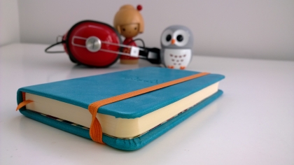
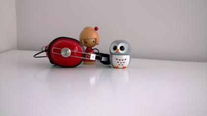
You can get some really detailed and natural-looking shots with the right lighting conditions, however. While there’s a certain amount of that bleached-out effect when photographing bright skies behind darker scenery, it’s much less pronounced than most smartphones manage.
Low-light shots without the flash tend to be grainy, too, even though they’re generally brighter and clearer than you might be used to from a mobile phone.
As we saw with the Lumia 925 and the Lumia 920 before it, Nokia’s OIS (optical image stabilisation) technology along with some clever algorithms ensure much better night time shots than most of its rivals. As long as the subject remains fairly still, you can get the kind of bright low-light snaps that would be impossible on most non-Nokia devices.
Nokia has packed a bewildering amount of settings and options into the Nokia Lumia 1520’s software, but at least it’s amalgamated some of those features into a single Nokia Pro Camera app. Nokia Smart Camera is now part of the package, which adds things like action shots and best shot to the mix.
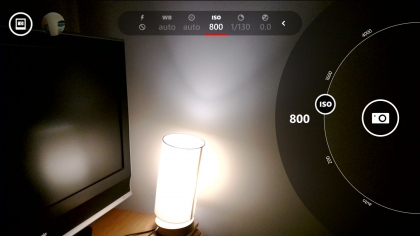
Again, you can jump to the Nokia Lumia 1520’s camera interface with a press of the physical shutter key – another reason we wish it was a standard feature on smartphones, besides the two-stage focus and shoot capabilities. It still isn’t the fastest camera app to boot up, but you’ll save a second or so by being able to initiate it without having to look at the screen.
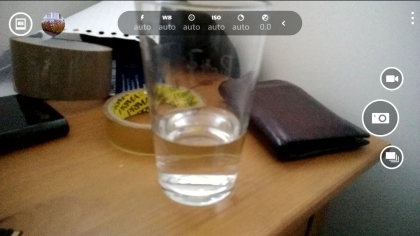
In use, the Lumia 1520’s camera UI is pretty intuitive despite its myriad options. You have a neat radial common menu to the right that rotates between a default (and somewhat superfluous) shutter command, video, and Smart mode (for burst photography).
You can tap to focus anywhere on the screen, with those Carl Zeiss optics duly obliging.
At the top left you have a thumbnail of your last shot, which can be tapped to reframe, delete, or share. Alongside this is your gallery button, allowing you to swipe back through all of your snaps.

Along the top of the camera UI is where the real magic happens, however. Here you have ever-present toggles for flash (a nice and bright dual-LED example, incidentally), white balance, focus, ISO (100-4000), shutter speed, and brightness.
The Lumia 1520 camera UI has everything a mobile photographer would need, and all to hand rather than tucked away in awkward menus like most of its rivals.
Indeed, it renders the default Camera app redundant, and even a little confusing. Elsewhere you get camera-related apps like Bing Vision (for QR and barcode scanning) and Cinemagraph, which lets you combine stills and video to create little animated snippets.
Once you’ve finished with your images you can edit them in the Creative Studio app. This lets you alter the focus or introduce blur to your images, play with colors to make certain ones “pop,” create collages and apply filters. It’s a great tool, and incredibly easy to get strong results from it.

Click here to see the full resolution image

Click here to see the full resolution image

Click here to see the full resolution image
Click here to see the full resolution image
Click here to see the full resolution image

Click here to see the full resolution image

Click here to see the full resolution image

Click here to see the full resolution image

Click here to see the full resolution image
Video
With all of those stand-out camera features, you might think that the Nokia Lumia 1520’s video capturing capabilities couldn’t have much more to add.
However, the Lumia 1520 has a technological innovation that’s dedicated to shooting footage. Nokia has incorporated four microphones, enabling you to capture directional stereo sound. Nokia calls it “Nokia Rich Recording,” and it really works.
Check out the sample video with the bus driving past on the left. You can close your eyes and track its progress past your left ear, while picking out the older gentleman’s footsteps as he walks past to the right. It’s fantastic, and is a world away from the tinny mess you might have grown accustomed to from your smartphone videos.
Otherwise you get full 1080p video capture at 30fps, as you’d expect from a modern high-end cameraphone.
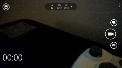
There are fewer options to tinker with when it comes to shooting video, as you might imagine. You can turn the dual-LED flash light on or off, tinker with the white balance, and switch focus between auto, manual, and infinite.
That’s your lot, and that’s all you really need – although anyone hoping for a high-fps slow motion mode like the iPhone 6 will be disappointed.
YouTube : https://www.youtube.com/watch?v=u-jR7KPVerI
Media
With that big, beautiful 6-inch display, the Nokia Lumia 1520 makes for a fine media player – provided you can lay your hands on the appropriate material.
You can store hours of video, thousands of songs, and plenty of 3D games on it with its 32GB of internal storage and enormous memory expansion potential, too.
Music
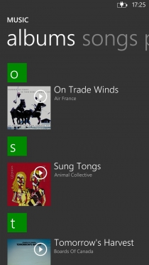
It’s a little surprising that, despite the Nokia Lumia 1520’s headline feature being that 6-inch Full HD display, it’s arguably set up to be a stronger music player than it is for videos or even games.
The default Music + Video app bunches all of your media together, but going into the dedicated Music section breaks your music collection (which can be synced by hooking up to your computer) up into artists, albums, songs, playlists (which can be created here), and genres.
These are all presented in typical Windows Phone 8 fashion, as sparse vertically scrolling lists, though the albums section does at least feature album artwork.
Once you’ve started a track playing, audio player controls will appear on the lockscreen, or after pressing the volume key when anywhere else in your device. It works well.
There’s also an FM radio accessible from the Music + Video app once you’ve hooked up a set of headphones, but that’s made pretty much redundant with the inclusion of the Nokia Music app.
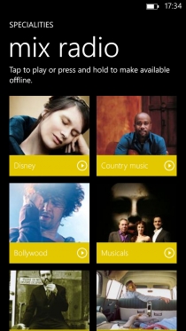
Here you get another audio player interface, which is very similar to the Microsoft one, as well as Mix Radio. This provides you with a wide selection of themed, curated playlists, which can all be listened to for free and with no sign-up. You can’t be too picky about which specific artists you want to listen to, but you can save particular playlist for offline listening.
When it comes to purchasing MP3s, the Nokia Lumia 1520 is a well catered for as any other Lumia device. Both Nokia and Microsoft offer online stores through their respective media apps.
On the Microsoft front, through Music + Videos, you get the Xbox Music Store, which enables access to Microsoft’s unlimited music subscription service as well as enabling you to purchase tracks outright.
And this is why the Nokia Lumia 1520 is so well suited to music fans – it’s got the content to back up its undeniably impressive specs.
Video
We have mixed feelings about the Nokia Lumia 1520 as a video player. When it comes to actually pumping out HD footage, it’s a stunner.
That 6-inch 1080p display (have we mentioned that before?) really does make watching full films on the go viable, and shows off its accurate color reproduction – which isn’t always the case with Nokia phones thanks to the company’s taste for super-vibrant AMOLED display technology.

This is LCD, and so nicely balanced, though you do lose the deep blacks of AMOLED. You’re well sorted for codec support too, including MP4, H.264, H.263 and WMV.
Our issue, though, is one of content. If the Lumia 1520 is almost overstocked with music-playing apps, it’s underserved for video.
There’s no Xbox Video Store service here. One is coming, but it’s not available yet. Meanwhile, Nokia has no equivalent to its own Nokia Music store for video content. There’s just nothing. This leaves you with support from third party apps such as Netflix, YouTube and Vimeo.

It’s a crying shame, as the Nokia Lumia 1520 has the raw specs to be one of the finest movie players in the business. Without the content ecosystem to back it up, though, it’s simply not good enough at this point in time.
Photos
The Nokia Lumia 1520 handles photos beautifully thanks to the ever delightful Windows Phone 8 Photos app.
We’ve mentioned it already in the review, but we love the way it cycles through your snaps on its Live Tile. There’s a reason it’s bigger than most of the others.
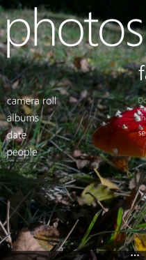
Into the Photos app itself, and you get to carry out your picture browsing with a high resolution snippet of one of your photos as the backdrop. It’s incredibly sharp.
Camera roll provides you with a list of square thumbnails for all of your photos and videos, with the latter clearly delineated by a play icon. We actually like that they’re placed into the context of the surrounding photos here.
Albums, meanwhile, splits your photos into their source folders. This includes your camera roll, any images you might have saved onto the device, screenshots (taken by pressing the power and Windows buttons together) and images that have been saved to Microsoft’s SkyDrive cloud storage solution.
You get 7GB of the latter for free as standard, so it’s well worth utilising.
The Photos app also allows you to sort your pictures by the date they were taken, as well as to pick out your favourites. It also lists any apps you have installed that enable you to interact with or enhance your photos, which helps remind you of that random filter app you installed on a whim three weeks ago.
Naturally, pictures look great on the Nokia Lumia 1520’s display. Add in the aforementioned Nokia Creative Studio app for editing purposes, and you have one of the best digital picture frames you can take around with you.
Battery life and connectivity
Battery life
The Nokia Lumia 1520 has a massive 3,400mAh battery. Of course, with a screen this big and this sharp, it needs it. The similarly sized Samsung Galaxy Note 4 has a similarly sized 3,220mAh battery.
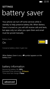
Don’t expect the Nokia Lumia 1520 to last you much more than any other high-end smartphone, though. We could comfortably get through a day of moderate usage, but we couldn’t stretch to two without charging up.
And boy does it take a while to charge up. We checked in after an hour of topping it up, and it had only gained about 15% in that time.
Also alarming was the fact that the phone chewed 17% of its battery capacity when left on flight mode overnight.
Still, when it comes to practical usage, it’s pretty capable. In our standard battery test, which involved running a 90 minute 720p video with all notifications on and the screen at its brightest, we were left with a little under 84% from a full charge. That’s pretty strong.
Overall, Nokia has ensured that its power-munching giant has an ample reservoir of power to draw from, so you probably won’t have to alter your usage or charging pattern from whatever smartphone you’re switching from.
Connectivity
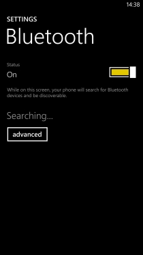
You won’t find yourself lacking for connectivity options with the Nokia Lumia 1520. It’s got Wi-Fi, of course, as well as 4G network support for those on an appropriate contract.
We found our connections to both mobile network and Wi-Fi hub to be universally reliable and strong.
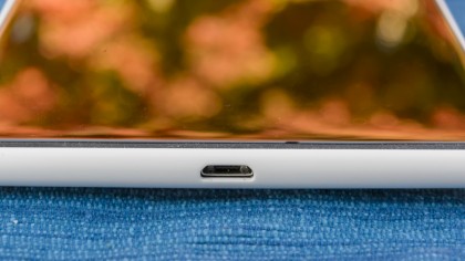
Elsewhere you have a standard microUSB slot for the dual purpose of charging and hooking up to your computer – which is a simple drag and drop process whether on Windows or OS X.
Bluetooth 4.0 is supported, and you also get NFC. Nokia is one of the few manufacturers to do more than pay lip service to the standard with a whole host of peripherals and accessories (speaker docks, wireless headphones etc.) that hook up to the Lumia 1520 with a simple tap.
Maps and apps
Maps
While most smartphone users will turn to Google Maps for all their general navigation needs, the Nokia Lumia 1520 has Nokia’s own fine mapping apps to lean on. These offer some unique features that are genuinely useful, too.

HERE Maps is the standard map app here, and it’s very solid and reliable. It’s main advantage over Google Maps on other platforms is that you can preload the entire map for a whole country, so you’re not reliant on a data connection to get you to where you need to go.
It’s perfect for the traveller who doesn’t want to incur roaming charges, not to mention those who live in poor signal areas.
The default view, upon entering, zooms into your location and shows your immediate surroundings. From here you can bring up local places of interest – restaurants, hotels, shops, and other amenities – as pins on the map.
Tapping on one of these offers you the option of directions, while a second tap brings up more detailed information on that location, as well as photos, reviews and guides.
Complementing HERE Maps is HERE Drive, which is no less than a full sat nag system for your phone. Again, you can preload full maps, which ensures a level of dependability that its rivals can’t match.
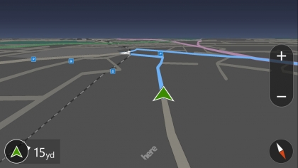
You also get a familiar 3D view (with the option of 2D) and excellent turn-by-turn instructions – both visual and audible.
HERE Drive can also notify you when you go over the local speed limit, and it can show you petrol stations and car parks along your route too.
Apps
We’ve discussed most of the truly useful apps included with the Nokia Lumia 1520, but there are a couple more to note.
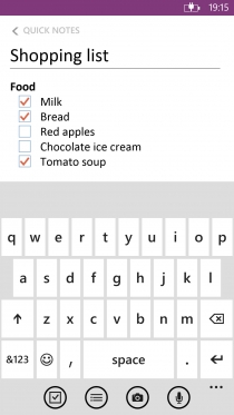
Microsoft OneNote is a handy note-taking app that enables you to jot down lideas and formulate check lists without messing around with formatting or anything too time consuming. It syncs with the desktop Office version, too.
Speaking of Office, you get access to the full MS Office suite of mobile apps here. That’s Word, Excel and PowerPoint documents, all fully editable on the Lumia 1520. As you might imagine, picking out those spreadsheet cells is that little bit easier on such a large display.
Kid’s Corner enables you to create a dedicated home screen for your little ones, cordoning off things like web access and settings menus. Great for when they’re restless on a long journey and want to play some games.
There are a host of Bing-related apps that concentrate on specific things like Sport, News, Finance and the like. Each is cleanly presented and perfectly functional in their own limited way.
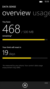
Data Sense is a handy tool for those not on an unlimited data plan, as it enables you to key in the effective date your plan rolls over and how much data you’re limited to. It will then warn you when you’re looking likely to exceed that limit.
Nokia Beamer, meanwhile, is an easy way to push photos and other files to other smart devices – including internet-connected TVs – even if they’re not running on Windows Phone 8. Just go to the Nokia Beamer website on the other device and scan the resulting QR code in with your Lumia 1520’s camera, and a connection will be made.
But of course, the apps that ship with any smartphone are only a small part of the story. When it comes to acquiring new applications, Windows Phone 8 still trails a distant third behind iOS and Android.
Some key applications are still missing and many which are present are inferior versions to those found on iOS or Android.
It’s the same case with games, which is slightly embarrassing when you consider that all Windows Phone 8 devices carry the Xbox brand in their dedicated Games app. The selection is simply not up to scratch.
Even worse on the latter point is the fact that the games that are there don’t look very good on the Lumia 1520’s large 1080p display. As we’ve noted, it’s the first Windows Phone device to sport this sharp a display and this much power, and few of the games available for it have been optimised for it.
Even big hitters like Halo: Spartan Assault look a little underwhelming, and Real Racing 2 looks like a PS2 game.

It’s a persistent issue we’ve found with the Lumia 1520 as a whole – bags full of potential that’s simply let down by an ecosystem seemingly caught on the hop by its excellence.
Hands on gallery

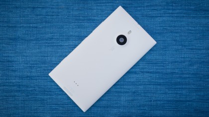
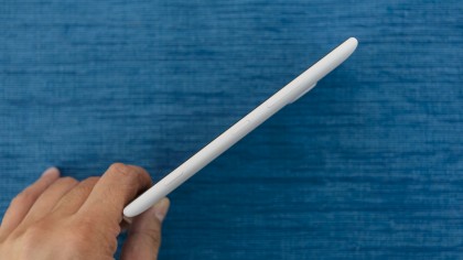
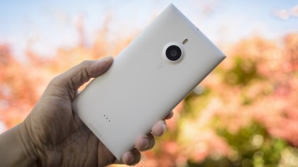
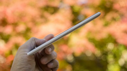

Verdict
The Nokia Lumia 1520 is a trailblazing 6-inch smartphone that forges a path for Windows Phone 8 into true high-end territory. And what a swathe this oversized phablet cuts – it’s huge.
However, Windows Phone 8 itself seems reluctant to follow. While still an attractive OS, it needs optimising for the Lumia 1520’s large Full HD display. So too does its app ecosystem, which remains well below par.
Still, there’s no denying that this is one of the most capable Windows Phone devices yet, with a fine camera and tip top performance.
We liked
The Nokia Lumia 1520 is a well put together smartphone with Nokia’s typical build quality.
Its 6-inch 1080p display is a thing of beauty, and is a great way to watch videos and view photos on the go.
Nokia has produced another excellent camera phone here, learning lessons from the Nokia Lumia 1020 and the Nokia Lumia 925 to produce a very well balanced snapper.
We disliked
Windows Phone 8’s lack of flexibility really holds the Lumia 1520 back from being the phone it could be. Too many elements fail to capitalise on the large, sharp display.
There’s also no denying that this is a ridiculously large phone, and whipping one out in public will be as embarrassing as it is tricky to wield for those who appreciate a little subtly and mobility from their phones.
Then there’s that age old problem of the Windows Phone 8 ecosystem, which still lacks apps, not to mention a video store to fully capitalise on that cinematic screen.
Verdict
The Nokia Lumia 1520 is an absolute beast of a phone that we suspect only the large-handed and generous pocketed will be able to live with day to day.
Those who accept the challenge will find just about the most capable Windows Phone 8 device yet, with top-of-the-range specs that include a stunning 1080p display and a superb 20-megapixel camera.
Despite its size, however, the Lumia 1520 feels like it’s missing something. Only when the Windows Phone OS allows itself to be moulded and expanded into this new super-sized form factor will it feel complete.
![]()
Related Posts
December 6, 2021
7+ Web Design Trends for 2022: Which Will You Use?
December 6, 2021
The 10 Best WordPress Booking Plugins to Use On Your Website
December 6, 2021
How to Use a Web Cache Viewer to View a Cached Page
November 6, 2021
10 Modern Web Design Trends for 2022
November 6, 2021
Best Free SSL Certificate Providers (+ How to Get Started)
November 6, 2021
How to Design a Landing Page That Sends Conversions Skyrocketing
November 6, 2021
What Are the Best WordPress Security Plugins for your Website?
October 6, 2021
Your Guide to How to Buy a Domain Name
October 6, 2021
How to Build a WordPress Website: 9 Steps to Build Your Site
September 6, 2021
10 Best Websites for Downloading Free PSD Files
September 6, 2021
HTML5 Template: A Basic Code Template to Start Your Next Project
September 6, 2021
How Much Does It Cost to Build a Website for a Small Business?
September 6, 2021
A List of Free Public CDNs for Web Developers
September 6, 2021
6 Advanced JavaScript Concepts You Should Know
August 6, 2021
10 Simple Tips for Launching a Website
August 6, 2021
25 Beautiful Examples of “Coming Soon” Pages
August 6, 2021
10 Useful Responsive Design Testing Tools
August 6, 2021
Best-Converting Shopify Themes: 4 Best Shopify Themes
July 6, 2021
What Is Alt Text and Why Should You Use It?
July 6, 2021
24 Must-Know Graphic Design Terms
June 6, 2021
How to Design a Product Page: 6 Pro Design Tips
April 6, 2021
A Beginner’s Guide to Competitor Website Analysis
April 6, 2021
6 BigCommerce Design Tips For Big Ecommerce Results
April 6, 2021
Is WordPress Good for Ecommerce? [Pros and Cons]
March 6, 2021
Make Websites Mobile-Friendly: 5 Astounding Tips
March 6, 2021
Shopify vs. Magento: Which Platform Should I Use?
March 6, 2021
Top 5 Web Design Tools & Software Applications
February 6, 2021
Website Optimization Checklist: Your Go-To Guide to SEO
February 6, 2021
5 UX Design Trends to Dazzle Users in 2021
February 6, 2021
What Is the Average Page Load Time and How Can You Do Better?
February 6, 2021
Choosing an Ecommerce Platform That Will Wow Customers
February 6, 2021
7 Best Practices for Crafting Landing Pages with Forms
February 6, 2021
7 B2B Web Design Tips to Craft an Eye-Catching Website
January 6, 2021
Mobile-Friendly Checker | Check Your Site’s Mobile Score Now
January 6, 2021
8 Tips for Developing a Fantastic Mobile-Friendly Website
December 6, 2020
How to Add an Online Store to Your Website [4 Ways]
December 6, 2020
5 UX Design Tips for Seamless Online Shopping
November 6, 2020
Ecommerce Website Essentials: Does Your Site Have All 11?
November 6, 2020
5 Small Business Website Essentials You Need for Your Site
November 6, 2020
Your Website Redesign Checklist for 2020: 7 Steps for Success
May 1, 2020
Psychology of Color [Infographic]
April 21, 2020
How to start an online store that drives huge sales
January 3, 2020
5 Lead Generation Website Design Best Practices
March 6, 2019
6 Reasons You Should Redesign Your Website in 2019
March 6, 2019
7 Web Design Trends for 2019
February 19, 2019
Who owns the website/app source code, client or developer
February 7, 2019
Don’t Let Your Domain Names Expire in 2019
January 8, 2019
2019 Website Development Trends To Note
October 6, 2017
How Web Design Impacts Content Marketing
October 6, 2017
How to Choose a Navigation Setup
August 6, 2017
Why User Experience Matters to Marketing
July 6, 2017
5 Ways Web Design Impacts Customer Experience
September 6, 2016
How to Learn Angular
September 6, 2016
The Excuses for Not Having a Website (Infographic)
September 6, 2016
How to Build an Award-Winning Web Design Team
September 6, 2016
13 Free Data Visualization Tools
August 6, 2016
How Selling Pastries Helped Us Design a Better Product
August 6, 2016
11 Sites to Help You Find Material Design Inspiration
July 4, 2016
How to change free wordpress.com url
April 6, 2016
The 5 Best Free FTP Clients
April 6, 2016
7 Free UX E-Books Worth Reading
March 6, 2016
Can Handwritten Letters Get You More Clients?
December 10, 2015
Star Wars Week: How to create your own Star Wars effects for free
December 6, 2015
20 "Coming Soon" Pages for Inspiration
December 6, 2015
6 Free Tools for Creating Your Own Icon Font
December 6, 2015
9 Useful Tools for Creating Material Design Color Palettes
November 6, 2015
20 Free UI Kits to Download
November 6, 2015
50 Web Designs with Awesome Typography
November 6, 2015
When to Use rel="nofollow"
November 6, 2015
7 Free Books That Will Help You Become More Productive
November 6, 2015
50 Beautiful One-Page Websites for Inspiration
November 6, 2015
Circular Images with CSS
October 6, 2015
Lessons Learned from an Unsuccessful Kickstarter
October 6, 2015
5 Games That Teach You How to Code
October 6, 2015
Cheatsheet: Photoshop Keyboard Shortcuts
October 6, 2015
An Easy Way to Create a Freelance Contract for Your Projects
October 6, 2015
50 Design Agency Websites for Inspiration
September 29, 2015
JB Hi-Fi shutting the book on ebooks
September 24, 2015
Opinion: Quick, Quickflix: It's time to give yourself the flick
September 24, 2015
New Star Wars 360-degree video is among first on Facebook
September 21, 2015
Apple purges malicious iPhone and iPad apps from App Store
September 12, 2015
Apple's new Live Photos feature will eat up your storage
September 12, 2015
The latest Windows 10 Mobile preview has been delayed
September 12, 2015
IBM buys StrongLoop to add Node.js development to its cloud
September 8, 2015
Fake Android porn app takes your photo, then holds it ransom
September 6, 2015
50 Restaurant Websites for Inspiration
September 6, 2015
Zero UI — The Future of Interfaces
September 6, 2015
50 Beautiful Websites with Big Background Images
September 6, 2015
Infographic: 69 Web Design Tips
September 6, 2015
Free Windows 10 Icons
September 2, 2015
Instagram turns itself into a genuine messaging service
August 11, 2015
In Depth: How Microsoft taught Cortana to be more human
August 11, 2015
Windows 10 price, news and features
August 11, 2015
Windows 10's broken update introduces endless reboot loop
August 11, 2015
Windows 10 races to 27m installs
August 11, 2015
Windows 10 IoT Core gets first public release
August 10, 2015
iOS Tips: How to backup iPhone to an external drive
August 10, 2015
Windows 8.1 RT finally getting Windows 10 Start Menu
August 10, 2015
How to use Windows Hello
August 10, 2015
Review: Moto Surround
August 10, 2015
Review: Moto G (2015)
August 9, 2015
8 of the best free VPN services
August 8, 2015
Use Firefox? Mozilla urges you update ASAP
August 7, 2015
Mac Tips: Apple Mail: How to remove the Favorites Bar
August 7, 2015
How to make the OS X dock appear faster
August 7, 2015
Review: BQ Aquaris E45 Ubuntu Edition
August 7, 2015
Review: Acer Liquid Jade Z
August 6, 2015
How to reinstall Linux
August 6, 2015
How to reinstall Windows
August 6, 2015
Updated: Apple Music: release date, price and features
August 6, 2015
Social News Websites for Front-End Developers
August 6, 2015
10 Free JavaScript Books
August 6, 2015
50 Beautiful Blog Designs
August 6, 2015
Animated SVG Pipes Effect
August 6, 2015
Launching Your First App
August 5, 2015
Windows 10 goes freemium with paid apps
August 5, 2015
Updated: Week 1 with Windows 10
August 5, 2015
Mac Tips: How to manage Safari notifications on Mac
August 5, 2015
Microsoft Sway may kill the PowerPoint presentation
August 4, 2015
Microsoft gives Outlook on the web a new look
August 4, 2015
Mac OS X vulnerable to new zero-day attack
August 4, 2015
Windows 10 users warned of two scams
August 4, 2015
Microsoft's Docs.com is now available to everyone
August 3, 2015
Mac Tips: How to edit the Favorites sidebar on Mac
August 3, 2015
Updated: Windows 10 price, news and features
July 29, 2015
Review: HP ProDesk 405 G2
July 29, 2015
Hands-on review: HP Elite x2 1011
July 29, 2015
Hands-on review: Updated: Windows 10 Mobile
July 29, 2015
Review: Updated: Nvidia Shield Android TV
July 28, 2015
LIVE: Windows 10 launch: Live Blog!
July 28, 2015
How to prepare for your upgrade to Windows 10
July 28, 2015
Review: Updated: Windows 10
July 28, 2015
Review: Updated: HP Pro Tablet 608
July 28, 2015
Review: Heat Genius
July 28, 2015
Hands-on review: Moto X Play
July 28, 2015
Hands-on review: Moto X Style
July 28, 2015
Hands-on review: Moto G (2015)
July 28, 2015
Review: 13-inch MacBook Air (early 2015)
July 28, 2015
Hands-on review: OnePlus 2
July 28, 2015
Review: LG 65EG960T 4K OLED
July 28, 2015
Mac Tips: How to share printers on Mac
July 27, 2015
Apple Music's arrival hasn't opened Pandora's box
July 26, 2015
Review: Garmin Swim
July 25, 2015
How to merge OS X contacts into an existing list
July 25, 2015
Hands-on review: UPDATED: ZTE Axon
July 24, 2015
Mac Tips: How to zoom in on a Mac
July 24, 2015
What Windows 10 means for the enterprise
July 24, 2015
Review: JBL Charge 2 Plus
July 24, 2015
Review: Acer Aspire S7
July 24, 2015
Review: Updated: Canon G3 X
July 24, 2015
Review: Updated: iPad Air 2
July 24, 2015
Review: Thinksound On1
July 24, 2015
Review: Asus Chromebook Flip
July 24, 2015
Review: Garmin Forerunner 225
July 23, 2015
Review: Garmin nuvi 68LM
July 23, 2015
Review: Samsung Galaxy S6 Active
July 23, 2015
Review: Bowers and Wilkins P5 Wireless
July 23, 2015
Review: Dell XPS 15 (2015)
July 21, 2015
Review: Fuji S9900W
July 21, 2015
Review: Updated: Fitbit Surge
July 21, 2015
Review: UE Roll
July 21, 2015
Hands-on review: Ubik Uno
July 20, 2015
Review: Samsung HW-J650
July 20, 2015
Updated: 40 best Android Wear smartwatch apps 2015
July 20, 2015
Review: Acer Chromebook C740 review
July 20, 2015
Review: Huawei Talkband B2
July 20, 2015
Review: Dell Venue 10 7000
July 20, 2015
Review: Intel Core i7-5775C
July 17, 2015
Mac Tips: How to delete locked files on Mac
July 17, 2015
Review: Pebble Time
July 16, 2015
Microsoft just made Windows XP even less secure
July 16, 2015
Windows 8.1 RT is getting an update this September
July 16, 2015
OS showdown: Windows 10 vs Windows 8.1 vs Windows 7
July 16, 2015
Review: Acer CB280HK
July 15, 2015
Windows 10 is ready for new laptops and PCs
July 15, 2015
Explained: How to take a screenshot in Windows
July 15, 2015
Office for Windows 10 appears in latest build
July 14, 2015
Review: ZTE Axon
July 14, 2015
Review: ViewSonic VP2780-4K
July 14, 2015
Hands-on review: SanDisk Connect Wireless Stick
July 14, 2015
Review: Oppo PM-3
July 14, 2015
Review: BT 11ac Dual-Band Wi-Fi Extender 1200
July 14, 2015
Review: Fuji X-T10
July 13, 2015
How to build an SEO strategy for your business
July 13, 2015
Review: Lenovo ThinkPad Yoga 15
July 13, 2015
Review: Audio-Technica ATH-MSR7
July 13, 2015
Review: Garmin NuviCam LMT-D
July 13, 2015
Review: Dell Inspiron 13 7000
July 13, 2015
Hands-on review: AstroPi SenseHAT
July 13, 2015
Hands-on review: EE Rook
July 13, 2015
Hands-on review: Updated: HTC Vive
July 12, 2015
Here's the ultimate software list for PC fanatics
July 10, 2015
How to use the new Photos app for Mac
July 10, 2015
Windows 10 Insider Preview Build 10166 available now
July 10, 2015
Splunk spends big on cybersecurity acquisition
July 10, 2015
Making Windows 10 apps just got a whole lot easier
July 10, 2015
Review: Lenovo LaVie Z 360
July 9, 2015
OS X El Capitan public beta available right now
July 9, 2015
Microsoft finally unveils Office 2016 for Mac
July 9, 2015
Review: Updated: Chromecast
July 9, 2015
Review: Updated: Tesco Hudl 2
July 9, 2015
Review: Lenovo ThinkPad E550
July 9, 2015
Review: Updated: Google Nexus 6
July 8, 2015
What you need to know about Windows Server 2016
July 7, 2015
Microsoft to hike enterprise cloud pricing
July 6, 2015
Hacking Team end up being totally 0wned
July 6, 2015
Review: HP Pro Slate 12
July 6, 2015
Review: Samsung 850 Pro 2TB
July 6, 2015
Review: Asus RT-AC87U
July 6, 2015
Review: Jawbone UP2
July 6, 2015
Reimagining the Web Design Process
July 6, 2015
50 Clean Websites for Inspiration
July 6, 2015
15 Free Books for People Who Code
July 6, 2015
Web Storage: A Primer
July 6, 2015
A Look at Some CSS Methodologies
July 3, 2015
6 Essential Mac Mouse and Trackpad Tips
July 2, 2015
How to install a third party keyboard on Android
July 2, 2015
Review: UPDATED: Asus Zenfone 2
July 2, 2015
Review: Alienware 13
July 2, 2015
Review: HP DeskJet 1010
July 1, 2015
5 issues we want Apple Music to fix
June 13, 2015
Cortana will get its own button on Windows 10 PCs
June 12, 2015
Windows 10 will come with universal Skype app
June 12, 2015
iPad music production: 18 Best apps and gear
June 12, 2015
Windows 10 all set for early enterprise struggle
June 12, 2015
Review: Garmin VIRB Elite
June 11, 2015
Review: Updated: Nvidia Shield Tablet
June 11, 2015
Review: Nokia Lumia 635
June 10, 2015
Microsoft brings more online tweaks to Office 365
June 10, 2015
Mac Tips: How to use Screen Sharing in Mac OS X
June 9, 2015
Hands-on review: Meizu M2 Note
June 9, 2015
Hands-on review: EE 4GEE Action Camera
June 9, 2015
Review: Toshiba 3TB Canvio external hard drive
June 9, 2015
Review: Olympus SH-2
June 8, 2015
Hands-on review: Updated: Apple CarPlay
June 8, 2015
UPDATED: iOS 9 release date, features and news
June 8, 2015
Review: Updated: Roku 2
June 8, 2015
Review: Updated: PlayStation Vue
June 8, 2015
Review: Dell PowerEdge R730
June 8, 2015
Review: Canon SX710 HS
June 7, 2015
UPDATED: iOS 9 release date, features and rumors
June 7, 2015
Review: Lenovo S20-30
June 6, 2015
Free Writing Icons
June 6, 2015
15 CSS Questions to Test Your Knowledge
June 6, 2015
The Best CSS Reset Stylesheets
June 6, 2015
How CSS Specificity Works
June 5, 2015
'Delay' is a new feature in Windows 10
June 5, 2015
Review: Beyerdynamic Custom One Pro Plus
June 5, 2015
Latest SEO Marketing tools
June 5, 2015
Review: Nvidia Shield Android TV
June 5, 2015
Review: Honor 4X
June 5, 2015
Review: In Depth: Oppo R5
June 3, 2015
Hands-on review: Huawei P8 Lite
June 3, 2015
How To: How to create eBooks on a Mac
June 3, 2015
Review: Updated: Tidal
June 3, 2015
Review: Canon 750D (Rebel T6i)
June 2, 2015
Review: Updated: Asus ZenWatch
June 2, 2015
Review: Alcatel OneTouch Idol 3
June 2, 2015
Review: Updated: Yotaphone 2
June 2, 2015
Review: Updated: Nokia Lumia 625
June 2, 2015
Review: Creative Muvo Mini
June 1, 2015
Review: Acer TravelMate P645 (2015)
June 1, 2015
Hands-on review: Corsair Bulldog
May 29, 2015
In Depth: NetApp: a requiem
May 29, 2015
July is looking definite for Windows 10 release
May 29, 2015
Hands-on review: Google Photos
May 28, 2015
Mac Tips: The 16 best free GarageBand plugins
May 28, 2015
Review: Canon 760D (Rebel T6s)
May 27, 2015
Review: Lenovo Yoga 3 14
May 27, 2015
Hands-on review: Serif Affinity Photo
May 27, 2015
Review: Garmin Vivoactive
May 26, 2015
Review: Datacolor Spyder5 Elite
May 26, 2015
Hands-on review: Sony Xperia Z3+
May 26, 2015
Review: Epson BrightLink Pro 1410Wi
May 26, 2015
Review: Technics Premium C700
May 26, 2015
Review: Canon EOS M3
May 26, 2015
Review: Updated: HTC One M9
May 26, 2015
Review: Updated: Sony Xperia Z3 Compact
May 25, 2015
Review: Updated: New Nintendo 3DS
May 25, 2015
Updated: 50 best Mac tips, tricks and timesavers
May 25, 2015
Updated: Windows email: 5 best free clients
May 25, 2015
Instagram is planning to invade your inbox
May 25, 2015
Review: Updated: Foxtel Play
May 24, 2015
How Windows 10 will change smartphones forever
May 24, 2015
Review: Vodafone Smart Prime 6
May 24, 2015
Review: Updated: iPad mini
May 22, 2015
Office Now may be Cortana for your work life
May 22, 2015
Review: Updated: Lenovo Yoga 3 Pro
May 22, 2015
Review: Microsoft Lumia 640 LTE
May 22, 2015
Review: Updated: Fitbit Flex
May 21, 2015
Updated: Best free Android apps 2015
May 21, 2015
Review: Asus ZenBook Pro UX501
May 21, 2015
Review: Sennheiser Momentum In-Ear
May 20, 2015
Hands-on review: UPDATED: Asus Zenfone 2
May 20, 2015
OS X 10.11 release date, features and rumors
May 18, 2015
Updated: Best free antivirus software 2015
May 18, 2015
iPhone 6S rumored to launch as soon as August
May 18, 2015
Microsoft ready to pounce and acquire IFS?
May 17, 2015
5 of the most popular Linux gaming distros
May 16, 2015
Review: Acer Chromebook 15 C910
May 16, 2015
Review: Lenovo ThinkPad X1 Carbon (2015)
May 16, 2015
Review: Polk Nue Voe
May 16, 2015
The top 10 data breaches of the past 12 months
May 16, 2015
Hands-on review: Updated: LG G4
May 16, 2015
Review: Updated: Quickflix
May 16, 2015
Review: LG Watch Urbane
May 16, 2015
Review: Razer Nabu X
May 16, 2015
Hands-on review: Updated: Windows 10
May 16, 2015
Review: UPDATED: Moto X
May 16, 2015
Review: Updated: Moto G (2013)
May 12, 2015
Review: TomTom Go 50
May 12, 2015
Review: Updated: Moto G (2014)
May 12, 2015
Review: Garmin Vivofit 2
May 12, 2015
Review: Asus Transformer Book Flip TP300LA
May 11, 2015
Review: MSI GT80 Titan
May 11, 2015
Review: Monster SuperStar BackFloat
May 9, 2015
Review: Updated: Apple Watch
May 7, 2015
5 million internet users infected by adware
May 7, 2015
Review: Updated: New MacBook 2015
May 6, 2015
Android M will be shown at Google IO 2015
May 6, 2015
Review: Epson WorkForce Pro WF-4630
May 6, 2015
Review: Master & Dynamic MH40
May 6, 2015
How to Use Gulp
May 6, 2015
Getting Started with Command-Line Interfaces
May 6, 2015
What It’s Like to Contribute to WordPress
May 6, 2015
Ultimate Guide to Link Types for Hyperlinks
May 6, 2015
11 Things You Might Not Know About jQuery
May 5, 2015
Hands-on review: Updated: PlayStation Now
May 5, 2015
Review: Lenovo ThinkPad Yoga 12
May 5, 2015
Review: Updated: iPad Air
May 5, 2015
Review: Panasonic SZ10
May 5, 2015
Review: Updated: Fetch TV
May 4, 2015
Review: Cambridge Audio Go V2
May 3, 2015
Review: Lightroom CC/Lightroom 6
May 2, 2015
5 of the most popular Raspberry Pi distros
May 1, 2015
Review: PlayStation Vue
May 1, 2015
Hands-on review: Updated: Microsoft HoloLens
April 30, 2015
Build 2015: Why Windows 10 may not arrive until fall
April 29, 2015
The biggest announcements from Microsoft Build 2015
April 29, 2015
Hands-on review: TomTom Bandit
April 29, 2015
Hands-on review: EE Harrier Mini
April 28, 2015
Review: Samsung NX500
April 28, 2015
Hands-on review: LG G4
April 28, 2015
Review: Patriot Ignite 480GB SSD
April 28, 2015
Hands-on review: EE Harrier
April 28, 2015
Review: Linx 10
April 28, 2015
Review: 1&1 Cloud Server
April 26, 2015
Hands-on review: Acer Iconia One 8
April 25, 2015
How to run Windows on a Mac with Boot Camp
April 24, 2015
Dropbox Notes poised to challenge Google Docs at launch
April 24, 2015
Hands-on review: Acer Aspire E14
April 24, 2015
Hands-on review: UPDATED: Valve Steam Controller
April 24, 2015
Review: Acer Iconia One 7
April 23, 2015
Windows 10 just revived everyone's favorite PC game
April 23, 2015
Google opens up Chromebooks to competitors
April 23, 2015
Here's how Outlook 2016 looks on Windows 10
April 23, 2015
Hands-on review: Updated: Acer Liquid M220
April 23, 2015
Hands-on review: Acer Aspire Switch 10 (2015)
April 23, 2015
Hands-on review: Acer Aspire R 11
April 22, 2015
Review: Alienware 17 (2015)
April 22, 2015
Hands-on review: Updated: HP Pavilion 15 (2015)
April 21, 2015
This is how Windows 10 will arrive on your PC
April 21, 2015
Review: iMac with Retina 5K display
April 21, 2015
Review: Epson XP-420 All-in-One
April 18, 2015
Google Now brings better search to Chrome OS
April 17, 2015
Review: Epson Moverio BT-200
April 17, 2015
Review: Pentax K-S2
April 16, 2015
Updated: Android Lollipop 5.0 update: when can I get it?
April 15, 2015
Hands-on review: Updated: Huawei P8
April 15, 2015
Review: SanDisk Ultra Dual USB Drive 3.0
April 15, 2015
Review: Updated: LG G3
April 15, 2015
Review: Updated: LG G3
April 15, 2015
Review: Crucial BX100 1TB
April 13, 2015
iOS 8.4 beta reveals complete Music app overhaul
April 13, 2015
Linux 4.0: little fanfare for a tiny new release
April 13, 2015
Achievement unlocked: Microsoft gamifies Windows 10
April 13, 2015
Best Android Wear smartwatch apps 2015
April 13, 2015
Review: Acer Aspire R13
April 12, 2015
Review: TP-Link Archer D9
April 10, 2015
Microsoft's new browser arrives for Windows 10 phones
April 10, 2015
Review: LG UltraWide 34UC97
April 9, 2015
Office now integrates with Dropbox on the web
April 9, 2015
Now you can buy video games with Apple Pay
April 9, 2015
Updated: iOS 8 features and updates
April 9, 2015
Microsoft's stripped down Nano Server is on the way
April 8, 2015
Skype Translator gets even more features
April 8, 2015
Windows mail services hit by widespread outages
April 8, 2015
Review: UPDATED: Amazon Echo
April 8, 2015
Hands-on review: Dell Venue 10 7000
April 8, 2015
Review: Updated: OS X 10.10 Yosemite
April 7, 2015
Google's GMeet could kill teleconferencing
April 7, 2015
Is Redstone the first Windows 10 update?
April 7, 2015
Next peek at Windows Server 2016 due next month
April 7, 2015
Review: Acer Aspire Switch 11
April 7, 2015
Review: Adobe Document Cloud
April 6, 2015
Hands-on review: Updated: New MacBook 2015
April 6, 2015
Freebie: 100 Awesome App Icons
April 6, 2015
Six Revisions Quarterly Report #1
April 6, 2015
A Modern Approach to Improving Website Speed
April 6, 2015
Disable Text Selection with CSS
April 4, 2015
Review: Nikon D7200
April 3, 2015
Amazon Prime video now streams to any Android tablet
April 3, 2015
Review: Google Cardboard
April 3, 2015
Review: MSI WS60
April 2, 2015
Chrome users can now run 1.3 million Android apps
April 2, 2015
See Windows 10 Mobile running on an Android handset
April 2, 2015
Review: Mini review: Macphun Noiseless Pro 1.0
April 2, 2015
Review: Intel SSD 750 Series 1.2TB
April 2, 2015
Review: BenQ TreVolo
April 2, 2015
Hands-on review: Nikon 1 J5
April 1, 2015
Microsoft launches Windows 10 music and video apps
April 1, 2015
Review: mini review: Sony XBA-H1
December 19, 2014
Review: CoPilot Premium sat nav app
December 19, 2014


