Windows 10 review: Introduction
Windows 10 is an entirely new version of the veteran Windows operating system – a version that is make-or-break for Microsoft.
Even though Windows 8.1 did improve things, there’s no escaping that with Windows 8, Microsoft was hugely complacent, buoyed by the success of Windows 7. It drastically misunderstood its users with a fundamentally changed user interface which didn’t make any logical sense and was hard to learn. It failed us. It failed itself.
Thankfully 2015 Microsoft is pretty different to 2012 Microsoft. The key management of the corporation has changed. It has woken up to the fact that people can choose other operating systems. It’s keen on making stuff for OS X, Linux, iOS and Android. As you’ll hear, it’s allowing apps from other platforms to be easily ported to Windows, too.
YouTube : https://www.youtube.com/watch?v=qQmlJRrhSQk&feature=youtu.be
Microsoft believes the future of Windows is as a platform for all. Like Android, the strength of Windows is in the thousands of companies that develop for it (see the section about Universal apps for more on the relationship with developers) and use it in their products.
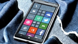
That’s why Windows 10 is no longer just an operating system for 32 and 64-bit PCs. It will also run on the ARM platform for smaller tablets and smartphones. Windows 10 is going to run on phones – it’s the new version of Windows Phone, but it’s not that clear whether Microsoft will brand new Windows Phones as ‘Windows 10’ or not. If you know what Windows RT was, then don’t worry, because it’s nothing like that.
Universal apps will run not only on PCs, but on Windows 10 phones, Windows 10 for IoT devices and Xbox as well.
Like Windows XP, Vista, 7 and 8 before it, Windows 10 is part of the Windows NT family.
From the Windows 10 Preview to RTM
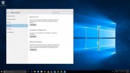
So, how have we put together this review? We’ve been part of the Windows Insider program, which has given people early access to Windows 10 through various phases of its development. The latest version which this article is based on, is known as build 10240, made available on 15 July. It is the RTM- or Release to Manufacturing – version. RTM will also end up on Windows 10 PCs.
RTM didn’t doesn’t have the usual ‘Windows 10 Insider Preview’ text on the desktop and it has also been released to everybody in the Windows Insider program – even those who didn’t want the latest updates (the ‘slow’ ring as opposed to the ‘fast’ ring).
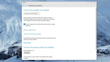
Even after Windows 10’s release, the Windows Insider program will continue and Microsoft will release Windows 10 updates to members of the program first.
While it’s natural that Windows 10 will be considered as ‘finished’ by reviewers (us) and consumers in the coming weeks, Microsoft doesn’t subscribe to this point of view and says it will carry on developing the OS with additional tweaks.
Windows 10 release date, upgrades, versions
Upgrading to Windows 10
We know that Windows 10 will be a free upgrade for the first year of release if you have Windows 7, Windows 8.1 or Windows Phone 8.1 device. If you have Windows 8.1 (PC or phone) there should be no issue in installing Windows 10.
If you have Windows 7, you’ll need to make sure you meet the system requirements – see below.
If you have a device with Windows XP or Windows Vista on it, you’ll need to do a clean install – make sure you meet the System Requirements which are:
- 1 gigahertz (GHz) or faster
- RAM: 1 gigabyte (GB) (32-bit) or 2 GB (64-bit)
- Free hard disk space: 16 GB
- Graphics card: Microsoft DirectX 9 graphics device with WDDM driver
- A Microsoft account and Internet access
Even though the free upgrade version of Windows 10 is only available for a year, Microsoft stressed the that those updating during the promotional period will be able to use Windows 10 at no cost forever (or as the company puts it, for the “supported lifetime of the device”). When you upgrade, you’ll be upgrades to the appropriate version – see ‘Windows 10 versions’ below.
If you’re on a version of Windows that can be upgraded (7 or a version of 8) you might well have seen an icon appear on your desktop via Windows Update (providing your machine is up-to-date, of course). Clicking the icon launches a window that enables you to reserve your place in the queue to download the free upgrade.
- Best Windows 10 laptops, tablets and 2-in-1s
You’ll then get a notification when it’s ready to install. This is presumably so Microsoft can drip down some elements early to your PC and avoid an old school iOS-style server meltdown when the new version is available.
If you have a pirated copy of Windows already, you will be able to “make it genuine” by getting hold of Windows 10 via the Windows Store. It’s not completely clear whether this upgrade will still be free.
If you’re unfortunate enough to have a Windows RT device, sorry, but you won’t be able to upgrade to Windows 10. Microsoft sold you a dud.
You’ll need to make sure you’re upgrading to the right version – see the section on Windows 10 price below.

Upgrading will mean you’ll lose a few things whateevr version of Windows you’re on but none of them are of any consequence – these include desktop gadgets from Vista, Media Center and Windows 8 Metro. All very forgettable.
Windows 10 release date
The Windows 10 release date is 29 July. The operating system will be available in 190 territories globally (111 languages) with existing Windows 8.1 and Windows 7 users having one year (until 29 July 2016) to upgrade free to the new version. After that they will presumably still be able to upgrade, but they’ll have to purchase an upgrade version.
Microsoft has planned a phased approach to the launch. Windows 10 will release for desktop and laptop devices first, then trickle down to phones, the Xbox One, Arduino machines and finally its own HoloLens.
Windows 10 versions
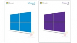
Windows 10 will be available in seven versions. These are IoT (Internet of Things, for devices like Raspberry Pi, Intel Galileo or Imagination’s Creator Ci20), Mobile, Home, Enterprise and Professional. There’s also a new Mobile Enterprise version (as Microsoft takes aim at BlackBerry’s stomping ground) well as Education.
Windows 10 Mobile and Mobile Enterprise are predictably for small screens less than 8-inches in size – so small tablets as well.
Windows 10 Mobile is a joy to use (we’ve got the Windows Insider version running on a Lumia 640). It doesn’t have IE, but it does have Microsoft Edge. Mobile Enterprise is designed to be similar for IT admins to deploy as Windows 10 Enterprise (see below), but we haven’t seen it in action.
Windows 10 Mobile, Mobile Enterprise and Windows 10 for Xbox (a new system update including Cortana) are among Windows 10 features and versions that haven’t hit the streets at the same time as the other verisons.
Windows 10 Home includes game streaming from Xbox One and other consumer features like Cortana as well as Windows Hello for logging into your PC via a fingerprint scanner or your face.
- Windows 10 Home vs Windows 10 Pro: the key differences explained
Windows 10 Home and Pro are available free to some users – see more on that below.
The Pro and Enterprise versions come with security and management improvements. Windows 10 also has a completely new approach to licences (including the ability to sign in with Azure Active Directory accounts). Both can join a domain.
Windows 10 Pro also includes Hyper-V for virtualisation, BitLocker whole disk encryption, enterprise mode IE, Remote Desktop, a version of the Windows Store for your own business and assigned access (which locks a PC to running only one modern application, to use like a kiosk). Network admins can also schedule updates so they don’t happen at important times.
Enterprise also adds group policy Direct Access for connecting without a VPN, AppLocker for whitelisting apps and BranchCache for sharing downloads. Enterprise also has an option that doesn’t get changes (apart from security updates for five years). For more on this, check out What Windows 10 means for the enterprise.
Windows 10 Education is new designed for Universities and similar organisations. It’s similar to Windows 10 Enterprise but it can also be installed as an upgrade to Windows 10 Home. That means they can integrate students’ own PCs with their own.
In comparison, there were only four versions of Windows 8.1 (five if you include Windows Phone 8) and one of them was the dead-as-a-dodo Windows RT.
Whatever version of Windows 10 you get, Microsoft will offer mainstream support for it until October 13, 2020 with Extended support will go on till October 14, 2025 (so just security updates for the last five years).
Windows 10 price
It will be free to upgrade to Windows 10 for the first year after release. That doesn’t mean you will have to pay after that if you’ve already upgraded, it just means that you need to upgrade your PC by Summer 2016.
Windows 10 Home and Pro will be available for free to Windows 7 and Windows 8.1 users that have appropriate licenses, so Windows 8.1 Pro users can upgrade to Windows 10 Pro and so on.
For users who are not eligible for Microsoft’s upgrade program – those who upgrade outside the first year free offer, those running a pirated version or those running a Windows operating system older than Windows 7 – Windows 10 Home will cost $119 (£78, AU$156) and Windows 10 Pro will cost $199 (£131, AU$262) per license,
And there is an option for Windows 10 Home users who want to upgrade to Pro. But it isn’t cheap, they will have to pay an additional $99 (£65, AU$130) for the Windows 10 Pro Pack.
But if you don’t have the ability to get a free upgrade to Windows 10, then listen up – the cheapest, (legal) route to getting Windows 10 on your PC via Windows 7. Yep, you should buy Windows 7 first. You will need to download truckloads (several GBs) of updates before you’ll get offered the OS upgrade, but it can be done.
So now we’ve got all that preliminary info out of the way, we can get on with the review! Read on…
Windows 10 key features: UI, apps and more
The redesigned user interface
The good news is that people who missed out the woeful Windows 8 will be right at home – in basic use Windows 10 is not a million miles from Windows 7. You’ve still got the Start menu, even though it’s fundamentally changed (more on that shortly). Key functions are all accessed from the Taskbar, which has a flat, functional feel. The design language feels refined – window borders are smaller, a subtle.
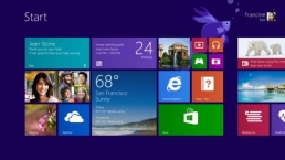
If you did immerse yourself in learning Windows 8, there is a little problem in that the Charms (the little icons that appeared on the right-hand side of the screen) have totally gone. Probably the shortest-lived yet supposedly crucial interface element in history. Microsoft said they were the future! Well they aren’t now.
Action Center
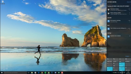
All the former Charms functions are contained in a new Notifications panel, called Action Center. This is launched from the notifications area of the task bar (some of you will know it as the system tray!). When you launch Action Center, a full height bar appears on the right of the screen; it’s designed to match the Notifications setup in Windows Phone.
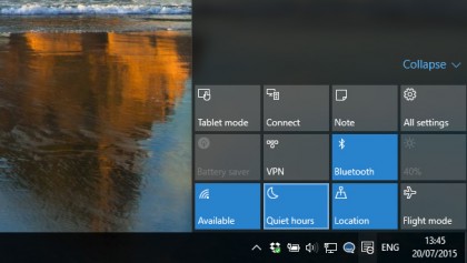
During the early 2015 versions of Windows 10, the Action Center was clearly a work in progress, but it is now not only usable, but powerful.
A raft of individual settings (called Quick Actions) resides at the bottom of the Center. Most of these functions are standard to us from iOS and Android; features such as toggling Bluetooth, Wi-Fi or Location on and off, but it’s great to have.
You can also get to Settings here as an alternative to the Start menu, as well as switch into Tablet mode (see later in this review for a lot more on that). And there’s also now a Note feature for instantly launching OneNote.
You’ll also notice there’s other connectivity features available from here, such as the ability to connect to devices such as Bluetooth speakers. You can also lock rotation if appropriate. This is context sensitive, so on a non-touch device it’s not there.
Quiet hours is a new feature to banish notifications when you don’t want to be disturbed.
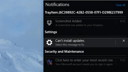
In the Settings app you can select which of these Quick Actions appear in the Action Center as well as which apps can send you Notifications. When notifications appear, you can swipe them away on touch, flick them with the mouse or just click the X to close. Tap or click the down arrow to see more detail. There’s a Clear All option, too.
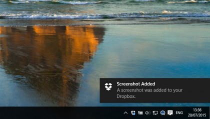
Pop-up notifications now appear in the bottom-right as opposed to the top-right in Windows 8. People were used to glancing at the bottom-right for pop-up messages in earlier versions of Windows, so this makes sense, although it does take a little getting used to.
The Start menu
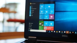
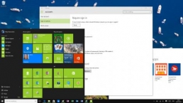
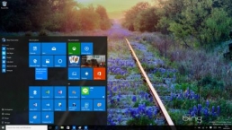
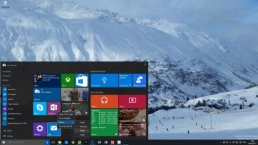
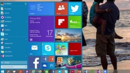
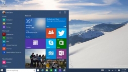
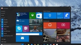
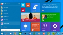
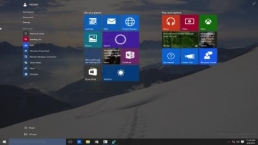
The Start menu is very Windows 8-like in that it features Live Tiles for at-a-glance information in apps. These were largely redundant for many Windows 8 users because of the lack of decent apps.
That’s likely to change in Windows 10 (see the ‘Apps and App Store’ section) but it remains to be seen how useful this section can be (we have used it a few times for looking at the weather and emails, but little else).
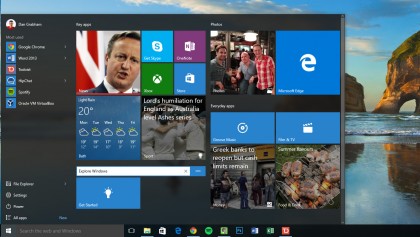
You can scroll down through the Live Tiles. The tiles also animate (as if the tile itself is rotating) if there’s new content for you to check out. You can group and rename the live tiles just as you could in Windows 8, as well as renaming the groups (that’s what we’re doing above).
You can resize the start menu itself by dragging the sides, which is a handy new feature. However, you can’t switch the live tiles section off completely. In early builds, we found the live tiles on the Start menu to be absolutely useless.
But more recently we’ve found ourselves looking at the tiles more as they pop up. And we really have found some interesting news that we’ve clicked on. It’s mainly useful for at-a-glance stuff, though.
The remainder of the Start menu is more like the Windows 7 version, with controls for turning your PC off and restarting it as well as most used apps and the ability to scroll down through all your apps in alphabetical order through an All Apps menu. File Explorer and Settings are also present.
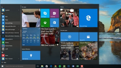
Clicking the Power button within the Start menu pops up another menu enabling you to shut down, restart or sleep. As in Windows 8, the lock and sign out settings are contained in a seperate menu; you have to clck your account picture at the top of the Start menu.
Search is no longer contained within the Start menu (it’s on the taskbar, more on that soon), although you can still hit the Start key on your keyboard and start typing to find something.
The taskbar
The taskbar is mostly unchanged, but open apps have a subtle coloured bar below them, while the new Search bar (which you can reduce to an icon or get rid of completely via the taskbar right-click menu) and Task View icons are there to stay alongsuide the Start button.
Coincidentally, the Windows logo got smaller as Windows 10’s development went on. Quite why we’re not sure, as it now looks a little lost sitting quietly in the bottom left.
The Noticifications area at the other end has been made much simpler by the advent of Action Center. App icons that aren’t shown in the Notifications area (formerly the system tray) are housed in a pop-up, just as they always were, but you can now drag them in and out to re-order them.
There’s also a completely new calendar – click on the clock icon to view it.
And, in case you were wondering, the power user menu is still there – just right-click on the Windows logo.
Once again, you can minimize everything by clicking in the far right-hand corner of the Taskbar. You might also notice that the Calendar has changed appearance if you click on the time and/or date. And there’s a nice way of knowing when apps are open – just a simple line underneath each pinned or open icon.
File Explorer enhancements
File Explorer has been given a little bit of a makeover. You now have a Quick Access area to which you can pin and unpin any folders you want to regularly access. In the ‘home’ screen of File Explorer you can also see Frequent Folders and Recent Files. It’s much more helpful now.
You can pin things permanently onto Quick access by right-clicking them and selecting Add to Quick access.
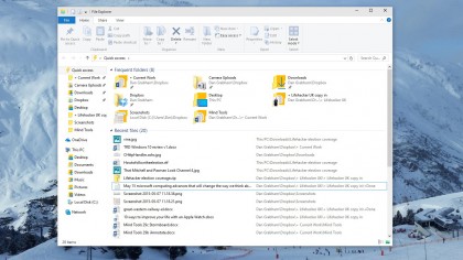
You’ll also notice that various icons have changed – many of these (such as the Recycle Bin) have gone through several iterations since the first preview version of Windows 10 debuted at the very beginning of October 2014.
There are a lot more file operations that you can access on the ribbon at the top of the window without the need to use the right-click menu.
The old Windows 8 Share logo is now used for File sharing from all apps. You can choose to email a file straight from the File Explorer window or add it to a zip file.

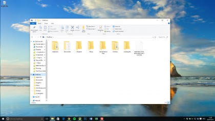
As you’d expect, OneDrive is also incorporated within File Explorer. While it’s now an integral part of Windows 10, it’s not a pain to dismiss and you can quite happily use Windows 10 without it.
Universal Apps and the new Windows Store
Windows 10 makes a big push in terms of apps, both built-in and third-party.
Microsoft is going big on so-called Universal Apps – it’s the corporation’s great hope that developers will develop their apps once and that they’ll work across PC, Windows 10 on mobile and Xbox, too – essentially on every screen size. This is known as the Universal App Platform or UAP.
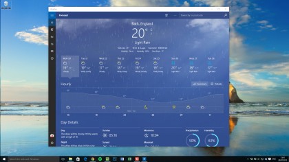
These Universal apps are the replacement for the apps that, in Windows 8 and 8.1, were known as Metro apps or Modern UI apps. They’re different than desktop apps, but they now co-exist with desktop apps on the desktop. They also have Live Tiles that live in the Start Menu.
Microsoft doesn’t want to repeat the mistake made with Windows 8 – that it assumed developers would flock to the new OS – and so it is making it easy for devs to convert existing Android apps, while Microsoft Visual Studio 2015 now supports Objective C (used to create iOS apps) and can compile it to Universal apps.
This doesn’t necessarily mean they’ll flock across, but it does at least attempt to minimize effort for devs so it’s not as simple for them to say they’re just prioritizing iOS and Android. It will be interesting to see how this pans out, though the continued dearth of Windows Phone market share isn’t exactly helpful.
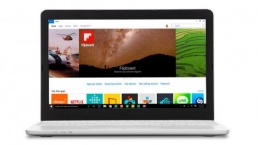
There’s a new Windows Store in Windows 10. As well as a revamped design, the new store will also house desktop apps as well as Universal Apps.
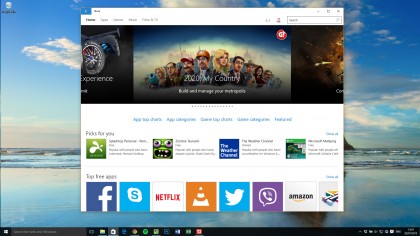
Like Universal apps, desktop apps installed from the Windows Store will be managed from there so theoretically they will install quickly (without you doing anything more than clicking once to download/install), they can be uninstalled without hassle and – crucially – they will be sandboxed from the rest of the system a la Universal apps.
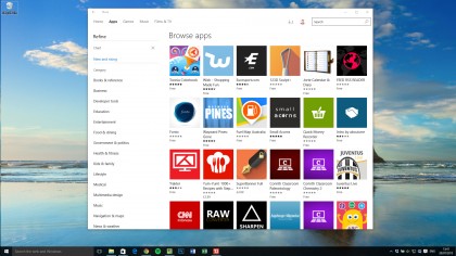
Devs will use an Application Virtualization (App-V) container to package up their desktop apps ready for the Windows Store.
Organizations will also be able to deploy apps from their own versions of the Windows Store. This is all managed from the Business Store Portal which will manage software licenses centralized payment info and more.
We mentioned before about Universal apps co-existing on the desktop – that has meant Microsoft has had to find a new way to control them because the Windows 8 and 8.1 Charms are no more.
This has meant a new menu bar in the top left, as well as standard minimize, maximize and close icons on the top right. These apps can now be resized however you want.
The built-in Windows 10 apps
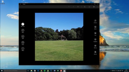
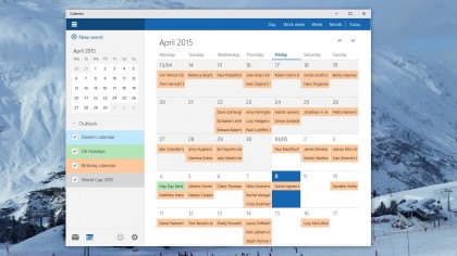
Thankfully, the quality of the built-in apps so far is way better. There’s a new Photos app that provides you with a complete back catalogue as well as editing and filter capabilities.
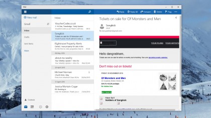
Mail actually works now and has some features (in Windows 8 Mail was so feature incomplete as to be embarrassing).
Sport and News are improved experiences even if they still feel a little superfluous. Best of all, these apps all start up nice and quick, too.
Microsoft Edge is the new browser for Windows 10 (previously it was codenamed Project Spartan), and we’ve covered that further into the review.
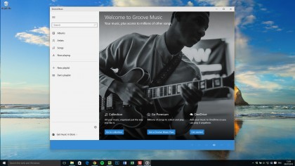
Music has also been renamed – it’s now called Groove Music to match up with Microsoft’s new subscription service.
Task View
There has always been Alt-Tab – well, since Windows 3.x, anyway – to switch between open apps. But over the last two decades of Windows, Microsoft has dabbled with various other ways of switching between open apps.
In Windows 95, we got the taskbar and, later, taskbar grouping in Windows XP, which we still have, although presented differently. In Windows Vista there was Windows Flip, where Windows+Tab showed a jazzy 3D view of your Windows (no wonder Windows Vista’s system requirements were so haughty). And there was the swipe in from the left on Windows 8.
Now in Windows 10 we have Alt+Tab (cycle through your apps) and a new thingy called Task View – there’s a permanent icon on the task bar for it next to the Cortana search bar.
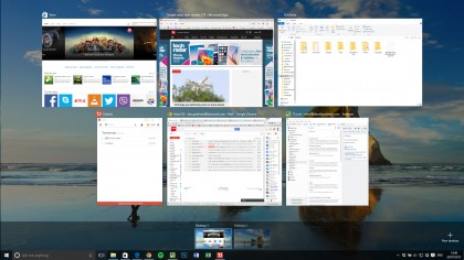
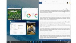
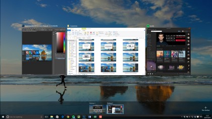
This now does the same as Windows+Tab. It takes you to an app overview where you can use your mouse to select the app you want. It’s pretty clever and in any mode of Windows 10 there is always an icon for it on the Taskbar.
But there is something else Task View can do – multiple desktops. Going into Task View and there’s an icon in the bottom right that enables you to add another desktop, so you can have one screen for your email perhaps and another for your Photoshop work. This is a nice new feature for Windows, but has been on the Mac for years – since OS X 10.5 Leopard introduced ‘Spaces’ in 2009.
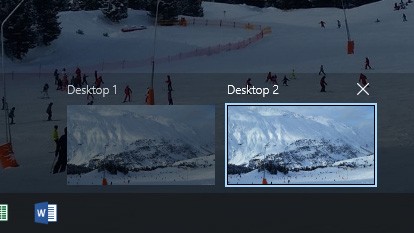
Apps can be open in more than one desktop, but you can’t switch into windows that are on another desktop. Things are kept nicely separate. Alt+Tab only works within the desktop you’re in. The only way to switch desktops is to go into Task View and select another open desktop. From here you can also close desktops using the X icon that appears when you hover over each desktop icon.
Settings, Search (Cortana) and Tablet Mode
The Settings app
If you used the Settings app in Windows 8 or 8.1, you’ll know what a half-arsed affair it was – you basically opened it, realized you couldn’t do what you wanted to and went to the Control Panel.
Well, the Control Panel is still there in Windows 10. And if you’re a technical user, you will come across it from time to time. But for most of us, you’ll never see it.
Settings is now a far more comprehensive solution and is much more logically arranged.
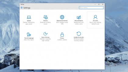
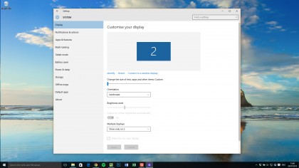
In early Windows 10 builds it still felt as though the Control Panel would reign supreme, but things have changed pretty much everything you’ll need is there, separated into nine distinct areas.
To give some indication of how little we’ve used the Control Panel in recent months (to bring you this review we’ve been using the various builds of Windows 10 since October 2014), we think we last went into something in the Control Panel in March.
There are still a few things you’ll need the Control Panel for – we think we needed to reset a network adapter on that occaision – but it’s really few and far between.
Each category in Settings leads you into a wordy sub-menu like this. It’s not quite as intuitive as the Control Panel was, but you can always find what you want. It’s light years ahead of the Settings app in Windows 8 and 8.1.
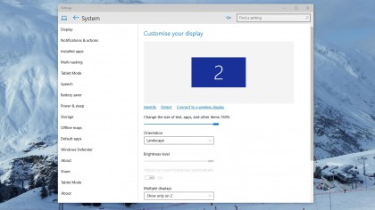
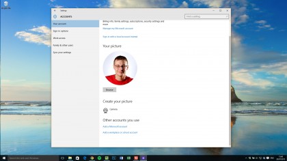
And, what’s more you can search in Cortana on the taskbar for a setting – and you can search within the Settings app, too. And – unlike in Windows 8 – the search normally finds the setting that you want, too.
Search and Cortana
Rather than being at the bottom of the Start menu as in Windows 7, search now has its own bar on your Taskbar (though you can reduce it to a simple icon or get rid of it completely).
That’s because Cortana, Microsoft’s virtual assistant is now incorporated within Windows’ search and you can – of course – control it by voice. So you can ask Cortana to complete various tasks for you.
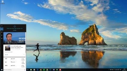
At one point we were quite concerned about search in Windows 10. In early builds Cortana just wouldn’t find stuff on our own PC, and this seemed to continue for eons. It was as if Microsoft was so keen to incorporate potential web searches into the Cortana results that often you needed to click again to find a file on your PC. And even then it wouldn’t always find the file you wanted.
Thankfully Microsoft has listened to what was (no doubt) a shrieking chorus of complaints from Windows Insiders. Search is now light years better.
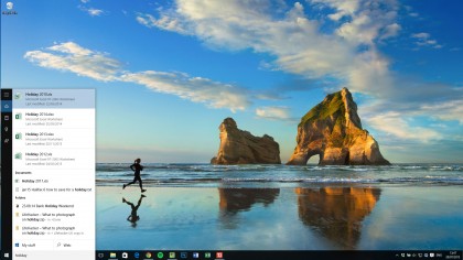
It finds your files, it finds your folders. It has become quite brilliant – say you type Linkedin into the menu, well you it will offer you the ability to open the site in your default browser (even if it’s Chrome) or you can search for Linkedin in Bing.
It’s difficult to tell what is prioritised, simply because the context sensitivity is so good. Apps and Settings appear to be first in line, with your files close behind. The only time Cortana looks a little lame is if you type a name like ‘Manchester United’ into the menu; you’re just offered the ability to search the web.
There are two tabs at the bottom of the search menu – My Stuff and Web – if you really do want to drill down to one type of results.
Cortana shows you a lot of context when you open the search bar, things such as weather, stocks and calendar appointments. This is within a section called Home. As you can see, there are other sections – Notebook, Reminders and Feedback (this latter option enables you to give direct feedback on Cortana results and may not be in the final release).
Notebook includes various options such as getting around, music and food and drink. Essentially these are options you can turn on and off (some with more settings than others). So perhaps you don’t want Cortana to tell you anything about traffic – well, you can have it your way.
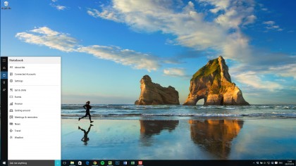
Reminders is just a simple tool to set yourself a reminder that pops up on your desktop (and presumably on other devices you have Cortana).
Cortana is a very handy tool if you’re just searching or asking simple tasks such as what the weather will be like in Berlin tomorrow, but the jury is still out on whether it’s a valuable addition to an operating system on a traditional computing device. Naturally, it comes into its own on devices without keyboards and it’s actually pretty reliable.
Cortana is also incorporated into Microsoft Edge, too – the new browser for Windows 10. More on Edge shortly.
Windows 10 Tablet Mode
Microsoft hopes a lot of tablet PCs will be sold over the coming years. As does Intel – it’s putting a lot of weight behind 2 in 1 PCs with detachable keyboards.
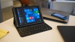
Originally named Continuum (a name that we really did love), Windows 10’s Tablet Mode is clever because it’s automatic; detach the keyboard and the desktop prepares itself for touch – the Start menu becomes the Start screen and apps appear full screen.
Because we haven’t got a huge number of Live Tiles pinned to the Start menu our Tablet Mode looks a little sparse, but you get an effect that’s more like the much-maligned Windows 8 Start screen. Despite its failings, a screen of apps is a better launcher for touch-enabled devices.
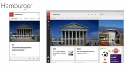
There are some differences to the Start screen though, the left-hand side now has three icons. The top ‘hamburger’ icon enables you to access your most-used apps, while there’s also a shortcut to the all apps menu and power options.
The Taskbar also changes to be more touch friendly – the icons are more spaced out while the pinned app icons don’t appear at all – you just cycle through them in Task View.
The Start icon is now joined by a back button, so you can cycle back to previous apps – even if you were in the Start menu before.
If you want, you can toggle between Tablet Mode and non-Tablet mode yourself via the settings at the bottom of the Notification Center. This could be useful if, say, you have a touchscreen laptop and want to put it into Tablet Mode for a presentation.
Aero Snap also goes all Windows 8.1 on you in Tablet Mode – you can pin two apps side-by-side. As in Windows 8.1 (but not original Windows 8) you’re able to adjust the split. You can’t do a four-way split as you can in the normal desktop mode.
Microsoft Edge
Microsoft Edge is the new browser for Windows 10 (previously codenamed Project Spartan). To say Edge is a little rough round the edges is an understatement. When it first appeared in the build 10041 on March 30, it was basically alpha software.
Many things just didn’t work and we felt a little queasy writing any kind of ‘verdict’ on a piece of software that was clearly so early in its development cycle that it couldn’t possibly be used.
In the latest 10062 build things are VERY different. Microsoft Edge has not just improved a great deal, but it’s also now completely usable as a browser – albeit with some missing features.
There’s even a new logo, too, while looks quite like the Internet Explorer ‘e’. Now, we were a bit surprised about this at first until someone else in the office pointed out that there are millions of Windows users out there that equate that ‘e’ to ‘how they access the internet’. (We know you’re not in that category, dear TechRadarian).
Still to come is support for extensions, which developers can easily port from Chrome. We don’t think we’ll get that update until after the release of Windows 10.
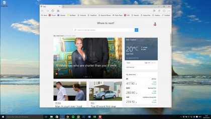
Edge is the default browser within Windows 10, though naturally you can change this. You can easily move your Favorites and bookmarks from another browser, though there’s no way to currently rearrange them properly which rather grated with us. Actually there is, it’s just that our changes didn’t stick (don’t worry, we completed a feedback note).
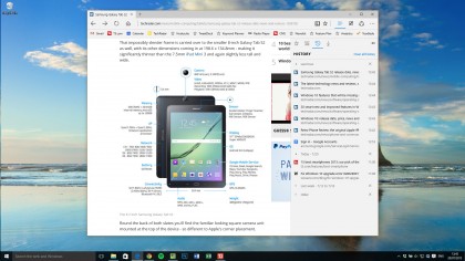
Where Edge is totally impressing is in terms of raw performance. Pages render jaw-droppingly quickly.
Using Sunspider 1.0.2 to test JavaScript performance, Microsoft Edge gave us a score of 118ms compared to Internet Explorer 11 which gave us a score of 137ms. Firefox 37 turned up with 260ms and Chrome 43 303ms. Not too shabby.
Browsing still needs work, mind you – some more complex websites don’t render quite right. In one web form we used, we couldn’t put our cursor in the box. Now, a lot of this is due to badly coded sites, but it shows there are still issues with Edge.
When we tried to use Sky Go – which uses Microsoft’s own but ageing Silverlight tech – Edge told us to open Internet Explorer to use it in there instead. Again, this is because of old protocols, but it’s quite amusing that it’s Microsoft’s own that caused this situation.
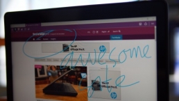
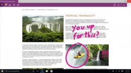
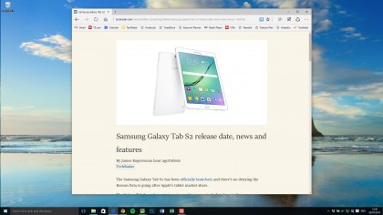
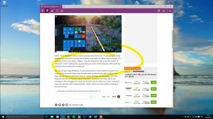
In this latest version you can finally rip tabs off and browse in private. There’s a built-in note-taking mode, so you can save and annotate webpages, plus a reading mode that strips away the content you don’t need when reading through an article:
And here’s the screen enabling you to annotate pages:
There’s also a new Dark theme to go alongside the standard Light theme.
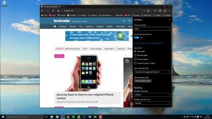
Favourites, Reading List, Downlads and History are all contained in the same pop-out panel.
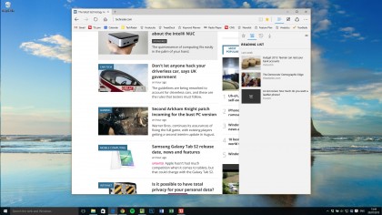
Similar to Internet Explorer, this panel can be toggled between the views.
Forward, back and refresh remain on the title bar, while there are also options to add the current page to your reading list or Favorites.
One major annoyance is that you can’t drag files into the browser (to attach them to an email or upload to cloud storage). This is a big miss and will put people off.
There is the ability to change various other settings, such as deploying a Favourites bar, configuring the home page and fine tuning the reading view. The browser can aslo save your form entries and paswords.
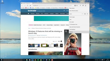
Talking of Cortana (no pun intended), you’re also able to select anything and ‘Ask Cortana’ about what you’ve highlighted by right-clicking. This brings up a sidebar where search results will appear.
So what do we think of Edge? Well, it has a lot to offer. In terms of browsing speed it’s brilliant, but it currently lacks power features such as Extensions. To that end, it has more work to do before it can persuade people to move from Chrome and Firefox.
Other Windows 10 features
Aero Snap
Windows 7 was such a great version of Windows. Aside from the fact it trumped Vista with its resource efficiency, general robustness and modest system requirements it also brought us something else – Aero Snap.
The ability to snap windows to the sides of your screen might seem small, but it’s something many Windows users use every day. Apple has obviously realised that Mac users use third-party extensions to get the same effect; it’s introduced window snapping in OS X El Capitan.
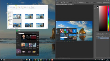
Windows 8 got it a bit wrong as Modern UI apps could only be snapped in certain ways, but Windows 8.1 improved on this hugely.
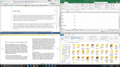
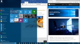
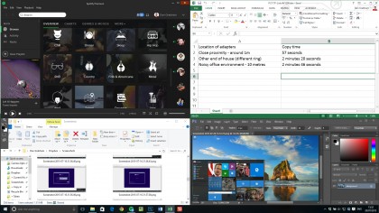
Windows 10 gives us something else – four way AeroSnap, so you can have four applications in each corner of your desktop.
Now, if you’ve got a laptop screen this is about the most inefficient way you could use your desktop, but if you’ve got a whopping 27+-inch display it might just be the ticket. In early builds it worked as well as an umbrella in a Force 10 storm, but now it’s pretty good and you’ll get used to it quickly.
Other enhancements
New systems that ship with Windows 10 and support biometric security hardware will enable you to use a fingerprint, face scan, or iris scan to log into Windows and apps, websites, and networks. This is called Windows Hello.
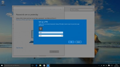
Windows also asks you to set up a PIN to use instead of your password. This is to make it easier to log onto Windows when you don’t have a keyboard – it’s all part of making Windows a more phone-like experience.
The Snipping Tool has been updated and – yes! – you can now set a delay so you can screenshot those pesky menus you couldn’t keep open before. (Just us? Oh.)
There’s a new Command Prompt too – small beer, you might say, but you’re now able to properly select text and copy and paste in and out. Ctrl-V really will work. Text also re-flows as the window is resized.
Windows 10 Verdict
Windows 10 Verdict
Now that Windows 10 is finished it’s clear to see that it’s a very usable and flexible operating system. Yet even when it was a much earlier work in progress, we knew it was going to be a good one. This is partly because Microsoft was so open with it; it wouldn’t have been so open with an OS that wasn’t going to be a success.
The key idea behind Windows 10 is also sound; that it should be available on as many devices as possible. That’s why it’ll be available in an Internet of Things version that’ll go on a Raspberry Pi – Microsoft acknowledges (finally) that PCs have gone away from the traditional idea of what a PC is.
We liked
We like the speed. Earlier on in the gestation of the OS we were really concerned. Because while things like file copying and app switching seemed fast and flawless, there were numerous other things that were poor like search and a sluggish Start menu. It turns out our fears were unfounded since the speed has picked up across the board.
We also like the way that, with Windows 10, Microsoft has acknowledged that Windows 8 was a terrible idea. Like a car crash waiting to happen, this very website said it was flawed (at some length) at the time, although we also must admit that we scored the review too highly.
Microsoft was so sure of itself because of the success of Windows 7 that it blinded itself by giving us an OS that wasn’t fit for purpose. In retrospect, Microsoft is quite lucky that businesses never had to even think about moving to 8 because XP was so long lasting and many of corporates haven’t really been on 7 all that long.
We also like two more staples of Windows 10 core interface. The Search is absolutely rock solid. Like Spotlight on OS X, you’ll always find what you want, whether that’s your PowerPoint presentation or the Power options.
Then there’s the Settings app. Awful in Windows 8 and even in 8.1, Settings is now a worthy replacement for the Control Panel. It’s testament to the new-found strength of Settings that the Control Panel is still present but you’ll hardly ever go to it.
Finally, we must say that we like Microsoft Edge as a browser. It’s SO fast. But it is missing a lot of features and the late blooming of the app means that it isn’t yet feature complete. More updates will come during the next few months, but it’s not yet a super-user’s dream.
We disliked
If there’s anything to dislike about Windows 10 it’s that Microsoft remains too bullish about the success of Windows 10’s Universal apps.
It’s by no means certain that developers are going to flock to Windows 10 from iOS and Android simply because they can convert their apps easily. It may well become a no brainer for them, but at the moment a concious decision is still required.
Mind you, Microsoft is capable of convincing developers of the merits of Windows and even though it failed with Modern UI apps in Windows 8 surely Microsoft can make it work this time. Why not capitalise on the app store model that its rivals have gained so much from?
We must add that Universal apps are a great idea in principle but Windows 10 apps are not going to force people to like Microsoft Lumia devices. It might work for some (indeed, Windows 10 for phones is VERY pleasant to use) but we don’t see it as a long term success. And neither does Microsoft judging by the continued struggle to shift Lumia units and make any money from handsets.
And are people going to use many Universal apps on the Xbox? Again, we doubt it.
Verdict
There are several keys to why we think Windows 10 will be a success – there’s the welcoming arms Microsoft is holding out to developers and the fact it is designed to run on so many devices from OEMs. Never has Windows been so accommodating of form factor.
Then there is the fact it will be a free download for consumers which has to ensure a high proportion of Windows 7 and many Windows 8 users will make the leap. The install is simple (in most cases) which helps. And, although we’ve had some driver issues and other niggles, we’ve installed it on four disperate devices without incident.
Above all, the most compelling fact about Windows 10 is that it just works. There’s not really a learning curve like there was with 8 or 8.1. Even if people don’t get to grips with features like the Taskbar search or Task View, it won’t actually take anything away from their core experience of the OS. And there’s no navigational hassles as there were with the charms; pretty much everything most people neeed is in the Start menu or Action Centre.
If Windows 8 was the steepest learning curve imaginable, Windows 10 is like meeting a great friend you once knew – it’s just they’ve bought some new clothes of which you really do approve.
![]()
Related Posts
December 6, 2021
7+ Web Design Trends for 2022: Which Will You Use?
December 6, 2021
The 10 Best WordPress Booking Plugins to Use On Your Website
December 6, 2021
How to Use a Web Cache Viewer to View a Cached Page
November 6, 2021
10 Modern Web Design Trends for 2022
November 6, 2021
Best Free SSL Certificate Providers (+ How to Get Started)
November 6, 2021
How to Design a Landing Page That Sends Conversions Skyrocketing
November 6, 2021
What Are the Best WordPress Security Plugins for your Website?
October 6, 2021
Your Guide to How to Buy a Domain Name
October 6, 2021
How to Build a WordPress Website: 9 Steps to Build Your Site
September 6, 2021
10 Best Websites for Downloading Free PSD Files
September 6, 2021
HTML5 Template: A Basic Code Template to Start Your Next Project
September 6, 2021
How Much Does It Cost to Build a Website for a Small Business?
September 6, 2021
A List of Free Public CDNs for Web Developers
September 6, 2021
6 Advanced JavaScript Concepts You Should Know
August 6, 2021
10 Simple Tips for Launching a Website
August 6, 2021
25 Beautiful Examples of “Coming Soon” Pages
August 6, 2021
10 Useful Responsive Design Testing Tools
August 6, 2021
Best-Converting Shopify Themes: 4 Best Shopify Themes
July 6, 2021
What Is Alt Text and Why Should You Use It?
July 6, 2021
24 Must-Know Graphic Design Terms
June 6, 2021
How to Design a Product Page: 6 Pro Design Tips
April 6, 2021
A Beginner’s Guide to Competitor Website Analysis
April 6, 2021
6 BigCommerce Design Tips For Big Ecommerce Results
April 6, 2021
Is WordPress Good for Ecommerce? [Pros and Cons]
March 6, 2021
Make Websites Mobile-Friendly: 5 Astounding Tips
March 6, 2021
Shopify vs. Magento: Which Platform Should I Use?
March 6, 2021
Top 5 Web Design Tools & Software Applications
February 6, 2021
Website Optimization Checklist: Your Go-To Guide to SEO
February 6, 2021
5 UX Design Trends to Dazzle Users in 2021
February 6, 2021
What Is the Average Page Load Time and How Can You Do Better?
February 6, 2021
Choosing an Ecommerce Platform That Will Wow Customers
February 6, 2021
7 Best Practices for Crafting Landing Pages with Forms
February 6, 2021
7 B2B Web Design Tips to Craft an Eye-Catching Website
January 6, 2021
Mobile-Friendly Checker | Check Your Site’s Mobile Score Now
January 6, 2021
8 Tips for Developing a Fantastic Mobile-Friendly Website
December 6, 2020
How to Add an Online Store to Your Website [4 Ways]
December 6, 2020
5 UX Design Tips for Seamless Online Shopping
November 6, 2020
Ecommerce Website Essentials: Does Your Site Have All 11?
November 6, 2020
5 Small Business Website Essentials You Need for Your Site
November 6, 2020
Your Website Redesign Checklist for 2020: 7 Steps for Success
May 1, 2020
Psychology of Color [Infographic]
April 21, 2020
How to start an online store that drives huge sales
January 3, 2020
5 Lead Generation Website Design Best Practices
March 6, 2019
6 Reasons You Should Redesign Your Website in 2019
March 6, 2019
7 Web Design Trends for 2019
February 19, 2019
Who owns the website/app source code, client or developer
February 7, 2019
Don’t Let Your Domain Names Expire in 2019
January 8, 2019
2019 Website Development Trends To Note
October 6, 2017
How Web Design Impacts Content Marketing
October 6, 2017
How to Choose a Navigation Setup
August 6, 2017
Why User Experience Matters to Marketing
July 6, 2017
5 Ways Web Design Impacts Customer Experience
September 6, 2016
How to Learn Angular
September 6, 2016
The Excuses for Not Having a Website (Infographic)
September 6, 2016
How to Build an Award-Winning Web Design Team
September 6, 2016
13 Free Data Visualization Tools
August 6, 2016
How Selling Pastries Helped Us Design a Better Product
August 6, 2016
11 Sites to Help You Find Material Design Inspiration
July 4, 2016
How to change free wordpress.com url
April 6, 2016
The 5 Best Free FTP Clients
April 6, 2016
7 Free UX E-Books Worth Reading
March 6, 2016
Can Handwritten Letters Get You More Clients?
December 10, 2015
Star Wars Week: How to create your own Star Wars effects for free
December 6, 2015
20 "Coming Soon" Pages for Inspiration
December 6, 2015
6 Free Tools for Creating Your Own Icon Font
December 6, 2015
9 Useful Tools for Creating Material Design Color Palettes
November 6, 2015
20 Free UI Kits to Download
November 6, 2015
50 Web Designs with Awesome Typography
November 6, 2015
When to Use rel="nofollow"
November 6, 2015
7 Free Books That Will Help You Become More Productive
November 6, 2015
50 Beautiful One-Page Websites for Inspiration
November 6, 2015
Circular Images with CSS
October 6, 2015
Lessons Learned from an Unsuccessful Kickstarter
October 6, 2015
5 Games That Teach You How to Code
October 6, 2015
Cheatsheet: Photoshop Keyboard Shortcuts
October 6, 2015
An Easy Way to Create a Freelance Contract for Your Projects
October 6, 2015
50 Design Agency Websites for Inspiration
September 29, 2015
JB Hi-Fi shutting the book on ebooks
September 24, 2015
Opinion: Quick, Quickflix: It's time to give yourself the flick
September 24, 2015
New Star Wars 360-degree video is among first on Facebook
September 21, 2015
Apple purges malicious iPhone and iPad apps from App Store
September 12, 2015
Apple's new Live Photos feature will eat up your storage
September 12, 2015
The latest Windows 10 Mobile preview has been delayed
September 12, 2015
IBM buys StrongLoop to add Node.js development to its cloud
September 8, 2015
Fake Android porn app takes your photo, then holds it ransom
September 6, 2015
50 Restaurant Websites for Inspiration
September 6, 2015
Zero UI — The Future of Interfaces
September 6, 2015
50 Beautiful Websites with Big Background Images
September 6, 2015
Infographic: 69 Web Design Tips
September 6, 2015
Free Windows 10 Icons
September 2, 2015
Instagram turns itself into a genuine messaging service
August 11, 2015
In Depth: How Microsoft taught Cortana to be more human
August 11, 2015
Windows 10 price, news and features
August 11, 2015
Windows 10's broken update introduces endless reboot loop
August 11, 2015
Windows 10 races to 27m installs
August 11, 2015
Windows 10 IoT Core gets first public release
August 10, 2015
iOS Tips: How to backup iPhone to an external drive
August 10, 2015
Windows 8.1 RT finally getting Windows 10 Start Menu
August 10, 2015
How to use Windows Hello
August 10, 2015
Review: Moto Surround
August 10, 2015
Review: Moto G (2015)
August 9, 2015
8 of the best free VPN services
August 8, 2015
Use Firefox? Mozilla urges you update ASAP
August 7, 2015
Mac Tips: Apple Mail: How to remove the Favorites Bar
August 7, 2015
How to make the OS X dock appear faster
August 7, 2015
Review: BQ Aquaris E45 Ubuntu Edition
August 7, 2015
Review: Acer Liquid Jade Z
August 6, 2015
How to reinstall Linux
August 6, 2015
How to reinstall Windows
August 6, 2015
Updated: Apple Music: release date, price and features
August 6, 2015
Social News Websites for Front-End Developers
August 6, 2015
10 Free JavaScript Books
August 6, 2015
50 Beautiful Blog Designs
August 6, 2015
Animated SVG Pipes Effect
August 6, 2015
Launching Your First App
August 5, 2015
Windows 10 goes freemium with paid apps
August 5, 2015
Updated: Week 1 with Windows 10
August 5, 2015
Mac Tips: How to manage Safari notifications on Mac
August 5, 2015
Microsoft Sway may kill the PowerPoint presentation
August 4, 2015
Microsoft gives Outlook on the web a new look
August 4, 2015
Mac OS X vulnerable to new zero-day attack
August 4, 2015
Windows 10 users warned of two scams
August 4, 2015
Microsoft's Docs.com is now available to everyone
August 3, 2015
Mac Tips: How to edit the Favorites sidebar on Mac
August 3, 2015
Updated: Windows 10 price, news and features
July 29, 2015
Review: HP ProDesk 405 G2
July 29, 2015
Hands-on review: HP Elite x2 1011
July 29, 2015
Hands-on review: Updated: Windows 10 Mobile
July 29, 2015
Review: Updated: Nvidia Shield Android TV
July 28, 2015
LIVE: Windows 10 launch: Live Blog!
July 28, 2015
How to prepare for your upgrade to Windows 10
July 28, 2015
Review: Updated: HP Pro Tablet 608
July 28, 2015
Review: Heat Genius
July 28, 2015
Hands-on review: Moto X Play
July 28, 2015
Hands-on review: Moto X Style
July 28, 2015
Hands-on review: Moto G (2015)
July 28, 2015
Review: 13-inch MacBook Air (early 2015)
July 28, 2015
Hands-on review: OnePlus 2
July 28, 2015
Review: LG 65EG960T 4K OLED
July 28, 2015
Mac Tips: How to share printers on Mac
July 27, 2015
Apple Music's arrival hasn't opened Pandora's box
July 26, 2015
Review: Garmin Swim
July 25, 2015
How to merge OS X contacts into an existing list
July 25, 2015
Hands-on review: UPDATED: ZTE Axon
July 24, 2015
Mac Tips: How to zoom in on a Mac
July 24, 2015
What Windows 10 means for the enterprise
July 24, 2015
Review: JBL Charge 2 Plus
July 24, 2015
Review: Acer Aspire S7
July 24, 2015
Review: Updated: Canon G3 X
July 24, 2015
Review: Updated: iPad Air 2
July 24, 2015
Review: Thinksound On1
July 24, 2015
Review: Asus Chromebook Flip
July 24, 2015
Review: Garmin Forerunner 225
July 23, 2015
Review: Garmin nuvi 68LM
July 23, 2015
Review: Samsung Galaxy S6 Active
July 23, 2015
Review: Bowers and Wilkins P5 Wireless
July 23, 2015
Review: Dell XPS 15 (2015)
July 21, 2015
Review: Fuji S9900W
July 21, 2015
Review: Updated: Fitbit Surge
July 21, 2015
Review: UE Roll
July 21, 2015
Hands-on review: Ubik Uno
July 20, 2015
Review: Samsung HW-J650
July 20, 2015
Updated: 40 best Android Wear smartwatch apps 2015
July 20, 2015
Review: Acer Chromebook C740 review
July 20, 2015
Review: Huawei Talkband B2
July 20, 2015
Review: Dell Venue 10 7000
July 20, 2015
Review: Intel Core i7-5775C
July 17, 2015
Mac Tips: How to delete locked files on Mac
July 17, 2015
Review: Pebble Time
July 16, 2015
Microsoft just made Windows XP even less secure
July 16, 2015
Windows 8.1 RT is getting an update this September
July 16, 2015
OS showdown: Windows 10 vs Windows 8.1 vs Windows 7
July 16, 2015
Review: Acer CB280HK
July 15, 2015
Windows 10 is ready for new laptops and PCs
July 15, 2015
Explained: How to take a screenshot in Windows
July 15, 2015
Office for Windows 10 appears in latest build
July 14, 2015
Review: ZTE Axon
July 14, 2015
Review: ViewSonic VP2780-4K
July 14, 2015
Hands-on review: SanDisk Connect Wireless Stick
July 14, 2015
Review: Oppo PM-3
July 14, 2015
Review: BT 11ac Dual-Band Wi-Fi Extender 1200
July 14, 2015
Review: Fuji X-T10
July 13, 2015
How to build an SEO strategy for your business
July 13, 2015
Review: Lenovo ThinkPad Yoga 15
July 13, 2015
Review: Audio-Technica ATH-MSR7
July 13, 2015
Review: Garmin NuviCam LMT-D
July 13, 2015
Review: Dell Inspiron 13 7000
July 13, 2015
Hands-on review: AstroPi SenseHAT
July 13, 2015
Hands-on review: EE Rook
July 13, 2015
Hands-on review: Updated: HTC Vive
July 12, 2015
Here's the ultimate software list for PC fanatics
July 10, 2015
How to use the new Photos app for Mac
July 10, 2015
Windows 10 Insider Preview Build 10166 available now
July 10, 2015
Splunk spends big on cybersecurity acquisition
July 10, 2015
Making Windows 10 apps just got a whole lot easier
July 10, 2015
Review: Lenovo LaVie Z 360
July 9, 2015
OS X El Capitan public beta available right now
July 9, 2015
Microsoft finally unveils Office 2016 for Mac
July 9, 2015
Review: Updated: Chromecast
July 9, 2015
Review: Updated: Tesco Hudl 2
July 9, 2015
Review: Lenovo ThinkPad E550
July 9, 2015
Review: Updated: Google Nexus 6
July 8, 2015
What you need to know about Windows Server 2016
July 7, 2015
Microsoft to hike enterprise cloud pricing
July 6, 2015
Hacking Team end up being totally 0wned
July 6, 2015
Review: HP Pro Slate 12
July 6, 2015
Review: Samsung 850 Pro 2TB
July 6, 2015
Review: Asus RT-AC87U
July 6, 2015
Review: Jawbone UP2
July 6, 2015
Reimagining the Web Design Process
July 6, 2015
50 Clean Websites for Inspiration
July 6, 2015
15 Free Books for People Who Code
July 6, 2015
Web Storage: A Primer
July 6, 2015
A Look at Some CSS Methodologies
July 3, 2015
6 Essential Mac Mouse and Trackpad Tips
July 2, 2015
How to install a third party keyboard on Android
July 2, 2015
Review: UPDATED: Asus Zenfone 2
July 2, 2015
Review: Alienware 13
July 2, 2015
Review: HP DeskJet 1010
July 1, 2015
5 issues we want Apple Music to fix
June 13, 2015
Cortana will get its own button on Windows 10 PCs
June 12, 2015
Windows 10 will come with universal Skype app
June 12, 2015
iPad music production: 18 Best apps and gear
June 12, 2015
Windows 10 all set for early enterprise struggle
June 12, 2015
Review: Garmin VIRB Elite
June 11, 2015
Review: Updated: Nvidia Shield Tablet
June 11, 2015
Review: Nokia Lumia 635
June 10, 2015
Microsoft brings more online tweaks to Office 365
June 10, 2015
Mac Tips: How to use Screen Sharing in Mac OS X
June 9, 2015
Hands-on review: Meizu M2 Note
June 9, 2015
Hands-on review: EE 4GEE Action Camera
June 9, 2015
Review: Toshiba 3TB Canvio external hard drive
June 9, 2015
Review: Olympus SH-2
June 8, 2015
Hands-on review: Updated: Apple CarPlay
June 8, 2015
UPDATED: iOS 9 release date, features and news
June 8, 2015
Review: Updated: Roku 2
June 8, 2015
Review: Updated: PlayStation Vue
June 8, 2015
Review: Dell PowerEdge R730
June 8, 2015
Review: Canon SX710 HS
June 7, 2015
UPDATED: iOS 9 release date, features and rumors
June 7, 2015
Review: Lenovo S20-30
June 6, 2015
Free Writing Icons
June 6, 2015
15 CSS Questions to Test Your Knowledge
June 6, 2015
The Best CSS Reset Stylesheets
June 6, 2015
How CSS Specificity Works
June 5, 2015
'Delay' is a new feature in Windows 10
June 5, 2015
Review: Beyerdynamic Custom One Pro Plus
June 5, 2015
Latest SEO Marketing tools
June 5, 2015
Review: Nvidia Shield Android TV
June 5, 2015
Review: Honor 4X
June 5, 2015
Review: In Depth: Oppo R5
June 3, 2015
Hands-on review: Huawei P8 Lite
June 3, 2015
How To: How to create eBooks on a Mac
June 3, 2015
Review: Updated: Tidal
June 3, 2015
Review: Canon 750D (Rebel T6i)
June 2, 2015
Review: Updated: Asus ZenWatch
June 2, 2015
Review: Alcatel OneTouch Idol 3
June 2, 2015
Review: Updated: Nokia Lumia 1520
June 2, 2015
Review: Updated: Yotaphone 2
June 2, 2015
Review: Updated: Nokia Lumia 625
June 2, 2015
Review: Creative Muvo Mini
June 1, 2015
Review: Acer TravelMate P645 (2015)
June 1, 2015
Hands-on review: Corsair Bulldog
May 29, 2015
In Depth: NetApp: a requiem
May 29, 2015
July is looking definite for Windows 10 release
May 29, 2015
Hands-on review: Google Photos
May 28, 2015
Mac Tips: The 16 best free GarageBand plugins
May 28, 2015
Review: Canon 760D (Rebel T6s)
May 27, 2015
Review: Lenovo Yoga 3 14
May 27, 2015
Hands-on review: Serif Affinity Photo
May 27, 2015
Review: Garmin Vivoactive
May 26, 2015
Review: Datacolor Spyder5 Elite
May 26, 2015
Hands-on review: Sony Xperia Z3+
May 26, 2015
Review: Epson BrightLink Pro 1410Wi
May 26, 2015
Review: Technics Premium C700
May 26, 2015
Review: Canon EOS M3
May 26, 2015
Review: Updated: HTC One M9
May 26, 2015
Review: Updated: Sony Xperia Z3 Compact
May 25, 2015
Review: Updated: New Nintendo 3DS
May 25, 2015
Updated: 50 best Mac tips, tricks and timesavers
May 25, 2015
Updated: Windows email: 5 best free clients
May 25, 2015
Instagram is planning to invade your inbox
May 25, 2015
Review: Updated: Foxtel Play
May 24, 2015
How Windows 10 will change smartphones forever
May 24, 2015
Review: Vodafone Smart Prime 6
May 24, 2015
Review: Updated: iPad mini
May 22, 2015
Office Now may be Cortana for your work life
May 22, 2015
Review: Updated: Lenovo Yoga 3 Pro
May 22, 2015
Review: Microsoft Lumia 640 LTE
May 22, 2015
Review: Updated: Fitbit Flex
May 21, 2015
Updated: Best free Android apps 2015
May 21, 2015
Review: Asus ZenBook Pro UX501
May 21, 2015
Review: Sennheiser Momentum In-Ear
May 20, 2015
Hands-on review: UPDATED: Asus Zenfone 2
May 20, 2015
OS X 10.11 release date, features and rumors
May 18, 2015
Updated: Best free antivirus software 2015
May 18, 2015
iPhone 6S rumored to launch as soon as August
May 18, 2015
Microsoft ready to pounce and acquire IFS?
May 17, 2015
5 of the most popular Linux gaming distros
May 16, 2015
Review: Acer Chromebook 15 C910
May 16, 2015
Review: Lenovo ThinkPad X1 Carbon (2015)
May 16, 2015
Review: Polk Nue Voe
May 16, 2015
The top 10 data breaches of the past 12 months
May 16, 2015
Hands-on review: Updated: LG G4
May 16, 2015
Review: Updated: Quickflix
May 16, 2015
Review: LG Watch Urbane
May 16, 2015
Review: Razer Nabu X
May 16, 2015
Hands-on review: Updated: Windows 10
May 16, 2015
Review: UPDATED: Moto X
May 16, 2015
Review: Updated: Moto G (2013)
May 12, 2015
Review: TomTom Go 50
May 12, 2015
Review: Updated: Moto G (2014)
May 12, 2015
Review: Garmin Vivofit 2
May 12, 2015
Review: Asus Transformer Book Flip TP300LA
May 11, 2015
Review: MSI GT80 Titan
May 11, 2015
Review: Monster SuperStar BackFloat
May 9, 2015
Review: Updated: Apple Watch
May 7, 2015
5 million internet users infected by adware
May 7, 2015
Review: Updated: New MacBook 2015
May 6, 2015
Android M will be shown at Google IO 2015
May 6, 2015
Review: Epson WorkForce Pro WF-4630
May 6, 2015
Review: Master & Dynamic MH40
May 6, 2015
How to Use Gulp
May 6, 2015
Getting Started with Command-Line Interfaces
May 6, 2015
What It’s Like to Contribute to WordPress
May 6, 2015
Ultimate Guide to Link Types for Hyperlinks
May 6, 2015
11 Things You Might Not Know About jQuery
May 5, 2015
Hands-on review: Updated: PlayStation Now
May 5, 2015
Review: Lenovo ThinkPad Yoga 12
May 5, 2015
Review: Updated: iPad Air
May 5, 2015
Review: Panasonic SZ10
May 5, 2015
Review: Updated: Fetch TV
May 4, 2015
Review: Cambridge Audio Go V2
May 3, 2015
Review: Lightroom CC/Lightroom 6
May 2, 2015
5 of the most popular Raspberry Pi distros
May 1, 2015
Review: PlayStation Vue
May 1, 2015
Hands-on review: Updated: Microsoft HoloLens
April 30, 2015
Build 2015: Why Windows 10 may not arrive until fall
April 29, 2015
The biggest announcements from Microsoft Build 2015
April 29, 2015
Hands-on review: TomTom Bandit
April 29, 2015
Hands-on review: EE Harrier Mini
April 28, 2015
Review: Samsung NX500
April 28, 2015
Hands-on review: LG G4
April 28, 2015
Review: Patriot Ignite 480GB SSD
April 28, 2015
Hands-on review: EE Harrier
April 28, 2015
Review: Linx 10
April 28, 2015
Review: 1&1 Cloud Server
April 26, 2015
Hands-on review: Acer Iconia One 8
April 25, 2015
How to run Windows on a Mac with Boot Camp
April 24, 2015
Dropbox Notes poised to challenge Google Docs at launch
April 24, 2015
Hands-on review: Acer Aspire E14
April 24, 2015
Hands-on review: UPDATED: Valve Steam Controller
April 24, 2015
Review: Acer Iconia One 7
April 23, 2015
Windows 10 just revived everyone's favorite PC game
April 23, 2015
Google opens up Chromebooks to competitors
April 23, 2015
Here's how Outlook 2016 looks on Windows 10
April 23, 2015
Hands-on review: Updated: Acer Liquid M220
April 23, 2015
Hands-on review: Acer Aspire Switch 10 (2015)
April 23, 2015
Hands-on review: Acer Aspire R 11
April 22, 2015
Review: Alienware 17 (2015)
April 22, 2015
Hands-on review: Updated: HP Pavilion 15 (2015)
April 21, 2015
This is how Windows 10 will arrive on your PC
April 21, 2015
Review: iMac with Retina 5K display
April 21, 2015
Review: Epson XP-420 All-in-One
April 18, 2015
Google Now brings better search to Chrome OS
April 17, 2015
Review: Epson Moverio BT-200
April 17, 2015
Review: Pentax K-S2
April 16, 2015
Updated: Android Lollipop 5.0 update: when can I get it?
April 15, 2015
Hands-on review: Updated: Huawei P8
April 15, 2015
Review: SanDisk Ultra Dual USB Drive 3.0
April 15, 2015
Review: Updated: LG G3
April 15, 2015
Review: Updated: LG G3
April 15, 2015
Review: Crucial BX100 1TB
April 13, 2015
iOS 8.4 beta reveals complete Music app overhaul
April 13, 2015
Linux 4.0: little fanfare for a tiny new release
April 13, 2015
Achievement unlocked: Microsoft gamifies Windows 10
April 13, 2015
Best Android Wear smartwatch apps 2015
April 13, 2015
Review: Acer Aspire R13
April 12, 2015
Review: TP-Link Archer D9
April 10, 2015
Microsoft's new browser arrives for Windows 10 phones
April 10, 2015
Review: LG UltraWide 34UC97
April 9, 2015
Office now integrates with Dropbox on the web
April 9, 2015
Now you can buy video games with Apple Pay
April 9, 2015
Updated: iOS 8 features and updates
April 9, 2015
Microsoft's stripped down Nano Server is on the way
April 8, 2015
Skype Translator gets even more features
April 8, 2015
Windows mail services hit by widespread outages
April 8, 2015
Review: UPDATED: Amazon Echo
April 8, 2015
Hands-on review: Dell Venue 10 7000
April 8, 2015
Review: Updated: OS X 10.10 Yosemite
April 7, 2015
Google's GMeet could kill teleconferencing
April 7, 2015
Is Redstone the first Windows 10 update?
April 7, 2015
Next peek at Windows Server 2016 due next month
April 7, 2015
Review: Acer Aspire Switch 11
April 7, 2015
Review: Adobe Document Cloud
April 6, 2015
Hands-on review: Updated: New MacBook 2015
April 6, 2015
Freebie: 100 Awesome App Icons
April 6, 2015
Six Revisions Quarterly Report #1
April 6, 2015
A Modern Approach to Improving Website Speed
April 6, 2015
Disable Text Selection with CSS
April 4, 2015
Review: Nikon D7200
April 3, 2015
Amazon Prime video now streams to any Android tablet
April 3, 2015
Review: Google Cardboard
April 3, 2015
Review: MSI WS60
April 2, 2015
Chrome users can now run 1.3 million Android apps
April 2, 2015
See Windows 10 Mobile running on an Android handset
April 2, 2015
Review: Mini review: Macphun Noiseless Pro 1.0
April 2, 2015
Review: Intel SSD 750 Series 1.2TB
April 2, 2015
Review: BenQ TreVolo
April 2, 2015
Hands-on review: Nikon 1 J5
April 1, 2015
Microsoft launches Windows 10 music and video apps
April 1, 2015
Review: mini review: Sony XBA-H1
December 19, 2014
Review: CoPilot Premium sat nav app
December 19, 2014


