Introduction and design
It’s not often you come across a truly unique device in the smartphone market, but the Yotaphone 2 is exactly that. Unique.
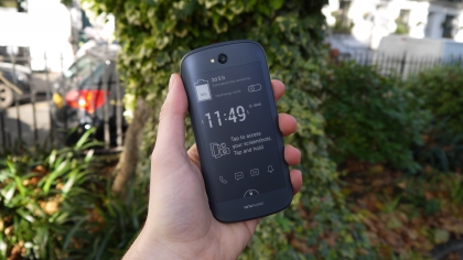
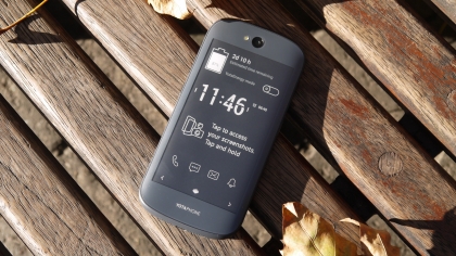
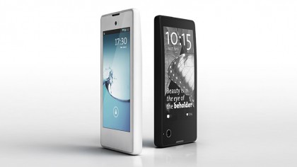
From the front it looks like any other Android smartphone, but flip it over and you’re greeted with a second, all-touch display – only it’s an e-ink screen similar to those found on ereaders.
The Yotaphone 2 is the Russian brand’s second entry into the market following on from the original, proof of concept, Yotaphone which launched in 2013 and aimed squarely at early adopters.
This time round Yota Devices means business. This is a global device aimed at the average consumer rather than those sitting at the forefront of technology. It’s even opened a dedicated store in London to really drive home the intent.
The Yotaphone 2 release date is December 4, where it goes on sale in over 20 countries, with Asia Pacific and China joining the party in early Q1 of 2015, and the US, Canada and Latin America towards the end of the same quarter.
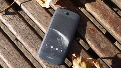
Fitting two screens into one device no thicker than 9mm while overcoming potential heat sync issues was no mean feat and the Yotaphone 2 carries a price tag which reflects the engineering complexity of its design.
SIM-free it’ll set you back £555 (around $870, AU$1035), which places it up there with the top smartphones of the moment including the Samsung Galaxy S5, HTC One M8 and Sony Xperia Z3.
There’s a decent level of tech included though, with a full HD 5-inch AMOLED display, 4.7-inch e-ink rear screen, 2.2GHz Snapdragon 800 processor, 2GB of RAM, 32GB internal storage, 8MP rear camera and 2.1MP front snapper.
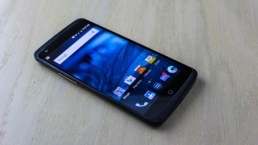
Place the Yotaphone 2 face up (coloured screen up) on a table and it looks like any run of the mill Android – there’s no indication of what lies on the other side.
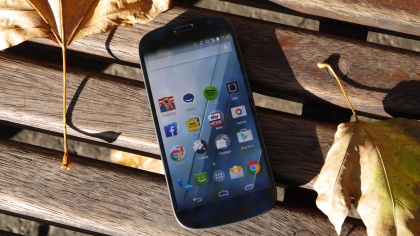
There’s no logo or navigation keys below the screen, and its rounded design reminds me of a cross between the Samsung Galaxy S3 and Galaxy Nexus.
It’s simple, yet I’m oddly drawn to the clean, fuss free design. With Gorilla Glass 3 front and back it feels supremely solid and the plastic frame which runs round the circumference has a textured rubberised feel providing a welcome level of grip.
The power/lock and volume keys are on the right side of the Yotaphone 2, and both fall nicely under thumb/finger during one handed operation.
The volume key has a pretty neat party trick which it’s learnt from its predecessor – it doubles as the nanoSIM tray.
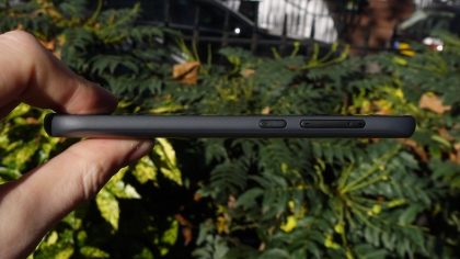
Your standard SIM tool won’t be long enough to dislodge it from the handset though, you’ll have to use Yota’s elongated tool which arrives in the box, or in my case a slender paper clip.
There is a fear that if used frequently you could end up damaging the volume keys and/or SIM tray, but for most users it’s unlikely that you’ll access the SIM particularly often.
The handset is only a touch taller than the Galaxy S5 (142mm) and not as wide, while the metal framed Lumia 930 is wider (71mm), thicker (9.8mm) and heavier (167g) than the 145g Yotaphone.
Considering it’s packing two fully touchscreen displays the fact Yotaphone 2 is just 8.95mm thick is impressive and the 144.9 x 69.4mm body means it sits comfortably in the hand.
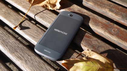
It’s a vast improvement on the blocky original Yotaphone, and the positioning of the rear camera clearly trumps the bottom corner location of its predecessor.
I’m not talking iPhone 6 levels of quality and premium appeal here, but pick up the Yotaphone 2 and it feels like a well made piece of kit rather than a cheap knockoff from a brand you’ve hardly heard of.
Unsurprisingly you can’t take the back off this phone thanks to the fact there’s a screen in the way, so the 2500mAh battery is locked away. That shouldn’t be a huge issue though, as one of the key reasons there’s an e-ink screen in play here is to suck less battery during mundane tasks such as texting, reading and updating social media.
There’s also the dedicated YotaEnergy power saving mode to help extend battery life further, but more on that later in this review.
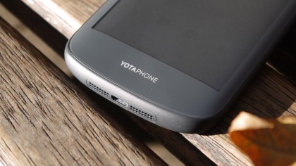
The dual screen setup means the speaker is shunted to the base of the handset, with a centralised microUSB port for company making for a tidy setup. Meanwhile the headphone jack is the only feature on the top edge.
With 32GB of internal storage there’s enough space to store a decent number of apps, games, movies and music, but power users may be disappointed to learn there’s no microSD slot to expand on this.
However the main attraction here is that rear e-ink display, which is always-on and slightly curved at the edges, making the Yotaphone 2 fit more snugly into your palm when using the coloured display.
There’s plenty going on with this always-on display. Want to find out what? Then head over to the next page.
The EPD: Electronic Paper Display
Round the back
Without question the biggest talking point here is the 4.7-inch EPD (Electronic Paper Display) slapped on the rear of the Yotaphone 2.
Unlike the e-ink screen on the original Yotaphone this one is full touch, providing a lot more functionality. The resolution isn’t exactly inspiring at 960 x 540, but you won’t be watching movies or playing games on this side of the handset.
For text though it’s perfectly acceptable and I didn’t have any issues reading on this rear screen – which is its forte. There is noticeable pixelation – it’s no where near as good as Amazon’s latest Kindle line up – which is a little disappointing when you consider the price tag.
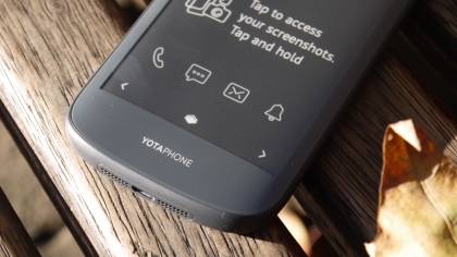
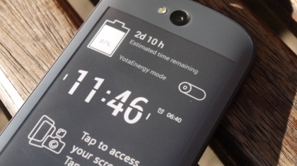
One of the big benefits of the EPD is that it’s always-on, allowing you to see vital information such as your latest notifications without even touching the device. Even when the device is powered off, you can select an image to remain on this display. Handy if you need a boarding pass or map home, but your phone has died.
With Gorilla Glass 3 protecting the curved display you shouldn’t have to fear sliding it in a pocket with keys, but to the touch it doesn’t feel like glass.
While the front of the Yotaphone 2 is cool to the touch and has the tactility of glass, the rear protection here feels more like plastic.
It’s not a bad feeling, but it’s noticeably different. It does help to quickly recognise which side is which when you’re plucking it out of a bag or pocket, allowing you to get it facing the right direction in your hand before looking at it.
Yota Devices collected feedback from everyone who purchased the first Yotaphone which it used to decide what features needed to be included in its second generation device.
To customise the EPD you’ll need to head to the Yota Hub on the colour screen, where you’ll be able to fiddle with your YotaCovers and YotaPanels.
Cover up
The EPD lock screen (called YotaCover) displays the number of new calls, text messages, emails and other notifications your phone has. You can also choose the picture(s) displayed as a background.
You can select photos stored on the handset, or albums from social networks including Facebook and Instagram, which will then cycle at an interval of your choosing (e.g. every 5, 10 or 30 minutes).
YotaCover can also show the details of a new message, from just the name of the sender to the message itself, or nothing at all. This allows you to tailor the information which is freely available on this screen without unlocking.
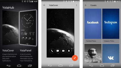
It’s not a flawless system. On several occasions the message notification said I had an unread text, even though I’d already gone and read and replied to it.
To unlock the e-ink display all you need to do is slide your finger up from the bottom of the screen and over the padlock icon – not too quickly though. You need to be relatively slow.
Most of the time this unlocked the phone first time for me, but every now and then I’d have to have three or four attempts before it understood what I was doing.

Once unlocked (and you’ve typed in your password if you’ve got one set) you’ll notice a navigation bar at the bottom of the screen, with a central button which lets you flip between YotaCovers and YotaPanels.
Panel beater
If YotaCover is your lock screen, then YotaPanels are your home screens, of which you can have up to four on the Yotaphone 2.
These panels can be customised with a variety of widgets and app shortcuts – although the selection of the former is limited to what’s pre-installed on the device.
The hope is more developers will code applications to play nicely with the EPD on the Yotaphone 2, but for now you can’t guarantee who will make the effort.
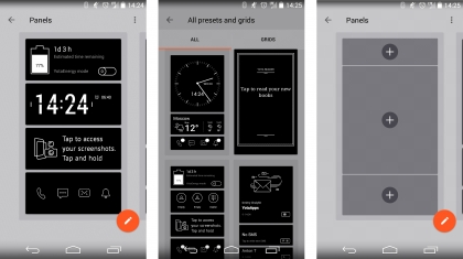
Unless you’re extremely privacy conscious I’d recommend ignoring YotaCover and sticking with YotaPanels as they offer up much more information at a glance, which you can tailor so it’s relevant to you.
You can lock the EPD on a panel – just click the power/lock key on the side of the handset (it’s now on the left!) and the padlock icon will show in the notification bar. A swipe up over this icon will unlock the display.
You’ll need to fire up the YotaHub app on the colour screen to edit your panels, and you can choose from pre-filled templates or start with a blank slate and craft your own info screen.
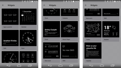
Some of the more basic widgets were the ones I found to be the most useful with notification icons (calls, texts, emails and other), clock and battery status all featuring front and centre.
Swiping sideways over a panel will see you cycle through your active panels, or you can just use the arrows in the navigation bar at the bottom of the screen.
Widget options also include calendar, agenda, weather, key contacts and a music player – all of which provide useful information and tools while use much less power than the same tasks on the AMOLED display.
Read me
A key widget for some will be YotaRSS, allowing you to get your daily news fix delivered to the power efficient rear display of YotaPhone 2 – perfect for the morning commute.
You’ll need to login to Feedly for the service to work, but once you’ve done that you’ll get the latest headlines from your RSS feeds in an easy to use widget.
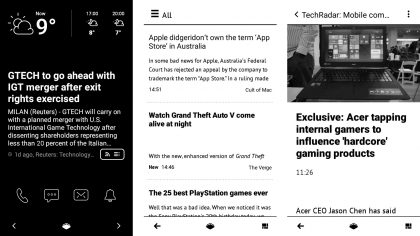
As I’ve already mentioned it’s excellent for reading, using the same screen technology as ereaders, although I did find some ghosting occurring – especially when scrolling pages with images.
In most cases it’s not bad enough to make the text unreadable, and the limitations of the e-ink screen are partly to blame – but it is noticeable and can be a little off putting during extended use.
Reading books is another obvious advantage with the low power EPD display, and Yota reckons you can get up to 100 hours reading time from a single charge – although you’d probably have to turn off cellular data, Wi-Fi and Bluetooth and not touch the colour screen at all.
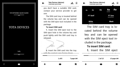
You can make one of your panels a link to the book your reading for easy access, or you can mirror a third party app such as Kindle to the rear screen if you have a collection elsewhere.
Text isn’t as sharp as it is on the latest fleet of ereaders, and the lack of a backlight means you can’t read in the dark, but those things aside the Yotaphone 2 still offers a solid reading experience which far exceeds rival smartphones.
Key features
Up front
I’ve focussed heavily on the rear display of the Yotaphone 2 so far for obvious reasons, but that’s not the only thing to shout about here.
The 5-inch AMOLED screen on the front isn’t just an afterthought, with a full HD resolution and bright, vibrant colours making for an attractive display.
It comfortably stands up against the displays found on the Sony Xperia Z3, Samsung Galaxy S5 and HTC One M8.
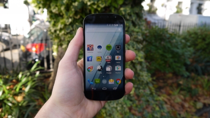
It may not be great in direct sunlight, but no phone screen is and the trump card held by the Yotaphone 2 is you can flip it over for a display which doesn’t have any trouble in bright light.
In fact, with a slightly smaller display size versus some of its high-end competition, the Yotaphone 2 boasts a pixel density of 442ppi. That’s a touch better than the S5 at 432ppi and the Xperia Z3 with 424ppi.
The 5-inch form factor provides enough on-screen real estate without being overbearing in the hand, and you’ll be able to comfortably watch movies and play the latest games without issue.
Mirror, mirror
As well as the custom interface Yota Devices has created for its rear facing EPD, the YotaPhone 2 also lets you access the full Android interface from the front screen on the rear display.
It’s a feature dubbed YotaMirror and it’s super easy to engage. All you need to do is hold and slide up from the home key (the action you use to launch Google Now), but instead of dragging your finger to the Google symbol go left to mirror mode.
Flip the phone over and you’ll find the full Android operating system in all its monochrome glory.
Performance is much slower due to the screen technology which needs to redraw every new screen, but it does work.
You won’t be playing games or watching movies in this mode, but for updating social media or checking out websites it works well (and a little slowly) and uses less battery in the process.
Life after death
I’ve already mentioned briefly on the previous page that the EPD stays on even when the phone is off and out of battery.
You can’t use the display when out of juice, but it can display a useful image such as a map, address or boarding pass.
The feature is called YotaSnap, and when the phone is on you can store a series of screenshots and images into a small gallery which you’ll still be able to access with just a sliver of battery left in the tank.

Let the phone die though and only one will be available – and you can set a default so you don’t have to remember to navigate to a particular image just before the phone switches off.
Yota clearly sings the praises of this feature, but in day to day use I found very few occasions where this would be genuinely useful. And that’s a feeling I get most of the time when using the rear display – it’s innovative, but I’d much rather use the more responsive and easier on the eye colour display most of the time.
Interface and performance
I’ve spoken a lot about the rear display on the Yotaphone 2, so in this section I’m going to concentrate more on the experience on the 5-inch, full HD AMOLED screen.
The Yotaphone 2 rocks up running Android 4.4.3 KitKat. That’s not quite the latest version of KitKat (which is 4.4.4), but that’s already been replaced by Android 5.0 Lollipop.
Yota Devices has confirmed that it will be bringing Lollipop to the Yotaphone 2, but there’s currently no time frame for the update as extra work is required for the second screen integration.
The good news here is Android has been left alone, giving you a pure experience without a manufacturer overlay.
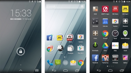
If you’ve used an Android device before you’ll have no trouble picking up the Yotaphone 2 and getting to grips with it straight away.
It means you get the traditional unlock screen with a shortcut to the camera and pull down notification bar with a separate screen of quick settings. Drag down with two fingers and you’ll been shown the quick settings page rather than your notifications.
Yota Devices has added a torch quick setting in here which is useful for stumbling home at 2am from a bar, plus there’s a toggle for the YotaEnergy power saving mode.
As I’ve mentioned earlier in this review, reading a message or dismissing a notification on the rear screen doesn’t always clear if from the notification bar.
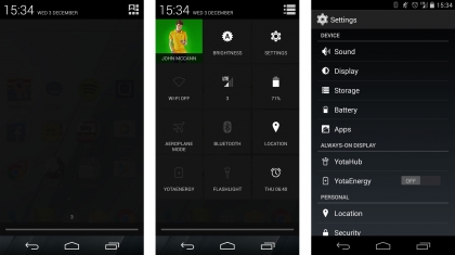
On a number of occasions during my time with the Yotaphone 2 I found myself excitedly dragging down from the top of the screen to see who’s just text me, only to find it’s one I’ve already read. Sad face.
Yota has included a small selection of pre-installed applications, most of which relate to the rear display, and thus are totally acceptable.
YotaHub is your one-stop-shop for customising covers and panels on the rear display, while you also get four games (chess, checkers, sudoku and 2048) to play on the EPD (Electronic Paper Display).
The Yotaphone 2 comes with a 2.2GHz Snapdragon 800 processor, which is now over a year old and has been succeeded by Qualcomm’s 801 and 805 chips.
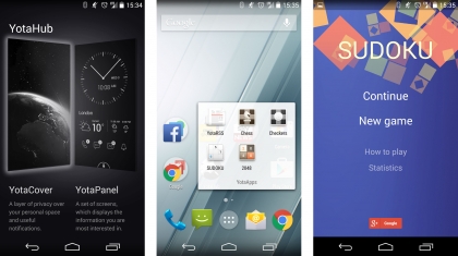
This means that the Android interface isn’t quite as snappy as 2014’s flagship handsets, and while it’s by no means slow every now and then there’s a half second load time wait.
I ran the Geekbench 3 benchmarking test on the Yotaphone 2 and after several runs it averaged a respectable 2719 for the multi-core test.
That’s not quite as high as the Sony Xperia Z3 (2737), Samsung Galaxy S5 (2905) or iPhone 6 (2902), but it did beat the LG G3 (2561) while the original Yotaphone (1054) was blown out of the water.
I was able to play a variety of games without issue on the handset, and while load times may have been a touch longer than on phones packing newer processors it certainly wasn’t sluggish, thanks in part to the 2GB of RAM.
Yota highlighted that it had to overcome various heat issues surrounding the processor in Yotaphone 2 thanks to the dual-screen setup making it harder for the heat to dissipate.
During my time with the handset I did find that it could heat up quickly during extending use – especially when playing a graphically intense game. It does get quite hot, more so than most mobiles, but not to an uncomfortable level.
Battery life
The Yotaphone 2 comes with a 2500mAh battery sealed in between those two display, which is a touch smaller than the power packs found in similarly priced competitors.
A slightly smaller battery coupled with an older Snapdragon 800 processor means power efficiency via the main 5-inch display isn’t particularly stellar. I found the Yotaphone 2 was consistently running out by the end of the day when the colour screen was predominantly used.
Running the 90 minutes battery test video with the colour screen at full brightness and accounts syncing in the background the Yotaphone lost 20% of life.
That’s better than the Xperia Z3, HTC One M8 and iPhone 6, but it’s beaten by the Galaxy Note 4, Galaxy S5 and OnePlus One.
It’s a shame it’s missed out on the Snapdragon 801 chip as it saw big battery life improvements over handsets rocking 800, and considering the processor in the Yotaphone 2 is way over a year old now it seems like a missed opportunity.
Yota isn’t overly concerned with the difference in power efficiency between the 800 and 801 chips, as it claims the Electronic Paper Display (EPD) can deliver significantly longer battery life.
Use the rear screen for day to day tasks such as text messaging, emails and social media and you’ll only drop a handful of percentage points.
The down side is you’ll need much more patience – typing is a bit of a chore as you wait for the e-ink technology to keep up with your taps, and general navigation isn’t as fluid as the colour screen.
It’s a trade off I was willing to make a lot of the time though, and the fact I can get live information on the low power display makes it great for glancing down at on my desk to get a quick update.

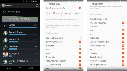
If you do find yourself running particularly low you can always engage the YotaEnergy power saving mode, which switches off various features in a bid to extend life as much as possible.
Yota claims that enabling YotaEnergy when you have 15% battery left will extend life by up to 8.5 hours, versus 1.5 hours if you didn’t enable the power saving mode – and it reckons with the mode enabled earlier the handset can last two days on a single charge.
You can set YotaEnergy to automatically come on when the battery falls below 15%, 10%, 5% or your own custom value, plus you can toggle which features it disables.
YotaEngergy can do a variety of things such as throttle processing power, turn off key functions such as WiFi, Bluetooth, GPS and NFC, and enable a 2G only mode which cuts mobile data but still allows calls and texts.

I found by enabling pretty much all the power saving features within the YotaEnergy menu and switching the mode on early that the claim of two days is achievable – but you need to keep off the front display.
The Yotaphone 2 is also wireless charging enabled, so if you have a Qi charging pad you’ll be able to plonk the handset on it to refuel.
It’s relatively impressive then, but battery life isn’t as groundbreaking as I’d hoped. Some of the top smartphones of 2014 can go a day and a half on one charge without the benefit of a low powered display for the menial tasks.
Use the Yotaphone 2 in the right way and two days is possible – focus on the front screen and you’ll be lucky to see out one.
Camera
Considering the price tag attached to the Yotaphone 2 I was disappointed to find an 8MP camera slapped on the rear of the device. Especially when its predecessor has a 13MP snapper.
The top Android phones at the moment are sporting 13MP, 16MP and even 20MP+ cameras, so the Yotaphone does feel a little behind the times.
It’s not all about meagpixels though, and the iPhone 6 shows that an 8MP lens is more than capable of taking some quite lovely smartphone shots. Sadly though, the camera here isn’t in the same league as Apple’s.
This is a snapper you’d expect to find on mid-range devices, around half the cost of the Yotaphone 2. It’s certainly not terrible, just a little disappointing.
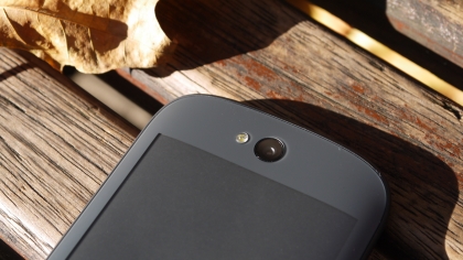
At least Yota has shifted the camera to the more sensible top-centre location on the back of the handset, as the original had it in the bottom corner which was pretty inconvenient.
The camera app is just Google’s stock Android offering, which offers up a small array of features including photo sphere, panorama and lens blur. It can also capture 1080p video through the rear camera and the front facing, 2.1MP lens.
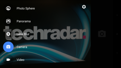
It’s all pretty standard, with no effects or advanced settings over a flash, timer and the option to toggle manual exposure.
The rear screen does provide a useful feature – fire up the camera app and then switch to mirror mode and when you flip the phone around you’ll see your face on the e-ink display.
For the selfie lovers out there it makes getting yourself and your mates in shot easy and you get a better quality picture as you’re using the higher res rear camera.
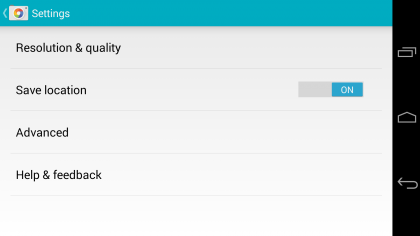
The e-ink display does a surprisingly good job of keeping up with your movements and as long as there’s enough light it’s a handy feature. Find yourself in a darker area though and the limitations of the black and white screen will mean you’ll struggle to see what’s happening.
Tap to focus is present, and for the odd snap here and there the Yotaphone 2 does an acceptable job with a decent shutter speed, but the results are nothing special.
Pictures tend to look a little washed out, and the level of detail is lacking with blurry backgrounds and some noticeable graining.
Camera samples

Click here for the full-res image

Click here for the full-res image

Click here for the full-res image
Click here for the full-res image

Click here for the full-res image

Click here for the full-res image

Click here for the full-res image
Media
The Yotaphone 2 has a full HD 5-inch display and 32GB of internal storage (of which 25GB is available to you). There’s also 4G connectivity, Wi-Fi, Bluetooth and NFC, giving you a strong line up of features for media activity.
There’s no microSD slot to expand on the storage, but for many the space offered inside will be enough.
Movies
There’s no dedicated video player application included on the Yotaphone 2, so you’ll have to head to the gallery to find your video files.
Tap on a video and the player will launch, offering up just play/pause and scrub controls. There are no further settings here, so if you’re after more functionality you’ll have to take to Google Play and download a third party offering.
Playback is bright and clear, with the AMOLED screen making viewing movies and TV shows an enjoyable experience.

The Yotaphone 2 is also comfortable to hold for extended viewing sessions on the train on the way to work.
The internal speakers are located at the bottom of the device, and while they do kick out a relatively decent volume the quality isn’t particulary stellar – you’ll be better off plugging in a set of headphones.
If you do choose to use the internal speakers then cup your hand over them when watching in landscape to direct the sound towards your face. It does make a difference.
Colours don’t pop as much as they do on Samsung’s Super AMOLED offerings, but the quality provided by the Yotaphone is still very good.
If you really want you can engage mirror mode and play your videos on the rear display – unsurprisingly playback is terrible, but that’s not what the rear display is designed for.
As well as transferring your own video files onto the Yotaphone 2, you can also buy and rent a wide variety of movies and TV shows from the Google Play store. The selection is large and prices are in line with similar services on rival handsets.
Music
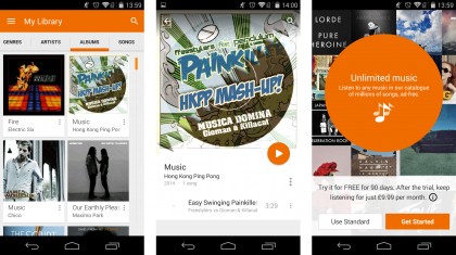
Google’s own Play Music app is where you’ll need to head to listen to your tunes. The straight forward interface lets you browse your music by artist, album or title, and the now playing screen has the various controls you’d expect from any player.
Play Music has been overhauled as part of Google’s Material redesign for Android Lollipop and the clean, fuss free app is easy on the eye as well as being easy to use.
You can subscribe to Google’s pay monthly streaming service (similar to Spotify and co.), which is free for 90 days and then £9.99 per month after the trial period.
As I’ve already mentioned the internal speakers aren’t particularly great, so if you want to really enjoy your tunes you’ll need to plug into an external system or use a pair of headphones.
I found music playback to be very good, and if you feel like you’re missing a vital track or album just head over to Google Play where there’s a huge catalogue of songs for you to purchase and download.
As well as getting playback controls on the lockscreen and in the notifications bar, there’s also a music player widget for the rear display. This gives you the ability to skip and play/pause tracks without firing up the power intensive front screen.
Gaming
The Yotaphone 2 has the older Snapdragon 800 processor backed up with 2GB of RAM which is good enough to run pretty much any game.
Load times do take a little longer compared to the latest and greatest flagship handsets, but I couldn’t find a game the Yotaphone 2 couldn’t play.
It managed to handle the graphically intensive Real Racing 3, and while the graphics weren’t as dialled up as on some handsets, it was still perfectly playable.
The essentials
Contacts and calling
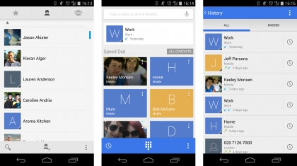
Contact management on the Yotaphone 2 is all very straight forward with the handset using Google’s stock People app to handle all your buddies.
It can pull through contact information from Google, email accounts and some social networks, creating an address book full of names and numbers. Profile pictures can also be dragged through, adding a splash of colour to the list.
Things aren’t quite so good on the calling side, and I found the Yotaphone 2 struggled to get the same level of signal as other phones.
There was never a case where I’d get signal on another phone and not on the Yotaphone, but it was regularly one or two bars lower than rival handsets – which caused issues at times when trying to get online.
Calls and text messages remained unaffected, although audio on quality on calls isn’t the strongest. It’s acceptable, but I’ve had much clearer calls on phones half the price and on a few occasions the person on the other end of the line said they were struggling to hear me.
Messages, email and keyboard
As with contacts and calling, messaging and email is all very straight forward and fuss free. Slightly confusingly however, you get two messaging apps and two email clients on the Yotaphone 2.
This isn’t just a Yota thing, the majority of Android handsets suffer from this duplication. The messages app is a straight forward app for texts, while Hangouts combines SMS with Google’s instant messenger.
In terms of text performance the two apps are very similar, but Hangouts plays nicely with Android Wear smartwatches – so that may sway you.
Then you have the Gmail and Email apps – both of which can now handle accounts from a variety of different sources.
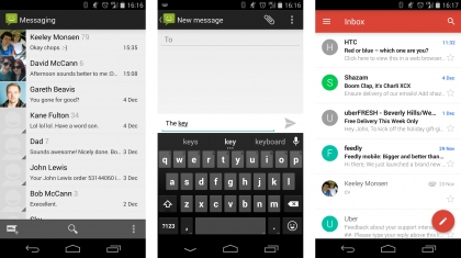
I prefer the cleaner layout of Gmail, but functionality wise both offer very similar features. Seeing as you have to sign in with a Gmail account anyway on an Android device you might as well stick with the Gmail app.
The Yotaphone 2 also uses the stock Android keyboard which comes with next word prediction and swipe input support.
It’s a pretty decent offering, and travel on the 5-inch screen is good – although I’d still recommend downloading a third party such as Swiftkey for a truly fluid typing experience.
You can also reply to texts and emails from the rear screen, and while the same keyboard is used there’s a noticeable delay between hitting each key and the Electronic Paper Display refreshing to show your action.
This slows down input times quite dramatically, so you’ll need to be patient if you opt to reply on the low power display.
Internet
The Yotaphone 2 is 4G enabled, providing superfast data speeds when you’re away from Wi-Fi, with a, b, g, n and ac networks all supported.
There’s just one browser installed, and it’s Google’s Chrome which offers up a highly capable surfing experience. You can also download an alternative in Google Play if Chrome isn’t to your liking.
Tabbed and private browsing is available and your bookmarks and open tabs from other devices can be seamlessly synced across to the phone for an uninterrupted experience.
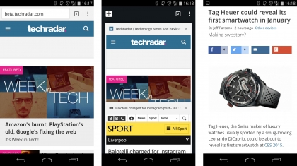
Load times are suitably speedy whether on 4G or a decent Wi-Fi connection. Mobile sites appear in just a couple seconds, while most desktop sites manage to at least partially load in around five.
The bright, crisp AMOLED displays makes sites look appealing and easy to read, while you can browse the web without damaging battery life by switching to the rear screen with mirror mode – but it’s not as slick.
Comparisons
Yotaphone
This is where this dual-screen adventure started, the original Yotaphone was never meant for the mass market, it was a proof of concept for the Russian firm to build on.
The concept nature was apparent from the cheese wedge shape and poor battery life to the odd camera placement and rear display which just had a touch sensitive strip.
If you’re really keen to see where the adventure started then you can still pick the original up, but the Yotaphone 2 is better in almost every way – apart from the camera.
- 10 things you need to know about the Yotaphone
HTC One M8
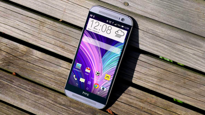
The HTC One M8 is actually cheaper than the Yotaphone 2, but sports a premium body and stronger set of specs.
It offers the best all round smartphone experience on the market, so if you’re looking for the best bang for your buck at the top, your search is over.
The Ultrapixel duo-camera won’t be for everyone, but it does make it stand out from the snappers on the Samsung, Sony and LG devices.
Front facing BoomSound speakers kick out decent quality audio, the full HD display is a joy to use and the powerful processor not only runs Android smoothly, it’s also pretty good for battery life too.
While it may not have the novelty of two screens, the One M8 provides a stronger smartphone offering.
- Read our HTC One M8 review
OnePlus One
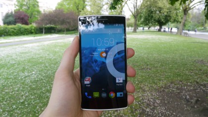
Like the YotaPhone 2, the OnePlus One comes from a relatively unknown brand, so you can be pretty sure your mates won’t have one.
The hook here though is the price – it’ll cost you half of what the Yotaphone 2 will and it arguably has a better spec line up with a 5.5-inch full HD display, 2.5GHz Snapdragon 801 processor, 3GB of RAM, 13MP rear camera and Android KitKat.
It’s trickier to get hold of with a limited invite-only system which is punctuated every now and then by general sale windows, but get hold of one and you’ll be grabbing yourself a bargain.
- Read our OnePlus One review
Sony Xperia Z3 Compact
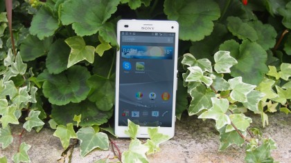
Sony’s latest small form flagship is a little bit cheaper than the Yotaphone 2 and comes with some real high end specs.
It may be the smaller brother of the Xperia Z3 with a 4.6-inch 720p display but it still packs some top end specs including a Qualcomm Snapdragon 801 processor, 2GB of RAM and that famous 20.7MP Sony sensor.
Design wise it’s premium with a glass back and IP68 dust and water protection. It’s a shame there’s only 16GB of onboard storage but there’s microSD support up to 128GB and an impressive 2600mAh battery to make up for it.
In the end the Xperia Z3 Compact has some impressive specs to look into but is it more important to you than having an eink display on the back? That you’ll need to decide.
- Read our full review of the Sony Xperia Z3 Compact.
Hands on gallery


Verdict
The Yotaphone 2 is a compelling device and for those looking for something different from a top of the range smartphone this is one of the most left-field options around.
It will turn heads, spark conversation and genuinely impress anyone you show it to. That’s all well and good, but it’s difficult to actually recommend.
We liked
The innovation and engineering achievement with the Yotaphone 2 is truly impressive, and the folks at Yota Devices have done a sterling job to create such a unique device.
I found the always on screen useful, with vital information popping into view without me having to even touch the handset, and the power saving benefits are a clear plus point.
I was also impressed with YotaMirror – giving full access to the Android interface on the monochrome display. Sure it’s not as slick, nor does it look great, but it does work.
We disliked
Favour the colour display on the Yotaphone 2 and battery life takes a beating – you’ll be lucky if it lasts a full day on a single charge.
That’s partly down to the additional processing power required to keep the rear display constantly updated, but also the older Snapdragon 800 processor. Considering the top phones of 2014 are rocking the power efficient 801 chip, it’s a real shame the processor here is over a year and a half old.
The rear display is fun, but I found I wasn’t using it as often as Yota would perhaps like. Knowing you have the faster, slicker full HD display on the other is too much of a draw a lot of the time.
Text input on the EPD (Electronic Paper Display) is slow, and browsing can become tedious and you wait for the screen to play catch up. There were times where I did find it useful, but they didn’t feel like paying the premium price tag for.
Verdict
I get the benefits of the EPD on the Yotaphone 2, but ultimately it still feels like a work in progress with clear-cut, everyday advantages still missing.
I question just how useful the rear screen is with its slow refresh rates and limited app integration. I’d like to see a slicker interface and some big name developers really get behind it.
Ignore the rear display altogether and it’s a competent Android smartphone with a decent level of power, mid-range camera and solid build.
The Yotaphone 2 is a huge leap forward from the original and it’s certainly a product which can appeal to a wider consumer base, but unless you’re desperate for a dual-screened smartphone there are better options to blow your cash on.
First reviewed: November 2014
![]()
Related Posts
December 6, 2021
7+ Web Design Trends for 2022: Which Will You Use?
December 6, 2021
The 10 Best WordPress Booking Plugins to Use On Your Website
December 6, 2021
How to Use a Web Cache Viewer to View a Cached Page
November 6, 2021
10 Modern Web Design Trends for 2022
November 6, 2021
Best Free SSL Certificate Providers (+ How to Get Started)
November 6, 2021
How to Design a Landing Page That Sends Conversions Skyrocketing
November 6, 2021
What Are the Best WordPress Security Plugins for your Website?
October 6, 2021
Your Guide to How to Buy a Domain Name
October 6, 2021
How to Build a WordPress Website: 9 Steps to Build Your Site
September 6, 2021
10 Best Websites for Downloading Free PSD Files
September 6, 2021
HTML5 Template: A Basic Code Template to Start Your Next Project
September 6, 2021
How Much Does It Cost to Build a Website for a Small Business?
September 6, 2021
A List of Free Public CDNs for Web Developers
September 6, 2021
6 Advanced JavaScript Concepts You Should Know
August 6, 2021
10 Simple Tips for Launching a Website
August 6, 2021
25 Beautiful Examples of “Coming Soon” Pages
August 6, 2021
10 Useful Responsive Design Testing Tools
August 6, 2021
Best-Converting Shopify Themes: 4 Best Shopify Themes
July 6, 2021
What Is Alt Text and Why Should You Use It?
July 6, 2021
24 Must-Know Graphic Design Terms
June 6, 2021
How to Design a Product Page: 6 Pro Design Tips
April 6, 2021
A Beginner’s Guide to Competitor Website Analysis
April 6, 2021
6 BigCommerce Design Tips For Big Ecommerce Results
April 6, 2021
Is WordPress Good for Ecommerce? [Pros and Cons]
March 6, 2021
Make Websites Mobile-Friendly: 5 Astounding Tips
March 6, 2021
Shopify vs. Magento: Which Platform Should I Use?
March 6, 2021
Top 5 Web Design Tools & Software Applications
February 6, 2021
Website Optimization Checklist: Your Go-To Guide to SEO
February 6, 2021
5 UX Design Trends to Dazzle Users in 2021
February 6, 2021
What Is the Average Page Load Time and How Can You Do Better?
February 6, 2021
Choosing an Ecommerce Platform That Will Wow Customers
February 6, 2021
7 Best Practices for Crafting Landing Pages with Forms
February 6, 2021
7 B2B Web Design Tips to Craft an Eye-Catching Website
January 6, 2021
Mobile-Friendly Checker | Check Your Site’s Mobile Score Now
January 6, 2021
8 Tips for Developing a Fantastic Mobile-Friendly Website
December 6, 2020
How to Add an Online Store to Your Website [4 Ways]
December 6, 2020
5 UX Design Tips for Seamless Online Shopping
November 6, 2020
Ecommerce Website Essentials: Does Your Site Have All 11?
November 6, 2020
5 Small Business Website Essentials You Need for Your Site
November 6, 2020
Your Website Redesign Checklist for 2020: 7 Steps for Success
May 1, 2020
Psychology of Color [Infographic]
April 21, 2020
How to start an online store that drives huge sales
January 3, 2020
5 Lead Generation Website Design Best Practices
March 6, 2019
6 Reasons You Should Redesign Your Website in 2019
March 6, 2019
7 Web Design Trends for 2019
February 19, 2019
Who owns the website/app source code, client or developer
February 7, 2019
Don’t Let Your Domain Names Expire in 2019
January 8, 2019
2019 Website Development Trends To Note
October 6, 2017
How Web Design Impacts Content Marketing
October 6, 2017
How to Choose a Navigation Setup
August 6, 2017
Why User Experience Matters to Marketing
July 6, 2017
5 Ways Web Design Impacts Customer Experience
September 6, 2016
How to Learn Angular
September 6, 2016
The Excuses for Not Having a Website (Infographic)
September 6, 2016
How to Build an Award-Winning Web Design Team
September 6, 2016
13 Free Data Visualization Tools
August 6, 2016
How Selling Pastries Helped Us Design a Better Product
August 6, 2016
11 Sites to Help You Find Material Design Inspiration
July 4, 2016
How to change free wordpress.com url
April 6, 2016
The 5 Best Free FTP Clients
April 6, 2016
7 Free UX E-Books Worth Reading
March 6, 2016
Can Handwritten Letters Get You More Clients?
December 10, 2015
Star Wars Week: How to create your own Star Wars effects for free
December 6, 2015
20 "Coming Soon" Pages for Inspiration
December 6, 2015
6 Free Tools for Creating Your Own Icon Font
December 6, 2015
9 Useful Tools for Creating Material Design Color Palettes
November 6, 2015
20 Free UI Kits to Download
November 6, 2015
50 Web Designs with Awesome Typography
November 6, 2015
When to Use rel="nofollow"
November 6, 2015
7 Free Books That Will Help You Become More Productive
November 6, 2015
50 Beautiful One-Page Websites for Inspiration
November 6, 2015
Circular Images with CSS
October 6, 2015
Lessons Learned from an Unsuccessful Kickstarter
October 6, 2015
5 Games That Teach You How to Code
October 6, 2015
Cheatsheet: Photoshop Keyboard Shortcuts
October 6, 2015
An Easy Way to Create a Freelance Contract for Your Projects
October 6, 2015
50 Design Agency Websites for Inspiration
September 29, 2015
JB Hi-Fi shutting the book on ebooks
September 24, 2015
Opinion: Quick, Quickflix: It's time to give yourself the flick
September 24, 2015
New Star Wars 360-degree video is among first on Facebook
September 21, 2015
Apple purges malicious iPhone and iPad apps from App Store
September 12, 2015
Apple's new Live Photos feature will eat up your storage
September 12, 2015
The latest Windows 10 Mobile preview has been delayed
September 12, 2015
IBM buys StrongLoop to add Node.js development to its cloud
September 8, 2015
Fake Android porn app takes your photo, then holds it ransom
September 6, 2015
50 Restaurant Websites for Inspiration
September 6, 2015
Zero UI — The Future of Interfaces
September 6, 2015
50 Beautiful Websites with Big Background Images
September 6, 2015
Infographic: 69 Web Design Tips
September 6, 2015
Free Windows 10 Icons
September 2, 2015
Instagram turns itself into a genuine messaging service
August 11, 2015
In Depth: How Microsoft taught Cortana to be more human
August 11, 2015
Windows 10 price, news and features
August 11, 2015
Windows 10's broken update introduces endless reboot loop
August 11, 2015
Windows 10 races to 27m installs
August 11, 2015
Windows 10 IoT Core gets first public release
August 10, 2015
iOS Tips: How to backup iPhone to an external drive
August 10, 2015
Windows 8.1 RT finally getting Windows 10 Start Menu
August 10, 2015
How to use Windows Hello
August 10, 2015
Review: Moto Surround
August 10, 2015
Review: Moto G (2015)
August 9, 2015
8 of the best free VPN services
August 8, 2015
Use Firefox? Mozilla urges you update ASAP
August 7, 2015
Mac Tips: Apple Mail: How to remove the Favorites Bar
August 7, 2015
How to make the OS X dock appear faster
August 7, 2015
Review: BQ Aquaris E45 Ubuntu Edition
August 7, 2015
Review: Acer Liquid Jade Z
August 6, 2015
How to reinstall Linux
August 6, 2015
How to reinstall Windows
August 6, 2015
Updated: Apple Music: release date, price and features
August 6, 2015
Social News Websites for Front-End Developers
August 6, 2015
10 Free JavaScript Books
August 6, 2015
50 Beautiful Blog Designs
August 6, 2015
Animated SVG Pipes Effect
August 6, 2015
Launching Your First App
August 5, 2015
Windows 10 goes freemium with paid apps
August 5, 2015
Updated: Week 1 with Windows 10
August 5, 2015
Mac Tips: How to manage Safari notifications on Mac
August 5, 2015
Microsoft Sway may kill the PowerPoint presentation
August 4, 2015
Microsoft gives Outlook on the web a new look
August 4, 2015
Mac OS X vulnerable to new zero-day attack
August 4, 2015
Windows 10 users warned of two scams
August 4, 2015
Microsoft's Docs.com is now available to everyone
August 3, 2015
Mac Tips: How to edit the Favorites sidebar on Mac
August 3, 2015
Updated: Windows 10 price, news and features
July 29, 2015
Review: HP ProDesk 405 G2
July 29, 2015
Hands-on review: HP Elite x2 1011
July 29, 2015
Hands-on review: Updated: Windows 10 Mobile
July 29, 2015
Review: Updated: Nvidia Shield Android TV
July 28, 2015
LIVE: Windows 10 launch: Live Blog!
July 28, 2015
How to prepare for your upgrade to Windows 10
July 28, 2015
Review: Updated: Windows 10
July 28, 2015
Review: Updated: HP Pro Tablet 608
July 28, 2015
Review: Heat Genius
July 28, 2015
Hands-on review: Moto X Play
July 28, 2015
Hands-on review: Moto X Style
July 28, 2015
Hands-on review: Moto G (2015)
July 28, 2015
Review: 13-inch MacBook Air (early 2015)
July 28, 2015
Hands-on review: OnePlus 2
July 28, 2015
Review: LG 65EG960T 4K OLED
July 28, 2015
Mac Tips: How to share printers on Mac
July 27, 2015
Apple Music's arrival hasn't opened Pandora's box
July 26, 2015
Review: Garmin Swim
July 25, 2015
How to merge OS X contacts into an existing list
July 25, 2015
Hands-on review: UPDATED: ZTE Axon
July 24, 2015
Mac Tips: How to zoom in on a Mac
July 24, 2015
What Windows 10 means for the enterprise
July 24, 2015
Review: JBL Charge 2 Plus
July 24, 2015
Review: Acer Aspire S7
July 24, 2015
Review: Updated: Canon G3 X
July 24, 2015
Review: Updated: iPad Air 2
July 24, 2015
Review: Thinksound On1
July 24, 2015
Review: Asus Chromebook Flip
July 24, 2015
Review: Garmin Forerunner 225
July 23, 2015
Review: Garmin nuvi 68LM
July 23, 2015
Review: Samsung Galaxy S6 Active
July 23, 2015
Review: Bowers and Wilkins P5 Wireless
July 23, 2015
Review: Dell XPS 15 (2015)
July 21, 2015
Review: Fuji S9900W
July 21, 2015
Review: Updated: Fitbit Surge
July 21, 2015
Review: UE Roll
July 21, 2015
Hands-on review: Ubik Uno
July 20, 2015
Review: Samsung HW-J650
July 20, 2015
Updated: 40 best Android Wear smartwatch apps 2015
July 20, 2015
Review: Acer Chromebook C740 review
July 20, 2015
Review: Huawei Talkband B2
July 20, 2015
Review: Dell Venue 10 7000
July 20, 2015
Review: Intel Core i7-5775C
July 17, 2015
Mac Tips: How to delete locked files on Mac
July 17, 2015
Review: Pebble Time
July 16, 2015
Microsoft just made Windows XP even less secure
July 16, 2015
Windows 8.1 RT is getting an update this September
July 16, 2015
OS showdown: Windows 10 vs Windows 8.1 vs Windows 7
July 16, 2015
Review: Acer CB280HK
July 15, 2015
Windows 10 is ready for new laptops and PCs
July 15, 2015
Explained: How to take a screenshot in Windows
July 15, 2015
Office for Windows 10 appears in latest build
July 14, 2015
Review: ZTE Axon
July 14, 2015
Review: ViewSonic VP2780-4K
July 14, 2015
Hands-on review: SanDisk Connect Wireless Stick
July 14, 2015
Review: Oppo PM-3
July 14, 2015
Review: BT 11ac Dual-Band Wi-Fi Extender 1200
July 14, 2015
Review: Fuji X-T10
July 13, 2015
How to build an SEO strategy for your business
July 13, 2015
Review: Lenovo ThinkPad Yoga 15
July 13, 2015
Review: Audio-Technica ATH-MSR7
July 13, 2015
Review: Garmin NuviCam LMT-D
July 13, 2015
Review: Dell Inspiron 13 7000
July 13, 2015
Hands-on review: AstroPi SenseHAT
July 13, 2015
Hands-on review: EE Rook
July 13, 2015
Hands-on review: Updated: HTC Vive
July 12, 2015
Here's the ultimate software list for PC fanatics
July 10, 2015
How to use the new Photos app for Mac
July 10, 2015
Windows 10 Insider Preview Build 10166 available now
July 10, 2015
Splunk spends big on cybersecurity acquisition
July 10, 2015
Making Windows 10 apps just got a whole lot easier
July 10, 2015
Review: Lenovo LaVie Z 360
July 9, 2015
OS X El Capitan public beta available right now
July 9, 2015
Microsoft finally unveils Office 2016 for Mac
July 9, 2015
Review: Updated: Chromecast
July 9, 2015
Review: Updated: Tesco Hudl 2
July 9, 2015
Review: Lenovo ThinkPad E550
July 9, 2015
Review: Updated: Google Nexus 6
July 8, 2015
What you need to know about Windows Server 2016
July 7, 2015
Microsoft to hike enterprise cloud pricing
July 6, 2015
Hacking Team end up being totally 0wned
July 6, 2015
Review: HP Pro Slate 12
July 6, 2015
Review: Samsung 850 Pro 2TB
July 6, 2015
Review: Asus RT-AC87U
July 6, 2015
Review: Jawbone UP2
July 6, 2015
Reimagining the Web Design Process
July 6, 2015
50 Clean Websites for Inspiration
July 6, 2015
15 Free Books for People Who Code
July 6, 2015
Web Storage: A Primer
July 6, 2015
A Look at Some CSS Methodologies
July 3, 2015
6 Essential Mac Mouse and Trackpad Tips
July 2, 2015
How to install a third party keyboard on Android
July 2, 2015
Review: UPDATED: Asus Zenfone 2
July 2, 2015
Review: Alienware 13
July 2, 2015
Review: HP DeskJet 1010
July 1, 2015
5 issues we want Apple Music to fix
June 13, 2015
Cortana will get its own button on Windows 10 PCs
June 12, 2015
Windows 10 will come with universal Skype app
June 12, 2015
iPad music production: 18 Best apps and gear
June 12, 2015
Windows 10 all set for early enterprise struggle
June 12, 2015
Review: Garmin VIRB Elite
June 11, 2015
Review: Updated: Nvidia Shield Tablet
June 11, 2015
Review: Nokia Lumia 635
June 10, 2015
Microsoft brings more online tweaks to Office 365
June 10, 2015
Mac Tips: How to use Screen Sharing in Mac OS X
June 9, 2015
Hands-on review: Meizu M2 Note
June 9, 2015
Hands-on review: EE 4GEE Action Camera
June 9, 2015
Review: Toshiba 3TB Canvio external hard drive
June 9, 2015
Review: Olympus SH-2
June 8, 2015
Hands-on review: Updated: Apple CarPlay
June 8, 2015
UPDATED: iOS 9 release date, features and news
June 8, 2015
Review: Updated: Roku 2
June 8, 2015
Review: Updated: PlayStation Vue
June 8, 2015
Review: Dell PowerEdge R730
June 8, 2015
Review: Canon SX710 HS
June 7, 2015
UPDATED: iOS 9 release date, features and rumors
June 7, 2015
Review: Lenovo S20-30
June 6, 2015
Free Writing Icons
June 6, 2015
15 CSS Questions to Test Your Knowledge
June 6, 2015
The Best CSS Reset Stylesheets
June 6, 2015
How CSS Specificity Works
June 5, 2015
'Delay' is a new feature in Windows 10
June 5, 2015
Review: Beyerdynamic Custom One Pro Plus
June 5, 2015
Latest SEO Marketing tools
June 5, 2015
Review: Nvidia Shield Android TV
June 5, 2015
Review: Honor 4X
June 5, 2015
Review: In Depth: Oppo R5
June 3, 2015
Hands-on review: Huawei P8 Lite
June 3, 2015
How To: How to create eBooks on a Mac
June 3, 2015
Review: Updated: Tidal
June 3, 2015
Review: Canon 750D (Rebel T6i)
June 2, 2015
Review: Updated: Asus ZenWatch
June 2, 2015
Review: Alcatel OneTouch Idol 3
June 2, 2015
Review: Updated: Nokia Lumia 1520
June 2, 2015
Review: Updated: Nokia Lumia 625
June 2, 2015
Review: Creative Muvo Mini
June 1, 2015
Review: Acer TravelMate P645 (2015)
June 1, 2015
Hands-on review: Corsair Bulldog
May 29, 2015
In Depth: NetApp: a requiem
May 29, 2015
July is looking definite for Windows 10 release
May 29, 2015
Hands-on review: Google Photos
May 28, 2015
Mac Tips: The 16 best free GarageBand plugins
May 28, 2015
Review: Canon 760D (Rebel T6s)
May 27, 2015
Review: Lenovo Yoga 3 14
May 27, 2015
Hands-on review: Serif Affinity Photo
May 27, 2015
Review: Garmin Vivoactive
May 26, 2015
Review: Datacolor Spyder5 Elite
May 26, 2015
Hands-on review: Sony Xperia Z3+
May 26, 2015
Review: Epson BrightLink Pro 1410Wi
May 26, 2015
Review: Technics Premium C700
May 26, 2015
Review: Canon EOS M3
May 26, 2015
Review: Updated: HTC One M9
May 26, 2015
Review: Updated: Sony Xperia Z3 Compact
May 25, 2015
Review: Updated: New Nintendo 3DS
May 25, 2015
Updated: 50 best Mac tips, tricks and timesavers
May 25, 2015
Updated: Windows email: 5 best free clients
May 25, 2015
Instagram is planning to invade your inbox
May 25, 2015
Review: Updated: Foxtel Play
May 24, 2015
How Windows 10 will change smartphones forever
May 24, 2015
Review: Vodafone Smart Prime 6
May 24, 2015
Review: Updated: iPad mini
May 22, 2015
Office Now may be Cortana for your work life
May 22, 2015
Review: Updated: Lenovo Yoga 3 Pro
May 22, 2015
Review: Microsoft Lumia 640 LTE
May 22, 2015
Review: Updated: Fitbit Flex
May 21, 2015
Updated: Best free Android apps 2015
May 21, 2015
Review: Asus ZenBook Pro UX501
May 21, 2015
Review: Sennheiser Momentum In-Ear
May 20, 2015
Hands-on review: UPDATED: Asus Zenfone 2
May 20, 2015
OS X 10.11 release date, features and rumors
May 18, 2015
Updated: Best free antivirus software 2015
May 18, 2015
iPhone 6S rumored to launch as soon as August
May 18, 2015
Microsoft ready to pounce and acquire IFS?
May 17, 2015
5 of the most popular Linux gaming distros
May 16, 2015
Review: Acer Chromebook 15 C910
May 16, 2015
Review: Lenovo ThinkPad X1 Carbon (2015)
May 16, 2015
Review: Polk Nue Voe
May 16, 2015
The top 10 data breaches of the past 12 months
May 16, 2015
Hands-on review: Updated: LG G4
May 16, 2015
Review: Updated: Quickflix
May 16, 2015
Review: LG Watch Urbane
May 16, 2015
Review: Razer Nabu X
May 16, 2015
Hands-on review: Updated: Windows 10
May 16, 2015
Review: UPDATED: Moto X
May 16, 2015
Review: Updated: Moto G (2013)
May 12, 2015
Review: TomTom Go 50
May 12, 2015
Review: Updated: Moto G (2014)
May 12, 2015
Review: Garmin Vivofit 2
May 12, 2015
Review: Asus Transformer Book Flip TP300LA
May 11, 2015
Review: MSI GT80 Titan
May 11, 2015
Review: Monster SuperStar BackFloat
May 9, 2015
Review: Updated: Apple Watch
May 7, 2015
5 million internet users infected by adware
May 7, 2015
Review: Updated: New MacBook 2015
May 6, 2015
Android M will be shown at Google IO 2015
May 6, 2015
Review: Epson WorkForce Pro WF-4630
May 6, 2015
Review: Master & Dynamic MH40
May 6, 2015
How to Use Gulp
May 6, 2015
Getting Started with Command-Line Interfaces
May 6, 2015
What It’s Like to Contribute to WordPress
May 6, 2015
Ultimate Guide to Link Types for Hyperlinks
May 6, 2015
11 Things You Might Not Know About jQuery
May 5, 2015
Hands-on review: Updated: PlayStation Now
May 5, 2015
Review: Lenovo ThinkPad Yoga 12
May 5, 2015
Review: Updated: iPad Air
May 5, 2015
Review: Panasonic SZ10
May 5, 2015
Review: Updated: Fetch TV
May 4, 2015
Review: Cambridge Audio Go V2
May 3, 2015
Review: Lightroom CC/Lightroom 6
May 2, 2015
5 of the most popular Raspberry Pi distros
May 1, 2015
Review: PlayStation Vue
May 1, 2015
Hands-on review: Updated: Microsoft HoloLens
April 30, 2015
Build 2015: Why Windows 10 may not arrive until fall
April 29, 2015
The biggest announcements from Microsoft Build 2015
April 29, 2015
Hands-on review: TomTom Bandit
April 29, 2015
Hands-on review: EE Harrier Mini
April 28, 2015
Review: Samsung NX500
April 28, 2015
Hands-on review: LG G4
April 28, 2015
Review: Patriot Ignite 480GB SSD
April 28, 2015
Hands-on review: EE Harrier
April 28, 2015
Review: Linx 10
April 28, 2015
Review: 1&1 Cloud Server
April 26, 2015
Hands-on review: Acer Iconia One 8
April 25, 2015
How to run Windows on a Mac with Boot Camp
April 24, 2015
Dropbox Notes poised to challenge Google Docs at launch
April 24, 2015
Hands-on review: Acer Aspire E14
April 24, 2015
Hands-on review: UPDATED: Valve Steam Controller
April 24, 2015
Review: Acer Iconia One 7
April 23, 2015
Windows 10 just revived everyone's favorite PC game
April 23, 2015
Google opens up Chromebooks to competitors
April 23, 2015
Here's how Outlook 2016 looks on Windows 10
April 23, 2015
Hands-on review: Updated: Acer Liquid M220
April 23, 2015
Hands-on review: Acer Aspire Switch 10 (2015)
April 23, 2015
Hands-on review: Acer Aspire R 11
April 22, 2015
Review: Alienware 17 (2015)
April 22, 2015
Hands-on review: Updated: HP Pavilion 15 (2015)
April 21, 2015
This is how Windows 10 will arrive on your PC
April 21, 2015
Review: iMac with Retina 5K display
April 21, 2015
Review: Epson XP-420 All-in-One
April 18, 2015
Google Now brings better search to Chrome OS
April 17, 2015
Review: Epson Moverio BT-200
April 17, 2015
Review: Pentax K-S2
April 16, 2015
Updated: Android Lollipop 5.0 update: when can I get it?
April 15, 2015
Hands-on review: Updated: Huawei P8
April 15, 2015
Review: SanDisk Ultra Dual USB Drive 3.0
April 15, 2015
Review: Updated: LG G3
April 15, 2015
Review: Updated: LG G3
April 15, 2015
Review: Crucial BX100 1TB
April 13, 2015
iOS 8.4 beta reveals complete Music app overhaul
April 13, 2015
Linux 4.0: little fanfare for a tiny new release
April 13, 2015
Achievement unlocked: Microsoft gamifies Windows 10
April 13, 2015
Best Android Wear smartwatch apps 2015
April 13, 2015
Review: Acer Aspire R13
April 12, 2015
Review: TP-Link Archer D9
April 10, 2015
Microsoft's new browser arrives for Windows 10 phones
April 10, 2015
Review: LG UltraWide 34UC97
April 9, 2015
Office now integrates with Dropbox on the web
April 9, 2015
Now you can buy video games with Apple Pay
April 9, 2015
Updated: iOS 8 features and updates
April 9, 2015
Microsoft's stripped down Nano Server is on the way
April 8, 2015
Skype Translator gets even more features
April 8, 2015
Windows mail services hit by widespread outages
April 8, 2015
Review: UPDATED: Amazon Echo
April 8, 2015
Hands-on review: Dell Venue 10 7000
April 8, 2015
Review: Updated: OS X 10.10 Yosemite
April 7, 2015
Google's GMeet could kill teleconferencing
April 7, 2015
Is Redstone the first Windows 10 update?
April 7, 2015
Next peek at Windows Server 2016 due next month
April 7, 2015
Review: Acer Aspire Switch 11
April 7, 2015
Review: Adobe Document Cloud
April 6, 2015
Hands-on review: Updated: New MacBook 2015
April 6, 2015
Freebie: 100 Awesome App Icons
April 6, 2015
Six Revisions Quarterly Report #1
April 6, 2015
A Modern Approach to Improving Website Speed
April 6, 2015
Disable Text Selection with CSS
April 4, 2015
Review: Nikon D7200
April 3, 2015
Amazon Prime video now streams to any Android tablet
April 3, 2015
Review: Google Cardboard
April 3, 2015
Review: MSI WS60
April 2, 2015
Chrome users can now run 1.3 million Android apps
April 2, 2015
See Windows 10 Mobile running on an Android handset
April 2, 2015
Review: Mini review: Macphun Noiseless Pro 1.0
April 2, 2015
Review: Intel SSD 750 Series 1.2TB
April 2, 2015
Review: BenQ TreVolo
April 2, 2015
Hands-on review: Nikon 1 J5
April 1, 2015
Microsoft launches Windows 10 music and video apps
April 1, 2015
Review: mini review: Sony XBA-H1
December 19, 2014
Review: CoPilot Premium sat nav app
December 19, 2014


