Week 1: Start menu, Cortana, openness
Even though Windows 10 appears to cater more to desktop users than tablet owners, there are features that tablet users will appreciate. After spending a week with Windows 10, I found that there is lots to love, but the minor bugs continue to add up to a major annoyance.
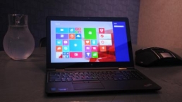
Yet, a week in, and Windows 10 is now the default operating system on my personal Surface Pro 2 as well as a Lenovo ThinkPad X1 Carbon Third Generation and Dell Latitude 12 7000 Series (E7250). These are some things that I’ve observed in my testing:
Let’s get “Started,” again.
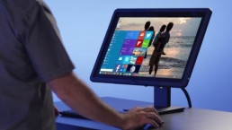
Despite its early quirks – Microsoft rolled out a huge 1GB launch day update to address some early user complaints – Windows 10 feels familiar, yet modern. It’s a mashup of the desktop experience of Windows 7 with the modern oomph of Windows 8 that makes Windows 10 easy to use. I let my colleagues, family and friends play with my Windows 10 laptops, and there was no pause or hesitation when they picked up the device, unlike with the transition from Windows 7 to Windows 8.
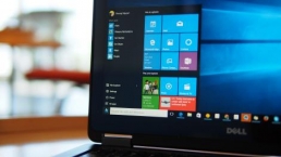
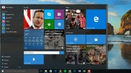
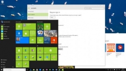
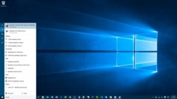
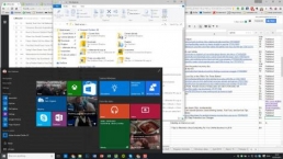
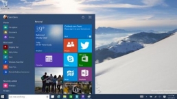
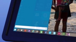
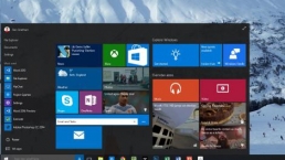
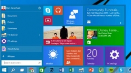
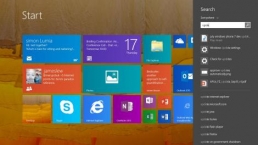
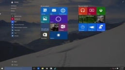
Part of that reason is that the Windows key and icon act like they do on Windows 7 by pulling up a Start menu, rather than taking you out of the desktop and into a new Start screen, like on Windows 8. When I upgraded my Surface Pro 2 on launch day, I thought the Start menu would be the biggest improvement in making my workflow easier, as I no longer needed to juggle between the classic desktop mode and the new Metro-inspired Live Tiles.
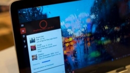
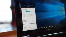
After a few days of using Windows 10, I barely touched the Start menu. It’s far quicker to use Cortana to launch programs. I can either tell Cortana to “Launch Word 2013” or I can type “Microsoft Word” into the search bar adjacent to the Windows icon on the taskbar. It’s easier than having to click or tap on the Windows icon, clicking “All apps” and then scrolling to find Word 2013 nestled in the Microsoft Office folder.
Cortana can also take you inside settings and search the internet. For quick web searches, rather than initiating my browser, I just default to Cortana for help.
Hey, Cortana
As easy as Cortana is, she is still a temperamental digital creature. She can’t launch Word if you tell her to “Launch Microsoft Word.” Instead, you have to know, and tell her, the exact name of the app, which in my case is “Word 2013.”
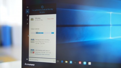
Cortana’s ability feels a lot more limited on the desktop, especially if you’re used to Siri and Google Now. Both rivals are able to deliver a number of search results as cards within the digital assistant experience. Cortana, on the other hand, likes to take you to the new Microsoft Edge browser.
Even though Cortana could track your packages based on information from your emails, asking her to do that will just pull up a Bing search result inside the Edge browser. Telling Google Now the same thing on my Samsung Galaxy Note 4 Android smartphone, and I was presented with recent orders and delivery information.
Even though Cortana may not have the same polish as Siri nor the predictive intelligence and integration that Google has bundled into its Google Now search, Cortana’s quirkiness makes her feel more like a human assistant. Like a college intern who may not know her way around the office, Cortana seems eager to help, and her best feature is her ability to integrate context with people.
You can tell Cortana to remind you to send a congratulatory note to a friend about her job promotion when you email her next, or you can tell Cortana to remind you to send a scathing note about missing the last team meeting to your colleague the next time you message him.
I usually have Post-it notes around my desk with reminders to talk to specific people about specific things, and now Cortana does that beautifully. The next time my boss emails, for example, Cortana will remind me to update him on my travel plans and the events I have lined up. It’d be nice to see Cortana integrated with other apps as well, like Facebook, Twitter, LinkedIn, Slack, Yammer, HipChat and other communications services.
On Windows 10 Mobile and Windows Phone, Cortana can also activate these contextual reminders when someone calls or sends a text message. Hopefully, her people context will also expand into the new Skype and messaging experience that will arrive on Windows 10 later this year. The new messages and Skype experience is Microsoft’s answer to Apple’s Continuity feature on iOS and OS X with Messages and FaceTime.
As long as you’re invited, the playground is open
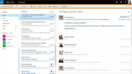
Windows 10 also feels more open. The stock Mail, Calendar and People apps integrate beautifully with Google services.
On Windows 8, even though the Mail app was able to retrieve my emails from Gmail, the People app could not synchronize my contacts stored on Google’s cloud. On Windows 10, I had no synchronization issue with any of the apps using Google, Microsoft or Yahoo services.
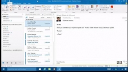
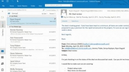
I like how fresh the apps look, and Microsoft did a great job of balancing the experience of using these new apps for both touch users and those on systems with keyboard and mouse. The one thing missing from the Outlook Mail app is a unified inbox. Currently, I have three personal email accounts and a work account that I have to switch between. Fortunately, I can just open the Action Center and get all my different email account notifications in a consolidated place as a workaround.
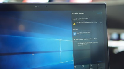
Another good thing about Action Center is that it will provide you with notifications about new email messages, even if you haven’t launched the Mail app. Action Center alerts you of new email messages, like on a consumer smartphone or tablet, as soon as Windows 10 boots up.
Outlook Calendar works as described, but Microsoft still needs to unify the user experience with its other products. On the web, Outlook Calendar has charms, so you can add a picture of an airplane to your date to quickly identify when you have a flight when at a glance. That feature is missing in the Windows 10 desktop app.
Coming from Windows Phone, the new People app on the desktop version of Windows 10 seems like a downgrade. It’s simple and does the job of not only pulling contacts from different cloud services, but combining contacts. This way it’s not showing three instances of “John Doe” if I have the person saved in Google, Outlook and Yahoo. However, what’s missing still is the ability to see quick social updates like on Windows Phone.
The ability to integrate social apps is present in the settings of the People app, and I see the option to add a social account, but it doesn’t seem to do anything. I would like the ability to look up “John Doe,” and if he is connected on Twitter and LinkedIn, I would love to see his recent updates. This way, if it’s a client I don’t frequently communicate with, I can bring up some relevant information that he’s shared to break the ice.
Even though Microsoft has welcomed Google into its wheelhouse, it’s another story with browsers. Microsoft has made it more difficult to move away from the Edge browser, even if you have Chrome or Firefox checked as your default browser. Now, there are more settings and toggles to adjust before you can be unshackled from the leashes of Edge, but that’s not necessarily a bad thing if you want to give Edge a try.
I chose to not live on the “Edge”
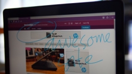
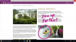
The Edge browser allows you to not only take a screenshot of a web page you’re looking at, but it also lets you to mark up the page and highlight relevant or important information to share. It’s a useful tool, and it feels a lot like scrapbooking or annotating a PDF.
Another useful tool is that Cortana is deeply integrated with Edge. She’ll pop up and help you with store hours, user reviews and directions if you’re searching for businesses or restaurants.
However, currently, Cortana doesn’t support plugins for password managers. I use 1Password and LastPass to help save, manage and regularly change my passwords, and it becomes a hassle when these plugins aren’t integrated to make logging into websites secure and easy.
Hopefully, in lieu of supporting password manager plugins, Microsoft will create single-sign on experiences with Edge through technologies enabled by Windows Hello and Microsoft Passport. Ultimately, what I’d like to see is for Edge to prompt you to enter a simple PIN or scan your iris, face or fingerprint before it automatically populates your username and password for your favorite banking, email or shopping sites.
Week 1: glitches, tablets, conclusion
Blacking out
Fortunately, I have only experienced the Blue Screen of Death (BSoD) on Windows 10 once on all three test systems. And yes, there is a BSoD on Windows 10; it just comes with a slightly more cheerful smiley face emoticon that alerts you that it is gathering data to send to Microsoft about this unfortunate occurrence.
But just because Windows didn’t crash doesn’t make me feel less like a crash test dummy.
I frequently experience issues with the screen blacking out for a second or two on my Dell Latitude 12 7000 Series (E7250) and Lenovo ThinkPad X1 Carbon Third Generation laptops. Usually, it’s a quick flash, but when it happens, I am never sure if the system just failed and crashed or if it’s just a screen refresh issue.
I am not sure what is causing these problems. The blackout issue appears to be happening more regularly after I installed VMWare, even though the VMWare program is not running.
Additionally, I’ve noticed that sometimes a black window pop up, and it would disappear as quickly as it appeared. As this happens so fast, I am not able to read the text in the window, but it looks more like a Command Prompt window than a pop-up from a webpage.
Poking the sleeping bear
As a notebook user, I hate shutting down my laptop. Instead, I prefer to just shut the lid and put my laptop into standby or hibernation mode. It’s faster to resume, doesn’t consume too much battery life and provides a better experience for my lazy self as I don’t have to re-open the twenty or so Chrome tabs and relaunch the eight running apps I have in the background.
On Windows 10, the resume from sleep mode appears glitchy. When I resume, sometimes my wireless connection would not reconnect until I restart my PC. Other times, I am able to launch or open anything pinned to the desktop or taskbar, but I can’t access the Start menu, and Cortana just hides and won’t respond to my beckoning cries for help.
Additionally, I’ve noticed on more than a few occasions that it could take two or three reboots to get my PC working again after a restart. At times, a single reboot would present my notebooks with the same issue, but restarting it for the second or third time could cure whatever ails it was suffering from.
Battery life
Battery life varies between systems. My Surface Pro 2, with the Power Cover keyboard, gets about the same battery life on Windows 10 as it did on Windows 8.1. I’ve noticed a small jump in battery life on the Dell Latitude 12 7000 Series (E7250) review unit, which is a plus.
However, battery life on the Lenovo ThinkPad X1 Carbon Third Generation dipped a little. It might be a little early to tell what effects Windows 10 has on battery life, and manufacturers are likely still tinkering with drivers to squeeze more power out of Windows 10.
Tablet experience
Even though Windows 10 appears more tailored to desktop users, Microsoft made subtle UI changes that make the OS even better for touch users.
In the desktop, compared to Windows 8, contextual menus are now more finger-friendly. I’ve noticed that if you right click on the desktop, or long tap if you’re using your tablet, the contextual menu now has a little bit more white space between each line on Windows 10. This makes it easier to tap on the correct target, even though the menu is still text heavy.
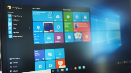
I also found the new task switcher to be convenient. Tablet users can either swipe in from the left side of the display or tap on the task switcher icon to the right of the Cortana search bar. This makes it far more convenient than connecting a keyboard to use the Alt+Tab command.
I am not sure that I like the Continuum Start menu experience in tablet mode. On the Surface Pro 2, for instance, when I undock my keyboard, the Start menu goes full screen to make it more accessible for finger input. With this view, it almost feels like I am going back to Windows 8 and having a separate Start screen from my desktop. As a result, I just lock my Surface into the desktop mode and opt not to use Continuum.
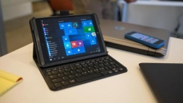
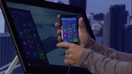
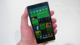
Continuum will be a bigger draw for devices with smaller screens, like 8-inch tablets and phones running Windows 10 Mobile. Continuum will provide huge advantages for new Windows 10 Mobile devices with display-out support. With these smartphones, some apps, like Microsoft Office, will scale its UI when you connect your keyboard, mouse and display.
When you dock your Windows 10 Mobile phone, Microsoft said you should have a Microsoft Office experience that looks exactly like running Office on a desktop PC. This is different than connecting an Android or iOS phone to a display. With these rivals, you’re just getting the exact screen on your phone, except now it fills the larger display of your desktop monitor.
Un-dock your Windows 10 Mobile phone and you’ll get a scaled down UI with Microsoft’s Reflow technology to adapt the experience to a smaller screen.
Giving the finger
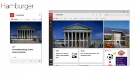
Microsoft toned down its use of finger gestures with Windows 10. On Windows 8, Modern apps had settings that were buried, requiring you to either swipe down from the top or in from the left or right edges from the screen. With Windows 8, a more unified UI with hamburger menus provide additional settings and information.
This makes it a lot easier to use Windows 10 as you don’t need to learn gestures or figure out where to swipe.
Despite the improvements coming from Windows 8, I am not ready to give Windows 10 the thumbs up yet. Early glitches mean that the experience is still not as reliable for enterprise users, especially for those who work in mission-critical environments. For consumers willing to bear the occasional glitches, Windows 10 is shaping up to be a great OS that marries the familiarity of Windows 7 with the modern design of Windows 8.
What are your thoughts, problems or issues with Windows 10 so far? Even though there were early problems with upgrading to Windows 10 on launch day, Microsoft deserves a bit of credit for a fairly smooth launch, considering the OS was installed on over 14 million systems in 24 hours.
Original story as follows for our Day 1 with Windows 10 experience:
Day 1 experiences
I took the Windows 10 plunge, and for the most part, I am a satisfied customer with an experience that I can call “better than seven.” But does Windows 10 live up to the hype that Microsoft created when it skipped a whole number generation, bypassing Windows 9 as it hopes to shed the negativity surrounding Windows 8?
If you’re expecting a “Whoa, this is brand new and different” reaction, you’re in for a disappointment. With Windows 10, Microsoft went with a more reserved less is more approach by keeping things the same, and that’s been my experience with Windows 10. Rather than reinvent the wheel, an approach that Microsoft tried to push on to users with Windows 8, Microsoft appears to be smoothing out the rough edges of Windows 7 with a more polished 10 OS.
Upgrading
I decided to go all in with Windows 10. After having tried out the Insider Preview on a few test systems around the office, I was ready to fully commit to the “last version of Windows” on my personal Surface Pro 2.
Once the install files are downloaded through Windows Update, the entire process took about thirty minutes. Initially, the update ran a compatibility scan, and alerted me that my hardware is Windows 10-compatible, which means all my drivers should work after the upgrade.
On earlier preview builds, for instance, the compatibility check found that a WiGig driver on my Dell wouldn’t work and I would lose the wireless docking capabilities had I upgraded to Windows 10 on a review unit of the Dell Latitude 12 7000 Series (E7250), and that a Lenovo utility was incompatible on an older ThinkPad model. This time, we’re good to go.
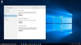
Next, the upgrade asked if I wanted to start fresh, migrate just my files over or keep everything. I chose the last option, placed all my faith in Microsoft’s process and opted to not create any backups of my existing files.
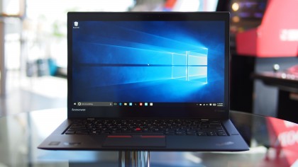
My most important files are my photos, and those are already backed up in the cloud. I figured that if the upgrade deleted my personal or work files, it would be a blessing in disguise as I could be given an opportunity to start with a fresh drive.
With a Microsoft ID associated with my computer, it took another ten minutes on top of the time required to upgrade, but Microsoft transferred my settings, apps and files over at the end of the process. To my surprise, my old desktop wallpaper even migrated over, but I opted to use the new smokey Windows image that Microsoft captured for Windows 10.
I was pleasantly surprised at how easy the upgrade process went compared to prior versions of Windows. When I migrated from Windows XP to Windows 7, I had to manually backup my existing files to an external hard drive, as Windows 7’s new system architecture required my computer to be completely wiped for the upgrade.
The migration from Windows 7 to Windows 8 required less work than the jump from XP to 7, but the upgrade broke drivers, and I had to manually hunt for upgraded drivers to get common peripherals, like printers and scanners, working again.
What didn’t work
Most things just worked. All my programs opened without a hitch, including Microsoft Office Professional 2013 and Adobe Creative Suite 6. This is to be expected, as most applications that work with Windows 7 or later should be compatible with Windows 10, with ‘should’ being the operative word.
I only had an issue with one program. My transition from Windows 8.1 to Windows 10 broke Mediafour’s MacDrive 9. Since I work with a PC and a Mac, MacDrive allows my PC to read and write to my Mac-formatted drives. I reached out to Mediafour, and the company said that a Windows 10-compatible version is in the works.
To be honest, I wasn’t really surprised that MacDrive didn’t work with Windows 10. In the past, new versions of Windows usually broke compatibility with existing versions of MacDrive, and Mediafour has been good about upgrading its software. However, you usually end up having to pay an upgrade fee for the new, compatible version, but the price is worth it if you work in a hybrid environment of Windows and Mac.
New love for the old desktop
Microsoft’s most noticeable upgrade for Windows 10 may be considered a downgrade for those coming from Windows 8, but for me it is a joyous occasion.
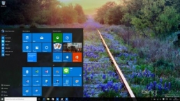
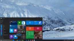
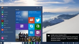
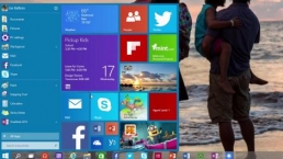
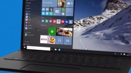
Now, when you boot into the desktop mode of Windows, hitting that small Windows logo in the bottom left corner of the screen brings back a Windows 7-inspired Start menu. Gone is the separate Start screen from Windows 8 and Windows 8.1.

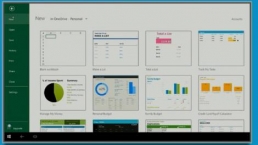
On the left side, the list of frequently used programs and a second list of recently added programs makes it easy to juggle tasks. You can also view all your programs and apps installed by going to the All Apps menu.
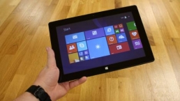
If you’re one of the few people who love Live Tiles and the separate Start menu, Microsoft didn’t forget about you. Those are still present on Windows 10, but in a more usable place to the right of the list of apps on the Start menu instead of on a separate screen. When you hit that Windows logo, you can jump to your apps and get quick updates on your emails, sports scores, financial news, and whatever other tiles you have.
This feels much more natural than the Windows 8 Start experience for me. Now, it doesn’t feel like I am getting interrupted with my work when I try to launch a new app or program. Whereas Windows 8 focused on touch, 10 embraces the old desktop again. Right clicking on the desktop, or a long tap and hold for touch users, brings up a list for contextual menus with more white space that makes these lists much more finger friendly for touchscreen environments. It feels less cluttered, too.
The windowed existence
Whereas the old Windows 8 experience launched apps into full-screen mode to make it easy for touch users, Windows 10 focuses more on productivity. Microsoft didn’t abandon its plans for touch, it’s just taking a more practical approach.
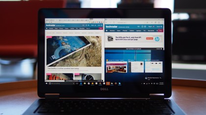
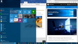
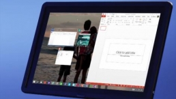
Those Metro or Modern UI apps are called Store apps, and those launch inside windowed panels that can be moved and resized across your desktop. It’s like Windows 95 all over again, but with a more attractive chrome design.
A forgetful Continuum tries to bring continuity
For tablet users, Continuum makes it easy to switch to a finger-friendly tablet mode and a more productive desktop mode.
Theoretically, on my Surface Pro 2, if I attach the keyboard, Continuum would automatically switch to desktop mode to make my experience easier for keyboard and mouse input. Once I remove my Type Cover, the Surface Pro 2 would switch to a UI with a full-screen Start menu to optimize for touch. Apps would also launch in full-screen, and Windows would show slightly expanded icons in the taskbar.
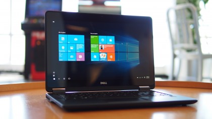
On my Surface Pro 2, this works sometimes. When I pop off my Type Cover keyboard, a small pop-up on the lower right corner – Microsoft informed me that notification pop-ups have moved to this location, rather than the top right of the screen on Windows 8 – asks if I want Windows 10 to remember my action for the next time.
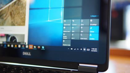
Windows 10 seems to have early onset Alzheimer’s when it comes to remembering my selection, and Continuum so far hasn’t been smooth. I ended up just locking my Surface Pro 2 in desktop mode, so I don’t have to switch out of tablet mode if Continuum forgets that I have my keyboard attached.
Glitches
Most of the glitches that I’ve experienced are on minor, but they’re still there. Sometimes it takes Windows a few seconds to be responsive.
I would try to launch an app or open the Start menu, and nothing would happen. I would end up clicking on all the apps pinned on my taskbar or the shortcuts on my desktop, walk away, and five seconds later, a cluttered mess invaded my desktop when Windows 10 decides to wake up and become responsive again.
Another issue that I found is that sometimes my Wi-Fi would not connect, or it would connect but I would get no internet connectivity. Restarting my Surface Pro 2 would resolve the issue, but I hate having to interrupt my workflow and close windows just to make something work.
The biggest complaint I have is that my Surface Pro 2 would occasionally not charge. I usually work with my Surface Pro 2 plugged in when I am at my desk, but Windows 10 would show my battery is draining and that I am not charging. If I shut down the Surface, leave it plugged in for twenty minutes and then power it up again, the Surface would register that it is charging.
I haven’t experienced this power management issue on hardware from Dell, HP and Lenovo running test builds of Windows 10, but on the Surface, it could mean that business users may arrive to their next meeting with a dead battery rather than a full one, resulting in lost productivity.
Another power-related issue with my Windows 10-powered Surface Pro 2 is that it exhibits erratic standby behavior. Ideally, when you close the Type Cover, the Surface Pro 2 would enter standby, saving battery life. After using the Surface Pro 2 for a full day in the office, I closed the Type Cover, and took my 1.5-hour commute home to find an extremely hot laptop bag because my tablet was still running and didn’t hibernate properly.
Smaller glitches include icon images not showing, brightness settings not saving properly and infrequent crashes when attempting to launch the Store app.
For me, the Store icon sometimes would disappear from my taskbar, but its position would still be there, marked by a blank space. It’s not quite as heartbreaking as Taylor Swift’s song of the same name, but the appearance of having a black, incognito icon is still as jarring as having a missing front teeth. The blacked out icon still works, and I can still launch the Store if I clicked it.
Xbox gaming
For Xbox One owners, the ability to stream your console games to your Windows 10 PC or laptop is a big feature. For me, it means that if my guest is watching television in the living room, I can still play my Xbox game in my den on my Surface Pro 2 or my Latitude.
So far, the gaming experience is great, and the few titles that I tried exhibited no lags or stutter. We’ll definitely take a look at Xbox integration more closely in the future with cheaper hardware to see how performance holds up.
Early conclusions
In many ways, the Windows journey for Microsoft parallels BlackBerry’s attempt to modernize its operating system for the post-PC era. Both operating systems attempted to embrace touch by shedding the comfort of old ways, only to return to the familiarity of the past after user outcry.
For BlackBerry, it was the return to the BlackBerry Classic that satisfied loyal customers, and I suspect that Windows 10 is the BlackBerry Classic for Microsoft.
Windows 10’s embrace of the desktop, classic start menu and powerful multitasking capabilities will help Microsoft win over users again. After all, Microsoft’s new OS brought back familiar features of the old Windows 7, which proved to be quite a popular operating system in its day. There are still issues to work out for early adopters, but considering the sheer number of hardware that Windows 10 is designed for, my experience so far has been surprisingly pain-free, especially considering that old upgrades to 7 and 8 caused.
Be sure to check back on this post, as I’ll keep it updated with my experience as I continue to use Microsoft’s new OS, but for now, be sure to stay up to date with our Windows 10 coverage.
Related Posts
December 6, 2021
7+ Web Design Trends for 2022: Which Will You Use?
December 6, 2021
The 10 Best WordPress Booking Plugins to Use On Your Website
December 6, 2021
How to Use a Web Cache Viewer to View a Cached Page
November 6, 2021
10 Modern Web Design Trends for 2022
November 6, 2021
Best Free SSL Certificate Providers (+ How to Get Started)
November 6, 2021
How to Design a Landing Page That Sends Conversions Skyrocketing
November 6, 2021
What Are the Best WordPress Security Plugins for your Website?
October 6, 2021
Your Guide to How to Buy a Domain Name
October 6, 2021
How to Build a WordPress Website: 9 Steps to Build Your Site
September 6, 2021
10 Best Websites for Downloading Free PSD Files
September 6, 2021
HTML5 Template: A Basic Code Template to Start Your Next Project
September 6, 2021
How Much Does It Cost to Build a Website for a Small Business?
September 6, 2021
A List of Free Public CDNs for Web Developers
September 6, 2021
6 Advanced JavaScript Concepts You Should Know
August 6, 2021
10 Simple Tips for Launching a Website
August 6, 2021
25 Beautiful Examples of “Coming Soon” Pages
August 6, 2021
10 Useful Responsive Design Testing Tools
August 6, 2021
Best-Converting Shopify Themes: 4 Best Shopify Themes
July 6, 2021
What Is Alt Text and Why Should You Use It?
July 6, 2021
24 Must-Know Graphic Design Terms
June 6, 2021
How to Design a Product Page: 6 Pro Design Tips
April 6, 2021
A Beginner’s Guide to Competitor Website Analysis
April 6, 2021
6 BigCommerce Design Tips For Big Ecommerce Results
April 6, 2021
Is WordPress Good for Ecommerce? [Pros and Cons]
March 6, 2021
Make Websites Mobile-Friendly: 5 Astounding Tips
March 6, 2021
Shopify vs. Magento: Which Platform Should I Use?
March 6, 2021
Top 5 Web Design Tools & Software Applications
February 6, 2021
Website Optimization Checklist: Your Go-To Guide to SEO
February 6, 2021
5 UX Design Trends to Dazzle Users in 2021
February 6, 2021
What Is the Average Page Load Time and How Can You Do Better?
February 6, 2021
Choosing an Ecommerce Platform That Will Wow Customers
February 6, 2021
7 Best Practices for Crafting Landing Pages with Forms
February 6, 2021
7 B2B Web Design Tips to Craft an Eye-Catching Website
January 6, 2021
Mobile-Friendly Checker | Check Your Site’s Mobile Score Now
January 6, 2021
8 Tips for Developing a Fantastic Mobile-Friendly Website
December 6, 2020
How to Add an Online Store to Your Website [4 Ways]
December 6, 2020
5 UX Design Tips for Seamless Online Shopping
November 6, 2020
Ecommerce Website Essentials: Does Your Site Have All 11?
November 6, 2020
5 Small Business Website Essentials You Need for Your Site
November 6, 2020
Your Website Redesign Checklist for 2020: 7 Steps for Success
May 1, 2020
Psychology of Color [Infographic]
April 21, 2020
How to start an online store that drives huge sales
January 3, 2020
5 Lead Generation Website Design Best Practices
March 6, 2019
6 Reasons You Should Redesign Your Website in 2019
March 6, 2019
7 Web Design Trends for 2019
February 19, 2019
Who owns the website/app source code, client or developer
February 7, 2019
Don’t Let Your Domain Names Expire in 2019
January 8, 2019
2019 Website Development Trends To Note
October 6, 2017
How Web Design Impacts Content Marketing
October 6, 2017
How to Choose a Navigation Setup
August 6, 2017
Why User Experience Matters to Marketing
July 6, 2017
5 Ways Web Design Impacts Customer Experience
September 6, 2016
How to Learn Angular
September 6, 2016
The Excuses for Not Having a Website (Infographic)
September 6, 2016
How to Build an Award-Winning Web Design Team
September 6, 2016
13 Free Data Visualization Tools
August 6, 2016
How Selling Pastries Helped Us Design a Better Product
August 6, 2016
11 Sites to Help You Find Material Design Inspiration
July 4, 2016
How to change free wordpress.com url
April 6, 2016
The 5 Best Free FTP Clients
April 6, 2016
7 Free UX E-Books Worth Reading
March 6, 2016
Can Handwritten Letters Get You More Clients?
December 10, 2015
Star Wars Week: How to create your own Star Wars effects for free
December 6, 2015
20 "Coming Soon" Pages for Inspiration
December 6, 2015
6 Free Tools for Creating Your Own Icon Font
December 6, 2015
9 Useful Tools for Creating Material Design Color Palettes
November 6, 2015
20 Free UI Kits to Download
November 6, 2015
50 Web Designs with Awesome Typography
November 6, 2015
When to Use rel="nofollow"
November 6, 2015
7 Free Books That Will Help You Become More Productive
November 6, 2015
50 Beautiful One-Page Websites for Inspiration
November 6, 2015
Circular Images with CSS
October 6, 2015
Lessons Learned from an Unsuccessful Kickstarter
October 6, 2015
5 Games That Teach You How to Code
October 6, 2015
Cheatsheet: Photoshop Keyboard Shortcuts
October 6, 2015
An Easy Way to Create a Freelance Contract for Your Projects
October 6, 2015
50 Design Agency Websites for Inspiration
September 29, 2015
JB Hi-Fi shutting the book on ebooks
September 24, 2015
Opinion: Quick, Quickflix: It's time to give yourself the flick
September 24, 2015
New Star Wars 360-degree video is among first on Facebook
September 21, 2015
Apple purges malicious iPhone and iPad apps from App Store
September 12, 2015
Apple's new Live Photos feature will eat up your storage
September 12, 2015
The latest Windows 10 Mobile preview has been delayed
September 12, 2015
IBM buys StrongLoop to add Node.js development to its cloud
September 8, 2015
Fake Android porn app takes your photo, then holds it ransom
September 6, 2015
50 Restaurant Websites for Inspiration
September 6, 2015
Zero UI — The Future of Interfaces
September 6, 2015
50 Beautiful Websites with Big Background Images
September 6, 2015
Infographic: 69 Web Design Tips
September 6, 2015
Free Windows 10 Icons
September 2, 2015
Instagram turns itself into a genuine messaging service
August 11, 2015
In Depth: How Microsoft taught Cortana to be more human
August 11, 2015
Windows 10 price, news and features
August 11, 2015
Windows 10's broken update introduces endless reboot loop
August 11, 2015
Windows 10 races to 27m installs
August 11, 2015
Windows 10 IoT Core gets first public release
August 10, 2015
iOS Tips: How to backup iPhone to an external drive
August 10, 2015
Windows 8.1 RT finally getting Windows 10 Start Menu
August 10, 2015
How to use Windows Hello
August 10, 2015
Review: Moto Surround
August 10, 2015
Review: Moto G (2015)
August 9, 2015
8 of the best free VPN services
August 8, 2015
Use Firefox? Mozilla urges you update ASAP
August 7, 2015
Mac Tips: Apple Mail: How to remove the Favorites Bar
August 7, 2015
How to make the OS X dock appear faster
August 7, 2015
Review: BQ Aquaris E45 Ubuntu Edition
August 7, 2015
Review: Acer Liquid Jade Z
August 6, 2015
How to reinstall Linux
August 6, 2015
How to reinstall Windows
August 6, 2015
Updated: Apple Music: release date, price and features
August 6, 2015
Social News Websites for Front-End Developers
August 6, 2015
10 Free JavaScript Books
August 6, 2015
50 Beautiful Blog Designs
August 6, 2015
Animated SVG Pipes Effect
August 6, 2015
Launching Your First App
August 5, 2015
Windows 10 goes freemium with paid apps
August 5, 2015
Mac Tips: How to manage Safari notifications on Mac
August 5, 2015
Microsoft Sway may kill the PowerPoint presentation
August 4, 2015
Microsoft gives Outlook on the web a new look
August 4, 2015
Mac OS X vulnerable to new zero-day attack
August 4, 2015
Windows 10 users warned of two scams
August 4, 2015
Microsoft's Docs.com is now available to everyone
August 3, 2015
Mac Tips: How to edit the Favorites sidebar on Mac
August 3, 2015
Updated: Windows 10 price, news and features
July 29, 2015
Review: HP ProDesk 405 G2
July 29, 2015
Hands-on review: HP Elite x2 1011
July 29, 2015
Hands-on review: Updated: Windows 10 Mobile
July 29, 2015
Review: Updated: Nvidia Shield Android TV
July 28, 2015
LIVE: Windows 10 launch: Live Blog!
July 28, 2015
How to prepare for your upgrade to Windows 10
July 28, 2015
Review: Updated: Windows 10
July 28, 2015
Review: Updated: HP Pro Tablet 608
July 28, 2015
Review: Heat Genius
July 28, 2015
Hands-on review: Moto X Play
July 28, 2015
Hands-on review: Moto X Style
July 28, 2015
Hands-on review: Moto G (2015)
July 28, 2015
Review: 13-inch MacBook Air (early 2015)
July 28, 2015
Hands-on review: OnePlus 2
July 28, 2015
Review: LG 65EG960T 4K OLED
July 28, 2015
Mac Tips: How to share printers on Mac
July 27, 2015
Apple Music's arrival hasn't opened Pandora's box
July 26, 2015
Review: Garmin Swim
July 25, 2015
How to merge OS X contacts into an existing list
July 25, 2015
Hands-on review: UPDATED: ZTE Axon
July 24, 2015
Mac Tips: How to zoom in on a Mac
July 24, 2015
What Windows 10 means for the enterprise
July 24, 2015
Review: JBL Charge 2 Plus
July 24, 2015
Review: Acer Aspire S7
July 24, 2015
Review: Updated: Canon G3 X
July 24, 2015
Review: Updated: iPad Air 2
July 24, 2015
Review: Thinksound On1
July 24, 2015
Review: Asus Chromebook Flip
July 24, 2015
Review: Garmin Forerunner 225
July 23, 2015
Review: Garmin nuvi 68LM
July 23, 2015
Review: Samsung Galaxy S6 Active
July 23, 2015
Review: Bowers and Wilkins P5 Wireless
July 23, 2015
Review: Dell XPS 15 (2015)
July 21, 2015
Review: Fuji S9900W
July 21, 2015
Review: Updated: Fitbit Surge
July 21, 2015
Review: UE Roll
July 21, 2015
Hands-on review: Ubik Uno
July 20, 2015
Review: Samsung HW-J650
July 20, 2015
Updated: 40 best Android Wear smartwatch apps 2015
July 20, 2015
Review: Acer Chromebook C740 review
July 20, 2015
Review: Huawei Talkband B2
July 20, 2015
Review: Dell Venue 10 7000
July 20, 2015
Review: Intel Core i7-5775C
July 17, 2015
Mac Tips: How to delete locked files on Mac
July 17, 2015
Review: Pebble Time
July 16, 2015
Microsoft just made Windows XP even less secure
July 16, 2015
Windows 8.1 RT is getting an update this September
July 16, 2015
OS showdown: Windows 10 vs Windows 8.1 vs Windows 7
July 16, 2015
Review: Acer CB280HK
July 15, 2015
Windows 10 is ready for new laptops and PCs
July 15, 2015
Explained: How to take a screenshot in Windows
July 15, 2015
Office for Windows 10 appears in latest build
July 14, 2015
Review: ZTE Axon
July 14, 2015
Review: ViewSonic VP2780-4K
July 14, 2015
Hands-on review: SanDisk Connect Wireless Stick
July 14, 2015
Review: Oppo PM-3
July 14, 2015
Review: BT 11ac Dual-Band Wi-Fi Extender 1200
July 14, 2015
Review: Fuji X-T10
July 13, 2015
How to build an SEO strategy for your business
July 13, 2015
Review: Lenovo ThinkPad Yoga 15
July 13, 2015
Review: Audio-Technica ATH-MSR7
July 13, 2015
Review: Garmin NuviCam LMT-D
July 13, 2015
Review: Dell Inspiron 13 7000
July 13, 2015
Hands-on review: AstroPi SenseHAT
July 13, 2015
Hands-on review: EE Rook
July 13, 2015
Hands-on review: Updated: HTC Vive
July 12, 2015
Here's the ultimate software list for PC fanatics
July 10, 2015
How to use the new Photos app for Mac
July 10, 2015
Windows 10 Insider Preview Build 10166 available now
July 10, 2015
Splunk spends big on cybersecurity acquisition
July 10, 2015
Making Windows 10 apps just got a whole lot easier
July 10, 2015
Review: Lenovo LaVie Z 360
July 9, 2015
OS X El Capitan public beta available right now
July 9, 2015
Microsoft finally unveils Office 2016 for Mac
July 9, 2015
Review: Updated: Chromecast
July 9, 2015
Review: Updated: Tesco Hudl 2
July 9, 2015
Review: Lenovo ThinkPad E550
July 9, 2015
Review: Updated: Google Nexus 6
July 8, 2015
What you need to know about Windows Server 2016
July 7, 2015
Microsoft to hike enterprise cloud pricing
July 6, 2015
Hacking Team end up being totally 0wned
July 6, 2015
Review: HP Pro Slate 12
July 6, 2015
Review: Samsung 850 Pro 2TB
July 6, 2015
Review: Asus RT-AC87U
July 6, 2015
Review: Jawbone UP2
July 6, 2015
Reimagining the Web Design Process
July 6, 2015
50 Clean Websites for Inspiration
July 6, 2015
15 Free Books for People Who Code
July 6, 2015
Web Storage: A Primer
July 6, 2015
A Look at Some CSS Methodologies
July 3, 2015
6 Essential Mac Mouse and Trackpad Tips
July 2, 2015
How to install a third party keyboard on Android
July 2, 2015
Review: UPDATED: Asus Zenfone 2
July 2, 2015
Review: Alienware 13
July 2, 2015
Review: HP DeskJet 1010
July 1, 2015
5 issues we want Apple Music to fix
June 13, 2015
Cortana will get its own button on Windows 10 PCs
June 12, 2015
Windows 10 will come with universal Skype app
June 12, 2015
iPad music production: 18 Best apps and gear
June 12, 2015
Windows 10 all set for early enterprise struggle
June 12, 2015
Review: Garmin VIRB Elite
June 11, 2015
Review: Updated: Nvidia Shield Tablet
June 11, 2015
Review: Nokia Lumia 635
June 10, 2015
Microsoft brings more online tweaks to Office 365
June 10, 2015
Mac Tips: How to use Screen Sharing in Mac OS X
June 9, 2015
Hands-on review: Meizu M2 Note
June 9, 2015
Hands-on review: EE 4GEE Action Camera
June 9, 2015
Review: Toshiba 3TB Canvio external hard drive
June 9, 2015
Review: Olympus SH-2
June 8, 2015
Hands-on review: Updated: Apple CarPlay
June 8, 2015
UPDATED: iOS 9 release date, features and news
June 8, 2015
Review: Updated: Roku 2
June 8, 2015
Review: Updated: PlayStation Vue
June 8, 2015
Review: Dell PowerEdge R730
June 8, 2015
Review: Canon SX710 HS
June 7, 2015
UPDATED: iOS 9 release date, features and rumors
June 7, 2015
Review: Lenovo S20-30
June 6, 2015
Free Writing Icons
June 6, 2015
15 CSS Questions to Test Your Knowledge
June 6, 2015
The Best CSS Reset Stylesheets
June 6, 2015
How CSS Specificity Works
June 5, 2015
'Delay' is a new feature in Windows 10
June 5, 2015
Review: Beyerdynamic Custom One Pro Plus
June 5, 2015
Latest SEO Marketing tools
June 5, 2015
Review: Nvidia Shield Android TV
June 5, 2015
Review: Honor 4X
June 5, 2015
Review: In Depth: Oppo R5
June 3, 2015
Hands-on review: Huawei P8 Lite
June 3, 2015
How To: How to create eBooks on a Mac
June 3, 2015
Review: Updated: Tidal
June 3, 2015
Review: Canon 750D (Rebel T6i)
June 2, 2015
Review: Updated: Asus ZenWatch
June 2, 2015
Review: Alcatel OneTouch Idol 3
June 2, 2015
Review: Updated: Nokia Lumia 1520
June 2, 2015
Review: Updated: Yotaphone 2
June 2, 2015
Review: Updated: Nokia Lumia 625
June 2, 2015
Review: Creative Muvo Mini
June 1, 2015
Review: Acer TravelMate P645 (2015)
June 1, 2015
Hands-on review: Corsair Bulldog
May 29, 2015
In Depth: NetApp: a requiem
May 29, 2015
July is looking definite for Windows 10 release
May 29, 2015
Hands-on review: Google Photos
May 28, 2015
Mac Tips: The 16 best free GarageBand plugins
May 28, 2015
Review: Canon 760D (Rebel T6s)
May 27, 2015
Review: Lenovo Yoga 3 14
May 27, 2015
Hands-on review: Serif Affinity Photo
May 27, 2015
Review: Garmin Vivoactive
May 26, 2015
Review: Datacolor Spyder5 Elite
May 26, 2015
Hands-on review: Sony Xperia Z3+
May 26, 2015
Review: Epson BrightLink Pro 1410Wi
May 26, 2015
Review: Technics Premium C700
May 26, 2015
Review: Canon EOS M3
May 26, 2015
Review: Updated: HTC One M9
May 26, 2015
Review: Updated: Sony Xperia Z3 Compact
May 25, 2015
Review: Updated: New Nintendo 3DS
May 25, 2015
Updated: 50 best Mac tips, tricks and timesavers
May 25, 2015
Updated: Windows email: 5 best free clients
May 25, 2015
Instagram is planning to invade your inbox
May 25, 2015
Review: Updated: Foxtel Play
May 24, 2015
How Windows 10 will change smartphones forever
May 24, 2015
Review: Vodafone Smart Prime 6
May 24, 2015
Review: Updated: iPad mini
May 22, 2015
Office Now may be Cortana for your work life
May 22, 2015
Review: Updated: Lenovo Yoga 3 Pro
May 22, 2015
Review: Microsoft Lumia 640 LTE
May 22, 2015
Review: Updated: Fitbit Flex
May 21, 2015
Updated: Best free Android apps 2015
May 21, 2015
Review: Asus ZenBook Pro UX501
May 21, 2015
Review: Sennheiser Momentum In-Ear
May 20, 2015
Hands-on review: UPDATED: Asus Zenfone 2
May 20, 2015
OS X 10.11 release date, features and rumors
May 18, 2015
Updated: Best free antivirus software 2015
May 18, 2015
iPhone 6S rumored to launch as soon as August
May 18, 2015
Microsoft ready to pounce and acquire IFS?
May 17, 2015
5 of the most popular Linux gaming distros
May 16, 2015
Review: Acer Chromebook 15 C910
May 16, 2015
Review: Lenovo ThinkPad X1 Carbon (2015)
May 16, 2015
Review: Polk Nue Voe
May 16, 2015
The top 10 data breaches of the past 12 months
May 16, 2015
Hands-on review: Updated: LG G4
May 16, 2015
Review: Updated: Quickflix
May 16, 2015
Review: LG Watch Urbane
May 16, 2015
Review: Razer Nabu X
May 16, 2015
Hands-on review: Updated: Windows 10
May 16, 2015
Review: UPDATED: Moto X
May 16, 2015
Review: Updated: Moto G (2013)
May 12, 2015
Review: TomTom Go 50
May 12, 2015
Review: Updated: Moto G (2014)
May 12, 2015
Review: Garmin Vivofit 2
May 12, 2015
Review: Asus Transformer Book Flip TP300LA
May 11, 2015
Review: MSI GT80 Titan
May 11, 2015
Review: Monster SuperStar BackFloat
May 9, 2015
Review: Updated: Apple Watch
May 7, 2015
5 million internet users infected by adware
May 7, 2015
Review: Updated: New MacBook 2015
May 6, 2015
Android M will be shown at Google IO 2015
May 6, 2015
Review: Epson WorkForce Pro WF-4630
May 6, 2015
Review: Master & Dynamic MH40
May 6, 2015
How to Use Gulp
May 6, 2015
Getting Started with Command-Line Interfaces
May 6, 2015
What It’s Like to Contribute to WordPress
May 6, 2015
Ultimate Guide to Link Types for Hyperlinks
May 6, 2015
11 Things You Might Not Know About jQuery
May 5, 2015
Hands-on review: Updated: PlayStation Now
May 5, 2015
Review: Lenovo ThinkPad Yoga 12
May 5, 2015
Review: Updated: iPad Air
May 5, 2015
Review: Panasonic SZ10
May 5, 2015
Review: Updated: Fetch TV
May 4, 2015
Review: Cambridge Audio Go V2
May 3, 2015
Review: Lightroom CC/Lightroom 6
May 2, 2015
5 of the most popular Raspberry Pi distros
May 1, 2015
Review: PlayStation Vue
May 1, 2015
Hands-on review: Updated: Microsoft HoloLens
April 30, 2015
Build 2015: Why Windows 10 may not arrive until fall
April 29, 2015
The biggest announcements from Microsoft Build 2015
April 29, 2015
Hands-on review: TomTom Bandit
April 29, 2015
Hands-on review: EE Harrier Mini
April 28, 2015
Review: Samsung NX500
April 28, 2015
Hands-on review: LG G4
April 28, 2015
Review: Patriot Ignite 480GB SSD
April 28, 2015
Hands-on review: EE Harrier
April 28, 2015
Review: Linx 10
April 28, 2015
Review: 1&1 Cloud Server
April 26, 2015
Hands-on review: Acer Iconia One 8
April 25, 2015
How to run Windows on a Mac with Boot Camp
April 24, 2015
Dropbox Notes poised to challenge Google Docs at launch
April 24, 2015
Hands-on review: Acer Aspire E14
April 24, 2015
Hands-on review: UPDATED: Valve Steam Controller
April 24, 2015
Review: Acer Iconia One 7
April 23, 2015
Windows 10 just revived everyone's favorite PC game
April 23, 2015
Google opens up Chromebooks to competitors
April 23, 2015
Here's how Outlook 2016 looks on Windows 10
April 23, 2015
Hands-on review: Updated: Acer Liquid M220
April 23, 2015
Hands-on review: Acer Aspire Switch 10 (2015)
April 23, 2015
Hands-on review: Acer Aspire R 11
April 22, 2015
Review: Alienware 17 (2015)
April 22, 2015
Hands-on review: Updated: HP Pavilion 15 (2015)
April 21, 2015
This is how Windows 10 will arrive on your PC
April 21, 2015
Review: iMac with Retina 5K display
April 21, 2015
Review: Epson XP-420 All-in-One
April 18, 2015
Google Now brings better search to Chrome OS
April 17, 2015
Review: Epson Moverio BT-200
April 17, 2015
Review: Pentax K-S2
April 16, 2015
Updated: Android Lollipop 5.0 update: when can I get it?
April 15, 2015
Hands-on review: Updated: Huawei P8
April 15, 2015
Review: SanDisk Ultra Dual USB Drive 3.0
April 15, 2015
Review: Updated: LG G3
April 15, 2015
Review: Updated: LG G3
April 15, 2015
Review: Crucial BX100 1TB
April 13, 2015
iOS 8.4 beta reveals complete Music app overhaul
April 13, 2015
Linux 4.0: little fanfare for a tiny new release
April 13, 2015
Achievement unlocked: Microsoft gamifies Windows 10
April 13, 2015
Best Android Wear smartwatch apps 2015
April 13, 2015
Review: Acer Aspire R13
April 12, 2015
Review: TP-Link Archer D9
April 10, 2015
Microsoft's new browser arrives for Windows 10 phones
April 10, 2015
Review: LG UltraWide 34UC97
April 9, 2015
Office now integrates with Dropbox on the web
April 9, 2015
Now you can buy video games with Apple Pay
April 9, 2015
Updated: iOS 8 features and updates
April 9, 2015
Microsoft's stripped down Nano Server is on the way
April 8, 2015
Skype Translator gets even more features
April 8, 2015
Windows mail services hit by widespread outages
April 8, 2015
Review: UPDATED: Amazon Echo
April 8, 2015
Hands-on review: Dell Venue 10 7000
April 8, 2015
Review: Updated: OS X 10.10 Yosemite
April 7, 2015
Google's GMeet could kill teleconferencing
April 7, 2015
Is Redstone the first Windows 10 update?
April 7, 2015
Next peek at Windows Server 2016 due next month
April 7, 2015
Review: Acer Aspire Switch 11
April 7, 2015
Review: Adobe Document Cloud
April 6, 2015
Hands-on review: Updated: New MacBook 2015
April 6, 2015
Freebie: 100 Awesome App Icons
April 6, 2015
Six Revisions Quarterly Report #1
April 6, 2015
A Modern Approach to Improving Website Speed
April 6, 2015
Disable Text Selection with CSS
April 4, 2015
Review: Nikon D7200
April 3, 2015
Amazon Prime video now streams to any Android tablet
April 3, 2015
Review: Google Cardboard
April 3, 2015
Review: MSI WS60
April 2, 2015
Chrome users can now run 1.3 million Android apps
April 2, 2015
See Windows 10 Mobile running on an Android handset
April 2, 2015
Review: Mini review: Macphun Noiseless Pro 1.0
April 2, 2015
Review: Intel SSD 750 Series 1.2TB
April 2, 2015
Review: BenQ TreVolo
April 2, 2015
Hands-on review: Nikon 1 J5
April 1, 2015
Microsoft launches Windows 10 music and video apps
April 1, 2015
Review: mini review: Sony XBA-H1
December 19, 2014
Review: CoPilot Premium sat nav app
December 19, 2014


