Introduction and design
- Our Google Nexus 6 review has been updated to include the new Google Project Fi information.
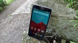
Google Nexus 6 is a supersized version of the Moto X that has been given a two-handed booster shot and appropriately received a post-surgery Lollipop. The results? It’s among the best phones in 2015.
This phablet-sized smartphone was the first to run Android 5.0 Lollipop, and now Android 5.1 and the Android M beta, and, really, there’s no better way to experience all of the changes Google has made to its operating system.
It parades the colorful new Material Design interface on a massive 6-inch display, moves seamlessly between apps thanks to one of the latest Snapdragon processors and 3GB of RAM, and lasts all day in most cases with a Qi-chargeable 3220 mAh battery.
These Nexus 6 specs are enough to edge-to-edge out Apple’s mighty iPhone 6 Plus. It feels better to hold in my hand, and typing is easier thanks to Androids always-superior keyboards options.
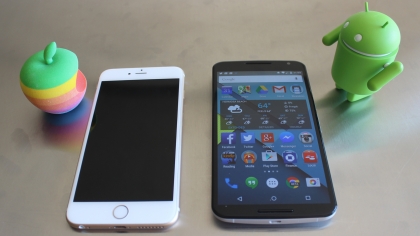
Google Now, still one swipe to the left, is more personal than ever, which shows this phone is willing to go the extra .5 inches to please without BendGating over backwards.
Nexus 6 isn’t for everyone, especially one-handed texters who think the 5.2-inch Moto X pushes the limit, or anyone who can’t live without the presence-sensing Moto Active Display. It’s also not as flashy as the newly launched Samsung Galaxy S6 Edge or premium feeling as the all-metal HTC One M9.
That said, Motorola has built one of the best Android phablets with very few feature misgivings, if you can’t wait for the rumored Nexus 5 2015 and Nexus 6 2015 sequels later this year.
Availability and price
Google Nexus 6 is available worldwide on every major carrier following its initial early November 2014 release date in the US, and the upgrade to Android 5.1 is underway.
At first, the phone was limited to AT&T, T-Mobile and Sprint, but Verizon began selling the Android phone with VoLTE enabled on March 12, four months later. In the UK, Vodafone and O2 were first to launch it.
At $649, £499 unlocked (AU$869), it’s pricier than past Nexus phones. And that’s just for the 32GB model. Google is selling the 64GB version for $699 in the US, £549 in the UK and AU$929 in Australia.
However, Google has now discounted both versions of the Nexus 6, with the 32GB version going for $499 (£399, around AU$670) and the 64GB version being reduced to $549 (£479, around AU$738). That’s quite a cut from its original price, and makes the Nexus 6 a much more desirable device.
On-contract, it’s $249 down in the US and in the UK plans start at as low as £32.50 a month with a free phone upfront.
- Nexus 5 vs Nexus 6
Google Project Fi
Nexus 6 is the first – and so only – phone to support the search engine giant’s experimental Google Project Fi cellular network, currently in beta with few invites sent out.
The invite-only program bounces between the signals of third- and fourth-place US carriers T-Mobile and Sprint with more forgiving and far cheaper plans for data usage.
It could shake-up the overpriced service of traditional US carriers and, hey, Android updates wouldn’t be as much of a problem since it’s a network operated by Google. Stay tuned for more on Project Fi.
Design
It takes two hands to properly operate the Nexus 6, but this Android phone feels better in my increasingly ambidextrous grasp for its size.
Motorola’s design, borrowed from the Moto X, gives it a sturdy BendGate-free aluminum metal frame and palm-pleasing gently curved back.

It’s sloped, so while the contoured sides run as thin as 0.15 in. (3.8mm), the thicker hump is 0.39 in. (10.1mm). The height and width are a normal 6.27 in. (159.3mm) x 3.15 in. (83.0mm).
Nexus 6 pushes an edge-to-edge display with no physical buttons, so the – by comparison – “small” 5.5-inch iPhone 6 Plus isn’t too far off: 6.22 in. (158.1mm) x 3.06 in. (77.8mm).
At 6.49 oz. (184g), it weighs more than the new iPhone or Samsung Galaxy Note 4. But there’s a good chance that if you can fit Apple’s biggest smartphone in your skinny jeans, you’re also going to be able to squeeze this oversized Android into a pocket too. You might not always be able to get it out as easily, especially when driving or sitting down.
The curve feels natural against my hands, and the back, while made of hard plastic, is at least smooth. It doesn’t try to mask the material with fake leather stitching or bumpy plastic.
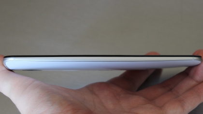
Nexus 6’s shell is different from the rubberized Nexus 5, but I found it a lot easier to grip than its “premium,” but far-too-slippery competitors that feature an all-metal design from top to bottom. With the iPhone 6, I felt like I needed a sleek-design-defeating case not to drop it.
This is a familiar Motorola device almost all of the way through, down to the dimpled logo on the back where my finger automatically rested when on a call. But it skips out on the Moto Maker customizations like wood finishes and far-too-supple leather backs.
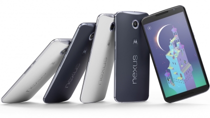
Nexus 6 colors are limited to two: either Cloud White or Midnight Blue with the advantage of both being compatible with Qi wireless chargers, a feature all of those tricked-out Moto X phones don’t support.
It’s also missing the Moto Active Display functionality. Waving my hand above the three IR sensors of the Moto X triggered a mostly unlit screen with just the current time and notification icons. Pressing down on these icons revealed more information like email teasers.
Active Display is nowhere to be found here, even though it was a great a battery-saving idea that made notifications very glanceable. Instead, there’s the less reliable Ambient Display mode that provides a greyed-out lockscreen whenever you lift the phone up suddenly. This doesn’t always work.
Nexus 6 misses the boat when it comes to a fingerprint scanner to rival Apple’s Touch ID. Apparently, the iPhone-maker is inadvertently responsible for killing Motorola’s biometric design plans because it bought supplier AuthenTec.
You won’t find a working LED light indicator here either. Recently, a developer discovered that the phone does emit one of these notifications pulses, but it’s disabled. Turning it on requires a rooted phone.
Also missing, or at least inconsistent, is the Nexus 9 tablet’s knock-to-wake feature. It actually works sometimes and turns on that greyed-out screen, but other times I get no response at all. “Hello, is anyone home?,” I keep asking. Maybe a firmware update can resolve this in the future but that hasn’t arrived in the months since the original launch.

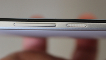
Nexus 6 does, thankfully, inherit the new Moto X’s ridge-filled power button. This helped me differentiate between the right-side located power and volume buttons in the dark. More phone manufacturers need to steal this design idea. I won’t tell.
- 10 tips and tricks for your Nexus 6
Phablet manufacturers also need to take note of these front-facing speakers. The stereo sound is almost as good as BoomSound technology found in the HTC One M9 because it points the sound in the right direction. I’m tired of backward-facing speaker grills.
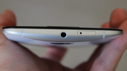
At the top of the Nexus 6, at its frame’s thickest point, is a 3.5mm headphone jack along with the nanoSIM card slot. Sadly, there’s no MicroSD slot to speak of. You’re locked into 32GB or 64GB configurations.
It’s also not waterproof like other IP67-certified Androids. It’s merely “water resistant” and has Corning Gorilla Glass 3 protecting the 6-inch AMOLED display that I’ll peer at next.
Key features
Nexus 6 pushes my fingertips to the limit with a 5.96″ AMOLED display that is as big as it is gorgeous. You won’t find a globally-available Android that matches its size.
Sure, it’s only an inch bigger than 2013’s Nexus 5 and half an inch larger than 2014’s biggest iPhone 6 Plus, but its meant for two hands and therefore makes it seem extra large.
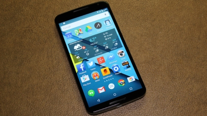
Google fills all of that space with a bright picture and a 1440×2560 resolution, which equates to 493 pixels per inch on the nearly 6-inch screen.
Its quad HD and doubles down on Apple’s “full HD” screen, though the LG G3 and Samsung Galaxy Note 4 have higher pixel densities care of their smaller display sizes. But not by much.
Watching videos on the Nexus 6 made me skip pulling out the Nexus 9 more than once. The phone is just three inches shy of Google’s new tablet and has a more video-friendly 16:9 aspect ratio.
This is Google and Motorola’s first quad HD smartphone and it’s a head-turning sight to see.
Beefier specs
At the heart of the Nexus 6 is a 2.7Ghz Qualcomm Snapdragon 805 quad-core processor that has an Adreno 420 GPU. It’s a top-of-the-line chip for Google’s largest Android phone yet.
Backing that up is 3GB of RAM and a reasonable 32GB or 64GB of internal storage. Notice, there’s no silly 16GB model to cheapen the value.
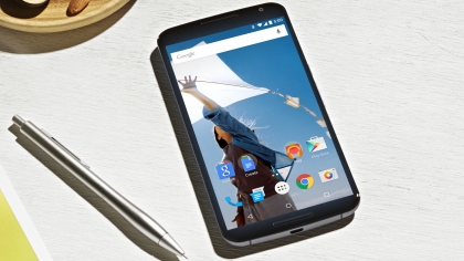
All of these Nexus 6 specs aren’t overkill. It’s important for the lightweight, but feature-filled Android Lollipop update that’s pre-installed on the phone.
Android does more things than ever in the background: it runs multiple apps, receives notifications that hit the new lockscreen non-stop and makes the instantly accessible Google Now available with one swipe to the left. Voice searches are also on demand whenever I say the “Okay Google” prompt.
13-megapixel camera
Around back, there’s a 13-megapixel camera that seems to be on par with that 13-megapixel Moto X 2014 snapper. It’s not.
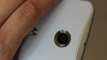
Nexus 6’s camera has a better Sony IMX214 CMOS sensor with a wider f/2.0 aperture and optical image stabilization.
This trumps the Moto X camera specs that comprise of an older sensor and lacked OIS. It’s not perfect, but it’s far superior to what we got with the 8-megapixel Nexus 5 camera in 2013.
Android 5.0 Lollipop
The LG G3 has beaten the Nexus 6 to the punchy colors with a sooner-than-expected update to Android 5.0 Lollipop, but Google’s new phone was still the first with it pre-installed.
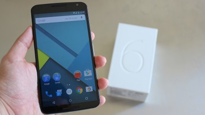
First, last, whatever – the “Material Design” theme is far more inviting than what I experienced on the Nexus 5. Flat layers of bright colors bring out the best on this 6-inch display.
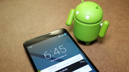
Android Lollipop is also more functional with lockscreen notifications and a new pulldown quick settings menu. It does go overboard though, adding an unnecessary new Messaging app.
More new features will be arriving any time now too, with Android 5.1 set to add support for multiple SIM cards, Device Protection and high definition voice calls.
You can find more of what TechRadar thinks of it in our Android 5.0 Lollipop review.
Qi and Turbo Charging
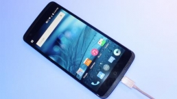
Google and Motorola spared me the embarrassment of toting around the ugly USB 3.0 Micro-B cable employed by past Samsung smartphones, but the pair still allow for a faster charging method.
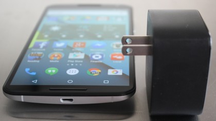
Nexus 6’s secret sauce is that it uses a Turbo Charger, a larger-than-normal plug that juices the phone with six additional hours of battery life in just 15 minutes. It uses a normal micro USB cable to transfer the juice.
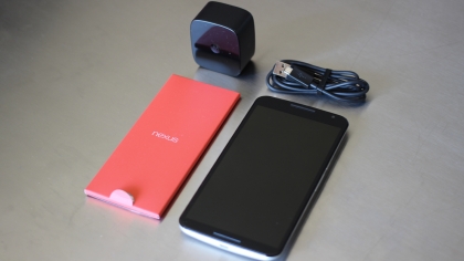
This is made possible by the same Qualcomm QuickCharge 2.0 technology that the Moto X 2nd generation and a handful of other Snapdragon CPU-powered Android phones have.
The difference here is that the Nexus 6 comes with the square-shaped plug, while most other QuickCharge smartphones sell it as an accessory.
Nexus 6 can also be juiced up with the Nexus Wireless Charger or any Qi inductive charger, though the wire-free base station is sold separately in this case. More on how this holds up in the battery life tests page.
Interface and performance
Nexus 6 sets new standards for both interface and performance among Androids with few exceptions. It’s once again Google’s standard bearer for other manufacturers to follow.
It’s colorful and bright on the outside thanks to the debut of Android Lollipop, and it’s a beast on the inside due to top-of-the-line internal specs.
Of course, even Google’s new champion for the better part of 2015 has its challengers. The once fragmented competition is coming together to raise the stakes.
Interface
Stock Android remains one of the best reasons to own a Nexus device. Its software is void of the often unnecessary third-party overlays and pre-installed apps that simply get in my way.
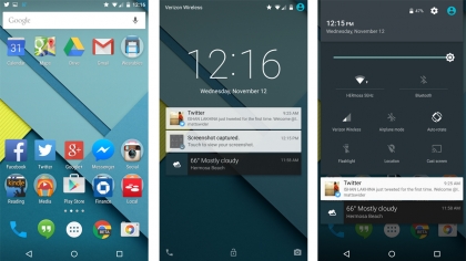
Sure, skins like Samsung TouchWiz, LG Optimus and HTC Sense look and run better today than they did two years ago, but pure Android is the way to go.
There’s no getting around the fact that Nexus devices, like all Google Play Edition devices, receive future Android updates almost immediately without carrier intervention. That matters as much this year as it does next year.
We’re gearing up for Google to unveil its successor to Android Lollipop, which currently goes by the name Android M, and will be released later this year.
While it probably won’t be as big a leap as Android Lollipop was compared to Android KitKat, it’s still set to come with some exciting new features, and it’s a good bet that the Nexus 6 will be one of the first handsets to get the update.
Right now though it’s all about Android 5.0 Lollipop, last fall’s pre-installed version of the operating system. It sports a flat, yet layered theme among its menus and apps.
Google calls this “Material Design,” and it sort of lifts 2D layers to the third dimension with a combination of shadows cast by key and ambient lights.
The new look also dials back the visual non-essentials, but punches up the color. Menus aren’t as dark as they were on Android 4.4 KitKat, and apps share in this same geometry-focused design and splash of color.
So far this applies to Google’s slate of apps like Gmail, Google Play Movies & TV and Google Maps. The company is driving a simplified, unified layout throughout its ecosystem.
There’s also a big difference to how Android 5.0 Lollipop functions. I didn’t even have to unlock my Nexus 6 to see the very first change – it was right there on the lockscreen.
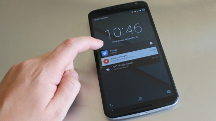
Lockscreen notifications bring the hidden notification panel to the forefront with email alerts, text messages exchanges, app updates and so forth. It’s all easily glanceable like on iOS 8.
Such a move would normally introduce a privacy problem. Google, however, nipped that issue in the bud within the “Sound & Notifications” settings menu.
With nothing to hide, I can “Show all notification content,” keep certain items confidential via “Hide sensitive notification content,” or turn everything off with “Don’t show notifications at all.” Better yet, I can block notifications on an app-by-app basis through this same handy menu.
Priority Mode is Google’s more advanced take on Apple’s Do Not Disturb feature. It silences the Nexus 6 indefinitely or in intervals ranging from 15 minutes to 8 hours.
Like the lockscreen notifications, certain apps and callers can be allowed or disallowed via whitelisting. I’ve since ditched my third-party Silence app for this new, system-wide feature.
Priority Mode isn’t part of Quick Settings like I had expected. It’s activated by pressing the volume key in either direction and following the on-screen toggles.
Quick Settings does have some new additions, however. The pulldown menu doesn’t require two fingers simultaneously. That still works, but now you can do one swipe for notifications, then another swipe to reveal this hidden quick settings menu. It’s a lot less awkward.
It’s still impossible to add to or rearrange the quick settings. What you see is what you get. Thankfully, new buttons alongside Wi-Fi, Bluetooth and Airplane Mode include Flashlight and the Chromecast “Cast Screen” button.
A brightness slider, while not necessarily new, is no longer hidden behind its own submenu. One less step is what quick settings is all about.
New features are already on the way too, with Android 5.1 set to roll out any moment at time of writing. That brings support for multiple SIM cards and high definition voice calls to the Nexus 6, as well as a new Device Protection mode, which keeps a lost or stolen handset locked until you sign in with your Google account.
Performance
Nexus 6 running Android 5.0 Lollipop clears all but one rival smartphone when it comes to benchmarks: the recently released Samsung Galaxy Note 4.
It’s awful close, and that’s no surprise. Google’s specs mirror it chip-for-chip with a 2.7GHz Qualcomm Snapdragon 805 quad-core processor, Adreno 420 GPU and 3GB of RAM.
Nexus 6 aces Geekbench 3 benchmarking tests with an average multi-core score of 3294. It’s significantly faster than the smaller iPhone 6 Plus (2911) and Samsung Galaxy S5 (2905).
Alas, the Galaxy Note 4 eeks out a win with a benchmarking score of 3,352. A real overachieving nerd with a pocket-protected S-Pen in its frame, if that’s what you want. The recently released Samsung Galaxy S6 and HTC One M9 also upstage the Nexus 6, with scores of 4,846 and 3,803, respectively.
Despite the newer handsets scoring higher, these numbers translate into stellar performance from the Nexus 6. Google’s phablet is venturing into tablet territory. The new Nexus 9 slate averaged 3,492 in the same tests.
It’s pushing the boundaries of more than just physical size. The one and only slowdown I saw was during the boot-up process. It took 1 minute 33 seconds to start this thing up.
Slow start times seem more like a glitch that can be addressed in a post-launch firmware update. Right now, streaming movies and playing CPU-intensive games hasn’t slowed this phone down one bit.
That’s a good sign if you’re going to hold onto this smartphone for two whole years.
Camera
Nexus 6’s camera certainly bests the flawed photos of 2013’s Nexus 5 snapper and it’s way more accurate than the rest of Motorola’s oversaturated lineup.
The improvements are care of the Sony IMX214 CMOS sensor, a wider f/2.0 aperture and optical image stabilization, all attributes that aren’t a part of the new Moto X.
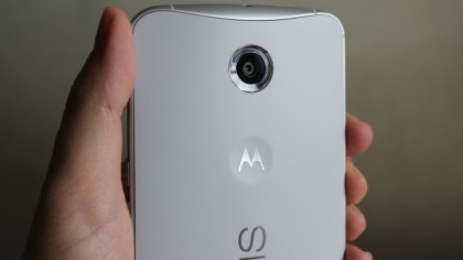
It’s a 13-megapixels – the same as the OnePlus One camera – and holds its own next to the 21-megapixel Droid Turbo for two reasons: it has better shot-for-shot color accuracy and OIS.
Both the Moto X and Droid Turbo have tried to impress with vibrant, Instagram-like colors for each shot. It works in some cases like photos of the sky or buildings, but when it occasionally turns your skin different hues, it’s unfortunate.
That’s why I appreciate the fact that the Nexus 6 is closer to reality. It’s still a bit warm in natural light and grainier than it should be in low-light situations, but a marked improvement.

The problems are only abundantly clear when comparisons are drawn between its camera and the Galaxy Note 4 camera. Samsung’s color accuracy and post-processing skills can’t be beat.
All of this is true of the front-facing camera too. It’s a bit redder and grainier in low light when using that 2 megapixels. The Note 4 and the front-flash-equipped HTC Desire Eye do a better job if you’re looking for selfies in your local pub.
I found the Nexus 6 autofocus to be comparable and even snappier in some instances, but the Note 4’s camera is just chock-full of options not in Google’s very straightforward default.

Sure, Photosphere is a neat camera trick that works on Google+, but its an overall bare bones camera app that’s easily overpowered by third-party alternatives in the Play Store. And sadly, Motorola hasn’t brought over the camera twist shortcut that launches the Moto X app.
Video is a little more straightforward. It shoots 4K video at 30 frames per second, but if you’re not playing it back on a 4K TV, it’s hard to justify the space on a quad HD smartphone. That’s where the 1080p video recording option is much more relevant.
You can find camera samples on the next page and I’ll be adding more of my photo-snapping results throughout the week with additional analysis.
Camera samples

Full resolution photo

Full resolution photo

Full resolution photo

Full resolution photo

Full resolution photo

Full resolution photo
Media
Nexus 6 is obviously a multimedia powerhouse given its phablet-sized display, but there’s speakers that backs up those good looks.
That has a significant impact on the 6-inch movie-watching, game-playing and music-listening experience, one area in which the Samsung Galaxy Note 4 doesn’t quite compare.
Video
I actually prefer watching movies on my Nexus 6 review unit over the Nexus 9 tablet due to the fact that Google’s new flagship smartphone boasts a more video-friendly screen.
It’s in the proper 16:9 aspect ratio, so all of the widescreen movies I watch are formatted sans letterboxing or at least kept at a minimum. The black void is strong with the Nexus 9, sadly.
Streaming Dumb and Dumber via Netflix in anticipation of the sequel, I found that the Nexus 9 has slightly darker tones, whereas the Note 4 was slightly brighter for the full 107 minutes.
The same was true with Gravity, which is currently free to download in the redesigned Google Play Movies & TV section, at least in the US. It demod Nexus 6’s excellent contrast ratio.
There’s hardly a winner in this side-by-side quad HD movie comparison. Samsung’s amped up screen made is easy to see darker objects, while Google’s didn’t blow out sunlight scenes.
It’s the front-facing dual speakers that hand the Nexus 6 a victory among phablets.
Music
Songs, of course, play well through these stereo speakers that rest at the top and bottom of the Nexus 6. It’s a big step up from Motorola’s mono-speaker Moto X from two months ago.
Running through my Google Music playlist, I could not only hear all of the music, I could see what was playing on the screen without having to face my phone in an awkward direction.
That’s just not the case with some phablets like the Galaxy Note 4 and iPhone 6 Plus in which the speaker grill is facing the back or the bottom.
It didn’t quite matching the larger sound produced by the HTC One M8 and its patented BoomSound speaker tech, but the Nexus 6 the most sense and noise among phablets.
Games
Nexus 6 didn’t flinch when it came to game apps, typically the most intensive media form for a jack-of-all-trade phone like this. It handled everything with flying, fluidly animated colors.
The free-to-play Asphalt 8: Airborne proved that Google’s latest Nexus is no slouch in 3D gaming performance. Simpler apps like the isometric Game of War did the same for 2D.
In fact, the Game of War overworld was easier to navigate thanks to 6-inch display and 2560 x 1440 resolution. It didn’t feel stretched from my days playing it on the Galaxy Note 3.
This is important for mobile gamers to take into consideration when thinking about purchasing a phabet. Touchscreen size matters just as much as internal specs sometimes.
Storage
Nexus 6 takes the phablet crown when it comes to multimedia, but with one caveat. It doesn’t have expandable storage. No microSD card support, something the Note 4 doesn’t have.
This Android Lollipop trailblazer comes in 32GB or 64GB flavors. That’s the internal storage size you’re stuck with for about two years if you don’t upgrade soon.
Also keep in mind that my review unit had a smaller-than-advertised 25.98GB of user-storage onboard when it’s really the 32GB model. Nearly 7GB is taken up by the OS.
Battery life
Nexus 6 battery life is excellent, judging from our tests. Behind its 6-inch AMOLED is a mighty 3220mAh capacity, the same as the Samsung Galaxy Note 4 and iPhone 6 Plus.
The difference maker is that Google’s new flagship is running Android 5.0 Lollipop with the battery-saving optimizations of “Project Volta” to eeks out two extra percentage points.
That translates into a 17% drop in battery life when running TechRadar’s 90-minute HD video test. The Note 4 dropped 19%, LG G3 lost 25% and iPhone 6 Plus went down 27%.
The difference maker appears to be the Android System and Android OS have been hogging a smaller percentage of battery life, according to the always-useful battery settings menu.
Outside of this looped battery test, my Nexus 6 lasted about a day and a half on travel, again pretty much tied with the Note 4 and more than enough time to seek a power outlet.
I wasn’t able to swap out the battery, however. It’s sealed inside the Nexus 6, unlike Samsung devices that offer access to batteries so that they are user-replaceable.
The good news with the current Nexus is that it takes advantage of Qualcomm’s QuickCharge 2.0 technology that boosts battery life in a jiffy and it comes with the special power adapter.
Motorola calls it a Turbo Charger, Samsung dubs it fast charger and HTC refers to it as rapid charger. Whatever, it’s a wonderful addition to devices with the latest Snapdragon CPUs.
Officially Nexus 6 is supposed to be able to add six hours of battery in just 15 minutes. That came out to 20% in 15 minutes when my phone started charging in at a critical state.
Those numbers continued to stay true as I left the phone attached to the oversized plug in the outlet. My total charge time for the Nexus 6 from zero to full was about 1 hour and 20 minutes.
Added to this fresh convenience is the return of an old one. Google once again supports the Qi charging standard for inductive charging.
That makes owning the Nexus Wireless Charger or any Qi charger that much more useful. Motorola has Qi experience with the Moto 360 and its phone works the same wire-free way.
You don’t need an accessory for Qi wireless charging, which makes the Nexus 6 battery that much better than the Samsung Galaxy Note 4 sans the non-user-replaceable aspect.
The essentials
Just because Google’s Nexus 6 looks all-grown-up doesn’t mean it can skip out on its basic chores as a cell phone. Call quality, keyboard functionality and messaging are still important.
Two out of three isn’t bad, especially when the last category has been a system-wide Android problem since the very beginning.
People I spoke with said that I was coming in clearly using the handset normally and switching over to the speakerphone. It’s loud through that top speaker and easy to hear everything.

I didn’t have to repeat anything, but I did discover a weird two- or three-second delay following my pressing the speakerphone button. It seems like an unresolved glitch more than anything.
My Nexus 6 didn’t become too hot after a very long 40-minute conversation with my mom, and trust me that’s not always the case. I found I could easily surf the web and text at the same time. For testing purposes. Not because I was bored in that time.
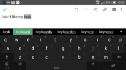
The new Android 5.0 Lollipop keyboard takes away the borders between the keys and adds two new themes – lighter and darker in color.
Google’s keyboard personalization makes Android’s default keyboard leagues ahead of the just-learning Apple iOS 8 QuickType keyboard and it comes with gesture typing out of the gate.
Messaging
Messages is the one area where Android 5.0 Lollipop isn’t making incremental improvements. In fact, I think it’s actually taking steps backward with additional confusion.
Hangouts is still here, with the ability to route SMS and internet messages through the app. But Google went ahead and introduced a new default “Messaging” app, too.
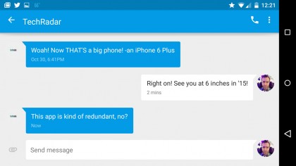
It sports the lovely Material Design theme, but is solely for text messages, which, as always can’t be beamed to a computer or tablet without a bunch of third-party app trickery.
As much as I like MightyText and similar apps that mirror my messages on the device that’s occupying my attention, Google needs to be the one to match iMessages’ seamless idea.
Hangouts on the computer almost did that last month. Google introduces an SMS tab on the computer-based internet messaging service, but it requires a Google Voice number.
Being able to route calls, texts and Hangouts (both messages and video chats) and ensuring users get is what the essential Google doesn’t have a handle on just yet.
Competition
Nexus 6 is bigger and newer than its competition, but it’s not a clear cut victory. If new and big always won the tech race, Samsung would have the best smartwatch every 3 months.
Here’s how Google’s new trend-setting Android stacks up to existing iOS 8 and Android KitKat devices in the phablet category.
iPhone 6 Plus
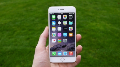
Apple went bigger with the iPhone 6 Plus and while its 5.5-inch display is king among iOS 8 devices, its specs don’t match what benchmarks set by Google and Samsung.
It still looks incredible with a 1920×1080 resolution display 401 pixels per inch that meets full HD standards. It defines ultra-thin and redefines what an 8-megapixel camera can do.
The big iPhone’s best feature is iOS itself. If you’re locked into Apple’s ecosystem with iMessages and iCloud, and don’t want to ditch Touch ID, this is a satisfying phablet. Plus, most of Google’s software is available in Apple’s App Store.
Samsung Galaxy Note 4
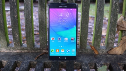
A lot of people are deciding between the Samsung Galaxy Note 4 and Nexus 6. Was it worth holding out until Google released its new phone?
There answer comes down to which features you want. The Note 4 comes with a advantages like the S Pen stylus that some people want phone that’s a large 5.7 inches.
It also boasts multitasking, a fantastic camera and runs circles around most Androids when it comes to benchmarks. A microSD card slot and replaceable battery are must-haves for a lot of people too.
If you can deal with TouchWiz, the backward-facing speaker and the phablet-sized price, then it’s something to consider over the cheaper, pure Android Google Nexus 6.
LG G3
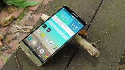
LG G3 is a little more manageable as a two-handed Android thanks to its 5.5-inch display. I can wrap my hand arounds its chassis without even stretching my fingers.
It’s still in the same quad HD resolution category as the Nexus 6 and sports a similar curved backside. But the smaller screen and brush-metal plastic back aren’t as striking as Google’s 6-inch behemoth.
That’s okay. The LG G3’s laser autofocus and price more than make up for this. The camera and price out-do the even smaller Galaxy S5.
Nexus 5
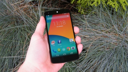
Since Google has discontinued sales of the Nexus 5 in the lead up to the NExus 6 launch, this is more of a “Do I upgrade early or hold tight for the Nexus 7” – oh wait, that already exists.
You get the point. Again, it depends on what you care about. The Nexus 5 is getting Android 5.0 Lollipop, so the interface is going to match what you see here.
The differences comes down to the size, obviously, the stylish design and the camera. Nexus 5 was rightfully criticized for its less than stellar performance last in 2013.
Nexus 6 passes the camera quality test and every other benchmark we threw at it. If those things are important to you, think about an early upgrade.
Hands on gallery


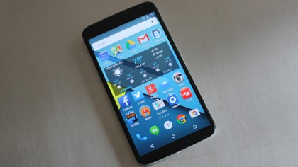
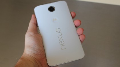
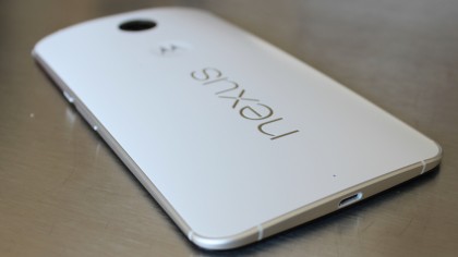

Verdict
Google and Motorola launch Android 5.0 Lollipop with the Nexus 6 and it’s a treat that doesn’t leave a bitter aftertaste thanks to its favorable design and specs.
It’s not as cheap as Google’s past flagship phones used, but you get more display for your money and the ability to upgrade to the next version Android without hesitation.
We liked
There’s a lot to like about Nexus 6. I’m a sucker for Android Lollipop and it looks great on this bright, 6-inch AMOLED display. It’s not filled with all of the pre-installed apps I never use.

Going along with the video-friendly 16:9 screen are front-facing speakers that project movie, game and music sound to me instead of away from me. What a concept!
The specs top almost all previous smartphone benchmarks thanks to the Qualcomm’s newest Snapdragon chip and 3GB of RAM. An extra-large battery has kept me running for more than a day.
The 13-megapixel camera is more true-to-life than 2013’s Nexus 5 and Motorola’s other smartphones combined, even if it doesn’t quite measure up what Samsung’s doing.
We disliked
It’s hard to call the Nexus 6 Android’s best phablet. It’s big but the 5.7-inch Samsung Galaxy Note 4 just barely inches out ahead of Google’s phone in the benchmarks.

But the perk of having the first smartphone to run Android 5.0 Lollipop is still there, right? No, actually the update it already available for the LG G3. Others are promising to follow soon.
It’s also a bummer to see that the Nexus 9 knock-to-wake function and Moto Active Display didn’t make the cut. Active Display is one of Motorola’s best features, and it’s not here despite the fact that the Nexus 6 costs more than the Moto X.
Final Verdict
The death of the Google Nexus program has been greatly exaggerated, and 2014’s stock Android phone ironically resulted in an exaggerated Moto X. Its tremendous display, premium specs and debut of Android 5.0 Lollipop make one of the best phablets to date.
That’s not to say it’s the perfect phablet. Without Moto Active Display, customizable voice command features and Moto Maker options, $649, £499 (around AU$700) would normally be a big ask.
Luckily, this just happens to be the best Nexus Google has ever crafted. And, when you think about it, you’re not going to need to hold onto your money, as you’ll require both hands to grab onto this two-handed monster.
First reviewed: November 2014
![]()
Related Posts
December 6, 2021
7+ Web Design Trends for 2022: Which Will You Use?
December 6, 2021
The 10 Best WordPress Booking Plugins to Use On Your Website
December 6, 2021
How to Use a Web Cache Viewer to View a Cached Page
November 6, 2021
10 Modern Web Design Trends for 2022
November 6, 2021
Best Free SSL Certificate Providers (+ How to Get Started)
November 6, 2021
How to Design a Landing Page That Sends Conversions Skyrocketing
November 6, 2021
What Are the Best WordPress Security Plugins for your Website?
October 6, 2021
Your Guide to How to Buy a Domain Name
October 6, 2021
How to Build a WordPress Website: 9 Steps to Build Your Site
September 6, 2021
10 Best Websites for Downloading Free PSD Files
September 6, 2021
HTML5 Template: A Basic Code Template to Start Your Next Project
September 6, 2021
How Much Does It Cost to Build a Website for a Small Business?
September 6, 2021
A List of Free Public CDNs for Web Developers
September 6, 2021
6 Advanced JavaScript Concepts You Should Know
August 6, 2021
10 Simple Tips for Launching a Website
August 6, 2021
25 Beautiful Examples of “Coming Soon” Pages
August 6, 2021
10 Useful Responsive Design Testing Tools
August 6, 2021
Best-Converting Shopify Themes: 4 Best Shopify Themes
July 6, 2021
What Is Alt Text and Why Should You Use It?
July 6, 2021
24 Must-Know Graphic Design Terms
June 6, 2021
How to Design a Product Page: 6 Pro Design Tips
April 6, 2021
A Beginner’s Guide to Competitor Website Analysis
April 6, 2021
6 BigCommerce Design Tips For Big Ecommerce Results
April 6, 2021
Is WordPress Good for Ecommerce? [Pros and Cons]
March 6, 2021
Make Websites Mobile-Friendly: 5 Astounding Tips
March 6, 2021
Shopify vs. Magento: Which Platform Should I Use?
March 6, 2021
Top 5 Web Design Tools & Software Applications
February 6, 2021
Website Optimization Checklist: Your Go-To Guide to SEO
February 6, 2021
5 UX Design Trends to Dazzle Users in 2021
February 6, 2021
What Is the Average Page Load Time and How Can You Do Better?
February 6, 2021
Choosing an Ecommerce Platform That Will Wow Customers
February 6, 2021
7 Best Practices for Crafting Landing Pages with Forms
February 6, 2021
7 B2B Web Design Tips to Craft an Eye-Catching Website
January 6, 2021
Mobile-Friendly Checker | Check Your Site’s Mobile Score Now
January 6, 2021
8 Tips for Developing a Fantastic Mobile-Friendly Website
December 6, 2020
How to Add an Online Store to Your Website [4 Ways]
December 6, 2020
5 UX Design Tips for Seamless Online Shopping
November 6, 2020
Ecommerce Website Essentials: Does Your Site Have All 11?
November 6, 2020
5 Small Business Website Essentials You Need for Your Site
November 6, 2020
Your Website Redesign Checklist for 2020: 7 Steps for Success
May 1, 2020
Psychology of Color [Infographic]
April 21, 2020
How to start an online store that drives huge sales
January 3, 2020
5 Lead Generation Website Design Best Practices
March 6, 2019
6 Reasons You Should Redesign Your Website in 2019
March 6, 2019
7 Web Design Trends for 2019
February 19, 2019
Who owns the website/app source code, client or developer
February 7, 2019
Don’t Let Your Domain Names Expire in 2019
January 8, 2019
2019 Website Development Trends To Note
October 6, 2017
How Web Design Impacts Content Marketing
October 6, 2017
How to Choose a Navigation Setup
August 6, 2017
Why User Experience Matters to Marketing
July 6, 2017
5 Ways Web Design Impacts Customer Experience
September 6, 2016
How to Learn Angular
September 6, 2016
The Excuses for Not Having a Website (Infographic)
September 6, 2016
How to Build an Award-Winning Web Design Team
September 6, 2016
13 Free Data Visualization Tools
August 6, 2016
How Selling Pastries Helped Us Design a Better Product
August 6, 2016
11 Sites to Help You Find Material Design Inspiration
July 4, 2016
How to change free wordpress.com url
April 6, 2016
The 5 Best Free FTP Clients
April 6, 2016
7 Free UX E-Books Worth Reading
March 6, 2016
Can Handwritten Letters Get You More Clients?
December 10, 2015
Star Wars Week: How to create your own Star Wars effects for free
December 6, 2015
20 "Coming Soon" Pages for Inspiration
December 6, 2015
6 Free Tools for Creating Your Own Icon Font
December 6, 2015
9 Useful Tools for Creating Material Design Color Palettes
November 6, 2015
20 Free UI Kits to Download
November 6, 2015
50 Web Designs with Awesome Typography
November 6, 2015
When to Use rel="nofollow"
November 6, 2015
7 Free Books That Will Help You Become More Productive
November 6, 2015
50 Beautiful One-Page Websites for Inspiration
November 6, 2015
Circular Images with CSS
October 6, 2015
Lessons Learned from an Unsuccessful Kickstarter
October 6, 2015
5 Games That Teach You How to Code
October 6, 2015
Cheatsheet: Photoshop Keyboard Shortcuts
October 6, 2015
An Easy Way to Create a Freelance Contract for Your Projects
October 6, 2015
50 Design Agency Websites for Inspiration
September 29, 2015
JB Hi-Fi shutting the book on ebooks
September 24, 2015
Opinion: Quick, Quickflix: It's time to give yourself the flick
September 24, 2015
New Star Wars 360-degree video is among first on Facebook
September 21, 2015
Apple purges malicious iPhone and iPad apps from App Store
September 12, 2015
Apple's new Live Photos feature will eat up your storage
September 12, 2015
The latest Windows 10 Mobile preview has been delayed
September 12, 2015
IBM buys StrongLoop to add Node.js development to its cloud
September 8, 2015
Fake Android porn app takes your photo, then holds it ransom
September 6, 2015
50 Restaurant Websites for Inspiration
September 6, 2015
Zero UI — The Future of Interfaces
September 6, 2015
50 Beautiful Websites with Big Background Images
September 6, 2015
Infographic: 69 Web Design Tips
September 6, 2015
Free Windows 10 Icons
September 2, 2015
Instagram turns itself into a genuine messaging service
August 11, 2015
In Depth: How Microsoft taught Cortana to be more human
August 11, 2015
Windows 10 price, news and features
August 11, 2015
Windows 10's broken update introduces endless reboot loop
August 11, 2015
Windows 10 races to 27m installs
August 11, 2015
Windows 10 IoT Core gets first public release
August 10, 2015
iOS Tips: How to backup iPhone to an external drive
August 10, 2015
Windows 8.1 RT finally getting Windows 10 Start Menu
August 10, 2015
How to use Windows Hello
August 10, 2015
Review: Moto Surround
August 10, 2015
Review: Moto G (2015)
August 9, 2015
8 of the best free VPN services
August 8, 2015
Use Firefox? Mozilla urges you update ASAP
August 7, 2015
Mac Tips: Apple Mail: How to remove the Favorites Bar
August 7, 2015
How to make the OS X dock appear faster
August 7, 2015
Review: BQ Aquaris E45 Ubuntu Edition
August 7, 2015
Review: Acer Liquid Jade Z
August 6, 2015
How to reinstall Linux
August 6, 2015
How to reinstall Windows
August 6, 2015
Updated: Apple Music: release date, price and features
August 6, 2015
Social News Websites for Front-End Developers
August 6, 2015
10 Free JavaScript Books
August 6, 2015
50 Beautiful Blog Designs
August 6, 2015
Animated SVG Pipes Effect
August 6, 2015
Launching Your First App
August 5, 2015
Windows 10 goes freemium with paid apps
August 5, 2015
Updated: Week 1 with Windows 10
August 5, 2015
Mac Tips: How to manage Safari notifications on Mac
August 5, 2015
Microsoft Sway may kill the PowerPoint presentation
August 4, 2015
Microsoft gives Outlook on the web a new look
August 4, 2015
Mac OS X vulnerable to new zero-day attack
August 4, 2015
Windows 10 users warned of two scams
August 4, 2015
Microsoft's Docs.com is now available to everyone
August 3, 2015
Mac Tips: How to edit the Favorites sidebar on Mac
August 3, 2015
Updated: Windows 10 price, news and features
July 29, 2015
Review: HP ProDesk 405 G2
July 29, 2015
Hands-on review: HP Elite x2 1011
July 29, 2015
Hands-on review: Updated: Windows 10 Mobile
July 29, 2015
Review: Updated: Nvidia Shield Android TV
July 28, 2015
LIVE: Windows 10 launch: Live Blog!
July 28, 2015
How to prepare for your upgrade to Windows 10
July 28, 2015
Review: Updated: Windows 10
July 28, 2015
Review: Updated: HP Pro Tablet 608
July 28, 2015
Review: Heat Genius
July 28, 2015
Hands-on review: Moto X Play
July 28, 2015
Hands-on review: Moto X Style
July 28, 2015
Hands-on review: Moto G (2015)
July 28, 2015
Review: 13-inch MacBook Air (early 2015)
July 28, 2015
Hands-on review: OnePlus 2
July 28, 2015
Review: LG 65EG960T 4K OLED
July 28, 2015
Mac Tips: How to share printers on Mac
July 27, 2015
Apple Music's arrival hasn't opened Pandora's box
July 26, 2015
Review: Garmin Swim
July 25, 2015
How to merge OS X contacts into an existing list
July 25, 2015
Hands-on review: UPDATED: ZTE Axon
July 24, 2015
Mac Tips: How to zoom in on a Mac
July 24, 2015
What Windows 10 means for the enterprise
July 24, 2015
Review: JBL Charge 2 Plus
July 24, 2015
Review: Acer Aspire S7
July 24, 2015
Review: Updated: Canon G3 X
July 24, 2015
Review: Updated: iPad Air 2
July 24, 2015
Review: Thinksound On1
July 24, 2015
Review: Asus Chromebook Flip
July 24, 2015
Review: Garmin Forerunner 225
July 23, 2015
Review: Garmin nuvi 68LM
July 23, 2015
Review: Samsung Galaxy S6 Active
July 23, 2015
Review: Bowers and Wilkins P5 Wireless
July 23, 2015
Review: Dell XPS 15 (2015)
July 21, 2015
Review: Fuji S9900W
July 21, 2015
Review: Updated: Fitbit Surge
July 21, 2015
Review: UE Roll
July 21, 2015
Hands-on review: Ubik Uno
July 20, 2015
Review: Samsung HW-J650
July 20, 2015
Updated: 40 best Android Wear smartwatch apps 2015
July 20, 2015
Review: Acer Chromebook C740 review
July 20, 2015
Review: Huawei Talkband B2
July 20, 2015
Review: Dell Venue 10 7000
July 20, 2015
Review: Intel Core i7-5775C
July 17, 2015
Mac Tips: How to delete locked files on Mac
July 17, 2015
Review: Pebble Time
July 16, 2015
Microsoft just made Windows XP even less secure
July 16, 2015
Windows 8.1 RT is getting an update this September
July 16, 2015
OS showdown: Windows 10 vs Windows 8.1 vs Windows 7
July 16, 2015
Review: Acer CB280HK
July 15, 2015
Windows 10 is ready for new laptops and PCs
July 15, 2015
Explained: How to take a screenshot in Windows
July 15, 2015
Office for Windows 10 appears in latest build
July 14, 2015
Review: ZTE Axon
July 14, 2015
Review: ViewSonic VP2780-4K
July 14, 2015
Hands-on review: SanDisk Connect Wireless Stick
July 14, 2015
Review: Oppo PM-3
July 14, 2015
Review: BT 11ac Dual-Band Wi-Fi Extender 1200
July 14, 2015
Review: Fuji X-T10
July 13, 2015
How to build an SEO strategy for your business
July 13, 2015
Review: Lenovo ThinkPad Yoga 15
July 13, 2015
Review: Audio-Technica ATH-MSR7
July 13, 2015
Review: Garmin NuviCam LMT-D
July 13, 2015
Review: Dell Inspiron 13 7000
July 13, 2015
Hands-on review: AstroPi SenseHAT
July 13, 2015
Hands-on review: EE Rook
July 13, 2015
Hands-on review: Updated: HTC Vive
July 12, 2015
Here's the ultimate software list for PC fanatics
July 10, 2015
How to use the new Photos app for Mac
July 10, 2015
Windows 10 Insider Preview Build 10166 available now
July 10, 2015
Splunk spends big on cybersecurity acquisition
July 10, 2015
Making Windows 10 apps just got a whole lot easier
July 10, 2015
Review: Lenovo LaVie Z 360
July 9, 2015
OS X El Capitan public beta available right now
July 9, 2015
Microsoft finally unveils Office 2016 for Mac
July 9, 2015
Review: Updated: Chromecast
July 9, 2015
Review: Updated: Tesco Hudl 2
July 9, 2015
Review: Lenovo ThinkPad E550
July 8, 2015
What you need to know about Windows Server 2016
July 7, 2015
Microsoft to hike enterprise cloud pricing
July 6, 2015
Hacking Team end up being totally 0wned
July 6, 2015
Review: HP Pro Slate 12
July 6, 2015
Review: Samsung 850 Pro 2TB
July 6, 2015
Review: Asus RT-AC87U
July 6, 2015
Review: Jawbone UP2
July 6, 2015
Reimagining the Web Design Process
July 6, 2015
50 Clean Websites for Inspiration
July 6, 2015
15 Free Books for People Who Code
July 6, 2015
Web Storage: A Primer
July 6, 2015
A Look at Some CSS Methodologies
July 3, 2015
6 Essential Mac Mouse and Trackpad Tips
July 2, 2015
How to install a third party keyboard on Android
July 2, 2015
Review: UPDATED: Asus Zenfone 2
July 2, 2015
Review: Alienware 13
July 2, 2015
Review: HP DeskJet 1010
July 1, 2015
5 issues we want Apple Music to fix
June 13, 2015
Cortana will get its own button on Windows 10 PCs
June 12, 2015
Windows 10 will come with universal Skype app
June 12, 2015
iPad music production: 18 Best apps and gear
June 12, 2015
Windows 10 all set for early enterprise struggle
June 12, 2015
Review: Garmin VIRB Elite
June 11, 2015
Review: Updated: Nvidia Shield Tablet
June 11, 2015
Review: Nokia Lumia 635
June 10, 2015
Microsoft brings more online tweaks to Office 365
June 10, 2015
Mac Tips: How to use Screen Sharing in Mac OS X
June 9, 2015
Hands-on review: Meizu M2 Note
June 9, 2015
Hands-on review: EE 4GEE Action Camera
June 9, 2015
Review: Toshiba 3TB Canvio external hard drive
June 9, 2015
Review: Olympus SH-2
June 8, 2015
Hands-on review: Updated: Apple CarPlay
June 8, 2015
UPDATED: iOS 9 release date, features and news
June 8, 2015
Review: Updated: Roku 2
June 8, 2015
Review: Updated: PlayStation Vue
June 8, 2015
Review: Dell PowerEdge R730
June 8, 2015
Review: Canon SX710 HS
June 7, 2015
UPDATED: iOS 9 release date, features and rumors
June 7, 2015
Review: Lenovo S20-30
June 6, 2015
Free Writing Icons
June 6, 2015
15 CSS Questions to Test Your Knowledge
June 6, 2015
The Best CSS Reset Stylesheets
June 6, 2015
How CSS Specificity Works
June 5, 2015
'Delay' is a new feature in Windows 10
June 5, 2015
Review: Beyerdynamic Custom One Pro Plus
June 5, 2015
Latest SEO Marketing tools
June 5, 2015
Review: Nvidia Shield Android TV
June 5, 2015
Review: Honor 4X
June 5, 2015
Review: In Depth: Oppo R5
June 3, 2015
Hands-on review: Huawei P8 Lite
June 3, 2015
How To: How to create eBooks on a Mac
June 3, 2015
Review: Updated: Tidal
June 3, 2015
Review: Canon 750D (Rebel T6i)
June 2, 2015
Review: Updated: Asus ZenWatch
June 2, 2015
Review: Alcatel OneTouch Idol 3
June 2, 2015
Review: Updated: Nokia Lumia 1520
June 2, 2015
Review: Updated: Yotaphone 2
June 2, 2015
Review: Updated: Nokia Lumia 625
June 2, 2015
Review: Creative Muvo Mini
June 1, 2015
Review: Acer TravelMate P645 (2015)
June 1, 2015
Hands-on review: Corsair Bulldog
May 29, 2015
In Depth: NetApp: a requiem
May 29, 2015
July is looking definite for Windows 10 release
May 29, 2015
Hands-on review: Google Photos
May 28, 2015
Mac Tips: The 16 best free GarageBand plugins
May 28, 2015
Review: Canon 760D (Rebel T6s)
May 27, 2015
Review: Lenovo Yoga 3 14
May 27, 2015
Hands-on review: Serif Affinity Photo
May 27, 2015
Review: Garmin Vivoactive
May 26, 2015
Review: Datacolor Spyder5 Elite
May 26, 2015
Hands-on review: Sony Xperia Z3+
May 26, 2015
Review: Epson BrightLink Pro 1410Wi
May 26, 2015
Review: Technics Premium C700
May 26, 2015
Review: Canon EOS M3
May 26, 2015
Review: Updated: HTC One M9
May 26, 2015
Review: Updated: Sony Xperia Z3 Compact
May 25, 2015
Review: Updated: New Nintendo 3DS
May 25, 2015
Updated: 50 best Mac tips, tricks and timesavers
May 25, 2015
Updated: Windows email: 5 best free clients
May 25, 2015
Instagram is planning to invade your inbox
May 25, 2015
Review: Updated: Foxtel Play
May 24, 2015
How Windows 10 will change smartphones forever
May 24, 2015
Review: Vodafone Smart Prime 6
May 24, 2015
Review: Updated: iPad mini
May 22, 2015
Office Now may be Cortana for your work life
May 22, 2015
Review: Updated: Lenovo Yoga 3 Pro
May 22, 2015
Review: Microsoft Lumia 640 LTE
May 22, 2015
Review: Updated: Fitbit Flex
May 21, 2015
Updated: Best free Android apps 2015
May 21, 2015
Review: Asus ZenBook Pro UX501
May 21, 2015
Review: Sennheiser Momentum In-Ear
May 20, 2015
Hands-on review: UPDATED: Asus Zenfone 2
May 20, 2015
OS X 10.11 release date, features and rumors
May 18, 2015
Updated: Best free antivirus software 2015
May 18, 2015
iPhone 6S rumored to launch as soon as August
May 18, 2015
Microsoft ready to pounce and acquire IFS?
May 17, 2015
5 of the most popular Linux gaming distros
May 16, 2015
Review: Acer Chromebook 15 C910
May 16, 2015
Review: Lenovo ThinkPad X1 Carbon (2015)
May 16, 2015
Review: Polk Nue Voe
May 16, 2015
The top 10 data breaches of the past 12 months
May 16, 2015
Hands-on review: Updated: LG G4
May 16, 2015
Review: Updated: Quickflix
May 16, 2015
Review: LG Watch Urbane
May 16, 2015
Review: Razer Nabu X
May 16, 2015
Hands-on review: Updated: Windows 10
May 16, 2015
Review: UPDATED: Moto X
May 16, 2015
Review: Updated: Moto G (2013)
May 12, 2015
Review: TomTom Go 50
May 12, 2015
Review: Updated: Moto G (2014)
May 12, 2015
Review: Garmin Vivofit 2
May 12, 2015
Review: Asus Transformer Book Flip TP300LA
May 11, 2015
Review: MSI GT80 Titan
May 11, 2015
Review: Monster SuperStar BackFloat
May 9, 2015
Review: Updated: Apple Watch
May 7, 2015
5 million internet users infected by adware
May 7, 2015
Review: Updated: New MacBook 2015
May 6, 2015
Android M will be shown at Google IO 2015
May 6, 2015
Review: Epson WorkForce Pro WF-4630
May 6, 2015
Review: Master & Dynamic MH40
May 6, 2015
How to Use Gulp
May 6, 2015
Getting Started with Command-Line Interfaces
May 6, 2015
What It’s Like to Contribute to WordPress
May 6, 2015
Ultimate Guide to Link Types for Hyperlinks
May 6, 2015
11 Things You Might Not Know About jQuery
May 5, 2015
Hands-on review: Updated: PlayStation Now
May 5, 2015
Review: Lenovo ThinkPad Yoga 12
May 5, 2015
Review: Updated: iPad Air
May 5, 2015
Review: Panasonic SZ10
May 5, 2015
Review: Updated: Fetch TV
May 4, 2015
Review: Cambridge Audio Go V2
May 3, 2015
Review: Lightroom CC/Lightroom 6
May 2, 2015
5 of the most popular Raspberry Pi distros
May 1, 2015
Review: PlayStation Vue
May 1, 2015
Hands-on review: Updated: Microsoft HoloLens
April 30, 2015
Build 2015: Why Windows 10 may not arrive until fall
April 29, 2015
The biggest announcements from Microsoft Build 2015
April 29, 2015
Hands-on review: TomTom Bandit
April 29, 2015
Hands-on review: EE Harrier Mini
April 28, 2015
Review: Samsung NX500
April 28, 2015
Hands-on review: LG G4
April 28, 2015
Review: Patriot Ignite 480GB SSD
April 28, 2015
Hands-on review: EE Harrier
April 28, 2015
Review: Linx 10
April 28, 2015
Review: 1&1 Cloud Server
April 26, 2015
Hands-on review: Acer Iconia One 8
April 25, 2015
How to run Windows on a Mac with Boot Camp
April 24, 2015
Dropbox Notes poised to challenge Google Docs at launch
April 24, 2015
Hands-on review: Acer Aspire E14
April 24, 2015
Hands-on review: UPDATED: Valve Steam Controller
April 24, 2015
Review: Acer Iconia One 7
April 23, 2015
Windows 10 just revived everyone's favorite PC game
April 23, 2015
Google opens up Chromebooks to competitors
April 23, 2015
Here's how Outlook 2016 looks on Windows 10
April 23, 2015
Hands-on review: Updated: Acer Liquid M220
April 23, 2015
Hands-on review: Acer Aspire Switch 10 (2015)
April 23, 2015
Hands-on review: Acer Aspire R 11
April 22, 2015
Review: Alienware 17 (2015)
April 22, 2015
Hands-on review: Updated: HP Pavilion 15 (2015)
April 21, 2015
This is how Windows 10 will arrive on your PC
April 21, 2015
Review: iMac with Retina 5K display
April 21, 2015
Review: Epson XP-420 All-in-One
April 18, 2015
Google Now brings better search to Chrome OS
April 17, 2015
Review: Epson Moverio BT-200
April 17, 2015
Review: Pentax K-S2
April 16, 2015
Updated: Android Lollipop 5.0 update: when can I get it?
April 15, 2015
Hands-on review: Updated: Huawei P8
April 15, 2015
Review: SanDisk Ultra Dual USB Drive 3.0
April 15, 2015
Review: Updated: LG G3
April 15, 2015
Review: Updated: LG G3
April 15, 2015
Review: Crucial BX100 1TB
April 13, 2015
iOS 8.4 beta reveals complete Music app overhaul
April 13, 2015
Linux 4.0: little fanfare for a tiny new release
April 13, 2015
Achievement unlocked: Microsoft gamifies Windows 10
April 13, 2015
Best Android Wear smartwatch apps 2015
April 13, 2015
Review: Acer Aspire R13
April 12, 2015
Review: TP-Link Archer D9
April 10, 2015
Microsoft's new browser arrives for Windows 10 phones
April 10, 2015
Review: LG UltraWide 34UC97
April 9, 2015
Office now integrates with Dropbox on the web
April 9, 2015
Now you can buy video games with Apple Pay
April 9, 2015
Updated: iOS 8 features and updates
April 9, 2015
Microsoft's stripped down Nano Server is on the way
April 8, 2015
Skype Translator gets even more features
April 8, 2015
Windows mail services hit by widespread outages
April 8, 2015
Review: UPDATED: Amazon Echo
April 8, 2015
Hands-on review: Dell Venue 10 7000
April 8, 2015
Review: Updated: OS X 10.10 Yosemite
April 7, 2015
Google's GMeet could kill teleconferencing
April 7, 2015
Is Redstone the first Windows 10 update?
April 7, 2015
Next peek at Windows Server 2016 due next month
April 7, 2015
Review: Acer Aspire Switch 11
April 7, 2015
Review: Adobe Document Cloud
April 6, 2015
Hands-on review: Updated: New MacBook 2015
April 6, 2015
Freebie: 100 Awesome App Icons
April 6, 2015
Six Revisions Quarterly Report #1
April 6, 2015
A Modern Approach to Improving Website Speed
April 6, 2015
Disable Text Selection with CSS
April 4, 2015
Review: Nikon D7200
April 3, 2015
Amazon Prime video now streams to any Android tablet
April 3, 2015
Review: Google Cardboard
April 3, 2015
Review: MSI WS60
April 2, 2015
Chrome users can now run 1.3 million Android apps
April 2, 2015
See Windows 10 Mobile running on an Android handset
April 2, 2015
Review: Mini review: Macphun Noiseless Pro 1.0
April 2, 2015
Review: Intel SSD 750 Series 1.2TB
April 2, 2015
Review: BenQ TreVolo
April 2, 2015
Hands-on review: Nikon 1 J5
April 1, 2015
Microsoft launches Windows 10 music and video apps
April 1, 2015
Review: mini review: Sony XBA-H1
December 19, 2014
Review: CoPilot Premium sat nav app
December 19, 2014


